Neumorphism is a design trend that combines elements of skeuomorphism and minimalism to create user interfaces (UIs) that appear soft and almost 3D. It uses subtle shadows, highlights, and muted color palettes to create elements that seem extruded or embedded within the background and offer a tactile feel. While visually appealing, it has been criticized for potential usability and accessibility issues due to its subtle contrasts.
Neumorphism comes from the expression “New skeuomorphism.” This UI trend has also been called “soft UI” due to its characteristic low contrast.
This design of a banking app done by Alexander Plyuto went viral on Dribbble, and it is said to be the first neumorphic design. His intention was to explore how skeuomorphism could have evolved in mobile interfaces, and the design community welcomed it as a fresh and exciting trend to explore.
© Alexander Plyuto via Dribbble, Fair Use
Why Is Neomorphism Important?
Neomorphism is significant in design for its innovative aesthetic which enhances user engagement with tactile, visually appealing interfaces. It supports a minimalist approach, adds depth and texture and potentially increases psychological comfort and user satisfaction. This style also allows for brand differentiation through a distinctive, modern look. However, Neomorphism's success can be viewed through a mixed lens, depending on the criteria used to evaluate it:
Design innovation: Neomorphism has been successful in terms of offering a fresh aesthetic and pushing the boundaries of digital design. It introduced a new way of thinking about UI aesthetics which focused on depth, texture, and a tactile feel. It was a departure from the flat design that had dominated the previous decade.
User engagement: For applications and websites that aim to stand out visually, neomorphism has helped create unique and engaging user interfaces. Its distinctive look can capture users' attention and provide a novel interaction experience.
Practical usability and accessibility: The success of neomorphism is more controversial when it comes to usability and accessibility. Critics argue its reliance on subtle gradients and soft shadows can lead to poor contrast and visibility, particularly for visually impaired users. This can make neomorphic designs less accessible and potentially reduce their effectiveness in providing a clear and easy user experience.
Adoption and longevity: While neomorphism sparked interest among designers and was quickly adopted in various digital products for its novelty, its long-term success is debatable. The practical challenges associated with its implementation—especially regarding accessibility—have led some in the design community to view it as more of a stylistic experiment than a lasting trend.
Neomorphism’s true impact may ultimately inspire designers to explore new directions while remaining mindful of the fundamental principles of good design.
Neomorphism vs Skeuomorphism: What’s the Difference?
Neumorphism and Skeuomorphism represent two distinct approaches to UI design, both commonly used in mobile UX design, each with its unique philosophy and aesthetic. Skeuomorphism, a design approach popularized in the early 2010s, particularly by early versions of Apple’s iOS, focuses on making digital elements mimic their real-world counterparts. This technique employs realistic textures, shadows, and gradients to emulate 3D objects on a 2D screen, with materials like leather, paper, and metal to create interfaces that feel intuitive and familiar to users. It aims to leverage users' pre-existing knowledge of physical objects to facilitate interaction, enhancing usability for newcomers with familiar visual cues.
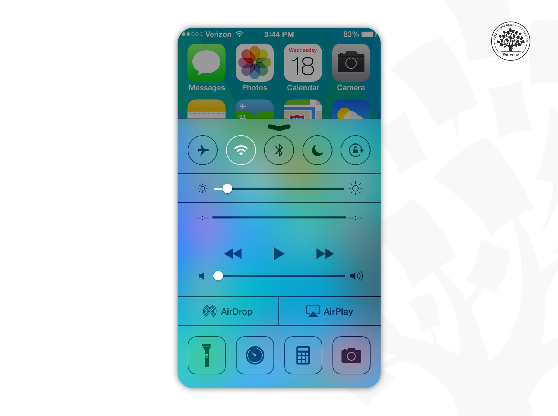
Early versions of Apple’s mobile operating system, iOS, used skeuomorphism heavily across the user interface.
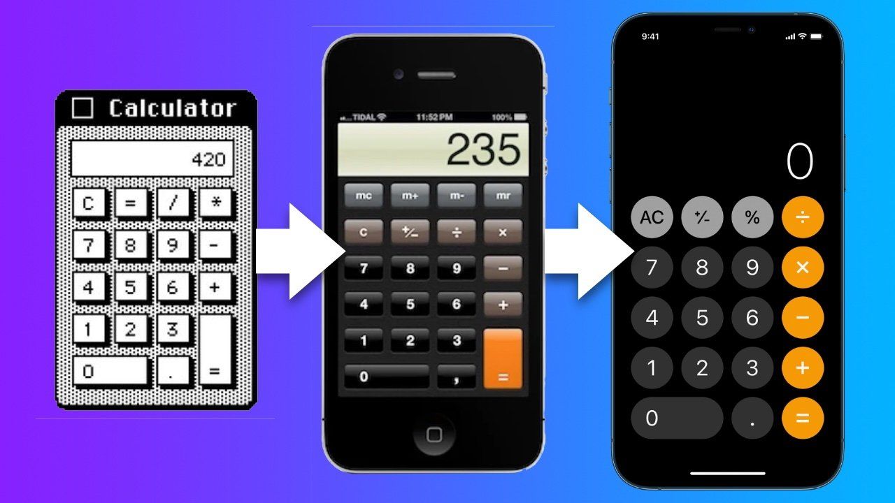
The evolution of Apple’s skeuomorphic calculator. The visual interface of early Apple apps and software imitated real-life objects to make their use more straightforward and intuitive for first-time users.
© Apple Insider, Fair Use
In contrast, neumorphism, which emerged as a trend in the late 2010s, blends concepts from skeuomorphism with a new, minimalist approach. It distinguishes itself by creating a soft, almost tactile feel in UI elements, making them appear as if they are emerging from the background. This design style uses soft shadows and highlights for subtle depth, coupled with a muted color palette and rounded shapes for simplicity and sophistication. While neumorphism aims for a balance between realism and minimalism, it prioritizes aesthetic innovation over direct emulation of the physical world. However, it has been critiqued for potential accessibility issues due to its subtle use of contrast, which can make interfaces less intuitive for some users.
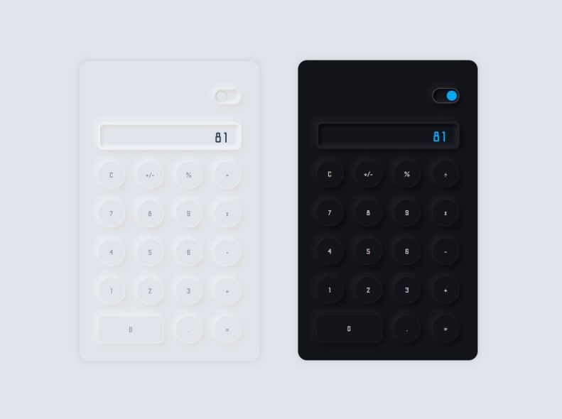
Concept of a neumorphic calculator.
© Ricky Eckhardt, Dribbble, Fair Use
The key differences between these design philosophies lie in their visual approach and design objectives. Skeuomorphism's direct imitation of real-world materials aims to reduce the learning curve for digital interfaces and make them more accessible through familiarity. Neumorphism, however, seeks to innovate by offering a new form of realism that emphasizes depth and dimension through minimalistic design cues. While skeuomorphism can lead to more cluttered interfaces with its detailed textures, neumorphism offers a cleaner, modern aesthetic that focuses on content. Despite their differences, both styles serve distinct purposes in UI design, with the choice between them depending on project goals, target audience, and context of use.
Neumorphism: Key Characteristics
Neumorphism is distinguished by several key characteristics that set it apart from other design styles.. Here are the main characteristics of neumorphism:
Soft, subtle shadows: Neumorphism heavily relies on the use of soft, subtle shadows to create a sense of depth. These shadows are often used to simulate extrusion or intrusion on the screen—the elements appear as if they are embedded within the background or gently protruding out of it.
Light and dark color contrast: It utilizes a palette of light and dark variations of colors to enhance the sense of depth and dimensionality. The balance between light and shadow is crucial to achieve the neumorphic effect.
Semi-flat colors: While neumorphism departs from the flat design, it still uses semi-flat colors. The colors are usually muted, with low saturation, to keep the design soft and unobtrusive.
Rounded corners: The rounded corners of design elements contribute to neumorphism’s soft and approachable look.
Minimalistic approach: Despite its focus on shadows and depth, neumorphism maintains a minimalistic approach. The design avoids unnecessary embellishments, focusing instead on cleanliness and simplicity.
Tactility and texture: Neumorphism aims to mimic real-world materials and textures, creating a sense of tactility. This is achieved through the subtle use of gradients and shadows, giving the impression that the objects can almost be felt through the screen.
Neumorphism stands out for its unique approach to depth and dimensionality; it offers a new twist on digital interfaces by seamlessly blending backgrounds and interface elements. This design trend seeks to create a bridge between the digital and the physical, providing users with a more intuitive and engaging interaction experience.
How to Create the Neomorphism Effect in UI Design?
The creation of the neomorphic effect in UI design involves a careful balance of colors, shadows, and highlights to achieve a soft, embossed, or inset look. Here's a step-by-step guide:
Choose a Soft Color Palette
Start with a soft, almost monochromatic color palette. Neumorphic elements usually have very subtle color differences, so choose a background color and then select slightly lighter or darker shades for the elements.
Design Background
Use a light color for the background. Neumorphism relies heavily on shadows and light to create depth, so a neutral or pastel background makes the elements stand out.
Create the Elements
Design your UI elements (e.g., buttons, sliders) with the same background color but slightly different shade. This minimal difference in color helps achieve a soft, subtle look.
Apply Soft Shadows and Highlights:
Shadows: Apply a soft box shadow to create depth. Use a darker shade of your element’s color. To create a lifted effect, the shadow should be subtle and often applied on two opposite sides of the element (e.g., bottom and right).
Highlights: Apply a light source as an inner shadow on the opposite sides of where you placed the box shadow, using a lighter shade than the element’s color. This simulates the effect of the element being lit from above, adding to the 3D appearance.
Adjust the Radius
Use a large radius for your box shadows and elements to soften the edges. neumorphism is known for its soft, pillowy look, so avoid sharp edges.
Fine-tune Contrast
Ensure enough contrast between the elements and the background while maintaining a subtle, soft appearance. This might require adjusting the colors, shadow intensity, or highlight brightness.
Test for Accessibility
Since neumorphism can sometimes lead to accessibility issues, especially regarding contrast and readability, test a design with various users, including those with visual impairments, to ensure usability.
Integrate with UI Components
Apply the neumorphic style to various UI components such as input fields, checkboxes, and toggles, ensuring consistency across your design.
Use Gradients for Added Depth (Optional)
A subtle gradient to the background or elements can enhance the 3D effect making the design more dynamic.
Prototype and iterate
Prototype your design to see how it works in practice. Collect feedback and iterate to improve the design with a focus on usability and aesthetics.
By following these steps, you can create a UI design that harnesses the unique and tactile feel of neumorphism, ensuring it's not only visually appealing but also user-friendly and accessible.
Neumorphism: Applications in Design
While neumorphism has been a popular trend in UI/UX design, specific well-known apps adopting this style outright can be less common, as mainstream applications often prioritize accessibility and usability, which can conflict with the neumorphic design's subtle features. However, there are several concept designs and smaller-scale applications where neumorphism has been explored more freely. Here are examples in line with the categories mentioned, noting that these might lean more toward conceptual or niche applications rather than mainstream ones:
Music player apps: Concept designs for music player apps on platforms like Dribbble or Behance showcase neumorphic design elements for play buttons and sliders. A specific example is hard to pinpoint as mainstream apps like Spotify or Apple Music maintain more accessible designs.
Smart home apps: While specific mainstream smart home apps (like those from Nest or Philips Hue) typically use more standard design approaches for broader accessibility, concept designs for smart home apps on Behance or Dribbble often experiment with neumorphism to represent physical switches or dials.
Fitness and health apps: Fitness app concepts, rather than widely recognized brands such as Fitbit or MyFitnessPal, might use neumorphic design for daily activity tracking or nutrition logging in their UI mockups.
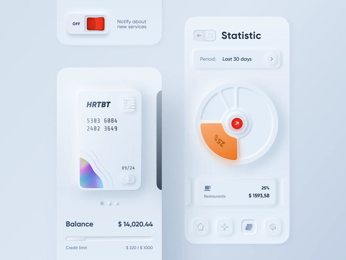
Banking and finance apps: Most banking apps stick to more traditional design paradigms for clarity and security reasons. However, fintech startups occasionally experiment with modern design trends, including neumorphism, for features like transaction buttons or account balance displays in their app prototypes or concept stages.
User Interface (UI) kits and themes: Designers on platforms like UI8, ThemeForest, and Creative Market offer neumorphic UI kits and themes for various applications and websites, providing resources for developers and designers to implement this style in their projects.
Dashboard interfaces: Conceptual dashboards for CRM, analytics, or IoT device management showcased on design inspiration websites might incorporate neumorphic elements to highlight key data points or controls.
Gaming apps: Indie game developers or concept designs for game interfaces might use neumorphic design to create a unique tactile feel for game controls or menus, although these are less common in mainstream games.
Website design: Portfolio websites or design-centric sites occasionally adopt neumorphic design elements to showcase creativity. These are usually individual projects or design agency websites rather than large-scale commercial sites.
Given the nature of neumorphism as a niche or emerging design trend, its adoption is more prevalent in design exploration and conceptual projects. Mainstream applications may incorporate elements of neumorphism subtly, but they typically do so while carefully balancing other design considerations to ensure usability and accessibility for a broad audience.
Neumorphism in UX and UI Design: What’s Next?
The future of neumorphism in UX/UI design hinges on balancing aesthetic appeal with accessibility. As technology and design tools evolve, neumorphism may adapt, integrating with other design trends and improving usability.
Future iterations could see it merging with new technologies or evolving into contemporary styles that address its limitations. The design community's feedback and technological advancements will likely dictate its role, potentially leading to hybrid approaches that combine neumorphism's tactile feel with more accessible and user-friendly designs.


