The MAYA principle, which industrial designer Raymond Loewy coined, stands for “Most Advanced Yet Acceptable.” It advises designers to introduce innovations that are progressive but still within the area of user comfort. UX (user experience) designers apply this principle to help create products that feel both fresh and familiar.
"The adult public's taste is not necessarily ready to accept the logical solutions to their requirements if the solution implies too vast a departure from what they have been conditioned into accepting as the norm."
— Raymond Loewy
The Need to Design for the Future, with Familiarity
The MAYA principle has been offering a guiding light for designers since Raymond Loewy (1893–1986) devised and began to apply it in the first half of the 20th century. The formula of MAYA’s success lies in how it encourages designers to find the right balance in what they create for the people who encounter and use products, which include anything from the smallest logos up to the largest items (such as jumbo jets and cruise ships)—and, indeed, digital products.
Loewy discovered a powerful truth about how humans “take to” new things: designs that push too far get rejected, but designs that play it safe are boring. He mastered the art of balancing what users already know with exciting new possibilities—so pushing at the frontiers of design and technology beyond users’ expectations, while keeping them on board. This approach to welcoming the future of design has proved successful because it respects the level of what people are prepared to embrace. There can be a fine line between “excited” and “shocked”; a design or product that seems to come too far from the future might enthrall many people—temporarily—before they shake their heads in bewilderment. Loewy put his finger on the public “pulse” and understood how to handle a timeless tension in design: the balance of novelty with familiarity.
To look back at the products Loewy designed and influenced in the 20th century is to capture snapshots of an exciting era filled with iconic logos and products, including redesigned soda bottles, refrigerators, and cars. To a 21st-century eye, the look of many such items may conjure terms like “retro” and “vintage.” However, therein lies the point: an automobile from 1950 inspired by the MAYA principle bridged the divide between future and present without shocking the public consciousness. Smart designers know to keep this practice going and keep one foot in the present while stepping into the future with the other.
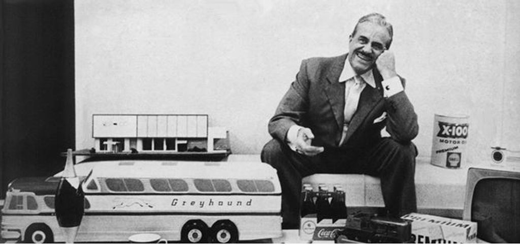
Raymond Loewy sits amid some of his iconic designs. Loewy is often dubbed the father of Industrial Design—and his “portfolio” includes the Air Force One logo, the Shell Oil logo, the US Postal Service logo, the Greyhound logo, and a variety of designs, many of which are still household names. Loewy coined MAYA after seeing that people resist overly unfamiliar innovations. Designers now use MAYA to introduce bold ideas gradually—whether through visuals, interactions, or structure—without alienating users.
© Raymond Loewy, All Rights Reserved
What Makes The MAYA Principle Timeless?
Human behavior reveals the science behind MAYA, and it’s a timeless concept. Psychologists call it the mere-exposure effect: people prefer what they recognize. Still, humans crave stimulation, too. This “move-stay” force creates a natural contradiction—one the MAYA principle resolves—and accounts for the point that while modern people may find “retro” items quaint, the reason few shockingly advanced outliers showed up in the marketplace was that designers typically knew better. For instance, even if 1950s designers could have created an outlandish-looking automobile which users could control just with their thought patterns, such advanced tech would have stayed behind closed doors—it would have been too much too soon.
Cognitive fluency explains another layer. The brain processes familiar things more easily—hence why people tend to find “faces,” “animals,” and other familiar shapes in natural formations such as clouds, for example—and fluency creates positive feelings. Even so, a little friction, in the form of innovation, also captures attention and encourages exploration. It’s one of the chief responsibilities of designers to walk this cognitive tightrope; the MAYA principle offers a framework to stay balanced.
Many aspects of the human condition show the MAYA principle or echo aspects of it. For example, a young child who is learning to count to ten won’t be ready to calculate the square root of 121 (11) until learning times tables later. This translates to any learner or user at any age—people need to be able to stand before they can walk, let alone run. The main point for the teacher—or designer—to consider is, when they want to help someone learn a new skill (or product), they must determine the person’s existing skill level first.
Learnability and comfort are essential to pushing boundaries and gaining new skills—and to decide how advanced and innovative a concept or design can be before the person who encounters it becomes confused. Soviet psychologist and founder of cultural-historical psychology, Lev Semyonovich Vygotsky (1896–1934) developed the zone of proximal development (ZPD) to describe the range of skills a child has while in the process of learning. The lower limit of the ZPD is the maximum skill level a child can attain by working independently, while the higher limit of the ZPD is the maximum skill level that the child can reach when a more capable instructor helps them.

Beautifully “classic,” but was this car with a Loewy touch, a Lincoln Continental, an instant “classic” on its release in 1946? Or more like something that rolled into dealerships as if back from the future to give exciting hints of things to come?
© Public domain
Why MAYA Matters to UX Designers
UX and UI (user interface) designers may handle the design of items that go more in the pockets and purses of users than their 1950s’ “counterparts” did in an era when consumer electronics were barely in their infancy. However, Loewy’s principle remains valid: teams who embrace MAYA can help themselves introduce forward-thinking solutions without overwhelming users.
Learnability goes a long way to reducing the chances of overwhelm. Vygotsky’s ZPD carries over to UX design in that it’s wise to gauge users’ current skill levels and the skills they can (easily) learn by themselves. For example, designers would accommodate this fact about users by making small changes in an existing product, or present users with a new product that has strong similarities to existing products or interaction patterns.
The MAYA balance applies to every UX layer—from visuals to interactions to underlying functionality. A product that follows the MAYA principle introduces fresh ideas within a familiar framework, encouraging trust and adoption. Design can be a risky realm if designers deliver too much “future” in the form of what they set before users. The “familiar” aspect must be there; if it’s not, its “foreign” nature may be too much for users. A successful design feels advanced—but not so alien that it becomes inaccessible and divorced from human relevance and relatability.
User experience hinges on two core human responses: curiosity and comfort. Curiosity drives interest in novel solutions, while comfort ensures ease of use and emotional safety. The MAYA principle supports both.
When UX professionals design “most advanced, yet acceptable” experiences, they can:
Encourage adoption of new technologies or workflows.
Reduce user anxiety around unfamiliar interfaces.
Increase retention by reinforcing intuitive behaviors.
Support business goals like innovation leadership without sacrificing usability.
It’s impossible to overstate how products that ignore this balance risk polarizing users. On the one hand, overly complex or futuristic designs may dazzle in demos but fail miserably in the marketplace—often far too exotic for users outside a niche of enthusiasts. Conversely, designs that cling to convention may feel outdated or fail to stand out—too nondescript or “stagnant” for most consumers to bother with. To consider this in a context where trust also extends to safety from cyberattacks, compromised privacy, and other problems online, designers have a prime opportunity to seize the moment and introduce a MAYA-tempered winning product.
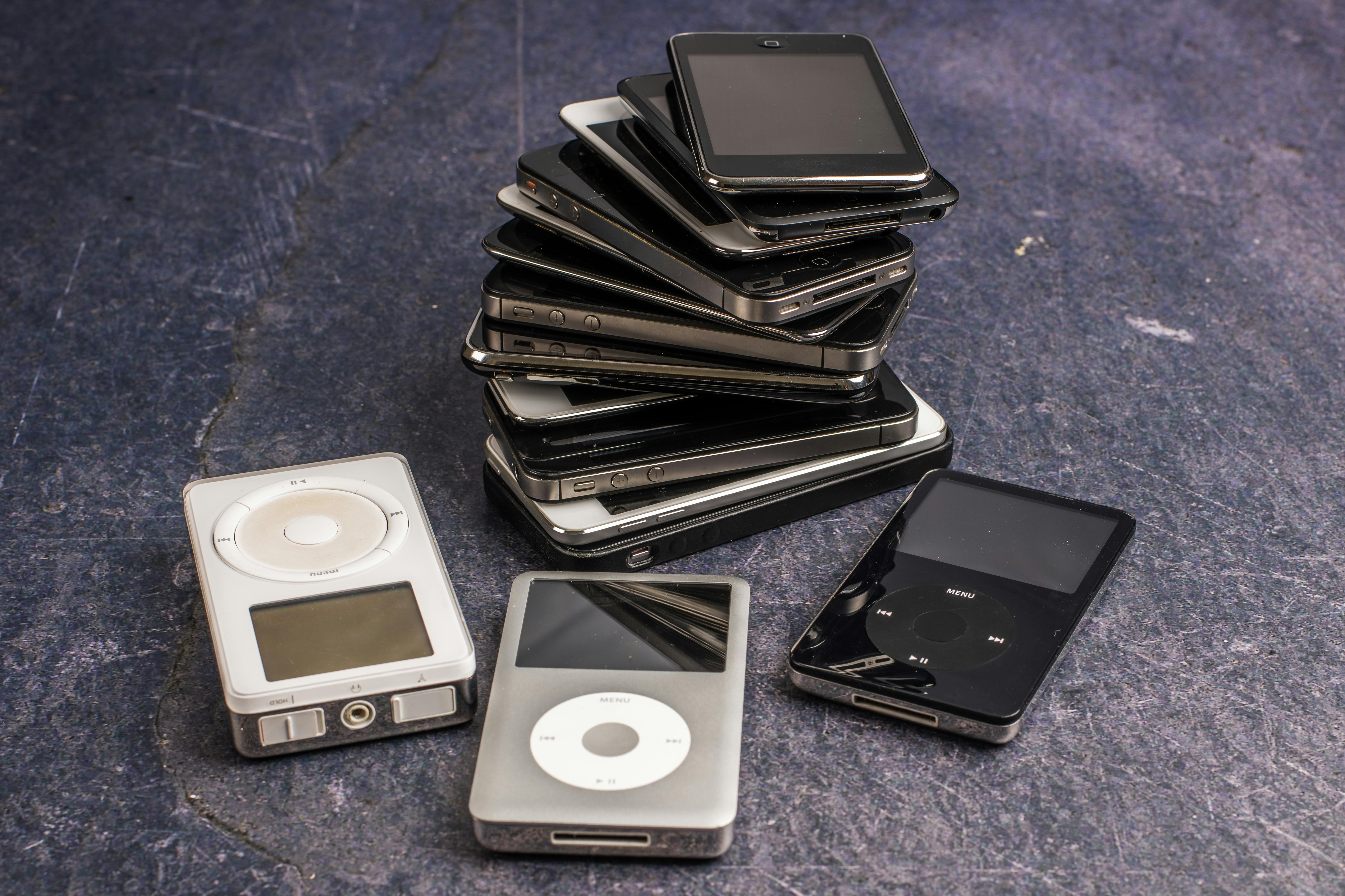
Consider the evolution of electronic music players—and how touchscreens and smartphones have evolved away from the control wheels users once were “ready for.”
© Skyler Ewing, Pexels
How to Apply MAYA in UX Design
To use MAYA effectively, assess where your product or idea lies on the spectrum between familiarity and innovation—and adjust accordingly and carefully.
1. Start with What Users Know
To begin, identify mental models your audience already holds—the frameworks users use to predict how systems behave. For example, mobile app users expect tab navigation, swipes, and a back button. Regardless of where design may be heading—for example, in a more XR (extended reality), including AR (augmented reality) and VR (virtual reality), or even thought-controlled direction—respect these expected patterns unless there’s a compelling reason to deviate.
Discover powerful points about designing to match users’ mental models in this video with Guthrie Weinschenk: Behavioral Economist & COO, The Team W, Inc., specializing in behavioral economics, decision-making, and business strategy. He’s also the host of the Human Tech podcast, and author of I Love You, Now Read This Book.
Best Practices
Use established design patterns wherever they’re appropriate.
Study competitors to understand baseline user expectations.
Observe real users to identify their behaviors and pain points.
Explore how UI design patterns help designers fast-track their way to better digital solutions via familiar paths for users, in this video:
2. Introduce Innovation with Intention
When you add advanced features or new interactions, make them discoverable and gradual. Don’t overwhelm users with a radically different system—even the smartest users likely won’t appreciate it, especially when they’re in busy situations. Instead, introduce novel elements inside known contexts.
Best Practices
Use progressive disclosure to reveal complexity over time.
Anchor new functionality with familiar visuals or metaphors.
Offer microcopy, tutorials, or onboarding cues to guide learning.
Explore how to leverage progressive disclosure by combining UI patterns in this video with Vitaly Friedman, Senior UX Consultant, European Parliament, and Creative Lead, Smashing Magazine:
3. Test the Boundaries of Acceptability
Conduct usability testing to measure what users understand, accept, or reject. Start early and long before you even think to commit to any final design solution. Prototype innovative ideas and observe reactions. Are users intrigued or confused? Are they confident or hesitant? This feedback defines the limits of acceptability for your audience—it’s the users’ “toes in the water”; if the “temperature” isn’t right for them or there’s a powerful “current,” few will enter the experience.
Get insights into the power of prototyping from Alan Dix: Author of the bestselling book “Human-Computer Interaction” and Director of the Computational Foundry at Swansea University:
Best Practices
Use A/B testing to compare novel and conventional designs.
Analyze abandonment points to see what’s causing cognitive overload.
Ask participants to “think aloud” to catch friction moments.
Discover how A/B tests can help you uncover essential insights about how users embrace design decisions, in this video with William Hudson: User Experience Strategist and Founder of Syntagm Ltd.
4. Evolve Over Time
What feels “advanced” today becomes normal tomorrow, and UX design must evolve with user expectations. Products like iPhones, Google Search, and Netflix slowly introduced major shifts by layering innovation over a stable core. For example, when Apple introduced gestures like pinch-to-zoom or swipe to unlock, it paired them with visual metaphors (like the “slide” animation). Each step built on existing interactions until gestures became second nature. The buttonless navigation users know—and expect—feels natural because of that gradual transition. This is why designers must monitor behavior and feedback; to time innovation correctly means standing on the shoulders of standards that will slowly sink into history.
Best Practices
Track usage metrics and session recordings over time.
Plan interface evolutions across product cycles.
Retire outdated patterns gradually to preserve users’ trust. This is especially important as many users will be slow to convert away from what they know and (at least, think they) love.
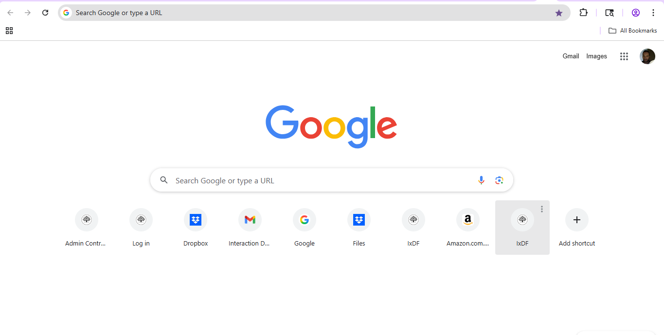
Google innovated in subtle ways—adding auto-complete, voice search, and predictive results without changing the core search bar. Users still enter text, but the underlying system has been advancing constantly and will continue to.
© Google, Fair use
Can Designers ever Break the MAYA Rule?
While MAYA serves most design challenges, it isn’t universal. In some contexts—like emergency systems or highly specialized tools—efficiency may trump comfort, and the need to get something new on the scene becomes all-important. Sometimes, designers must disrupt expectations to break harmful habits or reframe behavior. The evolution of medieval armor serves as a reminder that design also responds to necessity—plate armor resists piercing and slashing better than chain mail. For a more serene example, the mobile defibrillator and mobile coronary care program—begun by the Pantridge-Geddes team of doctors in 1966 and incorporating a car-battery-powered device—needed to hit the ground running as a radical new concept. What started as a system in the hands of specialists has saved millions of lives since, and most people can use a defibrillator.
Still, even in these cases, it’s wise for brands to implement transition strategies and user education to soften the shift.
What are Special Considerations with The MAYA Principle?
Don’t Over-Engineer
Designers who try to make design solutions appear futuristic can go too far. A sleek UI with unrecognizable icons or hidden controls may confuse rather than impress. So, be sure to strip down to essentials, validate early, and prioritize clarity over cleverness. If a brand needs to supply users with extensive instructions and a thick manual, it may not be able to save its product from obscurity in the marketplace. If a product needs to have extensive features that permit advanced functions—such as Microsoft Excel—a smart application of Heckel’s law, where users accept complexity if the effort is worth the reward, can help.
Don’t Play Too Safe
Designers who follow conventions too rigidly can limit innovation and create stale experiences—“by the book” won’t get a second look from users who may leave for more forward-thinking products. So, study where users show readiness for new ideas and offer optional beta features or early access programs.
Don’t Ignore Feedback
A single usability test may not capture long-term adoption—especially as users sometimes resist at first, then grow to love new interactions. Combine short-term testing with long-term usage tracking; be patient but observant—some design features may be “slow boilers” and gradually become massive hits with users. Careful research and testing will help turn up trends and straighten bends that might otherwise block insights.
Get a greater grasp of why user research is so vital to help designers find out what works—and what needs work—from the people they create digital products for, in this video:
A Practical Checklist for Designers
Use this checklist to help align with the MAYA principle:
Does the design feel familiar to the intended user?
What element introduces a sense of novelty or progress?
Does it introduce new features gradually and with support?
Do prototypes cause positive reactions in user testing?
Are advanced elements visually or functionally grounded in known patterns?
Can users achieve core goals without having to relearn everything?
Is our brand monitoring metrics post-launch to detect friction or drop-offs?
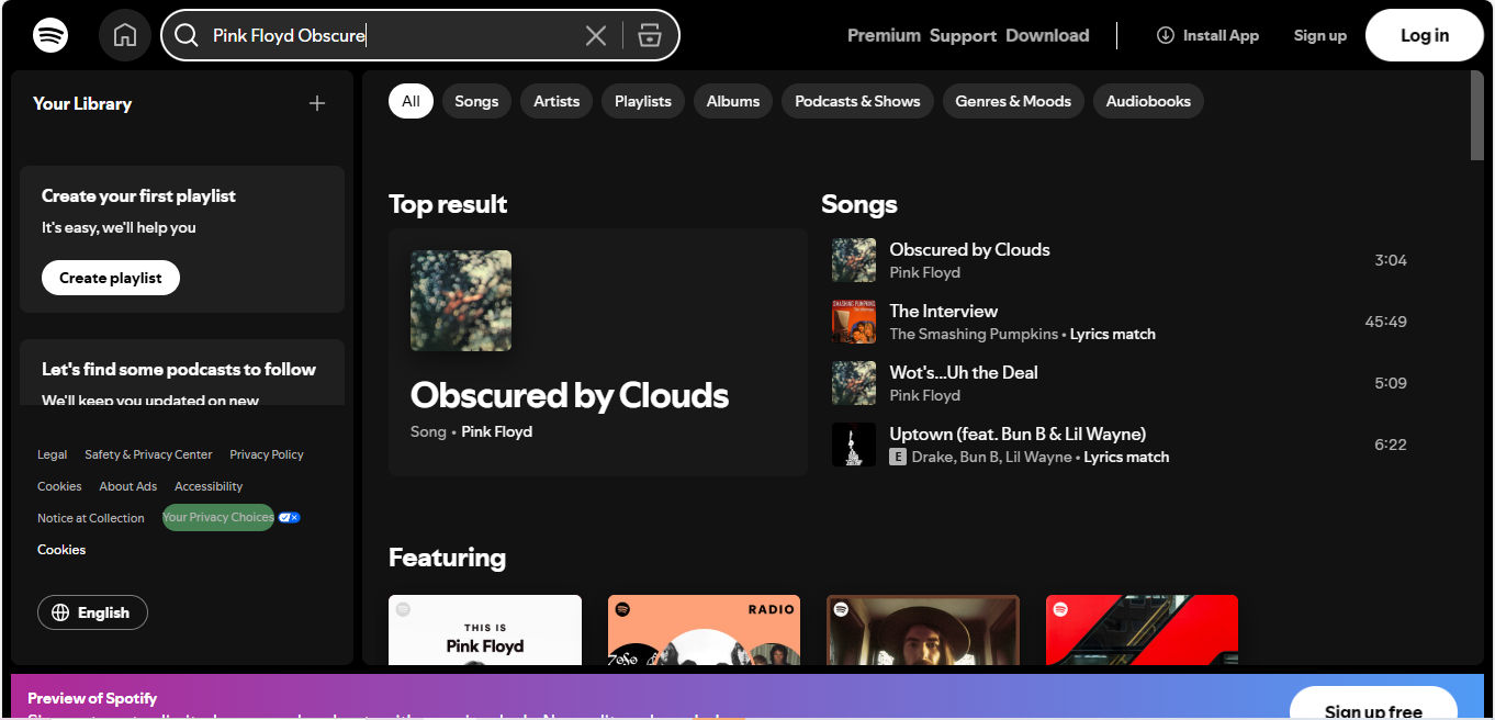
Spotify applies advanced AI to recommend music, but it packages that intelligence in familiar formats—playlists, album covers, and shuffle buttons. The innovation happens behind the scenes, keeping the user experience approachable.
© Spotify, Fair use
Overall, the MAYA principle reminds UX designers to lead users into the future with care. Technological advancements may be predictable to some degree. However, the “nature” of time is more like a curving corridor, and it’s hard to tell exactly what lies ahead—a fact mirrored in science-fiction movies that portrayed such luxuries as flying cars in 2019 (Blade Runner, 1982) or flying skateboards in 2015 (Back to the Future Part II, 1989). Note that such items will likely succeed if they evolve at just the right rate away from their ground-bound counterparts. In any case, innovation only thrives when people feel confident enough to use it.
Fortunately, design will keep moving in a healthy continuum—futurists will continue to thrive because humans naturally progress; nobody wants to be stuck in a state of decay. The “trick” is to lead users with little steps towards something exciting rather than a hard pull into angst-filled uncertainty. When designers balance the new and the known, they can create experiences that push boundaries without breaking trust—and leave a gentle trail of devices and design styles leading back to the “Grand Museum of Tech.” Designers can use MAYA as a trusty rule to keep users close—even as they guide them forward with brand-new products, new navigation models, or other design innovations. MAYA UX design isn’t a compromise between creativity and usability; it’s the craft of marrying both.