Heckel’s law is a principle that states how users will tolerate complex interfaces if the product offers high value. UX (user experience) designers must balance usability with functionality to ensure user satisfaction and be careful to prevent unnecessary complexity in the UIs (user interfaces) they create.
“The quality of the user interface of an appliance is relatively unimportant in determining its adoption by users if the perceived value of the appliance is high.”
— Heckel’s Law (cited by Technical Consultant, Nigel Derrett)
Explore how to balance simplicity with complexity in this video, featuring some fascinating insights from Morgane Peng: Designer, speaker, mentor, and writer who serves as Director and Head of Design at Societe Generale CIB:
What Heckel’s Law Means
Paul Heckel, a software designer active since the 1960s, authored The Elements of Friendly Software Design in 1984. This book laid the groundwork for user-friendly software with its emphasis on clarity, consistency, and designs that align with how people think. For no small reason, then, Heckel’s work continues to influence UX and UI practices far into the twenty-first century. Designs may have become more sophisticated, but the core principle that they need to communicate effectively with—and match the mental models and expectations of—users with real-world needs remains constant, and it will continue to do so as long as brands offer products to users.
While Heckel himself didn’t coin a formal “law,” the term Heckel’s Law later appeared in a 2004 academic paper by Nigel Derrett. Derrett drew on Heckel’s ideas to explore how users engage with complex systems—focusing on the bassoon, a notoriously difficult musical instrument. Despite its intricate design and steep learning curve, the bassoon remains a favorite among musicians because it offers exceptional expressive power. They tolerate its tricky nature and hard-to-access mastery because, to them, it’s worth the bother (time, effort, and maybe even tears). Derrett concluded that the usability of a product’s interface might not be the primary factor in its adoption if users perceive the product’s value to be high. So, if people want or need something badly enough, they’ll typically put up with flaws—within reason—and adapt to it.
Why Heckel’s Law Matters in UX Design
For UX and UI designers, Heckel’s law provides a useful lens for thinking about the trade-offs between usability and functionality—or simplicity and utility—in whatever they design. It shows that while intuitive interfaces are ideal, they’re not always necessary for user adoption—especially when the product offers substantial or unique value. If users can achieve some meaningful end which they couldn’t with a “lesser” item, the product they’ve chosen to invest their time and effort in has high-value features—and they’ll be more forgiving of a complex interface. While Derrett’s study of the bassoon presents an intriguing angle—an “analogue” item—consider some examples of interfaces that illustrate Heckel’s law:
Linux Operating Systems
Distributions like Arch Linux or Debian often call for manual configuration and terminal commands, and they appeal to advanced users and system administrators. They’re not quite so beginner-friendly, but power users love them for the control, customization, and performance they offer.
Microsoft Excel (Advanced Use)
While basic spreadsheets are easy to use, Excel’s advanced features—like pivot tables, nested formulas, VBA scripting, and Power Query—call for significant learning. Nonetheless, professionals in finance, engineering, and analytics rely on Excel because of its powerful capabilities. Even when alternatives exist, the ecosystem and depth of Excel keep it entrenched as a desirable asset and mainstay of the business world.
SAP ERP Systems
SAP is one of the world’s most widely used enterprise systems and figures significantly in resource planning. It’s known for being difficult to use and navigate, but its strategic value, customizability, and ability to support complex business processes make it indispensable. Organizations invest in training because the payoff is worth it; the system’s value is high and indispensable.

SAP S/4HANA Cloud represents the culmination of many years of innovation and refinement.
© SAP, Fair Use
How Heckel’s Law Helps Guide Designers
For a helpful way to grasp why Heckel’s law is important, consider how it sits alongside other important laws for designers to know—and apply—such as:
Hick’s law: The more options users have, the longer it takes them to pick one.
Fitts’ law: Larger and closer targets are easier to reach and select than smaller and farther-away ones.
KISS (Keep It Simple, Stupid or Keep It Simple and Straightforward or Keep It Short and Simple): The easier something is to understand and use, the more likely it is that users will adopt and engage with it.
What makes Heckel’s law particularly valuable for designers is how to understand the limits of tolerance that users will—or will be able to—have. If the interface hinders the user’s ability to access the product’s value, there’s a chance they’ll become frustrated and abandon it. In the commercial world where people often have countless alternatives and can dismiss products quickly and easily, this can be a major problem for a brand that doesn’t appreciate this “balance.” However, what about areas where “high value” or “unique use” are life-or-death matters? Consider two scenarios where a user interface must not hinder the users’ ability to access the “value” of a product (the device a user must use):
1. Aviation Systems
Airline pilots go through rigorous training, including in simulators, before they ever take control of a real cockpit. Aircraft systems are intentionally complex—and need to be with so much at stake—designed with redundant controls and fail-safes to ensure safety under any circumstance. The lives of passengers, crew, and people on the ground (in a potential accident zone) depend on that intricately strung system of safety nets, and the pilot’s and co-pilot’s expertise and judgment are vital. Here, the value is control, precision, and trust in critical situations; with so much skill and so many back-up systems guarding them, passengers can focus on other things, like their destination.

Takeoffs and landings particularly demand immense judgment—and levels of control.
© Rafael Cosquiere, Pexels
2. Nuclear Control Rooms
With great power, there must come great control—perhaps no setting can illustrate that more than nuclear power stations. Seven years before the notorious Chernobyl incident, another disastrous chain of events unfurled and would haunt the American nuclear power industry for decades. The Three Mile Island incident in 1979 remains a tragic case study in interface design gone wrong. There, a combination of equipment failure, unclear indicators, and human error led to a partial meltdown. Well-trained, competent operators misread the system, not realizing a stuck valve was causing the core to overheat. When systems are this complex, users must have the power to make the right decision at the right time—hence why UX design is mission-critical in contexts like these.
Explore vital points about UX design and more—including the Three Mile Island disaster—with Don Norman: Father of User Experience design, author of the legendary book “The Design of Everyday Things”, and co-founder of the Nielsen Norman Group, in this video:
Back to Software: Complexity Users Will Embrace
Professional tools like Adobe Photoshop illustrate Heckel’s law in everyday tech. It’s feature-rich but complex—and still, creatives around the world invest time and effort into learning it because they believe nothing else offers the same level of control and creativity. On the flip side, a clunky photo app with a confusing interface but limited functionality is likely to get deleted within minutes, even after just a glance at the UI. Value must justify effort.
For UX designers, this means that while it’s essential to strive for intuitive and user-friendly interfaces, it’s just as important to make sure that the product delivers substantial value to its users. When users recognize the benefits they gain from a product, they may be more willing to overcome usability challenges and put up with minor “inconveniences” to become proficient with it. Even so, designers should aim to minimize these challenges to enhance the overall user experience—there’s no room for complexity for complexity’s sake; empathy becomes a powerful keyword in this light.
Explore why empathy must figure in design from the outset, so users feel the product and brand truly caters to them, in this video:
How To Design with Heckel’s Law in Mind, Step by Step with Best Practices and Tips
To effectively apply Heckel’s law in UX design, follow these guidelines:
1. Understand Your Users
Conduct user research and do it well, so you can collect insights into user needs, preferences, mental models, and pain points—through surveys, interviews, and observations. Pick quantitative and qualitative research methods that you can apply well—and appropriately—to users in your target audience. Build strong foundations from solid insights you get from research methods into users—who these people are, what they face regarding problems or obstacles to what they want to do, and the wide range of concerns and pressures they have to deal with in their everyday lives. Interpret your findings well—and you’ll have a rich tapestry of minute details that can show you accurate pictures of where you may need to go with a digital solution or service.
Get valuable insights about the difference between qualitative and quantitative research, both essential ways to learn about users, as William Hudson, User Experience Strategist and Founder of Syntagm Ltd, explains:
Create user personas to guide your design decisions towards better outcomes for your product, your brand, and the users who should come to trust it as a go-to name. Personas are fictitious representations of real users; when you develop detailed profiles representing different user types, you can proceed more confidently on firmer foundations of what users are really like—and how they’ll use (and appreciate) your potential design solution.
Watch as William Hudson explains why design without personas falls short:
2. Prioritize Core Functionality
Identify essential features for users—which features are most valuable to them in their contexts of use—and focus on optimizing these elements for them.
Simplify user flows to smooth the way for users. Design intuitive pathways for them to accomplish primary tasks efficiently—learn how they expect to be able to move across a journey with your product and brand and get what they need or want to do done.
3. Implement Progressive Disclosure
Hide complexity and reveal advanced options as needed: When you present basic features upfront and reveal advanced options only when users actually want or need them, you lower the potential for overwhelm; too much too soon can put many users off.
Use tooltips and help guides to keep users from becoming confused or frustrated. When you provide contextual assistance to help users navigate complex features, they’ll value that in-the-moment help and trust your brand more as one that understands them and has their interests at heart.
Learn how to leverage progressive disclosure in this video:
4. Boost Learnability
Use consistent design patterns and familiar UI elements to reduce the learning curve—well-chosen design patterns can help users get up to speed without any moments of confusion souring their experience. Help users recognize rather than recall cues to speed them on their way to their goals.
Explore how to employ UI design patterns to help your interfaces reach users so they enjoy seamless user experiences with your product and brand.
Include interactive tutorials to lessen the risk of overwhelming users. Offer guided walkthroughs to help them understand how to use the product effectively and without confusion. You can shed light on the complex features they’ll need in a natural way, so they can take the right actions at the right times without breaking the seamless experience between themselves and your product. It only takes a moment of hesitation for users to start doubting (and distrusting) your product, so keep them on board and prevent that.
5. Balance Aesthetics and Functionality
Include a strong visual hierarchy and use design elements well—including color, size, and spacing—to guide users’ attention to important features; design in line with how their eyes will actually encounter what you intend to present for them.
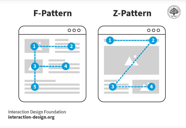
Give users fast access to what they want to see—design for reading patterns like the F- and Z-patterns.
© Interaction Design Foundation, CC BY-SA 4.0
Use responsive design so the interface adapts seamlessly across different devices and screen sizes—“flowing” from screen to screen in a way that preserves your brand image and matches their expectations and needs whatever the device.
Watch Frank Spillers explain responsive design and its benefits:
6. Provide Customization Options
Cater to user preferences to help make it a “preferred” product for them. Let users customize the interface to suit their workflow and preferences; they’ll want to do this especially when the functionality divides between what new users and experienced ones find most useful. Follow your research findings to see what power users would prefer, while novices can enjoy a simpler seamless experience—all within the same product.
Use modular design to keep design needs straightforward. Design components that are rearrangeable or modifiable according to what user needs tell you.
7. Monitor User Engagement and Gather and Act on Feedback
Conduct usability testing well and establish any issues that arise—and keep an open mind without bias. Observe users as they interact with the product and identify areas of confusion or difficulty; their actions will often teach you more than their words can. Approach them with a humble mindset and beware of the Hawthorne effect; they may act unnaturally if they feel “watched” and end up distorting how usable your product actually is.
Use analytics tools so you can track user interactions to spot which features they use most and any places they run into difficulties.
Apply performance metrics to get the figures out in the open. Measure task completion rates, error rates, and user satisfaction to assess usability and gauge your product’s effectiveness.
Discover what analytics can do for you as William Hudson reveals key benefits and more in this video:
Employ iterative design and keep making adjustments according to what users tell you—through their actions as well as words—through testing. When you continuously refine the interface based on user feedback and testing results—and keep going until tests reveal that you’ve smoothed out the kinks—you can craft the most effective digital solution.
8. Educate Users
Provide documentation to show you understand your users’ needs, prevent their confusion, and stay ahead of the game. When you give users comprehensive guides and FAQs to help them understand complex features so they can use them as they need or want to, you increase the chances that they’ll enjoy seamless experiences.
Nurture community support and prove your brand cares about its users and the impacts of using its product. Foster user communities where individuals can share tips and solutions; apart from anything else, it will take pressure off your brand’s technical support line—although it’s vital to identify and minimize potential problems in the first place.
9. Plan for Scalability
Future-proof your interfaces so any products you design can enjoy long “shelf lives.” Design interfaces that can accommodate additional features without compromising usability—your product may last for many years to come, so provide for changes without the need for major overhauls.
Create modular architecture to reduce the need for extensive overhauls, too. Develop a flexible system that permits easy updates and enhancements, and your digital solution should be able to keep helping users long into the future.
Remember Your Users’ Cognitive Abilities and Comfort
The bassoon example might imply one of the reasons some people prefer “difficult” things is that they are complex—and some designers might infer that users can find harder-to-use interfaces “cool” or a status symbol. After all, to outside eyes, developers often seem to dwell in a niche where skillset can lend itself to a type of “culture.”

With its complex key system, double reed, and other peculiarities, the bassoon is notoriously hard to play.
© Alexander Zvir, Pexels
However, remember that users are people—human beings who come from many backgrounds, encounter products in various contexts, and often don’t have the luxury of taking time to learn the intricacies of a product or service. For example, a stressed person who needs to purchase airline tickets in a hurry will appreciate being able to do so with minimum “detours” to find information or functionality. While Heckel’s law acknowledges that users may accept complex interfaces for high-value products, always strive to minimize unnecessary complexity. Designers who overcomplicate interfaces can cause user frustration, decreased productivity, and potential abandonment of the product.
Another vital point is that designers need to consider accessibility and ensure that individuals with varying abilities can indeed use interfaces. Accessible design essentials include keyboard navigation, screen reader compatibility, and sufficient color contrast—and many users with disabilities also use assistive technology to access and enjoy digital products.
Discover vital aspects of design in this video about accessibility:
Overall, user-friendliness needs to figure in design, however specialized the target audience may be. Extensive training and vocational know-how can’t overwrite the primary need of people who encounter interfaces to reach for controls and get something done, quickly. Heckel’s law deserves its place in the toolbox of UX design for that reason.
Heckel’s law teaches that complexity isn’t always the enemy—so long as it leads to meaningful value. However, that doesn’t give designers a free pass to ignore usability—the idea is to earn users’ time and trust, not waste it. Designers who understand how users think, feel, and behave—especially under pressure—can build products that are powerful, purposeful, and truly people-centered as well as desirable. Heckel’s law belongs in every designer’s toolbox—not to justify complexity, but to help designers recognize when it’s worth it. After all, if a product is to stand high above others in the marketplace, the people who take the trouble to reach its “summit” must feel rewarded for the effort to get there.


.jpg)