Audience Awareness

Your constantly-updated definition of Audience Awareness and collection of videos and articles.
Be a conversation starter: Share this page and inspire others!

98 Shares

What is Audience Awareness?

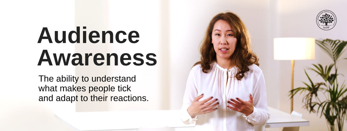
Audience awareness is your ability to understand who is in the room, what matters to them, and how they react to your message. You’re audience-aware when you understand what people care about, speak in a way that makes sense to them, and pay attention to how they respond. You connect better with your audience when they feel that you listen to them, not only to what they say, but also to how they react. This skill builds trust, makes your ideas more persuasive, and helps you stand out as someone who truly understands people. Over time, being audience-aware can make you more effective in your work, strengthen your professional relationships, and open doors to bigger opportunities.

Discover how to connect with people in the room using active listening, so they can get more from your presentation and you can get more from their responses, in this video with Morgane Peng, Managing Director, Global Head of Product Design and AI Transformation.

Transcript

The Power of Engagement: Audience Awareness Saves You Time, Builds Trust, and Wins Buy-In

Consider these benefits of audience awareness so you can shape your presentations with insights about what people really want.

You Can Make the Subject Stick with Your Audience (If They care)

No matter how brilliant your content is, if it doesn’t align with your audience’s needs, it won’t land with them. People only retain information when it feels relevant to them; if it’s an “exotic” topic, they might feel intrigued; but the speaker needs to bring it “home” to them so they can appreciate why they should care. When you speak with clarity and relatability and tailor your examples, vocabulary, and focus, you make your message stick; do it well, and it will resonate too.

It Saves Time and Keeps Momentum

If you don’t know what your audience members want, you risk wasting time explaining irrelevant details they mightn’t even be interested in. For example, a decision-maker doesn’t want your entire process; they want to know the impact, the bottom-line result. Meanwhile, a peer designer might crave detail and be hanging on your every word. “What’s in it for them?” helps you know the difference so you can keep projects moving forward and make people informed, interested, and invested.

It Builds Trust and Credibility

One thing nobody can recycle (yet, anyway) is time: it’s precious to virtually everyone. And then you’ve got the magic “ingredients” of personalization and consideration. When you demonstrate that you’ve thought about what others care about and what they’re prepared to sit for many minutes listening to, you come across as prepared, respectful, and professional. You win their trust and grow it when your message feels built for the people in the room, not recycled from another talk. It shows you’ve taken time to craft your message to suit their time. That’s a precious connection for you to make with them so they can also enjoy better information retention and trust you as a competent, caring professional.

It Helps You Influence and Persuade

Great presenters aren’t just clear; they’re strategic also. They understand the social dynamics of influence: who has power, who has interest, and how to adapt accordingly. Audience awareness empowers you to stand back from your own perspective and discover how other eyes and ears might perceive what you’ll show them, and how their minds might process that information and why. This lets you frame your ideas in ways that win support and get decisions made.

How to Be Audience-Aware: A Step-by-Step Approach

Step 1: Map Your Audience Before You Present

Know your target audience in advance: who are they, why are they coming to your presentation, and what can they do for you and your project afterwards? Use a stakeholder map to clarify two factors: influence and interest.

  • High influence, low interest keep it brief and deliver impact fast.

  • High interest, low influence → a follow-up email may be enough.

  • High influence, high interest → invest in tailored content with relatable examples.

Get more from your audience when you know what they want to get from your presentation, via a stakeholder map, in this video with Morgane Peng.

Transcript

For example, business stakeholders (generally high influence) may have a hard time finding your content relatable if it’s more design-oriented, so cut to the chase and get the bottom-line across to them concisely. Use a stakeholder map as a safeguard to help you scope out your audience members and stop yourself from drowning some people in detail while starving others of the information they need.

Step 2. Adapt Your Vocabulary

Match your language to your audience’s world when you prepare your presentation. Instead of saying “usability testing” to a non-designer, try “feedback session” so they understand it right away. The point isn’t quite so much about accuracy here, though accuracy is still essential; it’s about clarity. If your words trigger confusion, you’ve lost attention before you even make your point.

Flip things around and assess what you’re saying from someone else’s perspective. That’s why it’s a good idea to ask a colleague to watch you rehearse your presentation. Or record it alone, and when you play it back, ask yourself: “If I were a manager or CEO, would I understand that term? And why should I care about it? How could I make them want to care about and take home an impactful message they can act upon?”

Step 3. Position Yourself to Give and Receive

You’re giving a presentation, and that means you access your audience and keep the communication channel open. Although it may seem like a one-way setup with you speaking to them, it’s very much a two-way deal. They’re already investing their time in you, so you want to prove you’ve invested interest in them by making it interesting and relevant for them. That’s the difference between whether they listen to you or they just hear you, but your words go in one ear and out the other.

Get a greater grasp of how to position yourself for success in a presentation, in this video with Morgane Peng.

Transcript

If you’re standing, be sure to speak to the audience and not at the screen. Or, if sitting, you might want to use the SOLER framework (Sit squarely, Open posture, Lean forward, Eye contact, Relax); it’s an approach that promotes openness and can make audiences more receptive to you.

Step 4. Watch for Reactions in The Moment

Active listening is your tool to keep your radar on and tweak your talk in real-time. So, use it to stay attentive and focused and show that you’re listening. Even with preparation, you can lose people mid-presentation. Look for cues: eyes drifting to phones, fidgeting, or energy dropping. Think about that “glazed” look people have when they’re bored; some might be thinking about what they might want for dinner, others might lose themselves in the pattern on the carpet, and one or two might be on another “planet” entirely. Maybe the previous night’s documentary about mid-Renaissance sketching suddenly seems not so boring by comparison to what they have to sit through now. The difference is, they were able to change the channel after a minute then; here, they’re trapped listening to a speaker.

You can notice this if it happens, so pivot if it does. Offer a choice, like: “Do you want me to walk through the process or show an example first?” This small adjustment re-engages the room, shows you value their time, and gives them a sense of control. Better still, it puts you in a better light as a giver, not a taker, which is part of how you win your audience’s trust.

Explore how to apply trust frameworks to present yourself as a caring, competent, and giving professional and take your presentations to a higher level, in this video with Morgane Peng.

Transcript

Step 5. Vary Your Delivery

Don’t rely only on slides: for one, they can make you “redundant.” If people can read far ahead, they can easily get out of sync with what you’re saying. Slides can also cause cognitive overload and leave audience members “punch drunk” on terminology and what might be unrelatable subject matter. As if that’s not bad enough, the monotony of an uninteresting slide deck might induce sleep mode in some people.

So, use your voice, pacing, and pauses as tools. Vary the pitch and pace of your voice to highlight insights and create empathy. Empathy and emotion can be powerful, so can you include some storytelling in what you present to help keep your audience engaged? For example, “67% of users didn’t get past checkout before we tweaked the design” may sound a dramatic enough figure to shock a business stakeholder into listening up. However, something like this can bring it home with a human touch: “Rick needed to buy these products for his family, but, like over two thirds of would-be customers, he couldn’t get past this checkout screen. We fixed that.”

Use silence, too; it works like white space in design does, giving breathing space. In a sense, your presentation is like a design, too, so silence can give your audience a moment to take in and digest what you’ve said. It can also add dramatic emphasis in the right areas, so use it well. Better still, you can leverage active listening again to reflect in these silent moments, too, and respond with empathy for what audience members ask or tell you. Variation keeps attention alive.

Explore how empathy in design can translate to a more powerful message to the right audience, in our video that shows this unique human dimension.

Transcript

Step 6. Invite Interaction

Check in with your audience to keep people invested in your presentation. Ask questions, check understanding, and encourage participation. Even rhetorical prompts like “Does this make sense so far?” help people feel involved and can spark interest and interesting questions you may need to hear. Interaction makes your presentation a two-way exchange rather than a broadcast. Remember, it’s their time, too, so make it a win-win situation for everyone to contribute and make your presentation really matter. The users of your digital product will be grateful you did, too, even if they don’t realize it by the time they encounter, use, and love a better product from your brand.

A stakeholder map with interest on the x axis and influence on the y axis, forming four areas, with advice of Be concise for the top left, Invest in tailoring your content in the top right, and for the bottom right, maybe an email is enough?

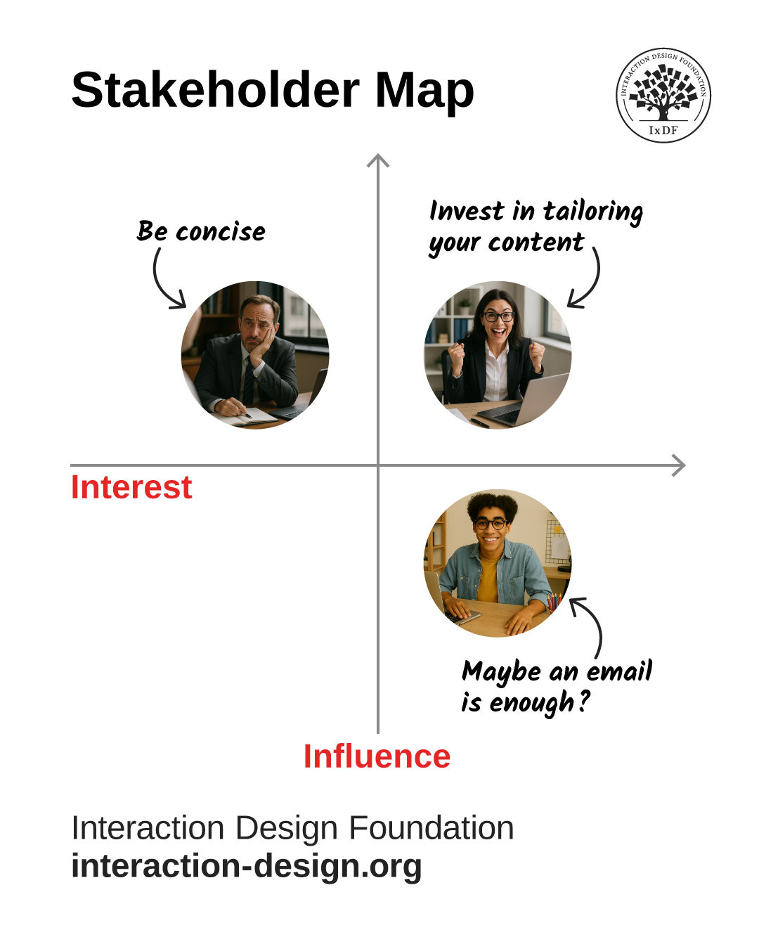
Remember who’s listening. Stay away from the bottom left (low interest, low influence) in any case, but adapt your content and voice for individuals in the other three “groups.”

© Interaction Design Foundation, CC BY-SA 4.0

How to Win Over Any Room: Make Your Audience Feel It’s About Them

Imagine you’re in a corridor with two open doorways beside you. In the room on your right, the speaker is talking about a new video game. In the one on your left, the speaker is talking about English grammar rules. After a minute of listening to each speaker, you realize something fascinating: some people in the grammar meeting are asking the speaker questions; the video-game meeting, however, is dead silent; apart from the speaker, who’s talking more to the screen behind him than to the people in front of him.

Intrigued, you peer through the door of the video-game meeting, only to notice one person apparently asleep while others in the back row look like they’ve lost the will to live. Meanwhile, you can hear the speaker better; he’s still talking away to the big screen behind him, which features a text-heavy slide. He’s enthusiastically going on and on about the extra features he and his development team just added to their brand’s new game, but it’s almost like he’s chatting to those absent people and not the businesspeople who have gathered in the room to hear him.

Suddenly, laughter erupts from the other meeting room, prompting you to turn around and look through the doorway there. The presenter has just made a joke, and the audience start clapping, too. “Those are the nuts and bolts of communication; now who’s got a question?” she asks just then. Half the hands in the room go up. Peering closer, you notice a well-made diagram on the presentation screen behind her, and realize that her voice is clearer because she’s speaking to the room, not to the screen.

Two meetings: one about what should be an exciting and fun subject, the other about what many people might call a dry-as-dust topic; yet the audience in the latter appreciated their meeting more. What happened? The video-game speaker was more or less reciting a speech to his screen and had his back turned to the audience. The grammar speaker, though, who maybe should have had a harder job of bringing her subject to life and presenting it well (grammar can be notoriously uninteresting), achieved audience engagement, partly because she made the subject so relatable, relevant to the audience, and “alive.”

The Real Skill: Have Conversations with Your Audience

Audience awareness isn’t about dumbing things down or overexplaining subject matter. It’s about shaping your message so the people listening can follow it, connect with it, and act on it. Think of it as tuning your presentation like a radio signal: clear, direct, and at the right frequency for your listeners.

If you’ve ever given a talk, or been in one, where eyes glazed over or had a meeting where nods felt more like polite compliance than engagement, you already know what happens when audience awareness is missing. Good preparation and polished slides don’t mean much if your audience doesn’t care, or doesn’t understand.

If you can recall an instance from your past, maybe school, college, or a workplace presentation, where you had to sit through a stultifying session where a speaker droned on and on about a subject that didn’t connect with you, you’ll understand lack of audience awareness. Time almost stands still, and the audience can feel trapped. If you came away from a boring session with nothing to show for it but wasted time, that’s a sore symptom of a speaker’s failure to connect with a target audience. Even if it was school and you had to be there, anyway, and even if the speaker had the authority to wield that sense of “I’m in charge; you’re not; so, you must listen to me!” you likely suffered another loss in addition to wasted time: you wouldn’t have retained the information; not well at least.

Fast-forward to the present: the people who come to your presentations also may have to be there. However, the attitude you cast to them should put them first: you have to cater to them. At first, it may seem like a double-hard task: you’ve got to prepare a presentation and then also make it sit well with the people sitting in the room. And what if you don’t like speaking in front of people: well, surely that’s a triple-hard job, then?

Relax. With some preparation and techniques to help you overcome stage fright and rehearse a first-class presentation, you can also handle the audience-aware part and have a complete “package.” And when you master audience awareness, you do more than just prevent confusion. You grab attention, build trust, and spark action, so presentations turn into conversations and listeners into allies: for projects that will get somewhere.

An image of the instructor with the caption Audience awareness the ability to understand what makes people tick and adapt to their reactions.

You can develop and fine-tune this skill to make presentations more dynamic and outcomes more productive, and successful: the key is engagement.

© Interaction Design Foundation, CC BY-SA 4.0

Stay Aware of Common Pitfalls

Pitfall 1: Don’t Forget Context

If you launch straight into details, you risk leaving people behind. Always give a quick recap of the why before diving into the what. Why is this important to them in the role they’re in? How much should they care? Frame it carefully within the right context to keep listeners on board. Some facts or figures may be shocking enough in their own right, but be sure to package them in a message where the room can contribute to a productive meeting rather than reel from blunt-force trauma.

Pitfall 2: Be Neither Too Generic Nor Too Specific

If you pitch at the wrong level, you’ll lose the room. Too much detail can saturate an audience and annoy especially business stakeholders; too little detail might leave stakeholders starved of context to the point that they don’t even realize it should be something to care about. So, aim for the “Goldilocks zone”: just enough detail to be clear, not so much that people feel overloaded.

Pitfall 3: Don’t Rely on Jargon

Jargon builds walls. Sure, those technical terms have a time and place (otherwise they wouldn’t exist) but unless you’re speaking to peers who share the same vocabulary, they’ll alienate your audience. Substitute technical terms for everyday language whenever possible so people can follow what’s going on and what’s important.

Pitfall 4: Don’t Ignore Cultural Differences

Eye contact, humor, or even silence may land differently across cultures. What feels confident in one context may seem intrusive or even aggressive in another. Some cultures may seem to prefer “stiffness” and formality; others may not; the trick is to find out ahead of time. A truly audience-aware presenter accounts for these nuances and conforms to the target audience’s culture just like a designer would when creating a product for that culture, so tailor your speech and delivery mode to be a good cultural fit.

Pitfall 5: Don’t Overload Your Slides

Don’t suffer your presentation, or audience, for that matter, to experience “death by PowerPoint.” If your slides contain every detail and you’ve stuffed them full of text, charts, and even fine points like notes to yourself, your audience will start reading instead of listening. And if there’s too much on the slides, audience members might start shutting off. So, keep slides clean and save detail for your notes or follow-up documents.

Pitfall 6: Don’t Talk at People; Talk to Them

If you’ve ever been in a situation where you’ve found yourself not listening to the other person but instead getting ready with your next point, that’s a symptom of what can happen from either side of the podium or presentation desk. If you’re hearing a criticism of your design or idea, for example, keep listening and acknowledge the speaker’s point of view with something like “That’s a good point.” Seek clarity for questions where you need it, such as “Can you share what makes you think why users might find this confusing?”

Get a greater grip on how to keep a roomful of people on board and not stumble on common mistakes, in this video with Morgane Peng.

Transcript

Overall, meetings, presentations, and discussions become valuable when people in the room feel “on the same page” as you and want to contribute and collaborate to make the best outcomes possible; that’s why you’re all in there. From the beginning moments when you show everyone you’re aware of them, that their points matter, and that you’re all moving in the same direction (towards the common good of the user and brand) that’s where the magic starts.

When you embrace audience awareness, your presentations transform and you shape and frame content so that what you present matters to the people who understand why they’re important points to understand and act upon. Giving audience-aware presentations and audience-aware public speaking is a learnable skill, not a natural-born talent. And it’s not about “working a crowd” or “people pleasing.” Even the “shiest” introverts can reach audiences well when they speak in a way that makes people listen, remember, and act.

Like in any industry, audience awareness in UX design isn’t a trick, but a mindset. Every presentation, however big or small, is a chance to practice. Every time you adapt your message, you sharpen your influence and the more you practice, the more natural it feels. So, the next time you prepare to present, don’t just think about what you want to say; remember how to make your audience feel good about being there. Rather than hijack their time, you’ll empower them to come away determined, enlightened, and refreshed by a presenter they didn’t hear but listened to, and someone they’ll remember and back as a trusted source of truth.

Questions About Audience Awareness?
We've Got Answers!

How does audience awareness make me a better presenter?

Audience awareness makes you a stronger presenter since it keeps your focus on the people you want to influence, not just on your slides or your script. When you understand what matters most to your audience, you can fine-tune your examples, simplify jargon, and connect your ideas to their priorities.

When you get what matters to them across like this, it is an approach that builds trust and keeps people engaged from start to finish. Instead of guessing what they want, you actively respond to their reactions in the room or online. Audience awareness also helps you not waste time on irrelevant details people do not need to know. In presentations, clarity equals credibility: speak their language and respect their needs and time; you’ll become the person they remember, support, and follow.

Discover more about what matters for UX designers to cast better impressions, in our article Key Soft Skills to Succeed as a UX Designer.

How can I figure out what my audience needs?

The best way to figure out your audience’s needs is to prepare before you ever step into the room and register their presence. Begin with a stakeholder map: place people on a grid of “interest” and “influence.” This lets you see who wants detailed information and who only needs high-level takeaways. For example, business decision-makers may want concise insights tied to business goals, while teammates may well prefer step-by-step explanations.

Research your audience’s background if you can: LinkedIn profiles, previous presentations, or even casual conversations can give you valuable clues as to what they need to know. During your presentation, keep watching reactions and adjust to deliver relevant information that feels tailored, not generic, so you can ensure your message sticks.

Get right into preparation that can pave the way to the success of your talk, in our article Stakeholder Mapping: The Complete Guide to Stakeholder Maps.

What if my audience has high power but low interest?

When you present to people with high power but low interest, respect their time. They’re often senior executives or decision-makers who influence outcomes but don’t want the technical deep dive or “scenic route.” Keep your message short, sharp, and focused on business impact. Use simple visuals and avoid overwhelming detail. Highlight key takeaways, such as cost savings, risk reduction, or user benefits; they’re used to key performance indicators (KPIs) and bottom-lines.

Think of it as an elevator pitch; you want to make them care just enough to support your project or idea. So, show you understand their role and priorities; they’ll respect the point that you respect what they’re about. Plus, they’ll see you as professional and trustworthy, and that should increase the chance they’ll back your recommendations.

Grab a firmer mindset of how businesspeople tend to view results, via Key Performance Indicators (KPIs).

What if they have high interest but low power?

When your audience has high interest but low power, they don’t make final decisions, true, but they can become strong allies, so don’t ignore them. These people often include teammates, junior staff, or subject-matter experts. Share enough detail to satisfy their curiosity, but don’t overload them in the main session.

A good strategy: follow up with an email that includes extra resources, links, or reports; it’ll show you respect everyone’s time while giving those who care a chance to dive deeper. Remember, engaged allies can become champions of your ideas, even if they lack authority. They can spread enthusiasm, provide useful feedback, and help influence decision-makers indirectly. So, treat them with respect to strengthen collaboration and build long-term trust that can pay dividends later.

Explore how to come across better in UX presentations, design team meetings, and more, in our article What Soft Skills Does a UX Designer Need?.

How do I engage people with both high power and high interest?

People with both high power and high interest are your most important audience members, caring deeply about your topic and having the influence to act. To engage them, speak their language, and use examples tied directly to their context, goals, or industry. Show how your work impacts their bottom line, solves their biggest problems, or advances their vision.

Not that anyone is unimportant, but this group deserves the most preparation. Build trust by balancing expertise with warmth: present data confidently, but also acknowledge their concerns and invite dialogue. Don’t show generic slides; instead, customize content to demonstrate relevance. If they leave convinced with a solid impression of you as a caring professional with vision, they’ll champion your ideas, fund your projects, and support your career growth. Engage them well, and you’ll turn an audience into allies, even partners.

Uncover a treasure trove of helpful points to appreciate your value as a designer, in our article How to Communicate Clearly and Gain People’s Interest.

What if I don’t know much about my audience beforehand?

If you don’t know much about your audience, don’t worry about going in “cold.” Instead, make smart assumptions based on the context to start with; for example, a job interview panel likely cares about results and teamwork, while a workshop group may value collaboration and detail.

At the start of your presentation, take a minute to ask light questions like, “How familiar are you with this topic?” or “Would you prefer to see examples or methodology first?” This instantly gives you clues and makes your audience feel included.

Pay close attention to their body language or online engagement tools: nodding, chat reactions, or confused looks tell you how well you’re connecting. Above all, stay flexible and responsive to show professionalism and build credibility, even without advance knowledge.

Come across better as a more trustable presenter in more effective presentations where people listen, in this video with Morgane Peng, Managing Director, Global Head of Product Design and AI Transformation.

Transcript

Should I change my slides depending on the audience?

Yes, adjust your slides depending on who you’re speaking to. Slides are not one-size-fits-all; they should support your message, not distract or confuse; and don’t let them take over “speaking” from you.

For executives, keep slides clean, high-level, and focused on results; they prefer bottom lines. For peers or technical audiences, you can include more detail, diagrams, or workflows. If the deck is something that will circulate without your presenting it, add complete sentences, clear headlines, and supporting context. If you’re presenting live, keep text minimal and let your voice lead. Think of your slides as flexible tools, not static documents, to reinforce your message, keep attention where you want it, and avoid wasting time on irrelevant or overwhelming content.

Fast-track your way to some slide ideas with our template bundles.

How do I avoid giving too much or too little detail?

To avoid giving too much or too little detail, match your depth to your audience’s knowledge and role. Too much detail overwhelms people, and makes you lose credibility, even if you know that you know your stuff. Too little detail makes you sound unprepared or vague.

The best approach is to prepare content in layers. Begin with a clear overview of goals, challenges, and outcomes. Then, have additional slides or notes ready, just in case someone asks for more. This way, you can adapt in real time without flooding everyone with information; a form of progressive disclosure. Research your audience in advance if you can, and practice explaining your ideas at both “big picture” and “deep dive” levels. When you strike the right balance, your presentation feels sharp, relevant, and professional.

Peer into progressive disclosure to get some ideas as to how to gradually reveal complexity should the need arise.

How can I check if I’m going too fast?

You can check if you’re speaking too fast by reading the room, or the screen if it’s a virtual meeting. Watch for signs like puzzled faces, lack of nodding, or silence in chat whenever you ask for feedback.

Try this tactic: build in natural pauses and ask simple questions like, “Is this making sense so far?” or “Would you like me to slow down?” These questions give your audience permission to guide your pace. Remember, politeness tends to come before honesty, so it’s unlikely anyone will just say, “Slow down!” or “Back up a moment or two!”

Online, you can also use polls or reactions to check understanding. Practice beforehand with a timer when you’re rehearsing to help pace yourself and avoid racing through. Speed can be a signal of nervousness, so build your confidence with practice and remember it’s a presentation, not a trial.

Uncover a wealth of prime presentation-related points to help boost your confidence, in our Master Class Win Clients, Pitches and Approval: Present Your Designs Effectively with Todd Zaki Warfel, Author, Speaker and Leadership Coach.

How do I adapt if my audience includes mixed levels of expertise?

When your audience has mixed expertise, design your presentation in layers.

Begin with a simple, high-level overview that everyone can follow. Use plain language and clear visuals to establish shared understanding. Then, build optional deeper sections for experts, additions like detailed data, technical workflows, or case studies.

You can prepare handouts or follow-up resources for those who want to explore more, too, like a “bonus” package for those so inclined. Do it this way and beginners don’t feel lost, and advanced listeners don’t feel bored.

While you’re presenting, watch for signs of confusion or disengagement and adjust accordingly. Acknowledge both groups: “For those new to this, here’s the big picture. For those who’re experienced, I’ll share specifics in a moment.”

Find many helpful insights and feel better and more secure about your craft when you enjoy our Master Class The Importance of Emotional Intelligence in UX with Darren Hood, UX Designer, Author, Speaker and Podcaster.

Should I adjust differently for in-person vs. online?

Yes, adjust things to whether you’re presenting in person or online. In-person, you’ve got the advantage of eye contact, body language, and physical presence to keep people engaged. Arrive early, set up the space, and make sure everyone can see and hear clearly.

Online, distractions are only a click away, so you’ll need to put more into holding the audience’s attention. Use polls, chat, and reactions to involve your audience. Keep your screen clean (no cluttered desktops or unnecessary tabs) so concepts and ideas can sink in. Acknowledge reactions you see on video, like nodding or smiling.

In both settings, start with strong introductions to establish connection and credibility and it’ll help you keep attention, respect context, and deliver a professional experience whatever happens, including if critiques come up.

Discover how to prepare for design critiques to know how to turn criticism around into something even more positive that preserves professionalism and guides the room to productive outcomes.

What are some helpful resources about audience awareness for UX designers?

Zenger, J., & Folkman, J. (2016, July 14). What great listeners actually do. Harvard Business Review. https://hbr.org/2016/07/what-great-listeners-actually-do

This article explores active listening as a critical professional skill. It explains how focusing attention, asking clarifying questions, and suspending judgment builds trust and improves collaboration. For UX designers, the lessons apply directly to audience awareness in presentations. By practicing active listening, you can adjust your delivery in real time, ensure stakeholders feel heard, and strengthen credibility. Instead of one-way communication, active listening encourages dialogue, which helps align teams around design decisions. This resource is especially useful when presenting complex UX work to diverse audiences who may have differing priorities.

Nielsen Norman Group. (2017, September 24). 5 Strategies for Presenting UX Remotely. Nielsen Norman Group.
https://www.nngroup.com/articles/presenting-remotely/
This NN/g article provides five practical methods for improving remote UX presentations. It emphasizes simplifying slides, pacing clearly, and using chat, polls, and visual cues to replace in-person body language. It also addresses the challenge of reduced non-verbal presence in virtual settings, offering solutions that maintain engagement and clarity. For UX practitioners, this advice is crucial in today’s hybrid work context: much user research and stakeholder communication now happens online. By applying these strategies, you can ensure design insights are understood, trusted, and acted on even when you’re not in the same room.

Duarte, N. (2010). Resonate: Present Visual Stories that Transform Audiences. John Wiley & Sons.

Nancy Duarte’s Resonate teaches how to move audiences with story-driven presentations. She shows how to analyze audience needs, build narrative arcs, and use visuals alongside non-verbal delivery, like gesture, tone, and pacing, to create emotional resonance. While not specific to UX, the book is invaluable for designers who must translate research and design insights into persuasive talks that drive decisions. Duarte’s frameworks help transform dense or technical content into compelling communication, making it a cornerstone reference for anyone looking to elevate their presence and impact when presenting design work.

Yocco, V. (2024, June 5). Presenting UX research and design to stakeholders: The power of persuasion. Smashing Magazine. https://www.smashingmagazine.com/2024/06/presenting-ux-research-design-stakeholders/

In Presenting UX Research and Design to Stakeholders, Victor Yocco emphasizes the crucial role of persuasive communication in UX practice. Drawing from his experience and principles of behavioral science, Yocco outlines methods for effectively sharing UX research and design concepts with stakeholders to gain buy-in and influence decision-making. The article explores how UX practitioners can tailor their presentations to different audiences, foster empathy, and use storytelling and data visualization to create alignment. This guidance is essential because even the best UX research can be ignored if not communicated compellingly, making persuasive communication a core UX skill.

Earn a Gift Earn a Gift, Answer a Short Quiz!

1
2
3
4
1
2
3
4
Question 1
Question 2
Question 3
Get Your Gift
Interaction Design Foundation logo

Question 1

Why should designers stay aware of their audience during the design process?

1 point towards your gift

  • Audience awareness helps designers copy popular trends
  • It helps designers match the solution to user needs and expectations
  • It allows designers to avoid testing their ideas with users
Interaction Design Foundation logo

Question 2

What should designers change when they present ideas to different audiences?

1 point towards your gift

  • The color scheme of their slides only
  • Their tone, language, and focus based on audience needs
  • Their main argument, even if it weakens the idea
Interaction Design Foundation logo

Question 3

How can designers show respect for their audience’s background and values?

1 point towards your gift

  • Use the same design approach for every culture
  • Focus only on technical accuracy
  • Understand and reflect users’ beliefs, emotions, and context

Learn More About Audience Awareness

Make learning as easy as watching Netflix: Learn more about Audience Awareness by taking the online IxDF Course Present Like a Pro: Communication Skills to Fast-Track Your Career.

Why? Because design skills make you valuable. In any job. Any industry.

In This Course, You'll

  • Get excited to finally see your work get the recognition and results it deserves. Strong communication is the #1 skill employers seek, and research shows it's directly linked to faster promotions and higher salaries. Successful presentations aren't an innate talent, they're a skill you can master. With proven frameworks and practical techniques, you'll gain lifelong skills that turn every presentation into a career opportunity.

  • Make yourself invaluable when you master the art of delivery and craft messages that resonate. You'll inspire action and guide the conversation. You become the person people listen to, trust, and follow. Research shows that people trained in presentation skills are 12% more likely to move into leadership roles. This is the skill that gets your name on the next big project, a salary increase, and the shortlist for promotion. Deliver presentations where each word works for you and gets you the results you want. As AI speeds up how products, services, and experiences are created, clear communication becomes the skill that keeps you in demand. Strong presentation skills help you turn AI output into clear direction, aligned decisions, and real results.

  • Gain confidence and credibility as you learn how to overcome nervousness and impostor syndrome, use your voice and body language to engage any audience, and own every room you enter. Never again leave a meeting thinking, "I should have said that better." Master the overlooked skill of turning feedback into fuel: handle criticism with confidence, navigate difficult conversations, and make Q&A sessions your strongest moments. If you can't communicate your ideas, someone else will, and they'll get the credit.

  • Craft your personal portfolio with step-by-step guidance. Through hands-on activities, you'll create a professional presentation video, an impactful asset that showcases your skills and helps you stand out to employers, clients, and collaborators. It'll speak for you long after the course ends.

It's Easy to Fast-Track Your Career with the World's Best Experts

Master complex skills effortlessly with proven best practices and toolkits directly from the world's top design experts. Meet your expert for this course:

Morgane Peng: Head of Product Design & AI Transformation at Societe Generale CIB. Morgane is a design leader who climbed from trainee to Managing Director, and knows exactly how to use strategic communication and presentation skills to fast-track career growth and open doors to leadership.

Get an Industry-Recognized IxDF Course Certificate

Increase your credibility, salary potential and job opportunities by showing credible evidence of your skills.

IxDF Course Certificates set the industry gold standard. Add them to your LinkedIn profile, resumé, and job applications.

Course Certificate Example

Be in distinguished company, alongside industry leaders who train their teams with the IxDF and trust IxDF Course Certificates.

Our clients: IBM, HP, Adobe, GE, Accenture, Allianz, Phillips, Deezer, Capgemin, Mcafee, SAP, Telenor, Cigna, British Parliament, State of New York

All Free IxDF Articles on Audience Awareness

Read full article
The Persuasion Triad — Aristotle Still Teaches - Article hero image
Interaction Design Foundation logo

The Persuasion Triad — Aristotle Still Teaches

The Greek philosopher Aristotle (384-322 b.c.e.) classified properties of items and concepts in the known universe. One of his most fundamental discoveries was the composition of persuasive speaking. Although Aristotle identified the “three appeals” that make it up 23 centuries ago, when the known u

Social shares
971
Published
Read Article

The Persuasion Triad — Aristotle Still Teaches

The Persuasion Triad — Aristotle Still Teaches

The Greek philosopher Aristotle (384-322 b.c.e.) classified properties of items and concepts in the known universe. One of his most fundamental discoveries was the composition of persuasive speaking. Although Aristotle identified the “three appeals” that make it up 23 centuries ago, when the known universe was smaller, they are timeless. Persuaders of all types have been relying on them since, including we who appeal to users through UX design.

The Trinity of Persuasion

Looking at any act where a speaker tries convincing another person or group, we might first see someone arguing a point. From debating in school to selling merchandise on TV, persuaders state a case to win over an audience in order for the latter to do something. The persuader needs a) an objective, b) an audience, and c) to reach that audience with a message. Specifically, he/she has to persuade them, as opposed to an authority figure ordering them to do something. Aristotle identified that the art of persuasion consisted of three parts:

1) Logos — Appealing to Logic

2) Pathos — Appealing to Emotions

3) Ethos — Appealing to Ethics, Morals and Character

In the case of logos, a persuader uses facts, statistics, quotations from reputable sources/experts, as well as existing knowledge. This is the side of the argument that can prove how solid it is based on facts alone.

Author/Copyright holder: Unknown. Copyright terms and licence: Unknown.

Pathos involves delivering the argument in a way that appeals to the audience’s emotions. Logos alone has facts that are cold, flat and ‘dead’. For example, a scientist speaking at a world convention can talk about global warming and bring up facts and figures about how many tons of ice melt into the sea every year. There, she would be using logos. However, by arguing about the impact of global warming on living things, for instance, how many polar bears will die if the current trend continues, she’ll tap the emotions of the audience. Pathos is the emotional vehicle that carries the logos to the audience.

Ethos has to do with who the persuader is. His/her identity will have a great impact on how the audience takes the message. If our scientist had been running late, and a politician stumbled onto the stage and tried speaking for her, no one would take him seriously. He isn’t a specialist in the field. Not only that, his general knowledge (and political agendas: he may want to distort facts about the topic for his own gain!) about global warming would fail to convince them of his “expertise”. Fortunately, our expert on thermodynamics and environmental science shows up to give the talk. The audience listens to her because:

  • She is a specialist in her field and has practical intelligence.

She knows what she’s talking about, having been working in the discipline for thirty-five years.

  • She’s got a virtuous nature.

She is an honest, hardworking professional who has proven her dedication by writing articles, working at the South Pole, and is not in her vocation just to make money.

  • She has good intentions.

Her commitment to environmental conservation is evident in the articles she has written and, now, in the speech she is delivering. Keeping global warming at bay is her sole intention, and her life’s work reflects that.

Ethos comes first

So, we can take the heuristics, or rules of thumb, embodied in Aristotle’s three appeals to deliver persuasive designs. First, work on establishing trust, which is what Aristotle determined was the most important part of the honest process of persuasion. Winning users’ trust (in that split second on landing on your design, where they judge you as being, hopefully, credible) and reinforcing it (by establishing familiarity or at least reducing uncertainty in a good-looking, user-friendly design) are essential for them to start recognizing your organization’s ethos. You can reinforce your ethos with a strong social media presence. A well-Liked Facebook page will show that you’re likeable, fashionable, are just like your users and, therefore, know what they want.


Author/Copyright holder: Social Media Examiner. Copyright terms and licence: All rights reserved Img source


How do we organize our three appeals around a plot? Let’s imagine that we’re designing for a water purification company. There, our plot is:

“The Smiths, Joneses and Johnsons are concerned about the purity of their water supply; they want to fix that problem but don’t know where to start.”

As the designer, you could mention that your models catch 99% of pollutants, and that logos will look good. Or, how about a good emotional hook to get users a little desperate to find the facts? If you build towards mentioning the statistical efficacy of your water purifier, you might first point out to users that what they don’t know sure can hurt them, and then show how many thousands of households’ dirty water problems your company has solved. Also, you might want to include some humor… “In many cities, a glass of water will have been through six or seven people before it gets to you; let’s flush those other folks right now!” There are many emotions out there for you to tap (I’ll stop it with the water puns now) as pathos. Then, are you going to back up these facts and passionate delivery by showing your audience why you are wise and a specialist (more of your ethos)?

Let’s stop right there, step back, and think about our users again. Who are they?

All About Them — Directing your Persuasive Design

Oddly, even if you’re the best advocate in the world and have an airtight case with the argument you’re presenting (because it’s so scientifically grounded) and you’re making the best speech in your career, you can still lose!

How? It’s easy—your audience was the wrong one to attempt persuading. If you’ve ever heard about stand-up comedians “dying” behind the microphone because the crowd was hostile and didn’t get their jokes, that’s a similar concept.


Author/Copyright holder: Unknown. Copyright terms and licence: Unknown.


Fortunately, as UX designers, we know that we must at least try to figure out exactly who our users are well in advance of presenting our work to them. Say you had to present a design to show 7-year-olds why drinking filtered water was good for them, and then had to present to the heads of a school. You’d focus on a simplified version with an image-heavy, text-light entertaining design for the kids (who just have to drink the water). For the other group (50-something-year-olds who have to worry about costs and benefits), you’d have to concentrate on more text to show the stats, keep the images relevant as functioning representations (like diagrams), and make the whole affair far more serious.

The audience determines the composition of your design. You’ll need to identify your audience. Of course, you want to build beyond that trust and familiarity that you’ll establish with them. You want to win them over so much that they’ll follow through with a call to action. Winning their approval is key; you want to take them from landing on your design with a sense of “What’s this?” and warming that neutral (or even skeptical) feel they have into a feeling of agreement and, if you’re selling something, need. If your design is for water purifiers, you’ll appeal to a large section of the public.

However, what if your industry doesn’t have that potential draw? What if you’re designing for a funeral director’s business? There, you’ll be addressing a totally different usership—bereaved people and professionals from associated fields.

The power of culture

It’s easy to forget another important variable when we’re considering the characters in our targeted audience: culture. The Internet has shrunk the world; however, as internationalized as our sensibilities may have become, and as much as we can find out more about other cultures in our “global village”, one powerful feature remains: our culture largely determines our values. In some cultures, for instance, black is a funerary color, in others white is. The world is awash with a variety of cultures that see the world in very different ways. What appeals to one might offend another.

Therefore, it’s impossible to design to try and reach everyone. So, you might think that the best option is to at least try and appeal to everyone without offending anyone. The answer is a neutral approach? Hmm…well, the problem there is that you’ll be backing away from reaching anyone in a powerful way. This is like painting the walls of a rental property magnolia and putting in beige carpeting. You don’t know who the tenants will be; you can’t afford to gamble with taste: red might offend; yellow might make people sick. Most people will tacitly agree with neutral color choices, but they won’t be thanking you for wowing them. Congratulations on taking a safe, marginal approach that will be sure to keep casual renters from ever really being able to feel totally at home.

So, how do you aim high and keep your users from finding you as tasty as boiled lettuce? You need to elicit strong, positive feelings from them before they click away to find your competitor who does it for them. The art of aiming your persuasive design is the other side of the coin.

The Take Away

Aristotle determined that persuasion comprises a combination of three appeals: logos, pathos, and ethos. Anyone seeking to persuade an audience should craft his/her message with facts (logos), tapping an argument’s emotional aspect (pathos), and presenting his/her apparent moral standing (ethos). Ethos consists of three sub-qualities: the persuader’s professional intelligence, virtuous nature, and goodwill.

Creating persuasive designs is only one side of the coin. Unless we’re casting them to the right audience, taking on board cultural/lifestyle considerations, we will fail. Knowing who the users are is vital. Moreover, in UX design, we can only start persuading our users once we have their trust by presenting our ethos. From there, we can bring out the solid facts and get users interested with well-placed emotional hooks.

Where to Learn More

Toxboe, A. (2015). “Beyond Usability: Designing with Persuasive Patterns”. Smashing Magazine.

Gremillion, B. (2015). “Why UX Design Patterns Work and How to Use Them.” Creative Bloq.

Feel Stuck?
Want Better Job Options?

AI is replacing jobs everywhere, yet design jobs are booming with a projected 45% job growth. With design skills, you can create products and services people love. More love means more impact and greater salary potential.

At IxDF, we help you from your first course to your next job, all in one place.

See How Design Skills Turn Into Job Options
Privacy Settings
By using this site, you accept our Cookie Policy and Terms of Use.
Customize
Accept all

Be the One Who Inspires

People remember who shares great ideas.

Share on:

Academic Credibility — On Autopilot

Don't waste time googling citation formats. Just copy, paste and look legit in seconds.