Mobile Computing

Your constantly-updated definition of Mobile Computing and collection of videos and articles.
Be a conversation starter: Share this page and inspire others!

394 Shares

What is Mobile Computing?

Mobile computing is the use of mobile devices to perform computing tasks while on the go—and without a fixed physical link. These devices include smartphones, tablets and wearable technology. They let users access, store and manipulate data from anywhere, anytime. Designers aim to satisfy users’ demands on tiny screens and account for their mobile contexts mindfully.   

CEO of Experience Dynamics, Frank Spillers explains the human-centered approach to mobile design:   

Transcript
    

The Rise of Mobile Computing: A Paradigm Shift

Mobile computing is a field of study—it’s a term that describes how legions of digital products operate, too. It has revolutionized many aspects of human life. These span from how people communicate and conduct business—to how they learn and entertain themselves. As the digital age continues to advance, it’s impossible to overstate just how important both exceptional user experience (UX) design and exceptional user interface (UI) design are for devices and users on the go.   

Mobile computing has marked a shift that’s unprecedented in the digital landscape—and society on the whole. Where once users had found themselves tied to stationary desktop machines—the advent of mobile technology has long since untethered this experience for them. Users can freely move around, and with their smartphones or other mobile devices they can interact with digital services anytime, anywhere.  

The benefits of mobile computing are many. It offers unparalleled convenience: Users can access information, communicate, shop, work and entertain themselves—away from their living rooms and offices. Even so, there’s perhaps an even more important factor involved with mobile computing. This form of ubiquitous computing has also—in a great sense—democratized access to digital services. It’s brought technology within reach of populations whom “traditional” computing hadn’t reached.  

From a business perspective, the ubiquity of mobile devices continues to open up many avenues for reaching and engaging with customers. Businesses deliver personalized, location-specific content, offer seamless omnichannel experiences, and leverage mobile-specific features like push notifications to drive engagement.   

An image of a user with a mobile device.

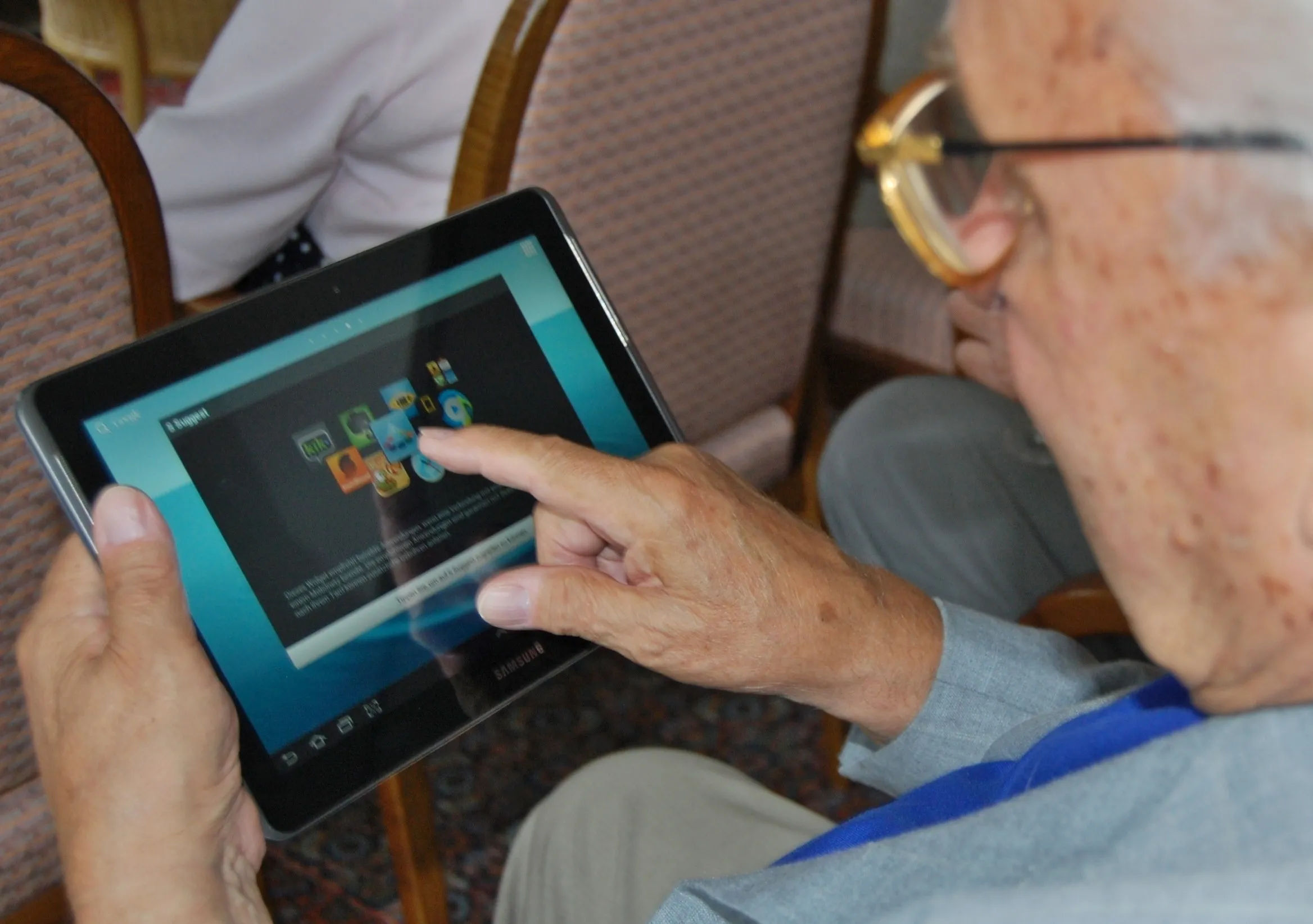
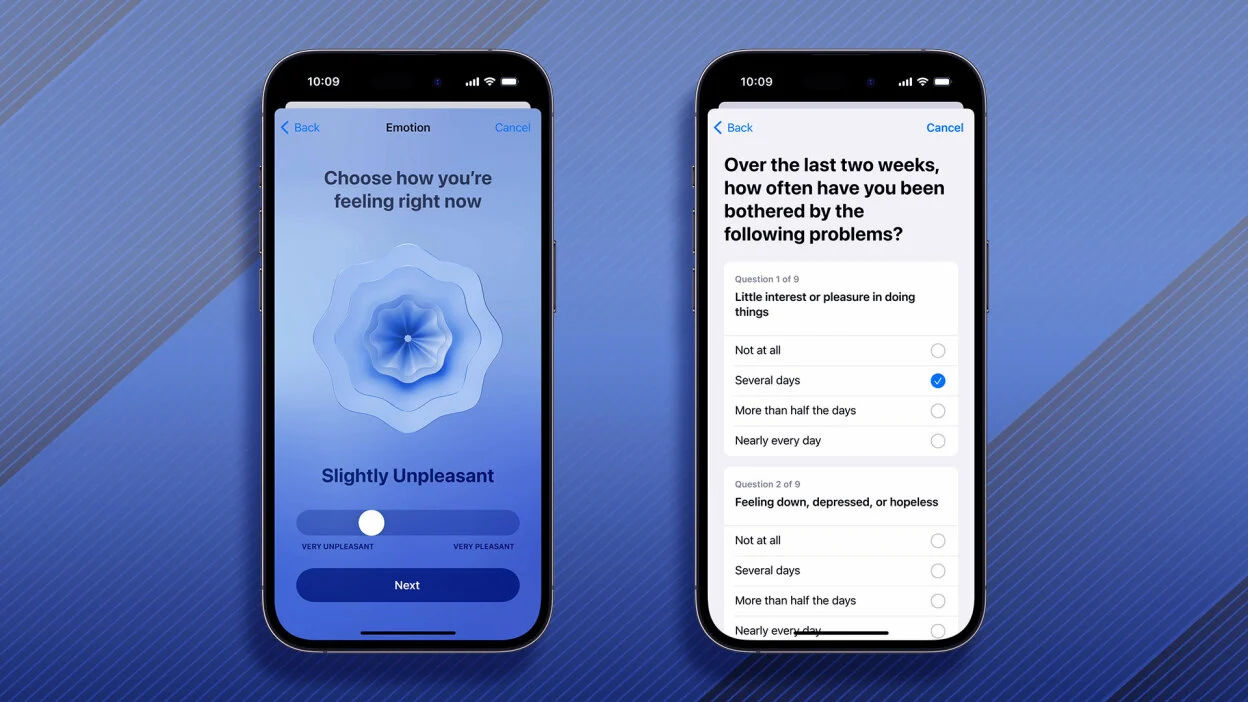
Mobile users are everywhere, and can enjoy quality content anywhere.

© Sigismund von Dobschütz, CC BY-SA 3.0

What Mobile Computing Means for UX Designers

The sheer importance of mobile computing goes far beyond just the provision of digital services and web design on mobile devices. How users interact with brands via digital products has fundamentally altered user expectations—as well as behaviors. This phenomenon provoked a shift in the way designers make digital experiences for the target users of the products or services they create for brands. This is where the importance of user experience design—and, maybe more importantly, user-centered design—in mobile computing comes into play. Designers and design teams who work to tailor mobile experiences for their target market have a wide range of considerations to build into their solutions long before they go to user testing. What’s more, the business goals of a typical organization need to be in tune with users who encounter brands primarily through mobile screens.  

The rise of mobile computing means that users expect digital services to be available on their mobile devices—optimized for smaller screens, touch input and on-the-go use. Users demand experiences that aren’t just functional but intuitive, enjoyable and matched to their specific context, too. Users want to feel that thoughtful designers have preempted their pain points—so the magic of a seamless experience plays out across all the touchpoints where they engage with brands.   

Mobile UX designers must fulfill their users’ expectations and meet their needs through the seamless digital experiences they make for users specifically for mobile devices. The designs that product teams produce for their target audiences mustn’t just be accessible, but usable and delightful on mobile devices as well. At the very least, designers must show empathy and insight into what sometimes are potentially stressful situations for users—such as apps for hospital services or driving. Good design means good functionality, usability and aesthetic appeal.   

An illustration showing various types of computing devices.

The many faces of design—most of which users encounter via their mobile devices.

© Interaction Design Foundation, CC BY-SA 4.0

A well-designed mobile UX can have a very profound impact on user satisfaction, engagement and loyalty. As a matter of fact, it can make the difference between a product that just exists on a mobile device and one that mobile users really take to and embrace fully. A vital point for designers to think about is that mobile computing isn’t just about apps or websites that users access on their mobile devices. It’s about the need to create an experience that they uniquely tailor to the mobile context, too—and give value and delight to users wherever they may be. So, the designer’s role goes far beyond just the design of interfaces—and designers have to think about the larger context where the users’ journeys play out, too. This includes their motivations, goals and the environment where they actually use the app.    

Service design is another huge realm of mobile computing. Because many brands offer services via their apps—such as Uber—designers have to factor in various considerations that go beyond just visual design features such as color schemes. With mobile, users are everywhere and anywhere. It could be a moment before they turn up at a coffee shop to pick up a latte. Or, it could be a real-time concern when they’ve got to check on their home security system. Compared with the desktop-oriented domain of users in previous times, mobile computing is a whole other world.   

Image showing three mobile phones featuring Uber.

Uber delivers on mobile users’ expectations as it aligns its design solutions with the many contexts of its target market.

© Mashable composite: Uber / Getty Images, Fair Use

Designers need to understand user needs and behaviors in a mobile service context, as well as create user personas and scenarios, map out user journeys, create wireframes, prototype and conduct usability testing.  

Frank Spillers explains service design in this video:  

Transcript
  

Challenges for Design in Mobile Computing

While mobile UX design holds immense potential, it’s also got some unique challenges that go with it. These stem from the inherent characteristics of mobile devices—as well as the diverse contexts in which users use them, and the varied user behaviors they elicit.  

1. Limited Screen Real Estate

Mobile devices—especially smartphones—have much smaller screens compared to desktop computers. This limits the amount of information that a screen can show at any one time. It also puts a constraint on how big and complex interface elements can be. Designers have to prioritize content and functionality—and they’ve got to do it carefully. What’s more, they have to think up creative ways to maximize the use of screen space. Mobile users usually want to accomplish their tasks quickly—and easily—so it’s important to make designs simple and intuitive, with clear navigation and minimal clutter.  

2. Varied Input Modalities

Mobile devices primarily rely on touch input—and it’s something that’s fundamentally different from the mouse and keyboard input of desktop computers. Touch input is less precise. It’s also a lot more susceptible to accidental activations—and it can get in the way of on-screen content. What’s more, mobile devices often support additional input modalities such as voice and sensors. These are additional considerations for designers and developers both. 

3. Diverse Usage Contexts

Users use mobile devices in a wide range of physical, social and situational contexts. That means that users may be on the move, multitasking—in varying lighting conditions or in situations where audio isn’t feasible. For example, they could be in a dark, noisy nightclub; or they might be in a bright hospital room where silence needs to reign. In any case, the design has to cater to these diverse contexts—and make sure that usability and accessibility do feature well under different conditions.  

An image of a graph about smartphone use.

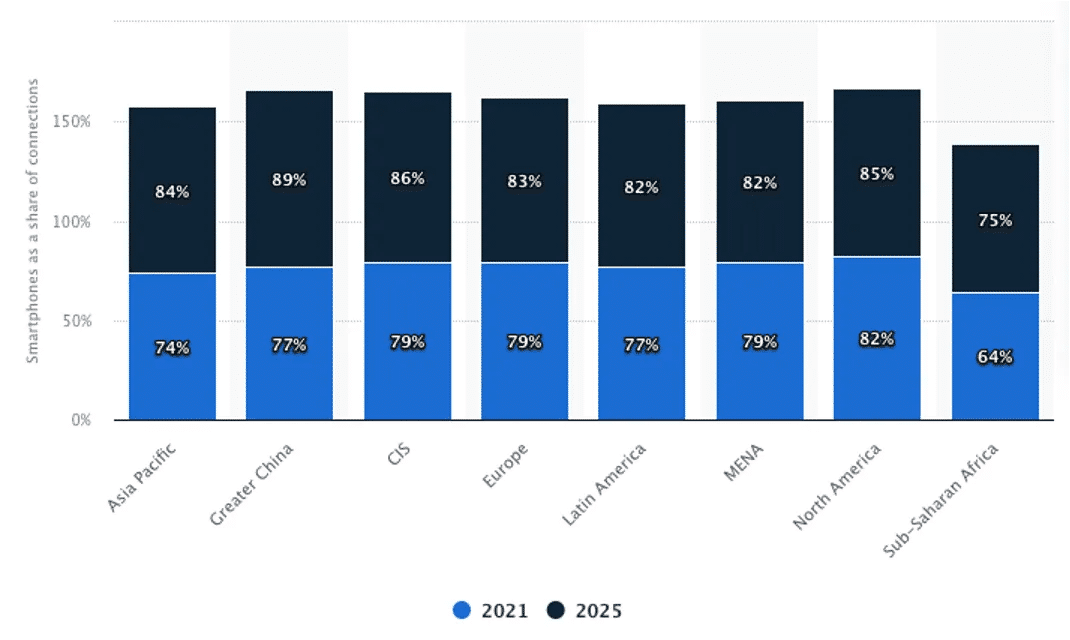
Mobile computing is growing as a reality, across the world.

© Statista, Fair Use

4. Limited Resources

Mobile devices often have less powerful processors, limited memory and shorter battery life compared to desktop computers. Designers have to create applications that are resource-efficient and that minimize battery, data and performance impact.    

5. Fragmented Device Landscape

The landscape of mobile devices is one that’s highly fragmented. There are a wide range of devices that are different in terms of their screen sizes, resolutions, operating systems, hardware capabilities—and more. Designers need to strive for a responsive design that makes sure that strong consistency and usability happens across different devices.  

Frank Spillers explains the need for mobile accessibility in this video:  

Transcript
  

Best Practices in Mobile UX Design

To meet design considerations for mobile computing, designers should:    

  • Prioritize content and features: Due to the limited screen space, it’s crucial to prioritize the most important content and features. This calls for solid UX research skills, to understand user needs and behaviors and focus on what matters most to them. Designers also need to know how to map out user journeys, and create user personas, wireframes and prototypes.  

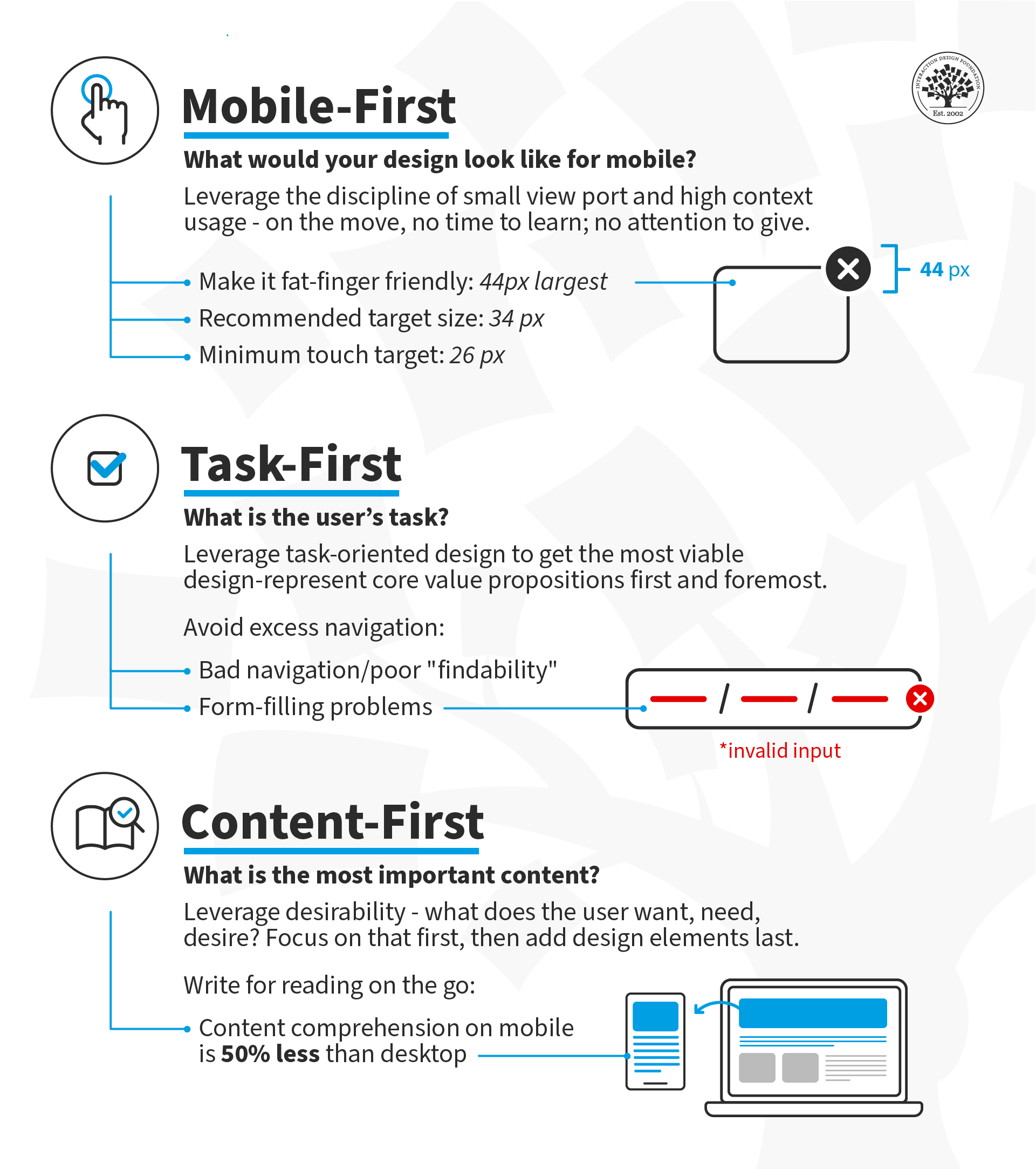
  • Design for the thumb: Most users operate their mobile devices with just one hand, so it’s vital to design interfaces that are thumb-friendly—or fat-finger friendly. Designers should be sure to put key elements within easy reach of the thumb and design touch targets that are large enough to tap very easily.  

    An image showing hand-reach comfort zones.

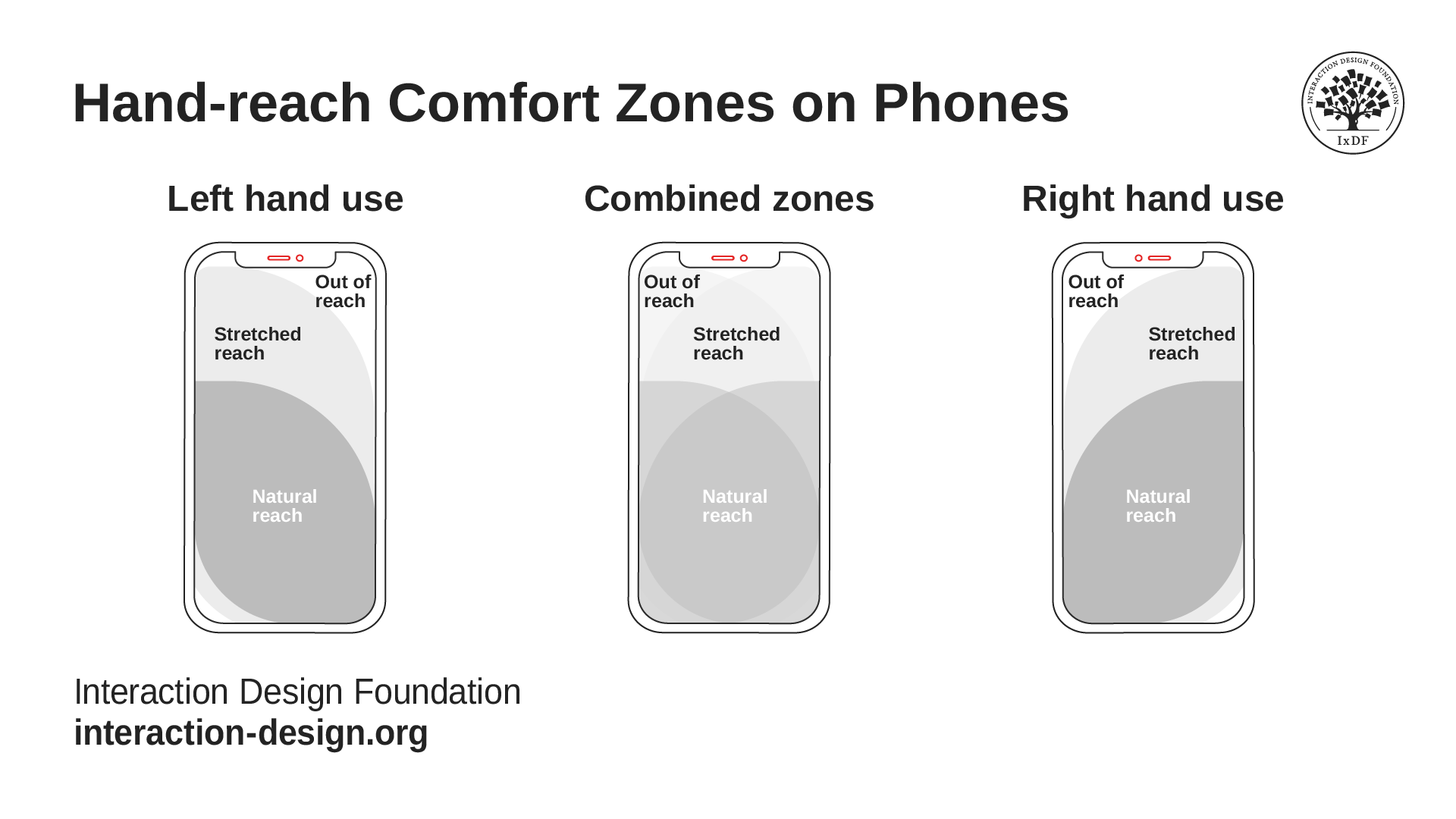
    It’s vital to know how users grasp their devices—and comfortably so.

    © Interaction Design Foundation, CC BY-SA 4.0

  • Follow platform guidelines—like those for iOS or Android—to be sure that the app does feel familiar and intuitive to users.    

  • Use standard UI elements like buttons, checkboxes and sliders—it helps users recognize and understand how they’re to interact with an interface. It’s important to understand design principles, as well as how visual hierarchies and elements in a design catch the viewer’s eye in mobile contexts.    

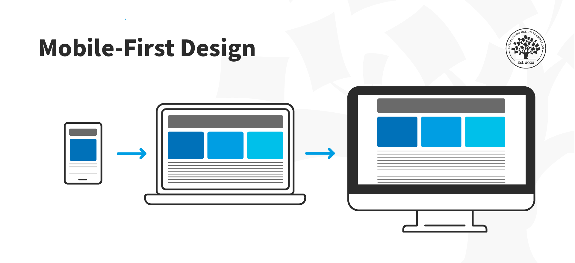
  • Consider mobile-first design and design for the smallest device first; then progressively enhance the design features for larger layouts. When designers start with mobile in mind, there’s little risk that users will feel as though the experience is a shrunken-desktop version.     

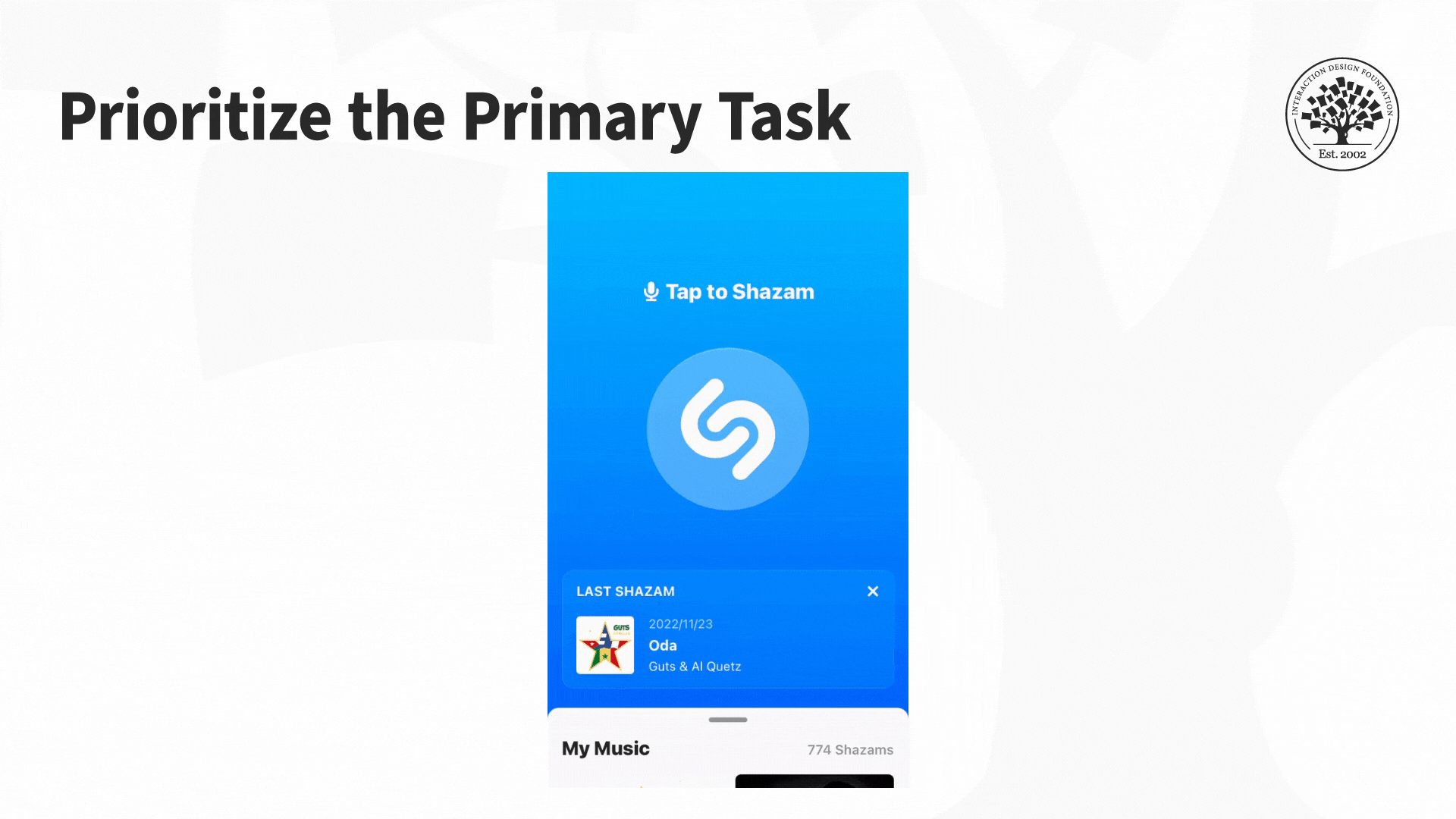
  • Focus on simplicity and clarity so each screen can support a single primary action—without any irrelevant content or functionality. Navigation needs to be intuitive and self-evident; plus, it’s got to guide users through the flow with a minimum in cognitive effort from them.  

  • Make sure text is legible so users can see it without having to zoom in—and a recommended minimum size is 11 points. It’s a crucial thing to keep adequate contrast going between text and its background for the sake of good readability. What’s more, whitespace can help with making things more legible; that’s because it reduces visual clutter and improves comprehension.   

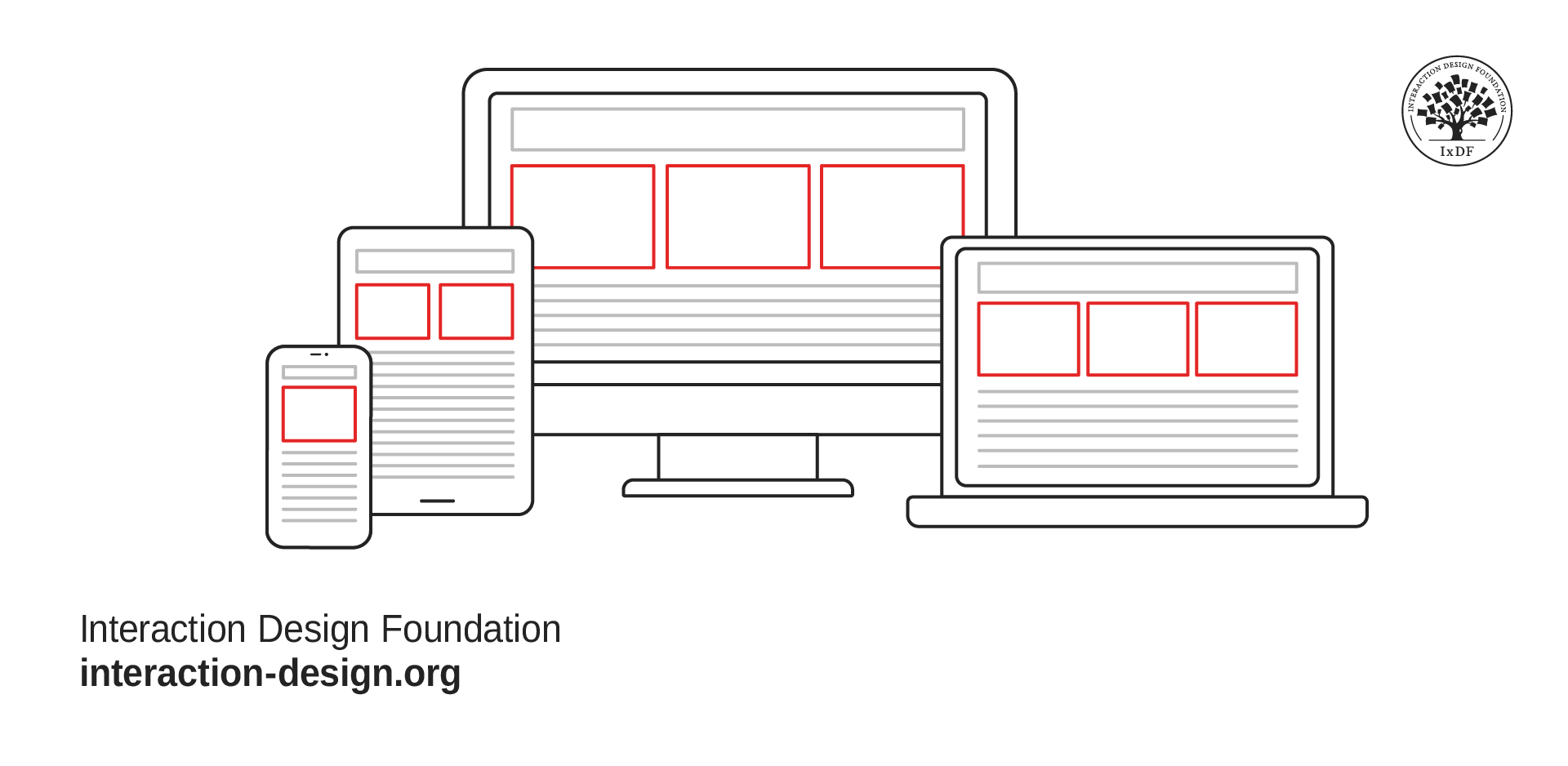
  • Understand adaptive and responsive design so that the design adjusts best to different screen sizes, orientations and resolutions. Flexible layouts, dynamic content scaling and platform-specific design guidelines are great helps that designers use there.    

    Responsive design flows the content across various screen sizes.

    © Interaction Design Foundation, CC BY-SA 4.0

  • Minimize input to help users by minimizing the need for time-consuming typing, through techniques like auto-completion, predictive text and smart defaults. Wherever possible, it’s good to support alternative input methods like voice or gesture.    

  • Optimize for speed to minimize load times, simplify tasks and give immediate feedback on user actions as they take them.  

  • Consider the context and make sure that users can access the interface under a variety of conditions and use it. This could also mean to adapt the product so it supports offline use or give context-specific functionality based on the user's location or their activity.  

  • Deliver a seamless cross-device experience to make sure users get to enjoy a high level of consistency in both content and functionality as they switch between devices. They should be able to pick up where they left off between desktop and mobile, for example.  

  • Test and iterate to make sure that the design meets real user needs and expectations, and that it provides a positive user experience in the field.    

    An image showing 3 mobile phones featuring Spotify.

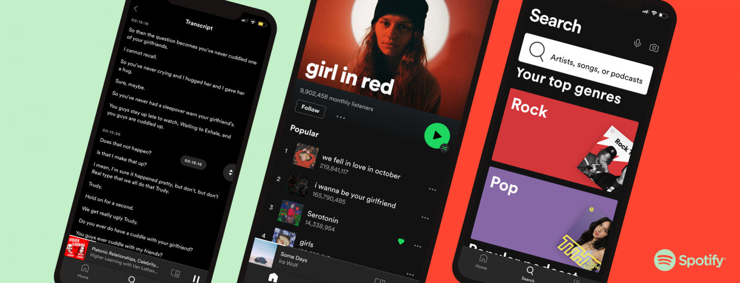
    Spotify is one of the brands at the forefront—among prominent mobile UX design examples—in meeting mobile users’ expectations, including accessibility.

    © Spotify, Fair Use

The Future of Mobile Computing

As mobile computing keeps on evolving, designers really need to stay abreast of what’s going on in terms of emerging trends and technologies. They’ve got to refine their designs so they can meet mobile users’ ever-changing demands. It’s about contributing to the ongoing evolution of mobile UX design—and making impactful experiences that really resonate with users.    

Another point is that, as users increasingly expect personalized and context-aware experiences, UX designers will need to use technologies—like artificial intelligence and machine learning—carefully and mindfully, to help deliver on these expectations.  

Overall, the mobile revolution has ushered in an era for UI UX design that’s new and exciting. It’s created unique opportunities for designers to craft engaging and adaptable experiences—ones they directly tailor to mobile devices. Still, with these opportunities there do come some challenges. To design well for a smaller screen, varied device capabilities and diverse user contexts, it takes a deep understanding of the unique characteristics of mobile computing. Designers must navigate these complexities to create attractive, intuitive and user-friendly interfaces—ones that meet the ever-evolving demands of mobile users.    

Questions About Mobile Computing?
We've Got Answers!

What components form the core of mobile computing systems?

The core of mobile computing systems consists of five main components: the mobile device, mobile operating system (OS), mobile communications network, application servers and databases. Mobile devices—like smartphones and tablets—serve as the primary interface for users to interact with. The mobile OS—like Android or iOS—is what manages the device's hardware and software resources. Mobile communications networks—including 3G, 4G and 5G—are vital parts of connectivity and data exchange over vast distances. Application servers—which are often cloud-based—provide the computing power and storage that’s needed for running mobile applications. Last—but not least—databases store the data required by these applications—permitting retrieval, manipulation and management of data across the network.  

When designers understand these components and understand them well, they can create more efficient and user-friendly mobile applications as they optimize each element for better performance and user experience.  

Take our Master Class How To Prepare For The Future Of Mobile UX with Steven Hoober, President of Design, 4ourth Mobile for more important information.  

How do designers optimize websites for mobile use?

Designers do this by following several key strategies. For one thing, they make sure that the website's layout is responsive. That means it automatically adjusts to fit the screen size of various devices. This approach does away with the need for users to zoom in and out to read content. Another thing is that designers make speed a priority in how they optimize images and use minimalistic design elements to cut down on loading times, and it’s something that’s crucial to keep users engaged. Thirdly, they make navigation simple—using large, easily clickable buttons and cutting down on the number of menu items. This makes it easier for users to find what they’re looking for—and with minimal effort, too. What’s more, designers focus on touch-friendly interfaces. They think about the size and spacing of touch targets to keep users from accidentally clicking the wrong link or button. Last—but not least—to test the website on multiple devices and browsers is something that makes sure that a consistent and user-friendly experience across all platforms actually happens.  

When they apply these strategies, designers can create mobile-friendly websites—ones that offer a seamless and intuitive user experience, and encourage longer visit durations and higher engagement levels.  

Take our Master Class Boost Mobile UX with UX Design Principles and Best Practices with Miklos Philips, Lead UX Designer/Product Designer.  

What strategies improve mobile app accessibility?

To improve mobile app accessibility, designers adopt several effective strategies. For one thing, they make sure there’s high contrast between text and background to help users with visual impairments. Second, designers use large, legible fonts so they make reading easier for everyone—especially for those users with low vision. Third, to put alternative text in for images lets screen readers describe images to users who can’t see them. Fourth, designers create simple and intuitive navigation—which helps users with cognitive disabilities to use the app better. Fifth, when designers include voice commands, it makes things more accessible for users who find it hard to interact with “traditional” touch interfaces. Last—but not least—designers regularly test their apps with a wide range of assistive technologies; they do this to make sure about compatibility and that there’s a seamless user experience for all.  

From focusing on these strategies, designers make apps that are more inclusive—and that accommodate the needs of users with various disabilities. They do—therefore—broaden their app's user base and improve the levels of overall user satisfaction.  

Understand accessibility, and its importance in design, from this video:  

Transcript
   

How does mobile computing impact the approach to information architecture?

Mobile computing has a great bearing on the approach to information architecture. That’s because it calls for a focus on simplicity, clarity and speed. Designers have to organize content in a way that lets users find information quickly—and very easily—on smaller screens. This requirement is something that leads to a minimalist design approach—one where only essential elements and information get to show up on the main pages. Navigation becomes more streamlined. Plus, there’s a priority put on intuitive interfaces that facilitate easy access to different sections of the app or website—with minimal taps or swipes. The use of icons and visual cues is something that becomes much more prevalent. It helps get information across in a space-efficient way and boost the user experience by making it more engaging and easier to understand.  

Mobile computing also drives the adoption of flexible, scalable architectures—architectures that can adapt to various screen sizes and orientations. This makes sure that a consistent user experience does happen across all devices. Last—but not least—as mobile devices often operate on slower network connections, information architecture must optimize for speed, with techniques like lazy loading and content prioritization making sure that critical information loads quickly and remains accessible.  

When designers adapt information architecture for mobile computing to these changes, it makes sure that users enjoy a seamless, efficient and enjoyable experience—and that’s regardless of the device they use.   

Take our Master Class Boost Mobile UX with UX Design Principles and Best Practices with Miklos Philips, Lead UX Designer/Product Designer.  

What ethical considerations do designers face in mobile computing?

In mobile computing, designers face several ethical considerations—things to think about that are crucial for them to protect user privacy and make sure that inclusivity gets built in. First, they’ve got to design for privacy—and make sure that apps only ask for necessary permissions and clearly explain why they need such permission. This transparency really helps users make informed decisions about their data. Second, designers should consider data security—and implement strong encryption and secure data storage practices so they protect users' personal information from unauthorized access.  

Another ethical concern takes the form of accessibility. Designers have to make sure their products are usable for people with various abilities. That includes users with visual, auditory, motor or cognitive impairments. This approach doesn’t just expand the app's user base. It upholds the principle of equal access to technology, as well.  

What’s more, designers need to stay away from manipulative practices—such as dark patterns that trick users into making decisions against their best interests. These patterns can take the form of things like subscribing to services that users don’t need. Last—but not least—sustainability emerges as an ethical issue. There’s a focus on minimizing the environmental impact that mobile computing has—such as lowering the levels of energy consumption and electronic waste.   

Take our course Mobile UX Design: The Beginner's Guide

How can designers facilitate easier user onboarding in mobile apps?

Designers can do this by implementing several strategies. For one thing, they can simplify the sign-up process—and ask only for essential information to reduce user effort and make completion much more likely. Second, to get progressive disclosure techniques—where the app gradually introduces features and functionality as needed—keeps information overload from happening, and keeps users engaged. A third point is that interactive tutorials or guided tours can help users make sense of the app's core functionalities through direct engagement—and not overwhelm them with text instructions. Fourth, to provide immediate value or show the app's benefits within the first few interactions encourages users to keep on exploring.   

Another point: to personalize the onboarding experience—based on the user's preferences or behavior—can make the app feel more relevant and more engaging. Last—but not least—to incorporate feedback mechanisms allows designers to collect user insights and continuously improve the onboarding process.   

When they focus on these approaches, designers can make a welcoming and intuitive onboarding experience that reduces dropout rates and encourages long-term engagement with the app.   

Take our Master Class How To Attract Users Through Great Onboarding Experiences with Wes Bush, Founder and CEO, Product-Led Institute and Author, Product-Led Growth.  

What challenges do designers face with cross-platform mobile app development?

Designers face several challenges with cross-platform mobile app development. First, to achieve a consistent user experience across different platforms (like iOS and Android) is hard due to varying design guidelines and user interface elements. Designers have got to make sure that the app feels intuitive on each platform while they keep up a unified brand identity.

Second, performance optimization is something that presents a hurdle. Apps must run smoothly on various devices with different hardware specifications. That’s something that calls for careful optimization to prevent lag or crashes. Third, screen size and resolution diversity make design more complicated. An app must look good and function well on everything—from small smartphones to larger tablets. This calls for flexible, responsive designs that adapt to any screen.   

Fourth, accessibility considerations become more complex. That’s because designers have got to account for the accessibility features and standards of multiple platforms—to make sure the app’s usable for people with disabilities. Last—but not least—to stay updated with multiple platform guidelines and updates is something that demands constant vigilance and adaptability from designers. That’s because failing to comply with the latest standards can lead to app rejections or poor user experiences.   

To overcome these challenges calls for a deep understanding of each platform's guidelines, thoughtful design strategy and continuous testing across devices and operating systems.  

Take our Mobile UI Design course. 

What influence does mobile computing have on branding strategies?

It’s got a great bearing on branding strategies. That’s because it shifts the focus towards creating a consistent and engaging brand experience across various mobile devices. Brands make a priority of mobile-friendly website design and mobile app development—to make sure their content’s accessible and appealing on smaller screens. This accessibility helps keep brand visibility and engagement in a mobile-dominated world high.  

What’s more, mobile computing enables more personalized brand interactions through the use of location-based services and push notifications. Brands can tailor their messages and offers to individual users based on their location, preferences and behavior—and so enhance the user experience and foster loyalty.  

Social media integration plays a crucial role in mobile branding strategies—that’s because mobile devices are the primary means of how many users access social networks. Brands leverage these platforms for direct communication, customer service and viral marketing campaigns—which makes a social media presence an essential item for effective mobile branding.  

Last—but not least—mobile computing has increased how important speed and usability are in branding. A fast, user-friendly mobile experience becomes a key brand differentiator. That’s because users often abandon sites or apps that perform poorly on mobile devices.  

Take our Master Class How To Differentiate Your Mobile UX with Frank Spillers, CEO at Experience Dynamics.  

What considerations do experts have for mobile app localization?

Experts consider several key factors when they localize mobile apps to make sure they resonate with users across different cultures and languages. For one thing, they focus on language translation—not just translating words but making sure the content’s culturally relevant and appropriate as well. That includes idioms, date formats and currency. Second, experts pay attention to cultural nuances—like colors, symbols and social norms—to keep from offending users or misrepresenting the brand. Third, they adapt the user interface (UI) design for right-to-left (RTL) languages—such as Arabic—which may require flipping layouts and adjusting alignments.  

Fourth, they localize multimedia elements like images and videos, and they make sure they’re culturally appropriate and relevant. Fifth, experts consider local regulations and legal requirements. These are things like data protection laws, and they can vary significantly from one region to another. Last—but not least—they do extensive testing with local users so they can spot and resolve any usability issues—and make sure the app meets its target audience’s expectations and needs.  

Watch as Author and Human-Computer Interaction Expert, Professor Alan Dix explains the need to design with culture in mind:  

Copyright
Transcript
  

What are highly cited scientific articles on the subject of mobile computing?

1. Mao, Y., You, C., Zhang, J., Huang, K., & Letaief, K. B. (2017). A survey on mobile edge computing: The communication perspective. IEEE Communications Surveys & Tutorials, 19(4), 2322-2358.   
This paper provides a comprehensive overview of mobile edge computing, a key technology for enabling mobile computing. It discusses the communication challenges and solutions in mobile edge computing, including resource allocation, offloading, and caching. The paper has been highly cited for its thorough analysis of this emerging field and its impact on the future of mobile computing.  

2. Eshet, E., & Bouwman, H. (2015). Addressing the Context of Use in Mobile Computing: A Survey on the State of the Practice. Interacting with Computers, 27(4), 392-412.  

This paper presents the results of a survey of 150 practitioners who were involved in mobile app design and development. The study examines how these practitioners address the mobile context of use—something that’s dynamic and heterogeneous compared to the more stable context of stationary computing. The findings show that the mobile context is mainly considered during the early phase of requirements collecting and specification, but there’s a lack of external context-related considerations in evaluations. The paper also reveals that methods perceived as more appropriate for addressing the mobile context are used less frequently—suggesting a need to improve the utility of such methods to better fit the time and budget constraints of practitioners.  

3. Mach, P., & Becvar, Z. (2017). Mobile edge computing: A survey on architecture and computation offloading. IEEE Communications Surveys & Tutorials, 19(3), 1628-1656.  
This paper presents a comprehensive survey of mobile edge computing—focusing on its architecture and the challenges of computation offloading. It discusses the key components of mobile edge computing, such as edge servers and mobile devices, and the strategies for offloading computations to the edge. The paper’s been widely cited for its in-depth analysis of this critical aspect of mobile computing.  

What are highly regarded books about mobile computing?

1. Kamal, D. (2019). Mobile Computing (3nd ed.). Oxford University Press. Mobile Computing by Raj Kamal is a comprehensive textbook that gives a detailed overview of the fundamental concepts, technologies and applications of mobile computing. It covers a wide range of topics. They include mobile communication systems, mobile devices, mobile operating systems, mobile databases and mobile applications. This book was written by a renowned expert in the field. It serves as a valuable resource for students, researchers and professionals working in mobile computing and wireless communication. Its importance lies in how it’s able to provide a solid foundation in the principles and technologies that underpin the rapidly evolving field of mobile computing.    

2. Othman, M. (2008). Principles of Mobile Computing and Communications. CRC Press.  

This textbook examines mobile networks and relevant standards, highlighting issues that are unique to the mobile computing environment and exploring the differences between conventional and mobile computing. It goes beyond discussions on wireless network infrastructure and mobile application development—considering pervasive computing, smart environments, and the complexity of designing and developing such applications. The book provides a comprehensive overview of the technologies and infrastructure of mobile and wireless networks, as well as important security and mobility support issues.   

Earn a Gift Earn a Gift, Answer a Short Quiz!

1
2
3
4
1
2
3
4
Question 1
Question 2
Question 3
Get Your Gift
Interaction Design Foundation logo

Question 1

What is mobile computing?

1 point towards your gift

  • The use of computers that are permanently installed in specific locations.
  • The use of mobile devices to access, store, and manipulate data anywhere.
  • The development of desktop applications.
Interaction Design Foundation logo

Question 2

How has mobile computing changed user behavior?

1 point towards your gift

  • Users now primarily engage with digital services via desktop computers.
  • Users expect instant access to digital services on smaller screens anytime, anywhere.
  • Users have shifted to using only desktop computers for their tasks.
Interaction Design Foundation logo

Question 3

What is one major design challenge in mobile computing?

1 point towards your gift

  • Designing for unlimited screen space.
  • Managing the smaller screen size and limited real estate.
  • Designing without considering user input methods.

Learn More About Mobile Computing

Make learning as easy as watching Netflix: Learn more about Mobile Computing by taking the online IxDF Course Mobile UX Strategy: How to Build Successful Products.

Why? Because design skills make you valuable. In any job. Any industry.

In This Course, You'll

  • Get excited as you create mobile experiences people love! Feel like you're not reaching your potential? This is your moment to grow, feel confident, and accelerate your career. Did you ever download an app, only to delete it almost immediately because it didn't meet your expectations? You're not alone. Apps lose 77% of their daily active users within the first 3 days of installation. In this course, you'll learn how to design apps that fit effortlessly into people's lives, solve real-world problems, and make a lasting impact. You'll build actionable personas and apply proven best practices. You'll learn how to tap into what people want and create an app that delivers with total confidence.

  • Make yourself invaluable when you create mobile experiences that drive adoption and loyalty in any industry. As AI supports new mobile features, timeless human-centered design skills help you decide how those features fit into real mobile contexts, on small screens, and in moments of distraction. That’s what turns AI from a superficial add-on into a real superpower in your day-to-day work. And it's easier than you think! With step-by-step guidance, you'll apply your new Mobile UX Strategy skills straight away. You'll learn how to conduct mobile user research and make data-driven decisions that increase engagement, boost retention, and drive measurable growth. You'll integrate assistive technology and champion accessibility to improve your app's usability for all and expand your market reach. You'll learn how to optimize your content for shorter attention spans and the on-the-go nature of mobile devices.

  • Gain confidence and credibility with practical exercises and ready-to-use templates like the Accessible Design Cheatsheet and 10-Step Guide to Personas. The optional portfolio project helps you walk away with an impressive portfolio. How? You'll learn to redesign a mobile app, and you'll be able to use your portfolio and IxDF course certificate to fast-track your career. You'll get comfortable with frameworks that help you lead mobile UX design initiatives, influence stakeholders, and turn ideas into successful mobile products.

It's Easy to Fast-Track Your Career with the World's Best Experts

Master complex skills effortlessly with proven best practices and toolkits directly from the world's top design experts. Meet your experts for this course:

  • Frank Spillers: Service Designer and Founder and CEO of Experience Dynamics.

  • Alan Dix: Author of the bestselling book “Human-Computer Interaction” and Director of the Computational Foundry at Swansea University.

  • Torrey Podmajersky: Author of “Strategic Writing for UX” and President of Catbird Content, who has designed and executed content strategies for iconic brands like Google, OfferUp, and Microsoft.

Get an Industry-Recognized IxDF Course Certificate

Increase your credibility, salary potential and job opportunities by showing credible evidence of your skills.

IxDF Course Certificates set the industry gold standard. Add them to your LinkedIn profile, resumé, and job applications.

Course Certificate Example

Be in distinguished company, alongside industry leaders who train their teams with the IxDF and trust IxDF Course Certificates.

Our clients: IBM, HP, Adobe, GE, Accenture, Allianz, Phillips, Deezer, Capgemin, Mcafee, SAP, Telenor, Cigna, British Parliament, State of New York

All Free IxDF Articles on Mobile Computing

Read full article
What Comes First in Mobile Design: Tasks, Content, or Mobile Optimization? - Article hero image
Interaction Design Foundation logo

What Comes First in Mobile Design: Tasks, Content, or Mobile Optimization?

For many users worldwide, mobile was their first Internet experience and continues to be their primary way to access information. This is also true for people who don't need to use computer desktops, particularly since smartphone applications have dramatically changed how we live our lives. Here, we

Social shares
692
Published
Read Article
Read full article
One Size Fits All? Definitely Not in Task-Oriented Design for Mobile & Ubiquitous UX - Article hero image
Interaction Design Foundation logo

One Size Fits All? Definitely Not in Task-Oriented Design for Mobile & Ubiquitous UX

In the 1980s and ‘90s, our technology-loving civilization rode the wave of Personal Computing – one computer per person. As computers became smaller and less expensive to produce, every worker—or indeed, every person—could have one at his/her disposal. With the rapid rise of Ubiquitous and Mobile co

Social shares
688
Published
Read Article
Read full article
How to Elevate Your Mobile UX Strategy - Article hero image
Interaction Design Foundation logo

How to Elevate Your Mobile UX Strategy

Mobile makes up over 54% of global website traffic—a far different world from how users used to get online. Exceptional mobile user experiences are a prime necessity in our digital-first world, and the quality of a mobile user experience can mean the difference between a product that thrives and one

Social shares
420
Published
Read Article

What Comes First in Mobile Design: Tasks, Content, or Mobile Optimization?

What Comes First in Mobile Design: Tasks, Content, or Mobile Optimization?

For many users worldwide, mobile was their first Internet experience and continues to be their primary way to access information. This is also true for people who don't need to use computer desktops, particularly since smartphone applications have dramatically changed how we live our lives. Here, we'll look at three UX approaches to design for a world that relies heavily on mobile to solve problems for entertainment, health, wellness and more. 

© Frank Spillers and Interaction Design Foundation, CC BY-SA 4.0

Distractions surround mobile users. Hence, when you design for mobile, you must prioritize what is important for the user: give them what they need and do it efficiently within their changing environments and contexts.

We can consider three approaches to design interactions for mobile:

  1. Mobile-First: Design for small screen sizes first and then expand to larger device sizes. Users are on the move; they can spare neither time nor attention. Under these constraints (movement, time, attention), decide what makes sense on your screen(s). 

  2. Task-First: Design the core value proposition first. Focus on the users' primary task and support successful task completion.

  3. Content-First: Start with Desirability—what does the user want, need and desire? Design the content around that desire and add the other elements of user experience (interactions, interfaces and usability) afterward. 

What is Mobile-First?

In the mobile-first design approach, you start your design process with mobile users in mind first and then scale up to larger screen sizes. This means you prioritize the mobile experience and ensure all your content and features are accessible on smaller screens. Another way to approach mobile-first is to prioritize content from the outset so that even if you begin your design process on a larger screen, you still have the flexibility to show your content effectively in a mobile environment.

Luke Wroblewski, a Product Director at Google, proposed this concept in 2009 and offered three reasons for designing for mobile first. Here, we've updated Luke's arguments for going mobile first to reflect the new mobile landscape:

1. Mobile Has Exploded

It's undeniable that the use of smartphones has become ubiquitous in today's society. Ensure your app provides an exceptional user experience across different platforms and screen sizes to reach a global audience.

2.  Mobile Forces You to Focus

Regardless of device specifications, the one thing that's key to all mobile devices is portability. People use them on the move, which means that you must focus on the most important actions and tasks for your users.  

There's much more room on a desktop screen, and you can afford to add extraneous features, but smartphones don't give you that luxury. Remember that the user experience on smartphones is also determined by how they're used—on the move and in short, sharp bursts of activity, which is very different from sitting at a desk and browsing the internet for hours on end.

© Interaction Design Foundation, CC BY-SA 4.0

 3. Mobile Offers New Capabilities

On desktop, the web is the standard way to interact with most businesses, but on mobile, the preference has shifted to applications. This is due to smartphones' many sensors and features, such as GPS, accelerometers, pedometers, touchscreens, gesture controls, augmented reality, and eye tracking.

The mobile-first approach enables designers to leverage the full potential of mobile, rather than replicate the desktop experience on a smaller screen.

© Interaction Design Foundation, CC BY-SA 4.0

What Is Task-First?

This approach prioritizes user tasks over other design considerations, such as aesthetics or technical feasibility. This ensures the app is designed with the users’ needs in mind, resulting in a more efficient and practical experience. By focusing on user tasks, designers can also identify pain points in existing workflows and streamline them to improve overall user satisfaction.

For example, let's look at an application like Shazam, designed with a task-first approach. Its primary function is to assist users to identify songs playing in their vicinity. The app achieves this thanks to its clean layout and user-friendly interface that makes it easy for users to complete the main task without any extra distractions or complications.

The Shazam app features a clean interface that helps users accomplish the main task: to identify music playing nearby.

© Interaction Design Foundation, CC BY-SA 4.0

The Task-First approach prioritizes giving users what they want as quickly and easily as possible without requiring them to hunt, search, or think too much.

What Is Content-First?

The concept of a content-first approach has been around since the early days of web design, but it gained new relevance with the rise of responsive design. The basic idea is that content should be the primary focus of mobile UX design, as users come to apps and sites primarily for the content they offer rather than for the interface's design.

As UX designers, we often focus on interfaces and wireframes, but the content-first approach suggests that we should define the content structure first and then add UI and interaction elements later.

There are three stages to this approach:

  1. Copy: Create clear and concise copy that conveys the intended message to users. This may include defining typography, font sizes, and heading structure (H1, H2, H3, H4, H5), which is critical for accessibility. Properly defined headings make it easier for screen readers to parse a page.

  2. UI Elements: Once the copy is defined, it's time to add UI elements such as buttons, icons and graphics that support the content and help guide users through their tasks.

  3. Interaction Elements: Add animations and transitions to enhance the user experience.

© Experience Dynamics, Fair Use

Interested in adopting the content-first approach? Here's a helpful checklist to assist you on your transition. Download the template, and share it with your team!

Advance Your Career With This Free Template for “How to Use the Content-First Design Approach”
How to Use the Content-First Design Approach
We respect your privacy
Get 1 powerful email each week: Design a life you love!

Put It All Together: A Demonstration of Mobile-, Task- and Content-First Approach

Now that we've covered the three approaches, let's see them in action! In this video, Frank Spillers will show you how to create an interface for a health app that enables patients to chat with doctors. He'll use examples from each approach: mobile-first, task-first, and content-first.

Transcript

The Take Away

It's important to understand the unique challenges and opportunities of the mobile platform. Here are three powerful prioritization approaches to keep in mind:

Mobile-First: Mobile-First is a design strategy that puts mobile at the forefront of the design process. It recognizes the importance of the mobile web and emphasizes the need to create an experience tailored specifically to mobile devices. 

Task-First: Task-First prioritizes users' tasks. It helps them complete tasks quickly and efficiently and minimizes cognitive load. This approach is particularly well-suited for mobile devices since users are often on-the-go and need to complete tasks quickly.

Content-First: Content-First puts content at the center of the design process. Rather than starting with wireframes or UI elements, this approach begins by defining the content structure first. This allows designers to optimize experiences for different contexts, physical or otherwise.

References and Where to Learn More

Read Luke Wroblewski’s original proposition for Mobile First.

See Clayton Lewis and John Rieman’s original definition of task-centered design in Task-Centered User Interface Design: A Practical Introduction.

More about content first in these articles:

To know why the heading structure is crucial for accessibility, see this resource:
Accessibility at Penn State 

Read the forecast number of mobile users worldwide from 2020 to 2025, from Statista.

Hero Image: © Interaction Design Foundation, CC BY-SA 4.0

Feel Stuck?
Want Better Job Options?

AI is replacing jobs everywhere, yet design jobs are booming with a projected 45% job growth. With design skills, you can create products and services people love. More love means more impact and greater salary potential.

At IxDF, we help you from your first course to your next job, all in one place.

See How Design Skills Turn Into Job Options
Privacy Settings
By using this site, you accept our Cookie Policy and Terms of Use.
Customize
Accept all

Be the One Who Inspires

People remember who shares great ideas.

Share on:

Academic Credibility — On Autopilot

Don't waste time googling citation formats. Just copy, paste and look legit in seconds.