Design History

Your constantly-updated definition of Design History and collection of videos and articles.
Be a conversation starter: Share this page and inspire others!

2,564 Shares

What is Design History?

Design history is the study of how people have shaped objects, systems, and environments—from early tools to complex digital interfaces. For UX (user experience) designers, it reveals how past innovations, principles, and cultural shifts still shape modern user experiences. Knowing this past helps designers ground modern work in tested ideas and inspires more informed decisions.

Track the history of design and discover how the timeless principles of what designers create now echo from a storied design past.

Transcript

Why Design History Matters to UX Designers

Consider any innovation or design—from a smartphone or an Amazon Kindle, to a desktop keyboard, or another device or digital product, maybe the last website you visited. What makes it relevant? Is it a “must-have” item (perhaps the smartphone, at least)? However old that item may be, think about how it resonates with its target audience—how the people who bought or received it as a gift appreciate the design, especially when it was brand-new.

“New” and “now” especially seem to mirror the fast-paced twenty-first century, which has seen many innovations enter the public consciousness and stay in popular demand. For many people, the history of design might seem a secondary or low-priority subject, perhaps too academic for even most designers to feel the need to delve into much. After all, surely it’s better to watch the horizon for the next best thing to hit the market and make life better, more exciting, or more “convenient”? And doesn’t “history” capture an element of some once-new innovation that either failed or was superseded by something else? Surely its place is now in the past—consigned to a kind of global “digital museum” as a model number with a dated look, becoming more rarely considered in its users’ memories as time marches on?

“The past is a foreign country: they do things differently there.”

— L.P. Hartley, Novelist

L.P. Hartley’s quote is perhaps a fitting way to capture the sentiment of keeping up with forward-facing design. However, good designUX design included—doesn’t “happen” in a vacuum, and there’s more to it than keeping a pulse on the present while monitoring how future trends might manifest. Design history is more than a record of styles—it’s a living resource for UX practitioners. When designers (and anyone else interested) study the history of design, they can see how evolving technologies, social needs, and cultural values have shaped the ways people interact with products and systems. In particular, the benefits of knowing where design has come from are significant, as they empower designers to:

1. Understand The Origins of Usability

From the ergonomic tools of early civilizations to the standardization efforts of the Industrial Revolution, usability has been central to effective design. Peering past the dust and sands of many eras, right back to the ancient Egyptians and Mesopotamians, one can notice the surviving evidence of tools and structures built for use—the earliest drills, saws, granaries, the list continues as long as the years extend back. Moreover, many ergonomic principles from industrial design—like hand-fit, reach distances, and task efficiency—translate directly into digital UX concepts such as touch target size and menu depth.

Get a firmer foundation on why usability matters to design and users, in this video.

Transcript

2. Recognize Patterns that Persist

Much of what turns up on screens as conventional ways to access users comes from the worlds of graphic design, first and foremost, and architecture. Fundamentally, despite the connection with aesthetics which design and art have, they are different. Design is not art, because the functional purpose of design keeps it apart. The signatures and tools from the “analogue” design world carry over neatly to UI (user interface) design. For example, grids from Swiss graphic design still underpin responsive web layouts. Bauhaus minimalism—embodied in many early twentieth-century buildings—still informs digital product UI, favoring clarity over ornament. When designers recognize these patterns, it helps them avoid reinventing the wheel.

Explore why graphic design is still important to UX design and how well good graphic designs can succeed, in our video.

Transcript

3. Learn from Past Failures

History is full of over-engineered products and interfaces that ignored human needs and either vanished quietly or left a sour taste in the collective palate of a large number of people. For whatever reason they failed, understanding why they failed sharpens a UX designer’s ability to critique and refine, so sparing users from difficult-to-use products and safeguarding their brands in the process.

Find out about one particularly disastrous result of poor design, in our video with Don Norman: Father of User Experience design, author of the legendary book The Design of Everyday Things, and Co-Founder of the Nielsen Norman Group.

Transcript

4. Connect with Broader Cultural Narratives

“In the right place at the right time” seems to capture how design has always reflected societal priorities—post-war efficiency, 1960s optimism, digital democratization. UX design inherits this narrative and keeps in step with what matters to enough people for a design trend to matter. A modern example is how accessibility and inclusivity as primary design values trace back to earlier universal design principles. Where before, accessibility had been more of an afterthought in design, it’s now a legal requirement in many jurisdictions to ensure people with disabilities can enjoy access to products and services.

Explore how to make accessible designs that help both users with disabilities and users without disabilities, in our video.

Transcript

5. Expand Design Vocabulary

When designers and their teams know historical precedents, they’re equipped to communicate ideas clearly with peers, stakeholders, and clients. For example, saying “We’ll use a Swiss-style grid” conveys both visual and usability intent.

An Apple screen announcing things to enjoy such as award-winning movies, binge-worthy TV shows, favorite music mastered in Spatial Audio, mobile games, and 4K Ultra HD fitness content.

Apple cleanly shows an application of Swiss-style grids in a layout that neatly guides the eye and keeps usability in sharp perspective.

© Apple, Fair use

A Brief History of Design with a UX Lens

A “select history” may be more appropriate to condense this essential subject, as influential developments have been occurring since ancient times and through many eras—for example, the legacy of Renaissance polymath, Leonardo da Vinci, with his early designs of a helicopter, submarine, and more. Most fundamentally, the following main eras exemplify design developments and shifts.

Pre-Industrial: Functional Craft

Even ancient designs addressed both function and human use; a fact which is sometimes hard to appreciate, for example, if one mistakes what one sees as the “trappings” of mysticism or even magic. For example, Egyptian hieroglyphs balanced readability and symbolism, a parallel to modern iconography in UI design. Chinese scroll layouts anticipated vertical digital feeds, with rhythm and pacing guiding the reader.

UX Parallels

The key point for UX designers is that hierarchy, clarity, and cultural literacy have always shaped user experience—whether on papyrus or pixels.

An image showing ancient Egyptian hieroglyphs.

A view into ancient Egypt from a visual design that communicates a great deal of information—relevant to its time and place.

© Pexels, Photo by AXP Photography.

Industrial Revolution (18th–19th Centuries)

Mass production changed design forever, as standardized parts, typefaces, and manufacturing processes required designs to be scalable and efficient. The growth of industrial design as a profession emphasized human factors in tools and machines—an early version of usability engineering.

UX Parallels

  • The idea of designing for repeatability matches today’s component libraries and design systems.

  • Early advertising layouts used typographic hierarchy much like UX design uses information architecture (IA).

Explore how to lay out better designs with effective information architecture, in our video.

Transcript

Early 20th Century: Modernism and Function

In the previous century, modern design broke away from the conventions that had preceded it—several movements stand out as prominent examples:

  • Bauhaus (1919–1933) rejected ornament and merged art, craft, and technology. The movement’s embrace of function, simple geometry, and standardization laid groundwork for UI minimalism.

  • De Stijl (1917–1931) stripped design to elemental shapes and primary colors—its clarity still informs modern dashboards and modular layouts.

UX Parallels

  • Bauhaus: function-first UI, clear affordances, simple navigation.

  • De Stijl: color as a structural cue in interfaces, not just decoration.

An image of a large white building with many straight edges in its design.

A Bauhaus building exhibits a clean functionalism that one might find echoed in, for example, Google’s home page—and not just because of all the white space here.

© Pexels, Photo by Birgit Böllinger.

Mid-20th Century: Systems Thinking in Design

As time wore on, “design modernity” took further, interesting new directions, which carry over into interface design and interaction design noticeably, such as:

  • Swiss style, which emphasized grids, sans-serif typography, and objectivity in visual communication.

  • Corporate identity systems—for example, IBM and Lufthansa—showed how consistency builds trust just as brand style guides now ensure digital UX coherence translate the brand’s values to the public.

  • Ergonomic research influenced physical controls, which informed early human–computer interface design.

UX Parallels

  • Swiss grids “equate” to responsive web frameworks.

Discover how to reach users across many screen sizes through responsive design, in this video with Frank Spillers: Service Designer, Founder and CEO of Experience Dynamics.

Transcript

  • Corporate identity remains a vital factor in consistent component styling in design systems.

  • Ergonomics remains the science behind button placement and gesture comfort zones.

An image showing hand-reach comfort zones for left-hand use, combined zones, and right-hand use, with areas of natural reach, which areas are stretched reach, and which areas are out of reach.

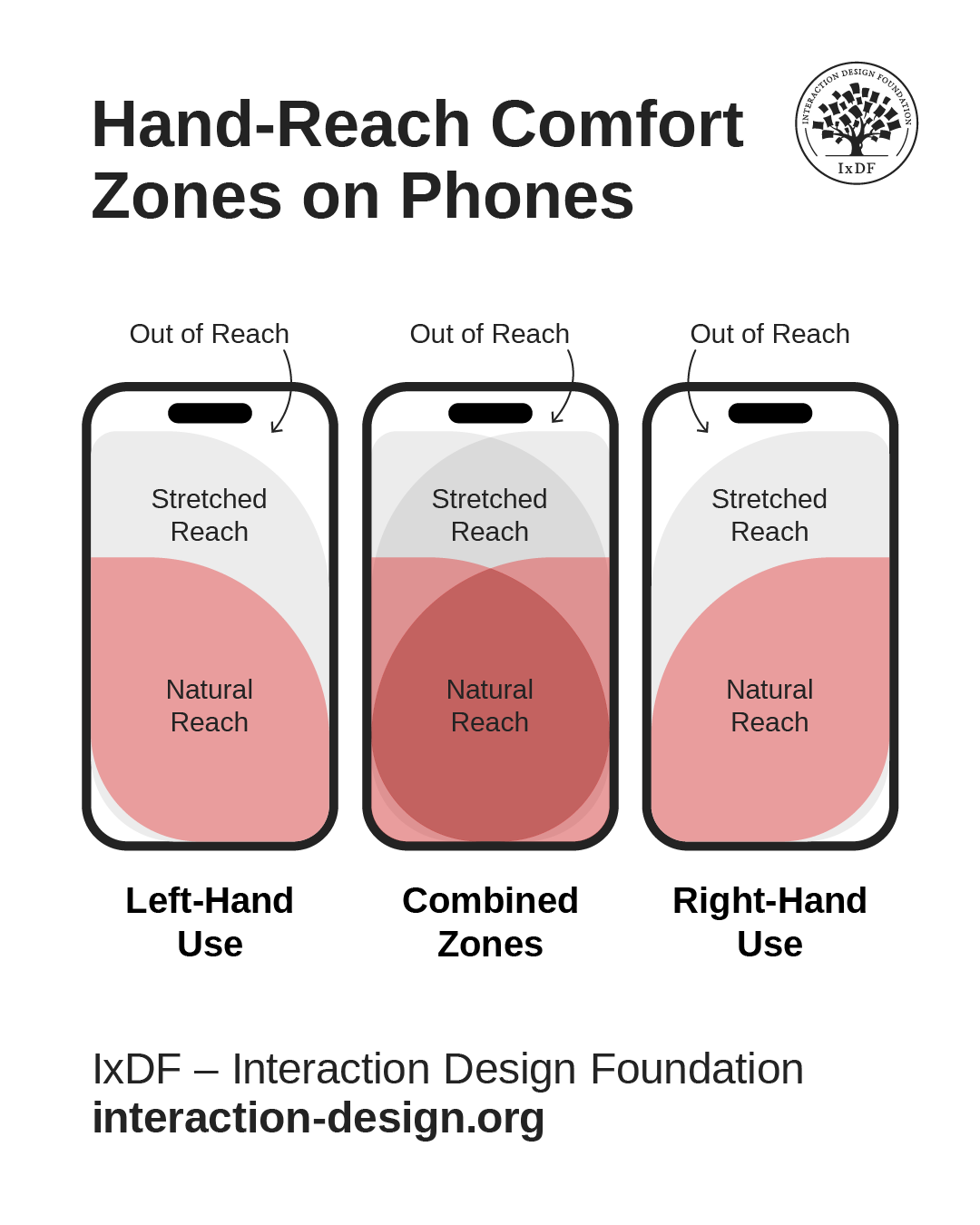
Ergonomics and designing for comfort remain primary considerations for designers, as these hand-reach comfort zones on smart phones show, with left-hand use, combined use, and right-hand use.

© Interaction Design Foundation, CC BY-SA 4.0

Late 20th Century: Human–Computer Interaction

Although the first computers emerged in the 1940s, they would largely remain in specialized environments until the 1970s. By the 1980s, computers had made the “mainstream” move into offices and homes. Xerox PARC’s work on the graphical user interface (GUI) introduced windows, icons, menus, and pointers—the WIMP paradigm—a strong “standard” which Apple and Microsoft later popularized.

Key Milestones

  • The 1984 Macintosh prioritized friendly onboarding through icons and metaphors, with UI staples such as the desktop and trash can.

  • Don Norman’s book The Design of Everyday Things (1988) formalized affordances, feedback, and mental models in interaction design, bringing usability—and the need for it—to a level of popular awareness that had been hitherto unknown.

UX Parallels

  • Metaphor use in onboarding, such as folders in file management apps.

  • Visual feedback loops in digital interactions.

Explore how to make designs that work well because users can tell what to do with what they easily find on display, in our video about affordances.

Transcript

Early 21st Century: UX as a Discipline and Career Choice

The term “user experience” gained mainstream use in the late 1990s, thanks largely to renowned cognitive scientist Don Norman’s popularizing the term (Norman was actually the first person to have “UX” in their job title). The 2000s saw it gain ground to become formalized as a profession and achieve widespread use as a term. UX design encompasses a vast realm that spans—among other “subsets”—user research, interaction design, and information architecture.

Discover how to build solid user research as a firm foundation on which to set powerful designs that resonate with real users, in our video.

Transcript

Digital product teams, including UX and UI designers, now apply history-rooted principles—such as hierarchy from print, modularity from industrial design, and affordances from product ergonomics—to responsive web design, mobile UX design and app design, augmented reality (AR) and virtual reality (VR), and voice user interfaces (VUIs).

Get a greater understanding of how to design for mobile screens, in this video with Frank Spillers.

Transcript

Non-Western Influences Often Overlooked

Addressing every “contribution” to contemporary UX design practices in a way that would do justice to the “contributors” would involve a long list. However, the impact of several cultural design traditions remains profound this far into the Digital Age. For example, many geometric designs offer lessons in scalable, modular patterns for complex data visualizations, while African textile pattern systems demonstrate color coding and symbolism (useful in data-driven storytelling). The examples on “offer” can reward any designer desiring to research this subject further.

Of special note is Japanese design, with the principles of ma (space) and minimalism that have had an undeniable influence on clean, spacious UI layouts. When designers respect rhythm, modularity, and culturally resonant symbolism, they can improve clarity and engagement for global audiences.

Discover how to design to resonate with users from other cultures, in this video with Alan Dix: Author of the bestselling book “Human-Computer Interaction” and Director of the Computational Foundry at Swansea University.

Copyright
Transcript

Best Practices to Apply Design History in UX Design

While it borders on being unrealistic to suggest a “UX design history approach” in the form of a step-by-step guide, try this practical way to harness the power of the past in the present moment for the benefit of future users.

1. Identify Historical Analogues

When starting a project, research design movements or products with similar goals. For example, a fintech dashboard may benefit from Swiss grid structure for clarity.

2. Extract Usable Principles

Distill methods from history into practical tools:

  • From Bauhaus, prioritize functional clarity.

  • From De Stijl, use restrained color to signal categories.

  • From Japanese ma, keep whitespace purposeful.

An image showing three rectangles of colored rectangular and squarish tiles or windows with different colors and sizes in a leaded, stained glass arrangment.

With its asymmetrical compositions and elementary shapes among its primary “signatures,” De Stijl (Dutch for “the style”) arguably echoes across from the early twentieth century to inspire screen layout choices for modern UX designers.

© Theo van Doesburg, Fair use.

3. Contextualize for Today’s Medium

Consider translating physical or print-based practices into digital equivalents. For example, letterpress spacing principles can inspire mobile line height and paragraph spacing. Apply a sharp eye for typography and what you include as UX writing, such as micro-copy, to ensure legibility (that users can easily make out the text) and readability (that they can understand it easily, too).

Explore how to apply smart typographical choices to deliver messages effectively and elegantly, in this video with Mia Cinelli: Associate Professor of Art Studio and Digital Design at The University of Kentucky.

Transcript

4. Prototype with Historical Logic

Apply historical design logic in wireframes and prototypes. For example, you might use modular De Stijl blocks to organize a complex settings panel—mindfully.

Explore how to use prototyping to test design ideas before they might become expensive missteps, in this video with Alan Dix.

Transcript

5. Test for Modern Usability

Conduct usability testing to confirm that borrowed historical ideas enhance clarity, not just aesthetics—that “yesterday thing” needs to be relevant now.

6. Document for Team Use

If these historically informed decisions are successful, add them to your design system for consistent application. If not, at least you’ll have learned a valuable lesson hopefully at the prototyping stage.

7. Explore

Get “out” there and learn more about what was important (and remains important) to the history of design and why. Read books, visit museums, research design history, and find yourself inspired by the past to build something innovative for the present, something that might become historically significant for the future as well.

Special Considerations and Risks

To design with present and future users in mind while lifting principles from the past can be precarious if designers don’t approach the subject with discretion, insight, and a firm grasp of design principles. Watch the following areas in particular:

  • Avoid historical literalism: Lift principles, not exact reproductions—remember, earlier designers had different solutions to what may seem to be the same problem, for a reason.

  • Cultural sensitivity: When borrowing from global traditions, understand meaning and avoid tokenism—make solutions count for people from different cultures who encounter and use your design.

  • Balance nostalgia with relevance: Users value ease over historical homage; that means pragmatic application and current needs outweigh sentiments about the “good old days.”

  • Test for fit: Aesthetic homage—sometimes taking the form of “retro”—should never undermine accessibility or usability. Designs need to fit users’ needs, not the users fitting the design’s “needs.” There’s no room for “retro-fitting” the users into the design.

A diagram showing 8 design principles of size, color, contrast, alignment, repetition, proximity, whitespace, and texture and style.

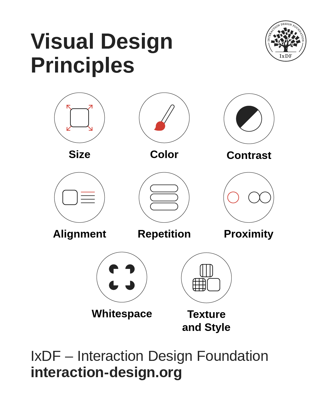
Design principles are a good “insurance policy” to help design for real users in the real world. Size, color, contrast, alignment, repetition, proximity, whitespace, and texture and style form main components of a designer’s toolkit. For example, size, color, contrast, and alignment help greatly with readability. Whitespace does, too, and gives breathing space to the page or screen, also factoring as an aid to repetition and proximity (how close elements are to each other). Texture and style help cue users to interactive elements, for example, like buttons.

© Interaction Design Foundation, CC BY-SA 4.0

Design history shows that UX design isn’t a sudden invention—it’s the latest chapter in a centuries-long story of shaping experiences for people. The same concerns—clarity, function, emotion, cultural fit—run from carved tools to mobile apps. And much of what was relevant to the user needs of the remote past became firm foundations for later designers to build on. The only design-related thing that separates users from long ago from users now is evident in the “ago” and “now”—time and, by association, technological advancements that came with the need to overcome the problems faced.

“Good design is a language, not a style.”

— Massimo Vignelli, Designer of the iconic New York City subway map, modernist furniture, iconic kitchenware, logos, and much more 

To bring the above quote back to L.P. Hartley’s one about the past’s being another country with different customs, one can notice the timelessness of design as a kind of language to speak back through the ages—and ahead. Design history will continue as long as users need solutions. By casting their minds back with a mature understanding of how current and future design are inseparable from their “roots,” designers can add a helpful—if not essential—lens to view their UX design process through. However, it’s more than appreciating how modern design can’t be divorced from earlier design traditions that worked well for a reason and became shoulders to stand upon. Designers also need a strong UX skill set and firm grasp of design principles.

Drawing from movements like Bauhaus for clarity, Swiss Style for structure, and non-Western traditions for rhythm and symbolism, UX designers can gain a richer awareness and deep, principled foundation to complement their design principles and other “tools” with. This context helps them create products that are not only functional but culturally aware, aesthetically resonant, and rooted in a tested legacy, too. Ultimately, the past is the past, but designs that remain relevant will last. Good designs that age don’t fall away into the mists of time or become relegated to history books; they endure and adapt thanks to the efforts of those who understand the value of UX design history.

Questions About Design History?
We've Got Answers!

How did UX design evolve from traditional design disciplines?

UX (user experience) design grew from industrial design, graphic design, and human factors engineering. Early industrial designers focused on function and aesthetics for physical products. Graphic designers refined visual communication and influenced digital layout and branding. Human factors specialists studied how people interact with machines, paving the way for “usability.”

As computing spread in the 1980s and 1990s, designers began applying these principles to digital interfaces. The shift to UX came when technology required not just attractive visuals but intuitive, user-centered systems. Today, UX design blends psychology, design thinking, and digital technology, creating seamless experiences across devices. This evolution mirrors the shift from designing static artifacts to crafting dynamic, interactive ecosystems where user satisfaction drives success.

Get a greater grasp of graphic design and its place in how to create effective visual designs.

What major milestones shaped the history of UX design?

Key UX milestones include the 1940s rise of human factors research in aviation, which focused on ergonomics and safety. In the 1960s, the invention of the computer mouse and demonstration of hypertext by Douglas Engelbart reshaped interaction possibilities. The 1984 release of the Apple Macintosh popularized graphical user interfaces (GUIs), and helped make computers accessible to non-technical users.

In the 1990s, the advocacy for “user experience” by Don Norman formalized the discipline. Also in that decade, the internet boom brought web usability to the forefront, with experts like Jakob Nielsen leading the way. The mid-2000s smartphone revolution, sparked by the iPhone, transformed UX with touch interactions and mobile-first design.

The 2020s have witnessed AI-driven personalization and immersive technologies like AR/VR represent the latest frontier, extending UX beyond screens into physical and hybrid experiences.

Peer into the past for a better understanding of where design foundations stand, in our article Build a common language by referring to design movements.

What role did cognitive psychology play in shaping UX principles?

Cognitive psychology provided UX design with a scientific understanding of how humans process information. Theories like Miller's “Magic Number 7±2” explained working memory limits, guiding interface simplicity. The Hick-Hyman law, sometimes called Hick's law, quantified decision-making time, influencing menu design and navigation structures.

Gestalt principles helped designers arrange visual elements for intuitive perception. Cognitive load theory emphasized reducing mental effort, which improved usability and retention. Usability testing techniques originated from cognitive psychology experiments, ensuring designs match how people think and behave. By grounding UX in how the brain perceives, remembers, and decides, cognitive psychology—or cognitive science—ensures interfaces align with human capabilities instead of forcing users to adapt to technology. It's about the users' needs, not the design's needs.

Discover how to apply time-tested principles in great designs, in our article What Science Can Teach You about Designing Great Graphical User Interface Animations.

How did UX design practices differ before and after the internet boom?

Before the internet boom, UX design focused mainly on desktop software and industrial systems. Designers tended to work within fixed environments, such as office computers or specialized workstations, often for trained operators. User testing was more limited, and iterative design cycles were slow due to software release constraints.

After the internet exploded in the mid-1990s, UX design needed to address massive, diverse audiences. Web usability became critical, emphasizing fast loading times, intuitive navigation, and cross-platform compatibility. Agile methods came to replace slow waterfall processes, enabling rapid prototyping and feedback loops. The internet's constant evolution also introduced ongoing optimization as a standard practice, transforming UX into a continuous, data-driven discipline rather than a one-time design effort.

Explore why Agile came about and how Agile design can offer a powerful approach in your design process.

What impact did the “desktop computing” era have on UX?

The desktop computing era of the 1980s and 1990s established many core UX patterns still in use today. Graphical user interfaces (GUIs) like Windows and Mac OS replaced text commands, enabling direct manipulation through icons, menus, and drag-and-drop. Standardized interaction models—such as double-clicking to open files—built user familiarity across software.

Desktop environments allowed richer visual design, too, fostering the rise of skeuomorphism for intuitive metaphors. Applications had to balance functionality with usability for both novices and professionals. This era also popularized usability testing as companies sought to reduce training time and support costs. The desktop model's emphasis on consistency, clarity, and feedback remains a foundation for modern UX.

Discover how to create effective Graphical User Interfaces that succeed with users.

How did mobile technology change the course of UX history?

Mobile technology revolutionized UX by introducing portability, touch interaction, and context-aware design. Before smartphones became “the way,” mobile interfaces had tended to be cramped, text-heavy, and navigated via physical buttons. The 2007 iPhone launch set new UX standards with capacitive touchscreens, gestures, and full-screen apps.

Mobile-first design emerged, prioritizing small-screen usability, responsive layouts, and fast load times. Location services enabled personalized, context-driven experiences. Mobile UX also pushed designers toward minimalism due to screen constraints, influencing broader design aesthetics. This shift turned UX into a 24/7 discipline—designers had to consider use cases on the go, from quick information lookups to immersive social and entertainment apps, fundamentally changing the way products are conceived and built.

Explore how to take a mobile first design approach and use it to great advantage.

How did skeuomorphic design shape early digital interfaces?

Skeuomorphic design—an approach that makes digital elements resemble their real-world counterparts—helped early computer users adapt to new interfaces. Icons like folders, trash bins, and notepads mirrored familiar objects, and so reduced learning curves.

Apple famously used skeuomorphism in its early software, with rich textures and shadows mimicking physical tools. This approach leveraged affordance theory: by resembling tangible items, digital controls suggested their function. While skeuomorphism fell out of fashion in favor of flat design, it played a critical transitional role, easing users out of analog into digital environments. Even today, onboarding flows and educational features often use skeuomorphic cues to bridge understanding for complex or unfamiliar systems.

Get a firmer foundation in skeuomorphic design to understand how to use it well, in our article Skeuomorphism is dead, long live skeuomorphism.

How did the arrival of touchscreens transform UX design?

Touchscreens replaced indirect input devices like mice and enabled direct interaction with on-screen elements. This shift required designers to account for finger size, gesture recognition, and tactile feedback absence. Interfaces became larger, simpler, and more gesture-based, prioritizing tap, swipe, and pinch actions.

Touch UX also demanded new navigation models, such as bottom menus for thumb reach. Multi-touch capabilities enabled richer interactions, from rotating images to zooming maps. Indeed, accessibility improved, as users could interact without fine motor precision. Touchscreen design extended beyond phones to kiosks, tablets, and automotive systems—and pushed UX design toward more natural, human-centered interactions across industries.

Pick up powerful points to bring into better digital products, in our article How to Use “Tappability” Affordances.

How did Japanese and Scandinavian design philosophies influence UX?

Japanese design's minimalism, harmony, and respect for craftsmanship influenced UX through clarity and elegance. Principles like ma (space) promote balanced layouts, while attention to detail ensures intuitive interactions.

Scandinavian design contributed functionality, simplicity, and democratic access—seen in IKEA's user-centered approach, for example. Both traditions prioritize human needs over decorative excess, aligning closely with usability principles. Their influence is visible in clean interfaces, accessible typography, and emotionally calming user experiences. Brands like Muji and Bang & Olufsen embody this blend, creating products that are both beautiful and practical, and prove that aesthetic restraint can enhance, not hinder, usability.

Investigate fascinating points to consider for your own designs, in our article The IKEA effect and Convivial Tools – Leveraging our human need for creativity.

How did accessibility concerns develop historically in UX design?

Accessibility began in physical product design, with ergonomic tools and ADA (Americans with Disabilities Act) standards influencing digital thinking. Early web design often overlooked accessibility—a “Wild West” of online designs meant barriers for users with disabilities.

The 1999 release of the Web Content Accessibility Guidelines (WCAG) set the first global standards. Over time, legal cases and advocacy pushed accessibility from a compliance checkbox to a core UX design value. Today's accessible and inclusive design practices consider visual, auditory, cognitive, and motor impairments from the start. Accessibility now benefits all users—such as captions, which help in noisy environments, while high-contrast modes aid visibility in sunlight—proving that accessible design is good design in any case.

Discover how to ground your designs in accessibility so they can resonate better with all users.

What are some recent or highly cited articles about design history?

Woodham, J. M. (2001). Designing Design History: From Pevsner to Postmodernism. ACCESS: Contemporary Issues in Education, 20(2), 130–140.

Jonathan M. Woodham's article critiques the early depiction of design history as a narrative of style and individual creativity. It emphasizes the intellectual freedom that comes from the relative youth of design history as an academic discipline and suggests its potential to strengthen understanding of material culture, combining insights from social, economic, and anthropological history. For UX designers, this article offers a reminder that design history can be reframed not just as chronology or aesthetics, but as a vehicle to investigate social context, cultural values, and the infrastructure of everyday creations—critical for building meaningful and user-centered experiences.

Norman, D. A. (1988). The Design of Everyday Things. Basic Books.

Originally titled The Psychology of Everyday Things, Donald Norman's foundational text explores how design communicates with users, introducing core concepts like affordances, signifiers, and the gulf of execution/evaluation. He argues that usability issues are design failures, not user faults—and that great design intuitively guides users. UX designers benefit from his clear framework for building intuitive interactions grounded in cognitive psychology. The book elevates user-centered design as a principle—and remains essential for creating human-friendly digital and physical experiences.

Norman, D. A. (2003). Emotional Design: Why We Love (or Hate) Everyday Things. Basic Books.

In Emotional Design, Norman extends the conversation beyond usability into how products can evoke visceral, behavioral, and reflective emotional responses. He posits that deeply pleasurable design—one that's functional and emotionally resonant—drives stronger engagement. UX practitioners gain a compelling reason to balance function with delight, employing emotion to enhance user satisfaction and brand connection. This perspective remains valuable for crafting memorable, meaningful digital experiences that resonate beyond mere utility.

Lees-Maffei, G., & Houze, R. (Eds.). (2020). The Design History Reader (2nd ed.). Bloomsbury Visual Arts.

This comprehensive anthology presents key writings that trace the intellectual development of design history as a discipline. Spanning decorative arts, industrial design, graphics, and critical theory, it includes classic and contemporary voices. For UX designers, the book offers vital historical context for understanding how user-product relationships have evolved. It equips practitioners with theoretical and cultural insight into the role of design across time and media, supporting a deeper, more reflective design practice. With contributions from leading scholars and designers, it's an essential resource for bridging academic design history with contemporary UX concerns.

Earn a Gift Earn a Gift, Answer a Short Quiz!

1
2
3
4
1
2
3
4
Question 1
Question 2
Question 3
Get Your Gift
Interaction Design Foundation logo

Question 1

Why should designers study design history?

1 point towards your gift

  • To copy old styles for modern projects
  • To understand how past ideas influence today’s design choices
  • To avoid using technology in visual design
Interaction Design Foundation logo

Question 2

What often drives the rise of new design movements?

1 point towards your gift

  • A need to respond to changes in society and technology
  • A desire to make all design look the same
  • A focus on personal expression over user needs
Interaction Design Foundation logo

Question 3

How does the Bauhaus movement continue to influence modern design?

1 point towards your gift

  • It promotes decoration and visual complexity
  • It encourages function-driven and minimalist design
  • It focuses on handmade art instead of usability

Learn More About Design History

Make learning as easy as watching Netflix: Learn more about Design History by taking the online IxDF Course User Experience: The Beginner's Guide.

Why? Because design skills make you valuable. In any job. Any industry.

In This Course, You'll

  • Get excited when you experience how easy it is to transition into tech and land your dream job with User Experience (UX) design skills. No design background? No problem. You already have transferable skills, so it's easy to fast-track your career

  • Learn to combine logical thinking with creativity. Do you enjoy creativity and structure? Do you communicate ideas clearly? UX designers turn ideas into services, experiences, and products. This course helps you structure your existing skills and apply them in an innovative, creative context. You'll use hands-on methods that empower you to continuously test and optimize your products and services from idea to delivery.

  • Make yourself invaluable when you use the very fabric of being human, such as empathy and intuition, to make users and customers smile. More smiles, more impact, greater salary potential. You'll find out what your users need and want, and you'll build products, experiences, and services that help them succeed. You can benefit from UX design in any job, any industry. As AI becomes part of everyday work, timeless human-centered UX design skills help you decide what problems are worth solving and how solutions should actually work for people. This approach turns AI from a tool into your new superpower, keeping your work useful, relevant, and centered around peoples’ needs, even as technologies change.

  • Gain confidence and credibility when you master a range of powerful, real-world UX design skills such as user research, user interviews, personas, customer journey maps, sketching, task analysis, low-fidelity paper prototyping, and usability testing. It's easy with downloadable templates

  • Craft your personal portfolio with step-by-step guidance. It's completely optional. Your portfolio is your gateway to transition into a career in tech or design. You'll be able to apply your new skills immediately in your current job. If you're new to UX design, this course is the best place to start. Your path to tech starts here. UX design is your way in.

It's Easy to Fast-Track Your Career with the World's Best Experts

Master complex skills effortlessly with proven best practices and toolkits directly from the world's top design experts. Meet your experts for this course:

  • Don Norman: Father of User Experience (UX) design, author of the legendary book “The Design of Everyday Things,” and co-founder of the Nielsen Norman Group.

  • Rikke Friis Dam and Mads Soegaard: Co-Founders and Co-CEOs of IxDF. 

  • Mike Rohde: Experience and Interface Designer, author of the bestselling “The Sketchnote Handbook.”

  • Stephen Gay: User Experience leader with 20+ years of experience in digital innovation and coaching teams across five continents.

  • Alan Dix: Author of the bestselling book “Human-Computer Interaction” and Director of the Computational Foundry at Swansea University.

  • Ann Blandford: Professor of Human-Computer Interaction at University College London.

  • Cory Lebson: Principal User Experience Researcher with 20+ years of experience and author of “The UX Careers Handbook.”

Get an Industry-Recognized IxDF Course Certificate

Increase your credibility, salary potential and job opportunities by showing credible evidence of your skills.

IxDF Course Certificates set the industry gold standard. Add them to your LinkedIn profile, resumé, and job applications.

Course Certificate Example

Be in distinguished company, alongside industry leaders who train their teams with the IxDF and trust IxDF Course Certificates.

Our clients: IBM, HP, Adobe, GE, Accenture, Allianz, Phillips, Deezer, Capgemin, Mcafee, SAP, Telenor, Cigna, British Parliament, State of New York

All Free IxDF Articles on Design History

Read full article
The MAYA Principle: Design for the Future, but Balance it with Your Users’ Present - Article hero image
Interaction Design Foundation logo

The MAYA Principle: Design for the Future, but Balance it with Your Users’ Present

Learn to design for the future, while balancing your design with your users’ present stage of skills and mindset. This is called the MAYA Principle and it’s the secret behind the industrial design of the Coca-Cola bottle, Shell Oil logo, and the Greyhound logo.Why not learn from the best design expe

Social shares
1.1k
Published
Read Article
Read full article
Build a common language by referring to design movements - Article hero image
Interaction Design Foundation logo

Build a common language by referring to design movements

Let’s check out a couple of words that are vital to us. Without them or their functions, life would be a nightmare. It would take ages to get anything done! Thankfully, we have categorization and labeling to help us understand our world and communicate with others.Labels and categories are great, ti

Social shares
754
Published
Read Article

The MAYA Principle: Design for the Future, but Balance it with Your Users’ Present

The MAYA Principle: Design for the Future, but Balance it with Your Users’ Present

Learn to design for the future, while balancing your design with your users’ present stage of skills and mindset. This is called the MAYA Principle and it’s the secret behind the industrial design of the Coca-Cola bottle, Shell Oil logo, and the Greyhound logo.

Why not learn from the best design experts with the most impressive track record? Raymond Loewy (1893-1986) is often referred to as the father of Industrial Design and his track record is indeed impressive. The Air Force One logo, the Coca-Cola bottle, the Shell Oil logo, the US Postal Service logo, the Greyhound logo are just some of his impressive designs which still exist today.

Today, Loewy can still teach us to design our products with just the right balance between the well-known present, on one hand, and a new and innovative future on the other hand. If we don’t hit the right balance, our users won’t embrace nor buy our products, Loewy emphasized.

Designs and drawings by Raymond Loewy who designed the Air Force One logo, the Coca-Cola bottle, the Shell Oil logo, the US Postal Service logo, and the Greyhound logo.

© Raymond Loewy, All Rights Reserved

The MAYA Principle

Loewy’s secret was essential to design for the future – but delivering the future gradually. He designed his famous logos, some of the most recognizable cars of the 40s, 50s, and 60s, refrigerators, and locomotives for his users’ present needs and skills while pushing the boundaries of design and technology beyond his users’ expectations. He called this approach the MAYA principle. Maya is an abbreviation for “Most Advanced. Yet Acceptable.” which means that Loewy sought to give his users the most advanced design, but not more advanced than what they were able to accept and embrace. Loewy believed that:

"The adult public's taste is not necessarily ready to accept the logical solutions to their requirements if the solution implies too vast a departure from what they have been conditioned into accepting as the norm."

Raymond Loewy surrounded by some of his iconic designs.

© Raymond Loewy, All Rights Reserved

The early iPod is a good example of how Apple applied the MAYA principle. The iPod’s designers gradually pushed the product design further and further as the iPod gradually lost the extra buttons and got a more streamlined interface. It is very likely that this gradual development from the first iPod in 2001 was what made the iPhone acceptable to users when it was launched in 2007. By applying the MAYA principle, the designers at Apple provided the users with the most advanced design within the boundaries of their acceptance.

© Unknown

Apple and the MAYA Principle

The Newton tablet was an early personal digital assistant and the first tablet platform developed by Apple. Apple started developing the tablet in 1987. It was launched in 1993 and cancelled in 1998 as it was a financial disaster for Apple. There were several reasons that the Newton tablet did not become a success, but one of the main reasons could well be that the Newton tablet was introduced without users being familiar with a digital personal assistant.

A more recent example is Google Glass which has not become the success it was anticipated to become. Maybe it’s because the whole concept of wearing glasses that both record everything we do – while augmenting what we see with a layer of information – is simply too advanced for us. Maybe we need to take gradual steps before being ready to embrace this new technology. So the question is, how do we learn to strike the right balance between the most advanced design and our users’ ability to accept our product?

The lack of success for both Apple’s Newton tablet and Google Glass could be that they were too advanced for their users.

© Unknown

How You Can Apply the MAYA Principle in Your Everyday Design Work

Most of us have experienced the frustrating feeling of trying to explain and sell a great design solution and not get the buy-in from our management or clients. Maybe the design solution was too advanced? Or too much like the old design? Next time, you should consider using the MAYA principle to strike the right balance.

  • Advance your design gradually over time as the Apple designers did with their development of the iPod. Do not make a lot of major changes right away as you risk scaring off your users. You need to ask yourself what context your users are familiar with and which features has to be changed. When in doubt you should distinguish between: Nice to have and need to have.

  • Include familiar patterns in the visual design so users can orient themselves just like Apple’s designers gradually made the iPod more and more streamlined and eventually launched the ultra-streamlined iPhone.

  • Draw on your user’s present skills and mindset while presenting them with only a carefully chosen few major changes.

  • A golden rule is that if you have to explain your product design and if you need to include a manual or elaborate “help” features, your product is overly advanced or too complex to use. Your users should be able to understand and use your product instantly or at least with little training and explanation. Your users will lose confidence in the product and in themselves if they need to read a thick manual to understand it. We will explain how to find the right balance further down based on the theory of psychologist Lev Vygotsky.

  • The MAYA principle resonates with many design principles and heuristics such as the “Match between the system and the real world” from Jakob Nielsen’s list of heuristics (http://www.nngroup.com/articles/ten-usability-heur...).

  • The MAYA principle also resonates with the use of libraries and design patterns when designing interactions: By using standard libraries and design patterns, you can increase the level of familiarity that the users will have with your design. That can be helpful if you aim to push the boundaries in some aspects of your design, i.e. if you intentionally depart from the norm in some aspects of your design.

Psychological and Philosophical Perspectives by Vygotsky and Kierkegaard

“Most Acceptable, Yet Advanced” is not specific to design. It’s fundamental to how human beings learn new skills and insights.

Among educators, the Danish philosopher Søren Kierkegaard (1813-1855) is often quoted for emphasizing the fact that when you want to help someone learn a new skill (or product), you first need to find out about the person’s present skill level. You need to find out what’s acceptable to them before teaching them anything new and advanced. Otherwise your efforts (and your design of a new product) will not be worth anything. For instance, there is no reason to teach a child to spell the word “philosophical” if the child has not learned what an alphabet is and what it means. The first step is always to find out what is “acceptable” for the learner and user.

There's no need to teach a child to spell the word “philosophical” if the child has not learned what an alphabet is and what it means. The first step is always to find out what is “acceptable” for the learner and user.

© Letter School. All rights reserved

How advanced and innovative can you then make your new product or design? To answer that question, you can use the principle called the zone of proximal development (ZPD). The term was developed by the Soviet psychologist and founder of cultural-historical psychology, Lev Semyonovich Vygotsky (1896-1934). Vygotsky’s term zone of proximal development describes the range of skills that a child is in the process of learning.

Vygotsky stated that a child follows an adult's example and gradually develops the ability to do certain tasks without help. Vygotsky believed that the role of education is to give children experiences that are within their zones of proximal development, thereby encouraging and advancing their individual learning. We will tell you how you can use that in a design process, but first you need some more background on the ZPD.

The lower limit of the ZPD is the maximum level of skill which a child can acquire by working independently (the child’s actual developmental level). This can be compared to your users’ present level of skills and the skills they are (easily) able to learn by themselves. This would mean small changes in an existing product, or a new product with a strong similarity to existing products or interaction patterns.

The upper limit of the ZPD is the maximum level of skills that the child is able to reach with the assistance of a more capable instructor. Vygotsky emphasized that you can only help the child, i.e. your user, through gradual steps of evolving new skills and understandings. A first-grade teacher will, of course, know that a child will learn to spell even the most complex words in the future. But you don’t present the child with long complex words to begin with. You start gradually by presenting the child with the letter A, then the letter B, and so forth. You always have to aim for only the next reachable zone of development.

What you can learn from Vygotsky is that you have to distinguish between:

  • Your user’s lower limit of ZPD – i.e. what she can easily learn by herself, without your help, without a manual, or without an instructor’s help.

  • Your user’s upper limit of ZPD – i.e. what she can learn with the help of an instructor or manual.

When seeking the right balance you should remember that a child most often has to attend school. Your users don’t have to buy your product. Maybe some users are forced to use your products at work, but you should strongly consider if you design for the lower or upper limit of ZPD. Do you want your users to read manuals or to require instruction before being able to use your product, or do you want them to be able to easily teach themselves new functions?

The MAYA principle advocates for designing with the lower limit of ZPD in mind if you want your product to succeed. Most often, users will not spend their valuable time and money by learning how to use your new product if they can find a product which is easier to use. At the same time, users are often attracted to shiny new products with advanced features - designed with the future in mind. Finding the right balance could be the determining factor that will decide if your next product will become a success.

The Take Away

Loewy teaches us to design our products with just the right balance between the well-known present, on one hand, and a new and innovative future on the other hand. We should design for the future but at the same time we should strive to deliver the future gradually. This is fundamental if we want people to embrace and buy our products. He called this approach the MAYA principle. Maya is an abbreviation for “Most Advanced. Yet Acceptable.” which means that Loewy sought to give his users the most advanced design, but not more advanced than what they were able to accept and embrace.

References and Where to Learn More

Learn more about Raymond Loewy.
More information about L.S. Vygotsky.

Feel Stuck?
Want Better Job Options?

AI is replacing jobs everywhere, yet design jobs are booming with a projected 45% job growth. With design skills, you can create products and services people love. More love means more impact and greater salary potential.

At IxDF, we help you from your first course to your next job, all in one place.

See How Design Skills Turn Into Job Options
Privacy Settings
By using this site, you accept our Cookie Policy and Terms of Use.
Customize
Accept all

Be the One Who Inspires

People remember who shares great ideas.

Share on:

Academic Credibility — On Autopilot

Don't waste time googling citation formats. Just copy, paste and look legit in seconds.