Information Anxiety

Your constantly-updated definition of Information Anxiety and collection of videos and articles.
Be a conversation starter: Share this page and inspire others!

197 Shares

What is Information Anxiety?

Information anxiety in UX (user experience) design describes the stress or confusion users feel when they encounter too much data, unclear content, or poorly organized information in a digital experience. As a UX designer, you can help by structuring, clarifying, and reducing informational overload to support users and help them feel confident and succeed at what they want to do with your solution.

In this video, William Hudson: User Experience Strategist and Founder of Syntagm Ltd., explains how behavioral economics helps you reduce information overload by designing interfaces that guide users toward clearer, easier decisions.

Transcript

How Information Anxiety Happens and Hurts

Imagine this: you’ve just opened a government website to renew your driver’s license. But you find the homepage cluttered with dozens of links, none of which clearly say “renew license.” You click one that seems promising, only to land on a page with dense legal text and outdated instructions. As precious minutes pass, your confusion turns into frustration. You’re unsure what to do next, afraid you’ll make a mistake, and you still haven’t found the answer. This is information anxiety: the stress that comes from not knowing what to do with too much or poorly organized information.

Information anxiety is a concept which Richard Saul Wurman introduced and popularized in his 1989 book Information Anxiety. In UX design, it arises when users face UIs (user interfaces) or systems where the navigation is confusing, content overwhelming, or information poorly organized. There’s a gap between what users understand and what they think they should understand. And that leads to frustration, indecision, abandonment, and, possibly, a long-lasting sour impression and memory of your brand.

You may think of it as a subtle cognitive burden: the more a user has to struggle to find, make sense of, or act on information, the greater that burden gets. As Wurman suggested, information becomes anxiety-inducing when it fails to bridge the gap to understanding. In an era of data-rich applications, dashboards, complex tasks, and multichannel flows, your role as a UX designer includes the responsibility of mitigating information anxiety. And, when you’ve got a firm grasp of users’ use cases and recognize where they feel uncertain, overloaded, or undecided, you can design experiences that feel clear, guided, and reassuring.

In this video, William Hudson explains how use cases map real interactions between users and a system so you can design experiences that reduce uncertainty and cognitive load.

Transcript

In the hypothetical driver’s license example, the website designer failed to empathize with users, almost as if to say it’s the users’ fault they’ve arrived on a website with expectations of an easy task. Many users might experience information anxiety at an even worse level if they’re already stressed and don’t have the time or mental bandwidth to even try to handle confusing text. For a government organization, that can send a bad message, like: “You’ve got to get your license from us, anyway, so it’s on you to make sense of what we show you.” Apart from failing in the “department” of a proactively ethical spirit of helping people, such a design wouldn’t do so well in terms of efficiency, either. Poor UX can increase support center calls, as seen in multiple case studies of public-sector websites. A little empathy and considerate design go a long way and help both user and brand.

Explore as this video shows how empathetic design reduces user stress by presenting clear, accessible information instead of forcing people to struggle with confusing or incomplete cues.

Transcript

How to Minimize Information Anxiety

Try these design principles to mitigate information anxiety; they’re actionable strategies you can apply to ensure that your UX designs address and reduce this problem:

1. Define Clear User Goals and Pathways

To begin, understand what users need to do. During user research and exploration:

  • Interview users about their main objectives, frustrations with information, and sources of uncertainty.

  • Observe how they seek, scan, and use content.

  • Map information pathways and cognitive loads, not just actions. Map their tasks and then design user flows that align with those goals.

Don’t assume users will just “figure it out”; guide them from choice to action with purpose. Have insight into their user contexts, too; even at the best of times, in a good mood, comfortable setting, and with time to spare, they’ll appreciate the help your design provides them with.

In this video, Alan Dix, Author of the bestselling book Human-Computer Interaction and Director of the Computational Foundry at Swansea University, shows how understanding users’ broader context helps you guide them smoothly from choice to action instead of expecting them to figure things out on their own.

Transcript

2. Simplify and Prioritize Information

Not all information is equally valuable at every moment; there’s a time and a place for everything you need to show users. So, use content hierarchy, progressive disclosure, and context-sensitive help to surface what matters when it matters. Doing that reduces overload and helps users focus on what they’re there to do.

In this video, William Hudson explains how progressive disclosure helps you surface only the information users need at the right moment.

Transcript

3. Structure Content and Navigation Meaningfully

Logical content grouping, consistent labels, intuitive navigation, and visible patterns reduce search time, confusion, and friction. A well-organized information architecture is essential to support understanding and action for users. To use an analogy, you wouldn’t drop users in the middle of a pathless forest and expect them to find their way; instead, you’d signpost every important feature with clear mapping and “You are here” markers. So:

  • Design components with clarity and have dashboards with headings, contextual help, and progressive reveal of details.

  • Build navigation that adapts with filters, search, and predictable layouts.

  • Add micro-feedback such as confirmations, tooltips, and minimal distractions.

4. Provide Context, Relevance, and Actionable Insight

Don’t just show data; help users interpret it and turn it into correct understanding. Use storytelling, tooltips, visual cues, and micro-interactions to explain why information matters. When users recognize relevance and know that you know why they’re using your digital product, they’ll feel more confident and less anxious. And an effective, if not essential, way for you to gain vital insights into what’s relevant to your users is to create user personas (research-based, synthetic representations of real users) and “plug” persona stories into your design thinking.

In this video, William Hudson explains how persona stories replace generic user stories with research-based narratives that reflect real user behaviors and needs.

Transcript

5. Support Interactive Feedback and Guidance

User inquiries don’t end at what they see on a display, so offer clear next steps, confirmations, error recovery, and feedback loops. When users know what to do and see tangible progress happening, their uncertainty levels fall as their engagement levels rise.

6. Design for Cognitive Ease and Manage Load

Given the limited working memory users have, interface design should reduce cognitive strain on them. That means you chunk information, use familiar patterns, avoid unnecessary distractions, and support scan-and-skim behaviors.

7. Create Testable Prototypes

By this stage, you’ll want to create prototypes that embody the above points and emphasize clear structure, relevance, and guided flows instead of dumping all content upfront.

In this video, Alan Dix explains how prototyping lets you test clear, structured designs early so you can refine them before overwhelming users with unnecessary content.

Transcript

8. Test and Iterate with User Understanding in Mind

Test your prototypes with representative users, specifically asking where they feel unsure or overwhelmed. You’ll want honest and upfront critiques; many users may not be so honest in their criticism, as they won’t want to “offend” the designer.

This is where you conduct usability testing on those prototypes and use heat maps, analytics, and qualitative interviews to discover where users feel lost or hesitant. Then, iterate on the structure, wording, and flow until you notice stronger comprehension and smoother tasks. Keep testing and tweaking your prototypes until users start getting through their tasks flawlessly and comfortably.

9. Measure, Monitor, and Refine Post-Launch

When you and your design team have refined your solution into a viable product, it’s time to analyze real-world user behavior for signs of confusion like long dwell times before action. Designing for clarity is ongoing, so:

  • Track metrics like task completion rate, error rate, time on task, help-content usage, and user feedback.

  • Conduct surveys: ask users whether the content and process felt clear and simple.

If you identify signs of information anxiety in real use, make the needed adjustments and refine content, restructure information, and then test new flows. Use feedback to refine labels, groupings, and pathways and keep testing until users prove they’re happy with your design solution.

How to Recognize Signs of Information Anxiety in Your UX

Because this problem can be intricate and manifest via many symptoms, it deserves a section of its own; use these indicators to spot where your users may be experiencing information anxiety:

  • Users linger on pages without taking next steps.

  • High “help” or “support” feature usage shortly after interface launch.

  • Frequent abandonment of tasks mid flow.

  • Repeated requests for clarification or definitions of common terms.

  • Analytics showing users bounce between pages without progressing.

  • Qualitative feedback highlighting confusion, such as “Not sure what this means” or “I don’t know what to do next.”

  • Users pausing at key interfaces, like dashboards, unsure which metrics matter or what action to take.

  • Form flows where users hesitate or frequently ask questions like these: “What does this mean?” or “Where do I go next?”

  • Search functions that return too many results and can cause decision fatigue instead of bolstering confidence.

  • Help content that floods users with dense paragraphs instead of directly answering their questions.

If you observe these signs, review your information architecture, content clarity, and user journeys. These patterns often signal cognitive overload, poor hierarchy, or a lack of contextual support, and they’re conditions that increase anxiety, reduce task success, and get in the way of what should be straightforward goals.

What Designs that Minimize Information Anxiety Do

You can enjoy numerous benefits of designing to minimize information anxiety, namely:

Better Usability and Task Success

When you reduce unnecessary information or make it easier to navigate, users complete tasks more smoothly and quickly.

Higher User Confidence and Satisfaction

Users feel more in control when content and structure make sense; that’s also where many of them might even forget they’re accessing your website or app through a device, which is part of how they can enjoy a seamless experience, and come away with more positive engagement.

Reduced Cognitive Load

Your design choices can lighten the mental effort required, therefore reducing the risk of user fatigue or disengagement. For example, if users don’t have to wade through line after line of superfluous or confusing information, and instead get to do what they’re there to do (and quickly), they’ll be able to preserve cognitive resources for other tasks and appreciate your considerate design as well.

Stronger Brand and Product Perception

When users feel supported and not overwhelmed, they’ll trust your product and may return to or recommend it, even a government website that may not have “competitor brands” to worry about as such.

Improved Accessibility and Inclusivity

Users vary in their ability to process information; think of users with cognitive disabilities, for instance. Addressing anxiety means designing for wider needs and contexts, and helping not just these users but all users in the process. Add to this the point that accessibility is a legal requirement in many jurisdictions and you’ll find that accessible design is serious business.

Discover how accessible design helps you reduce information anxiety by giving all users clear, usable, and well-labeled interfaces.

Transcript

What Triggers Information Anxiety: Causes and Dimensions

To design better, you’ll want to understand what triggers information anxiety and a detailed idea of how it shows up in digital products, such as:

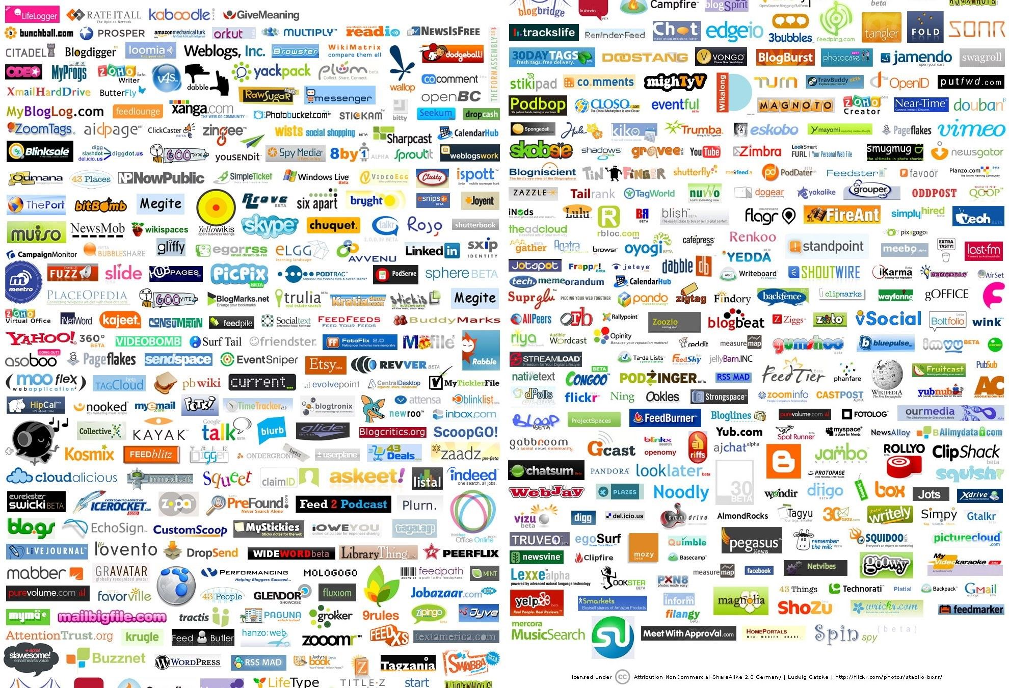
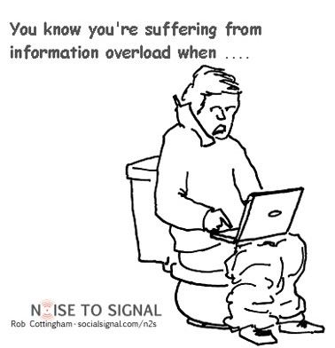
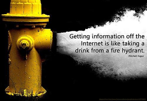
  • Information overload: When users face more input than they can process, or too many options, they may feel stuck or uncertain. Whether they’re drowning in data or the paralysis of choice is making them “freeze,” they may stop and just abandon what they’re doing.

  • Poor organization or clarity: Information that’s unstructured, poorly labelled, or lacks context can frustrate users. That’s why such measures as including an effective information architecture (IA) and thoughtful microcopy can help so much.

  • Unclear relevance or value: If users can’t tell what the information means for them, or why it matters, their anxiety levels rise. Real designer empathy means you take appropriate material to users so they can see things from their side.

  • Navigation or access barriers: Difficulty finding what’s needed or understanding how to act increases the stress users experience: “So what do I do now?!” screamed at a screen won’t endear the brand responsible for the digital product to that user.

  • High expectations with low support: When users believe they should “know how to do” something but the interface provides them with little help, the anxiety gap grows. For instance, a dismissive assumption of “How hard can it be to renew a license?” can quickly turn into “Why is this so hard? I just want to renew my license!”

Overall, when you aim to reduce information anxiety, you send a strong message, that you value the user’s time, cognition, and success. This positive mindset can help shape your brand’s design culture, where you might move from “just give them the data” to “help them act on meaningful information.” Consequently, you deliver digital products that feel helpful, trustworthy, and empowering rather than overwhelming or intimidating.

Remember, information anxiety doesn’t “just happen”; you have the tools to minimize it with clarity of goal, prioritized content, strong structure, relevance, and ongoing measurement. You can build interfaces that feel intuitive instead of chaotic, that guide rather than confuse, and that enable and empower, not overwhelm. So, aim to make every interaction feel clear, every path make sense, and every piece of information serve a purpose. Do that and you’ll be well on your way to creating user-centered, effective, and enjoyable digital experiences where many users can keep coming back because, as one of the reasons, they sense you’ve got their back.

Questions About Information Anxiety?
We've Got Answers!

How does information anxiety differ from information overload?

Information overload happens when users receive more data than they can process. Information anxiety is an emotional result, and it’s stress or confusion that comes from an inability to find, understand, or use information effectively. While overload is about quantity, anxiety stems from quality and usability.

Information architect Richard Saul Wurman coined “information anxiety” to describe the gap between what we know and what we think we should know. Unlike overload, anxiety can occur even with minimal content if it’s unclear or poorly structured. So, recognize this emotional barrier and don’t assume that “less” always means “better.”

Explore some helpful points about how to help users with what you show them, in our article Hick’s Law: Making the choice easier for users.

Why is information anxiety a growing concern in digital product design?

As digital interfaces grow more complex, users often feel lost in navigation, overwhelmed by choices, or unsure about what action to take. The sheer volume of content, features, and notifications fuels information anxiety.

Poor design magnifies this issue by offering unclear pathways or overloading users with irrelevant content. In UX design, emotional responses impact usability just as much as functionality. If users feel anxious, they’re more likely to bounce, abandon tasks, or mistrust the product. As attention spans shrink and competition increases, designing for cognitive ease has become essential.

Get some inspiration for effective design from our article How to Design an Information Visualization.

How can poor UX contribute to information anxiety?

Poor UX creates cognitive friction. Cluttered layouts, unclear labels, inconsistent navigation, or excessive options all force users to overthink. This disrupts flow and triggers anxiety, especially when users can’t locate what they need or understand how to proceed.

A design that lacks hierarchy or feedback mechanisms adds to user stress, undermining trust and engagement. So, it’s wise to guide users effortlessly, not make them work harder to understand the user interface.

Consider how to design to minimize cognitive friction and help users enjoy great experiences.

How can designers reduce information anxiety in user interfaces?

You can reduce anxiety by simplifying content, prioritizing clarity, and offering contextual help. Use plain language, progressive disclosure (show details only when needed), and familiar UI patterns.

Effective visual hierarchy helps users scan and find what matters fast, and clear CTAs (calls to action) and confirmation feedback reinforce confidence. Apply the 80/20 rule: emphasize the 20% of features that provide 80% of the value. Jakob Nielsen’s usability heuristics, especially “visibility of system status” and “recognition rather than recall,” help reduce user uncertainty, which is a key driver of information anxiety.

Harvest valuable insights about heuristic evaluation and discover many important points about how a good digital product should perform for users.

What role does information architecture play in reducing information anxiety?

Information architecture (IA) organizes and labels content so users can find what they need without feeling overwhelmed. Good IA reduces information anxiety by creating predictable pathways, clear hierarchies, and intuitive navigation. When users understand where they are and how to get somewhere else, they feel in control.

Card sorting and tree testing help validate IA decisions based on real user behavior. Just like a well-organized library, a good strong effective IA ensures users can retrieve information quickly, boosting both usability and confidence.

Find helpful insights about designing effective information architecture, in our article The Heart of the Matter, Information Architecture in the Mobile Age.

What are some best practices to avoid information anxiety in dashboards?

To reduce information anxiety in dashboards, focus on clarity and relevance. Prioritize key metrics and group related data visually. Use whitespace strategically to prevent clutter. Limit the number of widgets and avoid unnecessary charts.

Apply a good visual hierarchy: emphasize critical KPIs (key performance indicators) using color, size, and placement. Let users customize views based on their role or goals. Use tooltips and microcopy to explain complex data without overwhelming users upfront. A good dashboard tells a clear story at a glance, not a data dump.

Check out a wealth of visual hierarchy insights and tips to help make better design decisions.

How can designers use user personas to avoid information anxiety?

User personas (research-based, synthetic representations of real users) help you tailor your product’s content and structure to real user needs. By understanding each persona’s goals, pain points, and digital literacy, you can avoid unnecessary complexity. For example, a beginner-level user may prefer guided workflows and simplified terms, while an expert may want detailed data upfront.

When you align design decisions with user personas, you can help ensure the right information reaches the right people at the right time, minimizing cognitive load and confusion. Personas act as empathy tools, and help you ensure interfaces don’t assume one-size-fits-all solutions.

Peer into the power of personas to understand how they can help you design better solutions for users’ cognitive needs and more.

What UX laws or heuristics help combat information anxiety?

Several UX laws directly help reduce information anxiety for users. Hick’s Law advises limiting choices to speed decision-making. Miller’s Law reminds designers to group content in chunks users can process, typically 7±2 items. Jakob Nielsen’s heuristics, especially “consistency and standards” and “recognition over recall,” lower user effort. Fitts’s Law supports placing frequently used elements within easy reach.

All of these principles streamline interaction and reduce the mental strain that leads to anxiety. When you apply these rules smartly, you can help users feel confident and in control.

Fit Fitts’s Law into your design considerations and discover how it can help users achieve goals more easily.

How does information anxiety affect user behavior on websites and apps?

Information anxiety causes hesitation, frustration, and disengagement. Users faced with confusing layouts or unclear choices often abandon tasks, bounce from sites, or switch to competitors. They may mistrust the product or second-guess their actions.

Users tend to only scan pages briefly before deciding if they’ll stay. And when anxiety builds, cognitive overload leads to decision paralysis; users stop exploring or completing tasks. In contrast, and what you want to aim for as a designer, intuitive design builds confidence, keeps users engaged, and improves conversion rates.

Explore what goes into designs which users can take to naturally, with our article How to Create an Intuitive Design.

What are some common pitfalls with information anxiety and design?

Even with the best intentions, information anxiety can creep in. Here are common mistakes and how you can avoid them:

  • Overloading content early. Presenting everything at once may overwhelm users. Use progressive disclosure instead.

  • Assuming users share your knowledge. Don’t expect users to know terminology or context. Use clear language and signpost meaning.

  • Neglecting navigation and structure. Unclear navigation leaves users guessing. Always test pathways.

  • Ignoring feedback signals. If users repeatedly leave the task or log questions, treat it as a signal for information anxiety.

  • Turning off after launch. Ignoring postlaunch feedback is like asking for trouble. Real-world use often surfaces unseen anxiety triggers.

Investigate the interaction design process for helpful insights into what an effective design process looks like.

What are some recent or highly cited articles about information anxiety?

Modelling Information Anxiety — Muhammad Asif Naveed & Mumtaz Ali Anwar (2019) Library Philosophy and Practice (e‑journal).

This paper offers what the authors call a “nested model” of information anxiety: they position “information anxiety” as a broad, overarching concept, with “information‑seeking anxiety” and “library anxiety” as nested, more situation‑specific subtypes. Their model spans multiple stages of information behavior: need recognition, finding information, evaluating it, accessing it, and using it. Although the context is broadly information science (not strictly UX), this multidimensional framework anticipates modern digital‑information problems, making it a foundational reference for anyone studying anxiety in digital info environments, information design, or UX for information‑rich systems.

Enhancing the User Experience in Fragmented Reading Applications: A Study on Information Anxiety and Design Strategies — Zhiyong Xiong, Tianqi Yuan & Dianya Deng (2024) Proceedings of the 3rd International Conference on Educational Innovation and Multimedia Technology (EIMT 2024). DOI: 10.4108/eai.29-3-2024.2347726

This conference‑paper directly studies “information anxiety” in a mobile reading application context. The authors surveyed college students to identify causes of information anxiety in fragmented digital reading (e.g., source overload, poor information quality, medium issues, internal factors like attention, time management, concentration). Then they propose UX/design strategies, including reading management, knowledge visualization, and note‑management, to mitigate information anxiety.

Wurman, R. S. (1989). Information Anxiety. Doubleday.

This classic book introduced and popularized the term “information anxiety,” describing the experience of being overwhelmed when there is much data but little understanding. Wurman distinguishes between “data” and meaningful “information,” and argues that the problem is not just volume but poor organization, lack of clarity, and lack of guidance. The book offers insights and guidelines, often via design, indexing, filtering, and clearer presentation, to help readers and professionals turn raw information into usable knowledge.

Earn a Gift Earn a Gift, Answer a Short Quiz!

1
2
3
4
1
2
3
4
Question 1
Question 2
Question 3
Get Your Gift
Interaction Design Foundation logo

Question 1

What does information anxiety refer to in UX and design?

1 point towards your gift

  • The stress users feel when there is too much information to process, making it hard to understand and make decisions
  • The anxiety users feel when information is hidden behind login screens
  • A technical error message displayed when data fails to load
Interaction Design Foundation logo

Question 2

Information anxiety most directly impacts which aspect of user experience?

1 point towards your gift

  • How fast a product loads graphics
  • Users’ ability to understand and use information efficiently without feeling overwhelmed
  • The color scheme chosen for a brand
Interaction Design Foundation logo

Question 3

Which design technique can help reduce information anxiety by presenting only what’s needed at the moment?

1 point towards your gift

  • Progressive disclosure, where information is revealed only when relevant
  • Increasing animation and motion everywhere
  • Adding pop‑ups with additional tips all the time

Learn More About Information Anxiety

Make learning as easy as watching Netflix: Learn more about Information Anxiety by taking the online IxDF Course Object-Oriented UI Design: Build Interfaces Users Love.

Why? Because design skills make you valuable. In any job. Any industry.

In This Course, You’ll

  • Get excited to transform messy requirements into smooth, user-centered solutions people instantly love. Most designers have never even heard of object-oriented UI (user interface) design. That means your peers are still stuck bolting features together the old way. They end up with clumsy, confusing interfaces that frustrate users and drain development time. This gives you an edge. Research shows that clear, intuitive UI can double conversion rates. Object-oriented UI design makes that easy: You’ll design with objects, the same way you and your users already see the world, and bridge the gap between UX (user experience) and development. Master object-oriented UI design, and you’ll design interfaces that grow with your product, collaborate seamlessly with developers, and position yourself at the forefront of what’s quickly becoming the new standard in UX.

  • Make yourself invaluable by keeping design and development in sync. You’ll stop losing user-friendliness in translation and instead speak the shared language of stories of use, epics, constraints, conceptual models, and design maps. You’ll understand development constraints and technical realities, so you avoid impractical designs, bugs, and expensive redesigns. Modern tech needs timeless human-centered skills more than ever, and object-oriented UI design delivers that edge. This foundation turns AI into your superpower: Faster workflows, better decisions, smarter collaboration. The result? You become the go-to person who gets recognition because everyone involved can trust you to drive real impact with critical projects.

  • Gain confidence and credibility as the designer who cuts through complexity and delivers clarity. No more guessing, no more “just add one more feature.” You’ll know how to analyze needs, prevent feature creep, and create interfaces that stay consistent, intuitive, and loved by users. You’ll get the confidence to back up your decisions with research, user insight, and technical awareness. This will make you a respected partner in every cross-functional collaboration.

  • Craft your personal portfolio with results that prove your value. You’ll write compelling user stories, create wireframes and prototypes, and deliver design maps that show how you move from requirements to implementation-ready UI. These aren’t just practice activities. They’re career assets that demonstrate you can deliver designs users love and development teams can easily build.

It's Easy to Fast-Track Your Career with the World's Best Experts

Master complex skills effortlessly with proven best practices and toolkits directly from the world's top design experts. Meet your expert for this course:

  • William Hudson: User Experience Strategist and Founder of Syntagm Ltd.

Get an Industry-Recognized IxDF Course Certificate

Increase your credibility, salary potential and job opportunities by showing credible evidence of your skills.

IxDF Course Certificates set the industry gold standard. Add them to your LinkedIn profile, resumé, and job applications.

Course Certificate Example

Be in distinguished company, alongside industry leaders who train their teams with the IxDF and trust IxDF Course Certificates.

Our clients: IBM, HP, Adobe, GE, Accenture, Allianz, Phillips, Deezer, Capgemin, Mcafee, SAP, Telenor, Cigna, British Parliament, State of New York

All Free IxDF Articles on Information Anxiety

Read full article
Information Overload, Why it Matters and How to Combat It - Article hero image
Interaction Design Foundation logo

Information Overload, Why it Matters and How to Combat It

Designers often need to convey information to the users of their designs. Specialists in information visualization design in particular find themselves presenting data over and over again to their users. However, it’s important when developing your designs that you don’t create “information overload

Social shares
1.2k
Published
Read Article
Read full article
User Goals and How They Influence Information Design Decisions - Article hero image
Interaction Design Foundation logo

User Goals and How They Influence Information Design Decisions

As an information designer, your main aim is to help people understand the world better. Whether they’re trying to make sense of national election sentiments or get a grip on tourism activities in a region, people need to understand the meaning and implications of facts and figures. These collection

Social shares
796
Published
Read Article

Information Overload, Why it Matters and How to Combat It

Information Overload, Why it Matters and How to Combat It

Designers often need to convey information to the users of their designs. Specialists in information visualization design in particular find themselves presenting data over and over again to their users. However, it’s important when developing your designs that you don’t create “information overload” – that is presenting so much data that you leave the user confused and/or unable to make a decision.


Author/Copyright holder: Pietro Zanarini. Copyright terms and licence: CC BY 2.0

Just look at all these sources of information, above, and they barely represent a fraction of the sources of information available to us today.

A Brief History of Information Overload

The term “information overload” was coined by Bertram Gross, the Professor of Political Science at Hunter College, in his 1964 work – The Managing of Organizations. However, it was popularized by Alvin Toffler, the American writer and futurist, in his book “Future Shock” in 1970.

Gross defined information overload as follows:

“Information overload occurs when the amount of input to a system exceeds its processing capacity. Decision makers have fairly limited cognitive processing capacity. Consequently, when information overload occurs, it is likely that a reduction in decision quality will occur.”

The concept of information overload has been around for longer than the phrase and even in the 3rd (or possibly 4th) century BCE the writer of Ecclesiastes 12:12 was complaining that “of making books there is no end”.

Throughout history there have been complaints about information overload particularly during the Renaissance and the industrial revolution periods. However, the dawn of the information age and access to powerful and low cost data collection on automated basis has brought us more information than at any other point in history.

Managing information in daily life is no longer restricted to a wealthy elite but is a problem which faces nearly everyone. Social media, e-mail, webpages, mobile apps, etc. all spill data into our lives daily.


Author/Copyright holder: Cambodia4kids.org Beth Kanter. Copyright terms and licence: CC BY 2.0

The Causes of Information Overload Today

There are, of course, nearly as many causes of information overload as there are bits of information available to us. However, the most common reasons behind modern information overload include:

  • Huge volumes of new information being constantly created

  • Pressure to create and compete in information provision – leading to a quantity over quality effect in many industries

  • The simplicity of creating, duplicating and sharing of information online

  • The exponential increase in channels to receive information by; radio, television, print media, websites, e-mail, mobile telephony, RSS feeds, etc.

  • The increasing weight of historical data available to us

  • High volumes of conflicting, contradictory and plain old inaccurate information

  • No simple methodologies for quickly processing, comparing and evaluating information sources

  • A lack of clear structure in groups of information and poor clues as to the relationships between those groups

Avoiding Information Overload in Designs

The question then becomes; how do we help our users avoid information overload – what can we as designers do to try and alleviate the burden of information?

Tips to avoid information overload in designs include:

  • Keep things simple. The less information you present – the easier it is to understand.

  • Keep it relevant. Information that actually meets the user’s needs is less likely to overwhelm.

  • Keep it clear. Simplicity and relevance are good but information needs clarity to be effective.

  • Provide supporting information. If a user needs more information, make sure it’s easily accessible for them.

  • Provide balanced information. You should present both sides of the coin rather than just one.

  • Make it clear what is to be done with the information. What action should the user take? Why should they take it?

  • Make it easy for the user to take action. If they need to complete a task there and then make it accessible and make it obvious.

And don’t forget…


Author/Copyright holder: SparkCBC . Copyright terms and licence: CC BY-SA 2.0

Avoiding Information Overload Ourselves

We also need to ensure that we don’t fall victim to information overload ourselves. This can be done by using any or all of the following tactics:

  • Feel free to ignore information. That doesn’t mean ignore e-mail from your boss or your clients but do recognize you can’t consume every drop of information out there and don’t feel guilty for ignoring some (or a lot) of it.

  • Feel free to take action without all the facts. We all do this at times – ask yourself “what’s the worst that can happen?” when you realize the answer is “probably, not a lot” just take action.

  • Create an information queue and tackle it on a regular basis. Don’t feel pressured to deal with information as it arrives; put it to one side and tackle it in a quiet time of the day.

  • Filter information ruthlessly. Create filters on your e-mail box and ensure that only priority material catches your eye during the day. Use filters in your searches to reduce the amount of information you get on Google. Only deal with what is relevant and/or important.

  • Delegate information responsibilities. If you are part of a team – don’t take responsibility for knowing everything; encourage people to specialize and then rely on their understanding.

  • Learn to skim. Most information really only contains a key point or two – grab those points and move on.


Author/Copyright holder: Brian Solis. Copyright terms and licence: CC BY 2.0

The Take Away

Information overload is a real phenomenon which prevents us from taking decisions or actions because we feel we have too much information to consume. There are some simple tips to minimize both information overload for the users of our designs and which we can use to prevent information overload on ourselves. Following these tips will reduce (though it will never completely eliminate) the information overload that we and our users have to handle.

References & Where to Learn More:

Gross, Bertram M. (1964). The Managing of Organizations: The Administrative Struggle. p. 856

Find out more about Bertram Gross.

Find out more about Alvin Toffler.

Forbes Magazine offers additional tips for conquering information overload.

Hero Image: Author/Copyright holder: Jorge Franganillo. Copyright terms and licence: CC BY 2.0

Feel Stuck?
Want Better Job Options?

AI is replacing jobs everywhere, yet design jobs are booming with a projected 45% job growth. With design skills, you can create products and services people love. More love means more impact and greater salary potential.

At IxDF, we help you from your first course to your next job, all in one place.

See How Design Skills Turn Into Job Options
Privacy Settings
By using this site, you accept our Cookie Policy and Terms of Use.
Customize
Accept all

Be the One Who Inspires

People remember who shares great ideas.

Share on:

Academic Credibility — On Autopilot

Don't waste time googling citation formats. Just copy, paste and look legit in seconds.