Mega Menus

Your constantly-updated definition of Mega Menus and collection of videos and articles.
Be a conversation starter: Share this page and inspire others!

98 Shares

What are Mega Menus?

Mega menus are panel-like dropdown menus that appear when users hover or click on a navigation option. They are typically seen on websites with a wide range of content and categories. Mega menus are particularly useful in UX design as they can provide an overview of all available options within a site's complex information architecture

In this video, Vitaly Friedman, Senior UX Consultant and Creative Lead of Smashing Magazine, discusses when mega menus should be used and other important considerations: 

Mega menus display many choices at once, often organized into groups and subcategories, which makes it easier for users to see the breadth of content without navigating away from their current page. Mega menus can enhance the user experience by reducing the number of clicks needed to reach a destination and by presenting information in a visually structured and accessible manner.

Mega Menus vs Regular Dropdown Menus: What’s the Difference?

The difference between a mega menu and a regular dropdown menu lies in their structure, content capacity, and user interaction:

  1. Structure: Mega menus are typically wider and can display all available options in one large panel—items will be organized items into columns and rows. Regular dropdown menus are narrower and usually display items in a single column that lists options vertically.

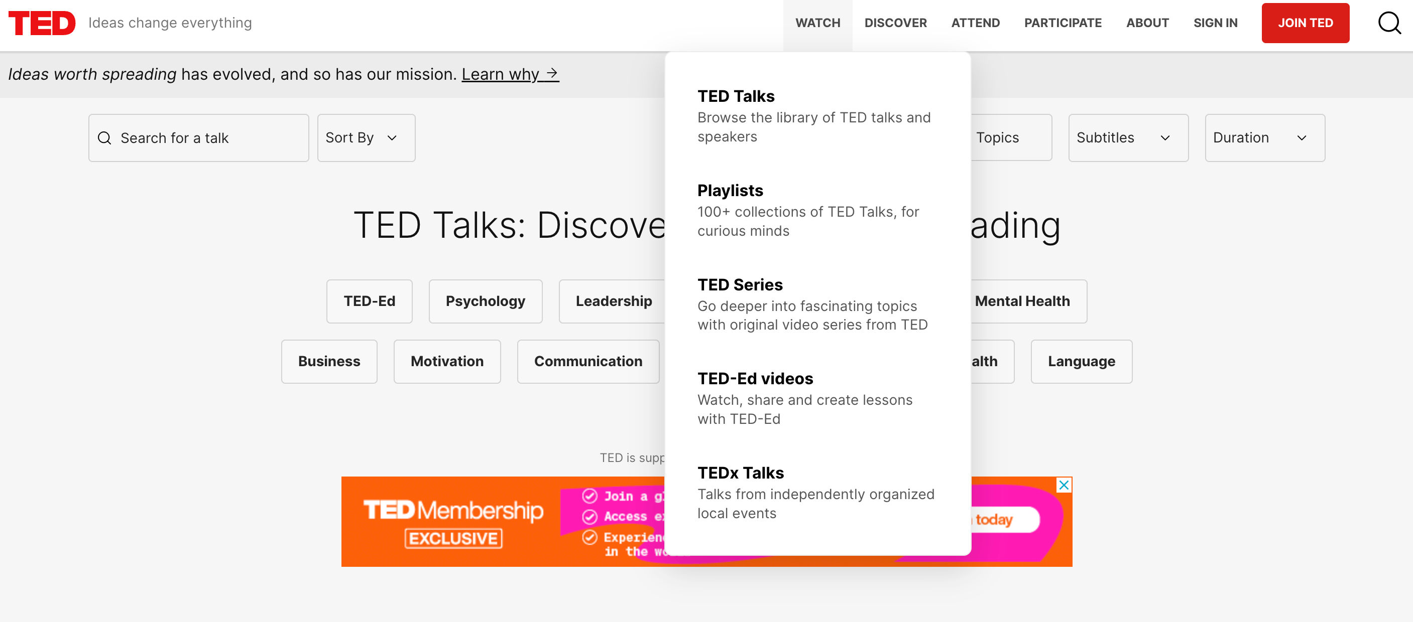
    The TED website’s dropdown menu is narrow and has a single column listed vertically—typical of a regular dropdown menu.

    © TED, Fair Use

  2. Content capacity: Mega menus are designed to accommodate a large amount of content, including text, images, and sometimes even widgets, without the need to scroll. They can showcase multiple levels of hierarchy at once. Regular dropdown menus are simpler and generally suited for shorter lists of options without additional content or media.

  3. User interaction: A mega menu often appears as part of a site-wide navigation bar and can be triggered by hover or click actions. It is best suited for websites with extensive content and categories. A regular dropdown menu is more suitable for straightforward navigation with fewer options, minimizing cognitive load and decision-making time for the user.

  4. Information architecture: Mega menus are useful for complex sites with deep information architecture. They allow users to see the scope of the site's content at a glance and navigate directly to sub-sections. Regular dropdown menus are more appropriate for simpler sites with flat architecture.

    Screenshot of CNN's website's mega menu

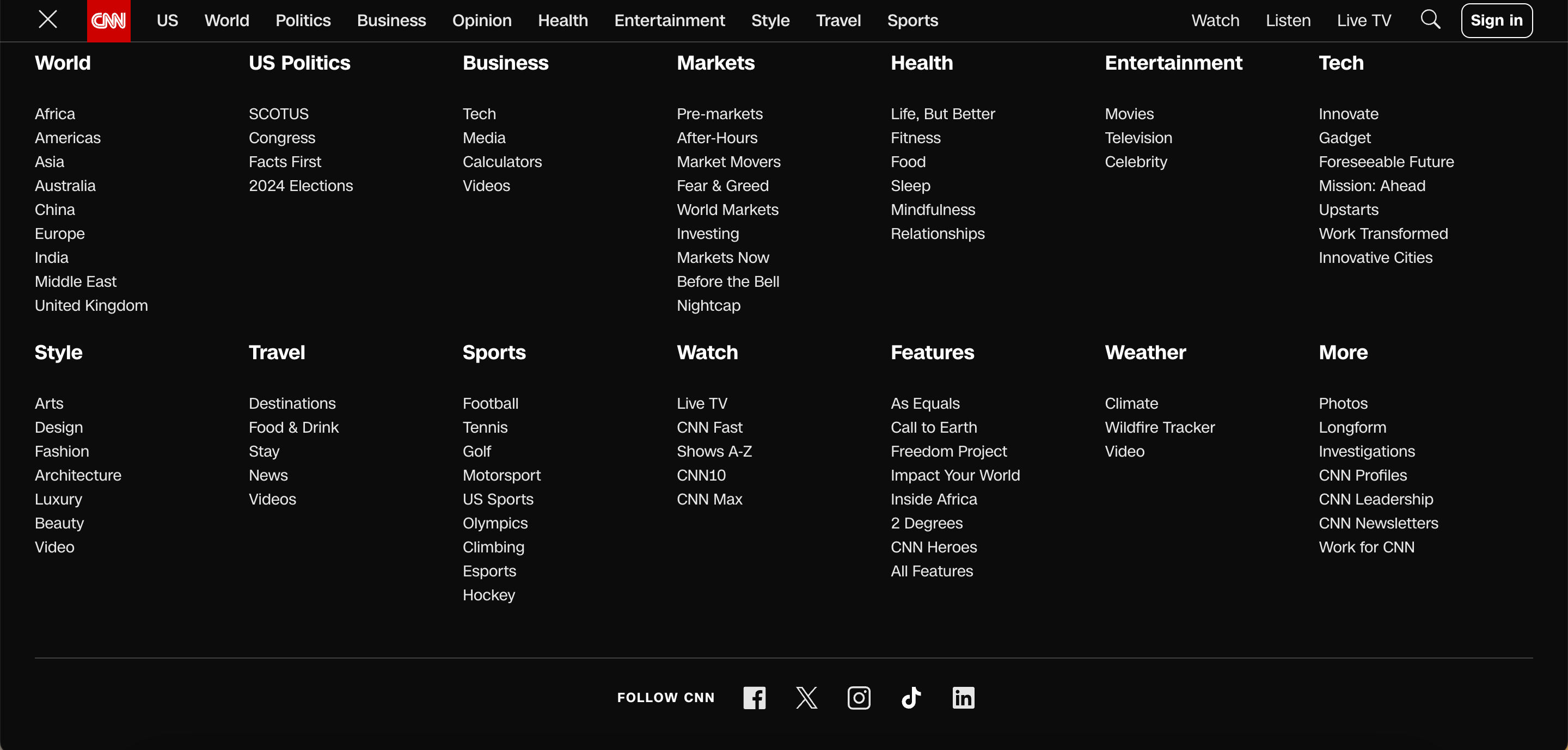
    Websites with a lot of content, like CNN, opt for mega menus due to their complexity and extensive information architecture.

    © CNN, Fair Use

  5. Visual presentation: Mega menus can use different types of content presentation, such as headings, icons, and images, to create an engaging and informative menu. Regular dropdowns typically use a text-based list format.

How to Use Mega Menus in UX Design

For desktop platforms, mega menus offer an attractive alternative to layered navigation. If they are designed to meet users’ expectations, users can do a quick visual scan and single click away from most pages in a site. But to achieve this the many menu items shown in a single popup have to be well organized. On mobile platforms, mega menus are somewhat limited, although certainly not impossible, because of the typically-vertical orientation. The John Lewis website does not attempt mega menus on a mobile, for example—not even in landscape mode.

Mega menu with 50 items arranged into six columns

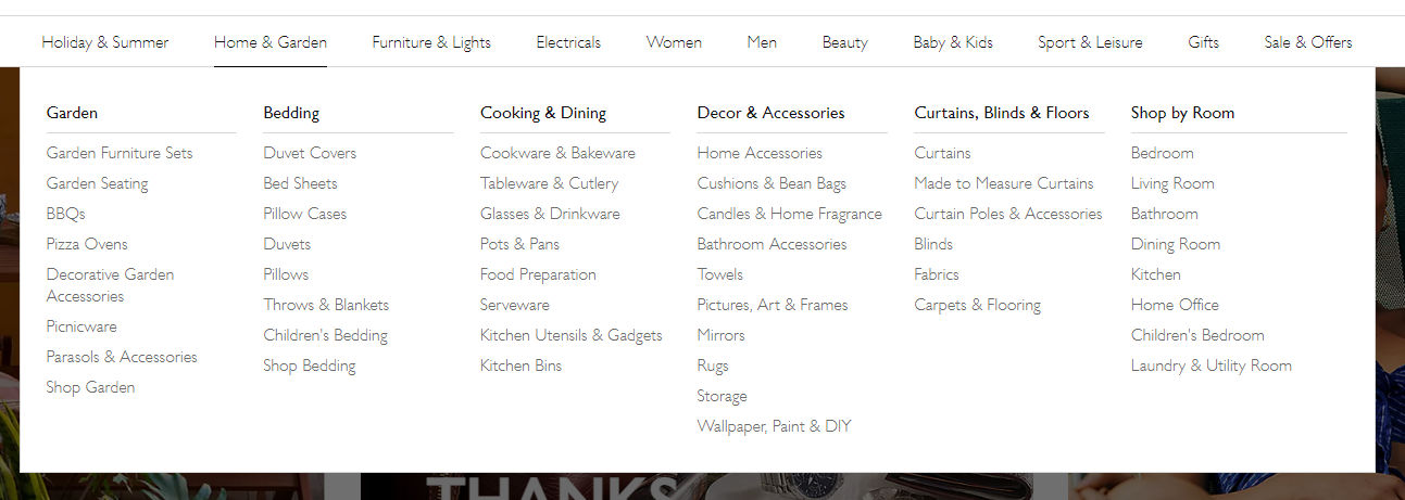
Mega menus can be intimidating, so meaningful grouping is important.

johnlewis.com, Fair Use

Mega menus work best in problem areas that are well understood, such as e-commerce for household items. For online grocery websites, they can quickly become nightmarish because of the sheer number of categories. In domains with more abstract or overlapping categories, users may need the reassurance provided by “incremental” navigation. This involves the more traditional loading of a new page for the menu category selected where users will see examples, illustrations and descriptive text that provides navigational feedback.

Important UX Design Considerations for Mega Menus

UX designers should review the following key points to ensure that mega menus are user-friendly and effective.

  • Clarity and organization: Ensure the mega menu's content is well-organized with clear headings and logical groupings that help users quickly understand their options.

In this video, HCI Professor Alan Dix talks about the importance of structure in mega menus

Transcript

  • Responsive design: Mega menus should be adaptable to different screen sizes, ensuring a seamless experience on desktops, tablets, and smartphones.

  • Accessibility: Implement accessibility standards, such as keyboard navigability and ARIA roles, to make mega menus usable for everyone, including people with disabilities.

  • Simplicity: While mega menus can display more information than standard dropdowns, it's important to avoid overcrowding. Keep options concise and to the point.

  • Visual hierarchy: Use typography, color, and spacing to establish a visual hierarchy that guides users to the most important or commonly used items.

  • Hover and click behavior: Decide whether the menu appears on hover or click, considering that hover can sometimes lead to accidental activation, whereas click ensures a deliberate action.

  • Performance: Optimize for quick loading times; a slow mega menu can frustrate users and detract from the overall experience.

  • Consistent navigation: Keep the navigation experience consistent across the site, so users don't get confused when they switch between pages with and without mega menus.

  • Use of imagery: When applicable, incorporate imagery or icons that can help users quickly identify content, but ensure they don't overwhelm or distract from the menu's main purpose.

  • Testing and iteration: Conduct user testing to gather feedback on the mega menu's usability, making iterative improvements based on real user interactions.

Alternatives to Mega Menus

Mega menus can be daunting for some users. If the grouping is not clear or not as expected, users can struggle to find the item they’re after. Consider providing additional or alternative approaches to navigation, particularly if you need to consider mobile platforms. The two most likely are…

  • Search: The world’s most successful online retailer, Amazon, does not make use of mega menus. Their sites rely primarily on search and cascading menus. However, be sure that your search is effective for users. Too many results are just as bad as too few.

  • Cascading menus: These are the traditional pop-out (horizontal) or pull-down (vertical) menus found in many, if not most, desktop interfaces. They are less-frequently used on mobile platforms because of screen limitations. Their advantage is that users are only shown further choices relevant to their earlier selections, thereby making more efficient use of the screen space. 

Cascading menu of three levels fromm ocado.com

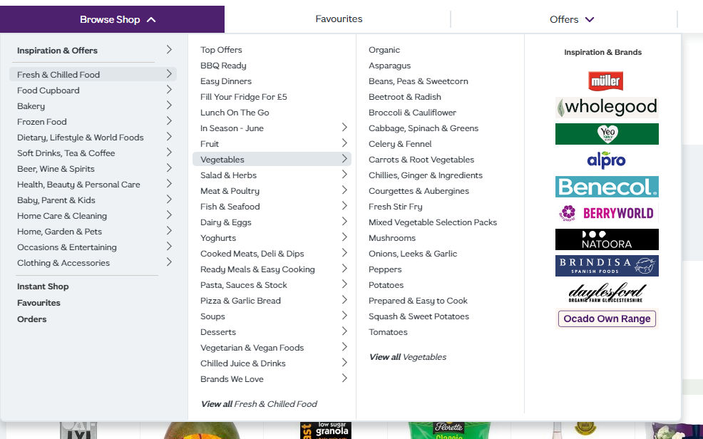
This is a cascading menu from ocado.com, but it occupies half of the screen width when fully extended. Notice that the right-hand column has nothing to do with the vegetables menu.

ocado.com, Fair Use

Questions About Mega Menus?
We've Got Answers!

Are there any disadvantages or drawbacks to using mega menus?

Mega menus can present several disadvantages that may affect user experience and site navigation efficiency. One major drawback is that they can overwhelm users with too much information at once, particularly if not well-organized. A cluttered or overly complex mega menu can confuse users or slow down the process of finding specific items, especially on websites with a vast range of content or products. This information overload can lead to choice paralysis, where users may feel overwhelmed by the options and have difficulty making a decision.

Additionally, mega menus can pose challenges in terms of accessibility and responsiveness. They often require precise mouse control, which can be difficult for users with motor impairments or those using touch devices like smartphones and tablets. On smaller screens, mega menus may not render correctly or may take up too much screen space, which detracts from the overall user experience. Proper design and testing across different devices and user abilities are crucial to ensure that mega menus enhance rather than hinder navigation and accessibility.

Learn more about menu and navigation design in our course Interaction Design for Usability.

How should content be organized within a mega menu for optimal user experience?

For optimal user experience, content within a mega menu should be organized logically and hierarchically, grouping related items together to facilitate quick scanning and navigation. Start by categorizing content into clearly defined sections or columns that reflect the user’s expectations and the site's information architecture. Use headings to label these sections clearly, making it easy for users to identify areas of interest at a glance. This structured approach helps minimize the cognitive load on users as they navigate through the options, improving the speed and efficiency of the navigation process.

Additionally, consider the visual design and layout of the mega menu to enhance usability. Ensure that the design is clean and uncluttered, with sufficient spacing between items to prevent accidental clicks and to accommodate users with motor difficulties. Utilize typography, icons, and color strategically to differentiate sections and highlight important or popular items. Keeping the design consistent with the overall website aesthetic also contributes to a seamless user experience. By carefully planning both the organization and design of a mega menu, you can significantly enhance usability and ensure that users find the information they need without frustration.

Learn more about the optimal user experience in our course User Experience: The Beginner’s Guide.

What are the best practices for designing a responsive mega menu for mobile devices?

It’s crucial to prioritize simplicity and usability when designing a responsive mega menu for mobile devices. Start by adapting the layout to fit smaller screens and ensure that the menu is easily navigable with touch controls. Opt for a collapsible or accordion-style menu that expands when tapped, keeping the interface uncluttered and conserving valuable screen space. This approach allows users to explore deeper menu levels one at a time without overwhelming them with too much information all at once. It’s also essential to ensure that interactive elements are large enough to be tapped easily, avoiding closely packed links that can lead to accidental selections.

Furthermore, integrate a clear and accessible way to close the menu, such as a large “X” icon or swipe gesture, to allow users to exit the menu smoothly. Given the limited space on mobile devices, consider highlighting the most important menu items or using icons alongside text for quick recognition. Use a search feature within the mega menu can also enhance user experience by allowing users to quickly find specific items without navigating through multiple levels. You can create a responsive mega menu that enhances the mobile browsing experience by focusing on a user-friendly layout and streamlined navigation.

Learn more about mobile UX design in our courses Mobile UX Design: The Beginner's Guide and Mobile UI Design.

How can mega menus be made accessible to all users, including those with disabilities?

To make mega menus accessible to all users, including those with disabilities, start with keyboard navigability. Users should be able to navigate through all menu items using keyboard shortcuts alone, such as the Tab key to move forward and Shift+Tab to move backward. Implement clear focus indicators, like borders or color changes, that visually highlight which menu item is currently selected. This feature is crucial for users with visual impairments who rely on screen readers and those who do not use a mouse.

Additionally, ensure that all textual content within the mega menu is readable by screen readers. This involves using proper HTML structures, such as <nav> for navigation blocks and ARIA roles to describe the function of menu components. Consider the timing of how submenus open and close, providing ample time for users to make selections without the menu closing unexpectedly, which can be essential for users with motor impairments. Including options to adjust text size and contrast within the menu can further enhance accessibility, accommodating users with varying levels of visual acuity. By focusing on these aspects, designers can create mega menus that are inclusive and navigable for everyone.

Learn more about digital accessibility in the Master Class Introduction to Digital Accessibility.

What are some common mistakes to avoid when implementing mega menus?

Avoid these common mistakes when implementing mega menus

  • Overload of options: One of the biggest mistakes is cramming too many options into the mega menu. This can overwhelm users and make it difficult to locate specific items quickly. Prioritize content by relevance and popularity, ensuring that users can easily navigate through options without feeling overwhelmed.

  • Poor organization: Illogical organization of content within the menu can lead to confusion and frustration. Group similar items together under clear, concise headings to help users find what they need through intuitive navigation paths.

  • Inconsistent design: Mega menus should be visually consistent with the rest of the website. An inconsistent design can disorient users and detract from the overall user experience. Ensure that the design of the mega menu reflects the site’s aesthetic and brand identity.

  • Overlook mobile users: It’s an oversight not to optimize mega menus for mobile devices. A complex mega menu can become unusable on smaller screens. Adapt mega menus for touch interactions and consider simpler, more compact navigation structures for mobile users.

  • Ignore accessibility: Mega menus must be accessible to all users, including those with disabilities. Ensure that the menu is navigable via keyboard and screen readers, and use ARIA roles and properties to enhance accessibility.

  • Slow performance: Mega menus that are heavy with images, animations, or dynamic content can slow down site performance, particularly on mobile devices. Optimize content for quick loading times to prevent user drop-off due to impatience.

  • Lack of testing: Failing to test the mega menu on different devices and under various user conditions can lead to a poor rollout. Comprehensive testing ensures that all users have a positive experience, regardless of how they access the menu.


Learn more about menu and navigation design in our course Interaction Design for Usability.

How does the use of mega menus impact SEO?

The use of mega menus can impact SEO (Search Engine Optimization) in several ways, both positively and negatively:

  • Improved user engagement and site navigation: Mega menus can enhance user engagement by making it easier for users to find information and navigate a website efficiently. Search engines favor websites with good usability and user experience, which can indirectly boost SEO rankings through reduced bounce rates and increased time on site.

  • Site structure and crawlability: Well-organized mega menus help search engines understand the website's structure by clearly presenting the relationships between different parts of the site. This organization can aid in better page indexing, as search engines can easily crawl and map out the content hierarchy, which is crucial for SEO.

  • Potential overuse of links: However, mega menus that contain excessive links can dilute link equity across a site. This occurs when too many links on a single page spread the page’s authority too thin, which can potentially reduce the ranking power of important pages. It’s essential to strategically use links in mega menus to avoid overwhelming both users and search engines.

  • Keyword optimization: Mega menus also offer an opportunity to include relevant keywords in navigation links, which can help improve the SEO if done correctly. These keywords can give search engines more context about the linked pages, which enhances the relevancy of those pages for specific search queries.

  • Mobile optimization issues: If mega menus are not properly optimized for mobile devices, they can lead to a poor user experience, which negatively impacts mobile SEO. Since mobile-friendliness is a ranking factor, ensuring that mega menus are responsive and easy to use on all devices is critical.

  • Loading speed: Large mega menus, especially those loaded with images or complex scripts, can slow down page loading times. Since page speed is a ranking factor for Google, slow-loading mega menus can negatively impact SEO.

Learn more about menu, navigation design and SEO in our course Interaction Design for Usability.

Can mega menus be integrated with e-commerce platforms effectively, and if so, how?

Mega menus can be effectively integrated with e-commerce platforms to enhance user navigation and improve the shopping experience. E-commerce sites allow customers to see the breadth of available products at a glance through the organization of extensive product categories and subcategories within a single, expansive menu which speeds up the browsing process. It’s crucial to design these menus with clear, logical categorization and to use visual cues such as icons and images, which help users quickly identify the type of products they are interested in. This setup reduces the number of clicks needed to reach desired products, facilitating a smoother and faster shopping journey.

To implement mega menus effectively on e-commerce platforms, ensure they are responsive and load efficiently to maintain a high level of user experience across all devices, especially mobile. Including features such as dynamic product highlights, promotions, and new arrivals within the mega menu can also drive attention to specific items or deals. Additionally, integrating search functionality within the mega menu can allow users to find specific products directly which will enhance the utility of the menu. If you focus on user-friendly design and quick access to products, a mega menu can significantly boost usability and satisfaction on an e-commerce site.

Learn more about menu and navigation design in our course Interaction Design for Usability.

What metrics should be used to evaluate the effectiveness of a mega menu?

Focus on metrics that measure user interaction and navigation efficiency to evaluate the effectiveness of a mega menu. Key metrics include click-through rates (CTR) on menu items, which indicate how effectively the menu draws user interest and guides them deeper into the site. Also, monitor the average time users spend navigating the menu and the number of clicks required to reach desired content; fewer clicks and efficient navigation typically signify a well-structured menu.

Additionally, analyze bounce rates for pages accessed through the mega menu to assess if users find the content relevant and engaging. High bounce rates might suggest mismatches between menu labels and content. Conversion rates stemming from menu interactions also provide insights into whether the menu setup effectively drives business goals, such as sales or sign-ups. When you combine this quantitative data with user feedback on the menu's usability and satisfaction can comprehensively evaluate and refine the mega menu's design.

Learn more about metrics and data in our course Data-Driven Design: Quantitative Research for UX.

Earn a Gift Earn a Gift, Answer a Short Quiz!

1
2
3
4
1
2
3
4
Question 1
Question 2
Question 3
Get Your Gift
Interaction Design Foundation logo

Question 1

What is the primary function of mega menus on websites?

1 point towards your gift

  • To display large images for marketing purposes and brand identity
  • To provide an overview of all available options within a site's complex information architecture
  • To reduce the number of clicks needed to reach a destination
Interaction Design Foundation logo

Question 2

How do mega menus differ from regular dropdown menus?

1 point towards your gift

  • Mega menus are typically narrower and simpler.
  • Mega menus display items in a single vertical column down the side of a webpage.
  • Mega menus display multiple levels of hierarchy at once in a large panel.
Interaction Design Foundation logo

Question 3

Why is clarity and organization crucial for mega menus?

1 point towards your gift

  • To help users quickly understand their options
  • To make the menu visually appealing
  • To reduce the number of menu items

Learn More About Mega Menus

Make learning as easy as watching Netflix: Learn more about Mega Menus by taking the online IxDF Course Human-Computer Interaction: The Foundations of UX Design.

Why? Because design skills make you valuable. In any job. Any industry.

 In This Course, You'll

  • Get excited about designing products and experiences people truly love. From medical apps that save lives to educational tools that bridge learning gaps, Human-Computer Interaction (HCI) is at the heart of every great User Experience (UX) Design. You'll learn what people enjoy and how to use that knowledge to create meaningful, engaging solutions. No design background? No problem. You already have transferable skills, like empathy, problem-solving, communication, and organizing information, so you have more HCI knowledge than you realize. HCI blends psychology, design, engineering, and ethics to help you craft experiences that feel intuitive and make it easy for people to fulfill their needs and reach their goals. That's what we human beings love. More love means higher business profits and a salary that reflects your value.

  • Make yourself invaluable when you discover the science behind great design. You'll master timeless human-centered design skills like perception, insight, and strategic thinking that become even more powerful in an AI-enhanced world. Turn AI into your superpower with your unique human understanding that no algorithm can generate on its own. Studies show that tech and design-related occupations will grow 23% by 2031, much faster than the average. HCI skills are in demand across every industry. This course helps you structure your existing skills and apply them creatively, from idea to delivery. With your HCI skills, it's easy to drive customer loyalty and business success because you know how to design for people. Level up in your current role or use your new skills to break into a career in design and tech.

  • Gain confidence and credibility as you build experiences so effortless they feel like second nature. It's easier than you think. With ready-to-use templates for global navigation, personas, and more, you'll get everything you need to immediately apply your skills and create user-centered results people keep coming back to. Build a standout portfolio and fast-track your career with optional hands-on exercises. This course will give you real-world human-centered design solutions, such as a website, app, or smart device, to showcase your in-demand skills.

It's Easy to Fast-Track Your Career with the World's Best Experts

Master complex skills effortlessly with proven best practices and toolkits directly from the world's top design experts. Meet your expert for this course:

  • Alan Dix: Author of the bestselling book “Human-Computer Interaction” and Director of the Computational Foundry at Swansea University.

Get an Industry-Recognized IxDF Course Certificate

Increase your credibility, salary potential and job opportunities by showing credible evidence of your skills.

IxDF Course Certificates set the industry gold standard. Add them to your LinkedIn profile, resumé, and job applications.

Course Certificate Example

Be in distinguished company, alongside industry leaders who train their teams with the IxDF and trust IxDF Course Certificates.

Our clients: IBM, HP, Adobe, GE, Accenture, Allianz, Phillips, Deezer, Capgemin, Mcafee, SAP, Telenor, Cigna, British Parliament, State of New York

All Free IxDF Articles on Mega Menus

Read full article
User Interface Design Guidelines: 10 Rules of Thumb - Article hero image
Interaction Design Foundation logo

User Interface Design Guidelines: 10 Rules of Thumb

Learn to design with your user’s needs and expectations in mind by applying Jakob Nielsen and Rolf Molich’s Ten User Interface Guidelines. These heuristics have been reflected in many of the products designed by some of the most successful companies in the world such as Apple, Google, and Adobe. Fur

Social shares
1.4k
Published
Read Article

User Interface Design Guidelines: 10 Rules of Thumb

User Interface Design Guidelines: 10 Rules of Thumb

Learn to design with your user’s needs and expectations in mind by applying Jakob Nielsen and Rolf Molich’s Ten User Interface Guidelines. These heuristics have been reflected in many of the products designed by some of the most successful companies in the world such as Apple, Google, and Adobe. Further evidence of how their design teams incorporate these rules into their design process is reflected in the user interface guidelines published and shared by these companies. This article will teach you how to follow the ten rules of thumb in your design work so you can further improve the usability, utility, and desirability of your designs.

Nielsen and Molich's 10 User Interface Design Guidelines

Jakob Nielsen, a renowned web usability consultant and partner in the Nielsen Norman Group, and Rolf Molich, another prominent usability expert, established a list of ten user interface design guidelines in the 1990s. Note that there is considerable overlap between Nielsen and Molich's heuristics and Ben Shneiderman’s 'eight golden rules'. These 10 rules of thumb further iterate upon Shneiderman’s eight golden rules 4 years after Shneiderman’s initial publication.

  • Visibility of system status. Users should always be informed of system operations with easy to understand and highly visible status displayed on the screen within a reasonable amount of time.

  • Match between system and the real world. Designers should endeavor to mirror the language and concepts users would find in the real world based on who their target users are. Presenting information in logical order and piggybacking on user’s expectations derived from their real-world experiences will reduce cognitive strain and make systems easier to use.

  • User control and freedom. Offer users a digital space where backward steps are possible, including undoing and redoing previous actions.

  • Consistency and standards. Interface designers should ensure that both the graphic elements and terminology are maintained across similar platforms. For example, an icon that represents one category or concept should not represent a different concept when used on a different screen.

  • Error prevention. Whenever possible, design systems so that potential errors are kept to a minimum. Users do not like being called upon to detect and remedy problems, which may on occasion be beyond their level of expertise. Eliminating or flagging actions that may result in errors are two possible means of achieving error prevention.

  • Recognition rather than recall. Minimize cognitive load by maintaining task-relevant information within the display while users explore the interface. Human attention is limited and we are only capable of maintaining around five items in our short-term memory at one time. Due to the limitations of short-term memory, designers should ensure users can simply employ recognition instead of recalling information across parts of the dialogue. Recognizing something is always easier than recall because recognition involves perceiving cues that help us reach into our vast memory and allowing relevant information to surface. For example, we often find the format of multiple choice questions easier than short answer questions on a test because it only requires us to recognize the answer rather than recall it from our memory.

  • Flexibility and efficiency of use. With increased use comes the demand for less interactions that allow faster navigation. This can be achieved by using abbreviations, function keys, hidden commands and macro facilities. Users should be able to customize or tailor the interface to suit their needs so that frequent actions can be achieved through more convenient means.

  • Aesthetic and minimalist design. Keep clutter to a minimum. All unnecessary information competes for the user's limited attentional resources, which could inhibit user’s memory retrieval of relevant information. Therefore, the display must be reduced to only the necessary components for the current tasks, whilst providing clearly visible and unambiguous means of navigating to other content.

  • Help users recognize, diagnose and recover from errors. Designers should assume users are unable to understand technical terminology, therefore, error messages should almost always be expressed in plain language to ensure nothing gets lost in translation.

  • Help and documentation. Ideally, we want users to navigate the system without having to resort to documentation. However, depending on the type of solution, documentation may be necessary. When users require help, ensure it is easily located, specific to the task at hand and worded in a way that will guide them through the necessary steps towards a solution to the issue they are facing.

Google Inc., the multibillion-dollar technology company, certainly produces designs that reflect the above heuristics. Jon Wiley, the head designer of Google Search in 2012 once said:

“When I think of design and creating great user experiences, I generally think of it in terms of three things: usability, utility and desirability.”

Nielsen and Molich’s 10 user interface guidelines cover these three key components of user experience quite nicely, which means you can likely improve the user experience of your designs by following these guidelines!

Learn How Adobe Integrates Nielsen and Molich's Ten User Interface Design Guidelines

Adobe Systems Incorporated, the large North American computer software company, is a great example of how designs reflecting Nielsen and Molich’s ten user interface guidelines can lead to success for a company. One of their most popular products, Adobe Photoshop, which is a raster graphics editor exhibits the characteristics of a well designed user interface that reflects these guidelines.

We will take a closer look at how Adobe Photoshop reflects each of these guidelines in order to inspire you to improve the usability, utility, and desirability of your own designs by incorporating the 10 rules of thumb into your own work.

1. Visibility of System Status

Photoshop does a great job of letting the user know what’s happening with the program by visually showing the user what their actions have led to whenever possible. For example, when users move layers around in the Layers palette, they can visually see the layer being represented as physically dragged within the space.

The cursor graphic goes from representing an open-hand to a gripped hand when the user drags a layer around within the Layers palette. This makes it easier to instantly understand the system status. Additionally, Adobe’s choice of using a ‘hand’ is a great example of the second guideline where the system matches the real world.

© Adobe Systems Incorporated, Fair Use

2. System Match to the Real World

An example of Photoshop mimicking the real world in terms and representations that their target users would understand, is where they design the information structure and terminology to mirror the same wording we would use in the world of photography or print media. Familiar concepts and terms like RGB, Hue/Saturation/Brightness and CMYK are used to represent color, while various tools like the dodge tool and the burn tool mimics a traditional darkroom technique for photographs.

Photoshop’s Dodge Tool and Burn Tool mimics a traditional darkroom technique for photographs

© Adobe Systems Incorporated, Fair Use

Photoshop utilizes the term, “Exposure”, as commonly used in the world of photography.

© Adobe Systems Incorporated, Fair Use

3. User Control and Freedom

Photoshop is very good at providing users with control every step of the way. As the user makes changes to an image or adds various artistic effects, they are able to quickly and easily take a step backwards if they make an error, for instance.

The users are in control as they can take a Step Backward or Step Forward under the Edit menu, or alternatively they can use Photoshop’s keyboard shortcuts like Alt+Ctrl+Z, for example.

© Adobe Systems Incorporated, Fair Use

4. Consistency and Standards

Photoshop maintains a standard layout and look and feel when it comes to the menu bar. They also utilize commonly known terminology such as “New…”, “Open…”, “Save As…”, etc.

The File menu in Photoshop displays a variety of highly familiar options.

© Adobe Systems Incorporated, Fair Use

5. Error Prevention

To prevent users from making errors, Photoshop provides a brief description or label of the tools when a user hovers over it to help make sure users are using the proper tool for the task at hand.

The user hovers over the eraser icon and Photoshop displays the “Eraser Tool” label.

© Adobe Systems Incorporated, Fair Use

Advance Your Career With This Free Template for “Bad UI Design Mistakes and How to Avoid Them”
Bad UI Design Mistakes and How to Avoid Them
We respect your privacy
Get 1 powerful email each week: Design a life you love!

6. Recognition rather than Recall

Whether it be making a selection from the artistic filters menu, or opening a new image file, Photoshop provides a sample view for users to make the right choice. This allows for the user to visually recognize what they’re looking for instead of having to recall the name or typing it in to search for it. Perhaps you have encountered other photo editing programs which ask you to recall and type the name of the file you want to work on. This can indeed be really difficult to recall as it is often something to the effect of: 29412_09342.JPG.

The user is able to visually recognize the sunset image by its thumbnail and select it.

© Adobe Systems Incorporated, Fair Use

7. Flexibility and Efficiency of Use

One of the many reasons for frequent users to love Photoshop is for its flexibility and efficiency. Users are able to utilize its flexibility by organizing and adding to their Workspace, as well as making things more efficient by saving it for future use.

Photoshop gives frequent users the ability to save their preferred workspace-setup.

© Adobe Systems Incorporated, Fair Use

8. Aesthetic and Minimalist Design

The toolbar in Photoshop only displays the icons and is neatly tucked to the side to help keep clutter to a minimum, and maintain a minimalist aesthetic.

The Photoshop toolbar is minimalist and avoids clutter by representing the tools with icons only.

© Adobe Systems Incorporated, Fair Use

9. Help Users Recognize, Diagnose and Recover from Errors

Whenever there is an error, Photoshop provides dialogue that lets the user know what went wrong and how to fix it.

In this error message for the user’s misuse of the clone stamp, Photoshop explains what went wrong, the reason why and how the user should proceed from there.

© Adobe Systems Incorporated, Fair Use

10. Help and documentation

Help and documentation can be accessed easily via the main menu bar. From there, you can find a wide variety of help topics and tutorials on how to make full use of the program.

The window displays information on how to create rollovers in the context of web graphics. The user is also able to see a list of topics on the side menu.

© Adobe Systems Incorporated, Fair Use

10 Steps to Improve Usability, Utility, and Desirability by Implementing Nielsen and Molich’s User Interface Design Guidelines

As a designer, you should have the ability to critique the designs of your own as well as the work of others with well supported reasoning. Applying Nielsen and Molich’s 10 rules of thumb in evaluating interface design will help you recognize any potential issues as well as guide you and your team in creating better experiences for your users. Here’s a worksheet for you to practice with as you learn the skill of recognizing whether or not these rules have been applied and when these rules have been violated. Finally, it’s time to improve the website or app by further implementing the 10 guidelines.

Download PDF here.

The Take Away

When you follow Nielsen and Molich’s 10 user interface guidelines you will design with usability, utility and desirability in mind. Just as the designers of successful companies like Apple, Google, and Adobe, you’ll be able to support your design decisions with well researched heuristics and be confident in creating designs that are both usable and beautiful. To practice recognizing these 10 rules of thumb, go ahead and work through the exercise outlined in the attached file from the above section.

References and Where to Learn More

To find more information on Jakob Nielsen’s ‘Enhancing the Explanatory Power of Usability Heuristics’ please see

Course: UI Design Patterns for Successful Software

Hero Image: Barry Schwartz. Flickr, CC BY-NC 2.0

Feel Stuck?
Want Better Job Options?

AI is replacing jobs everywhere, yet design jobs are booming with a projected 45% job growth. With design skills, you can create products and services people love. More love means more impact and greater salary potential.

At IxDF, we help you from your first course to your next job, all in one place.

See How Design Skills Turn Into Job Options
Privacy Settings
By using this site, you accept our Cookie Policy and Terms of Use.
Customize
Accept all

Be the One Who Inspires

People remember who shares great ideas.

Share on:

Academic Credibility — On Autopilot

Don't waste time googling citation formats. Just copy, paste and look legit in seconds.