Typography is the discipline designers use to arrange typefaces in a user interface to ensure text is legible, readable, and scalable. It must also be visually appealing to users. The right typography can enhance a product’s aesthetic, optimize user-friendliness, and contribute to brand perception.
How Important is Typography in UX Design and Product Design?
Of the many factors that shape a website or application's user interface (UI), typography is vital. It can significantly influence a user's experience with your product. So, the way you portray text has a huge bearing on your work as a user experience (UX) designer. In fact, how long users stay on your website or app will depend largely on your typographical choices.
For example, typography is half of your message when you include written copy on your website. That’s why it’s important to keep your copy streamlined and efficient. You can think of typography as the form that carries the substance of what you want users to find and learn. What you write, how you write, and how that text looks all come together to make an impact. That makes it crucial to understand how to use typography effectively.
Typography differs from type. Type is the style or appearance of text in itself. Also, type sometimes refers to the process of working with text. Your decisions about typography in user interface design go beyond just how to select fonts, for example. There’s more involved than whether to use a sans-serif font or a serif.
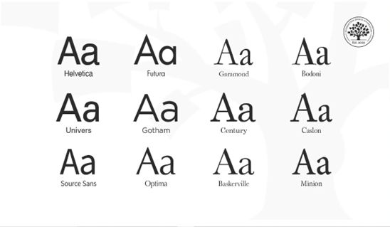
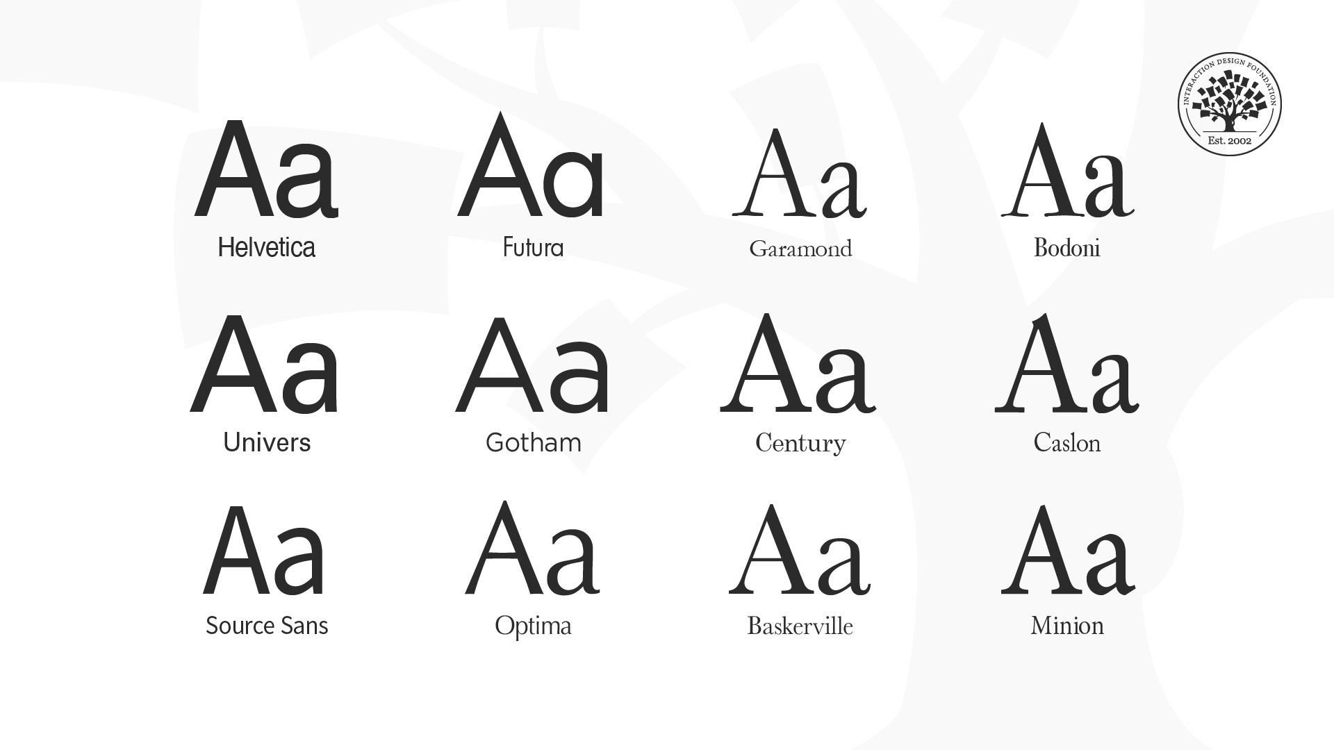
Typefaces of Helvetica, Futura, Garamond, Bodoni, Univers, Gotham, Century, Caslon, Source Sans, Optima, Baskerville and Minion.
© Daniel Skrok and Interaction Design Foundation, CC BY-SA 4.0
When you pick the right typography for your UI design work, it:
Communicates Essential Information
Your selection of typography for your interface acts as a visual communication tool. It helps users find the information they need swiftly. It guides their eyes as they navigate and interact with your interface. That way, you can ensure that the most crucial content stands out and guides users to take actions seamlessly.
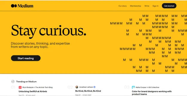
Medium uses clean, minimalist typography that is easy to read. They utilize optimal line lengths, line spacing, font sizes and font families.
© Medium, Fair Use
Enhances Readability and Accessibility
When you use good typography in your digital product, you prioritize readability and accessibility. This makes it easier for users to consume and navigate content, whoever and wherever they are.
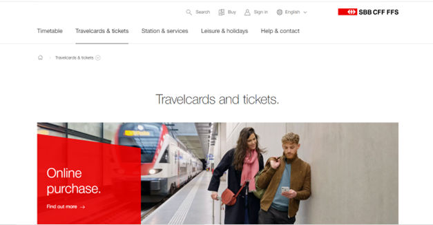
SBB CFF FFS – Swiss Federal Railways – uses fonts with pristine alignments and styles, boosting readability and accessibility.
© SBB CFF FFS, Fair Use
Establishes a Consistent Brand Tone
It can help create a consistent tone throughout a website or app. This reinforces your brand identity for your target audience and makes it memorable for all users. For example, if a product team is designing their startup’s fashion app for young people, the look of the text should have a trendy feel.
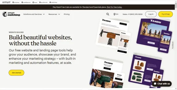
Mailchimp (mailchimp.com) – Mailchimp balances playful, friendly fonts for headlines with highly legible body text. Their typography aligns with their quirky brand personality.
© Mailchimp, Fair Use
Differentiates the Product
When you find that unique typography that’s right for your brand, you can help set your website or app apart from competitors. This enhances its appeal to users and improves user engagement.
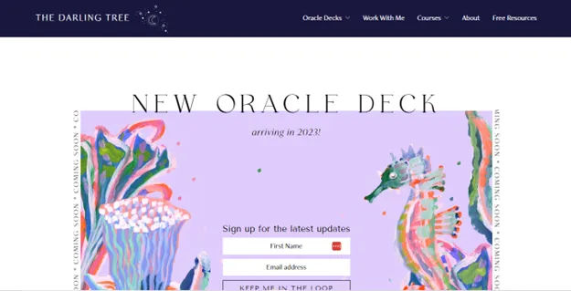
The Darling Tree presents a beautifully unique and appropriate brand image also through its typography.
© The Darling Tree, Fair Use
Drives Conversion
If you’ve got your typography well thought out, it can encourage users to respond to call-to-action buttons. That will boost conversion rates and ultimately, sales.
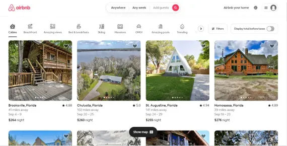
Airbnb also uses typography to their advantage. They use minimalistic fonts and lines that are both visually appealing and easy to read.
© Airbnb, Fair Use
What are Key Elements of Typography?
When you set out to pick the best and most appropriate typography, it isn’t just about good design. Typography is also a powerful tool to create an emotional connection with users. When you use the right typeface, size, and spacing, you can evoke certain feelings in your users. That is a large part of how to form an engaging experience for them. What’s more, design teams for brands all over the world understand how to leverage typography to add personality to their designs and make them stand out.
Effective typography is a blend of several elements. Here are the main ones:
Fonts and Typefaces
Fonts are specific weights within a typeface. You choose a typeface; you use a font. If you were to select Arial as your typeface, then Arial bold, italic and regular would be your fonts. As such, a font is the distinct, stylized characteristics found within a typeface. It’s important to choose your fonts and typefaces well in your projects.
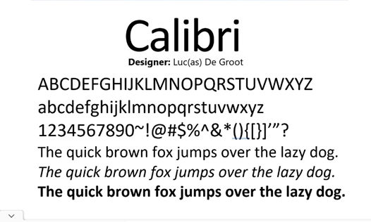
Calibri is a popular typeface with a warm and soft feel, featuring in Microsoft applications, for example.
© Free Fonts, Fair Use
Letter and Line Spacing
These also go by the names of kerning and leading, respectively. They influence the readability of the text. When you optimize the space between letters and lines, you ensure the text doesn't appear too crowded or too sparse.
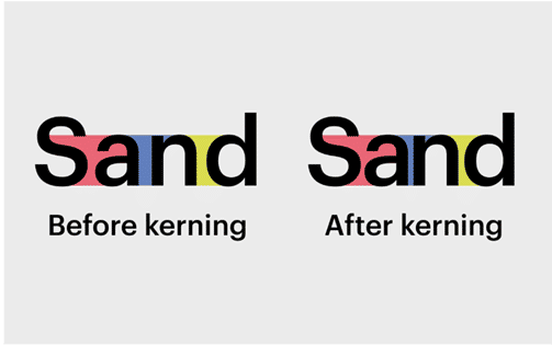
Kerning in action, tightening up the letters.
© Fabrik, Fair Use
Font Weight, Height, and Size
These aspects of typography contribute to uniformity in the text. When you make them consistent across your website or app, you maintain your brand’s identity and enhance readability.
Find all the little elements of type here.
© Aelaschool, Fair Use
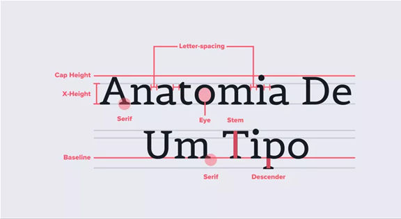
Character
This is an individual element—commonly a single letter, number or punctuation mark.
Baseline
This is the invisible line upon which all letters rest. You can create a grid using the baseline of your chosen type to create a harmonious layout. Learn more about grid systems here.
x-height
This is the distance between the baseline and the height of the lowercase letter “x”. If you’re working with a font that has an unusually large (or small) x-height, it could affect the entire interface—sometimes even breaking the layout.
Stroke
This is a straight or curved line that creates the principal part of a letter.
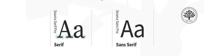
Serif
This is the stroke, or foot-like element, connected to the end of the main stroke of some typefaces. Serif fonts are often more readable, as the tiny “feet” guide the readers’ eyes to the next character. Nonetheless, because of their tiny size, they may not always render well on screens.
Sans serif
This is a typeface without strokes or any extra elements at the bottom of a letter. Due to the lower resolution of screens, sans serifs are often preferable for digital interfaces. As technology improves and screens come equipped with better resolutions, this may no longer be a deciding factor in choosing a font.
Ascender and descender
The vertical stroke that extends upward beyond the x-height and downward beyond the baseline, respectively.
Alignment
This is how text is positioned. There are 4 main alignments: left, right, centered and justified. Alignment helps designers to create a coherent composition.
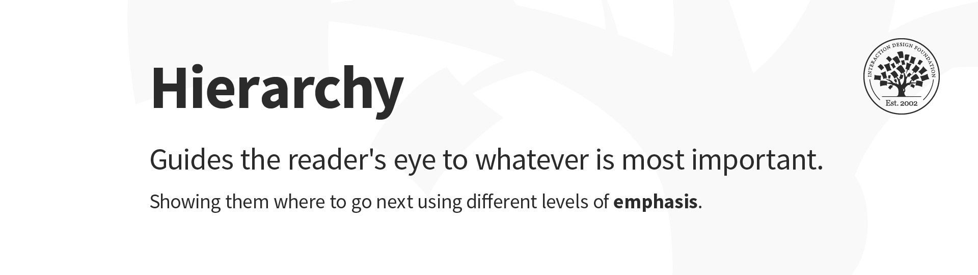
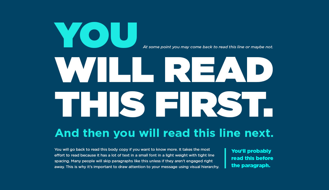
Hierarchy
This is the principle of arranging elements according to importance. Creating a strong hierarchy is paramount to helping users identify where to look first. No matter the screen size, if an interface has multiple elements, it is important to guide the user towards the most important elements of the screen. Your choice of font, its weight, size, letter spacing, alignment and surrounding white space, along with other visual design elements, work together to create this hierarchy.
White Space
Also called whitespace and negative space, this is the area between elements on a page. When you use white space properly, it can make your interface look clean and organized. That will help your design to “breathe” while it lets users find what they need to quickly and effortlessly. That seamlessness is a magic component of a great user experience.
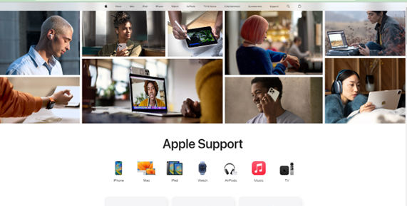
Apple employs effective use of white space to deliver a calm and seamless experience.
© Apple, Fair Use
How to Use Typography Best?
Here are some key principles, best practices, and examples to consider so you can optimize how users interact with your design:
Maintain Consistency
Consistency in typography helps you create a seamless user experience. So:
○ Stick to a defined set of fonts and typefaces throughout your design. That’s essential also for building and maintaining trust with your users. It’s best to keep to the standard fonts rather than have ones that are overly “interesting” for users to think about.
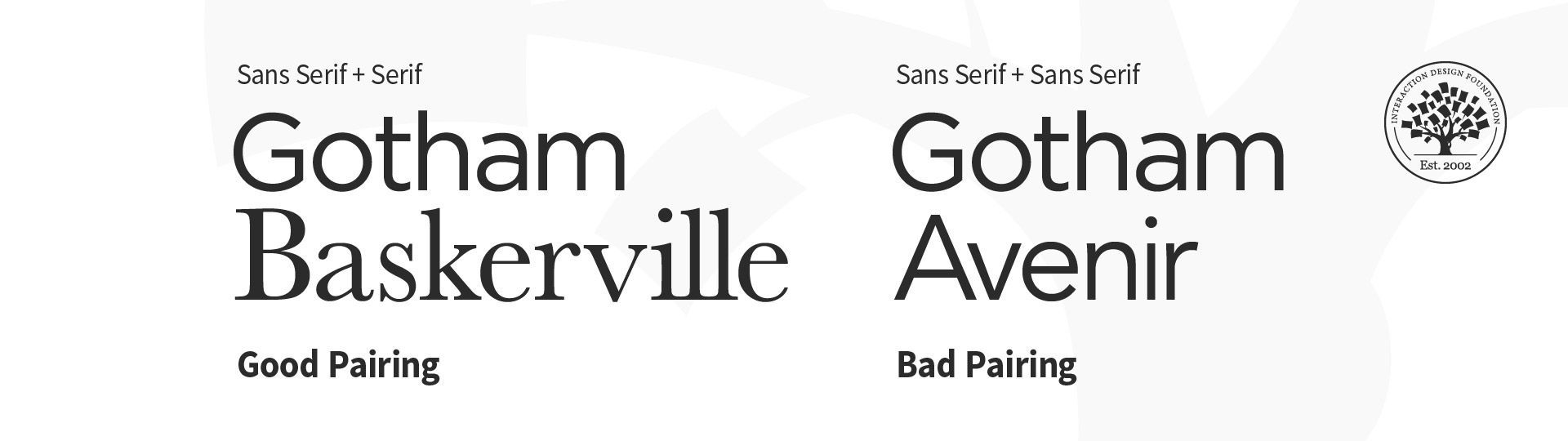
○ Use no more than 3 different fonts on a website, and don’t have too many type sizes and styles. Two fonts that complement each other are ideal.
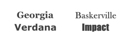
Georgia and Verdana complement each other; Baskerville and Impact don’t.
© Nick Babich, Fair Use
Establish a Clear Hierarchy
A clear typographic hierarchy guides users through the content. As with information architecture in general, this makes it easier for them to find what they're looking for. Ensure they don’t hesitate or become confused. This is essential for any product or service. So, make sure you distinctly style headers, subheaders, and body text with the best font sizes and weights to establish this hierarchy.
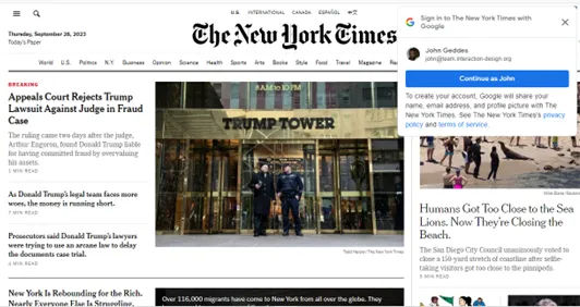
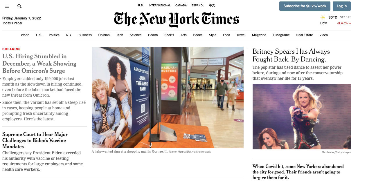
The New York Times exemplifies a clear hierarchy in type.
© The New York Times, Fair Use
Ensure Readability and Accessibility
Make the text easy to read and accessible to all users. Choose font sizes, weights, and line spacings that enhance readability. It’s best to limit the line length to 60 characters per line, or 30 to 40 per line for mobile. Also, remember how color contrast is especially important for users with visual impairments. And bear in mind, too, that “impairments” can also be temporary ones. A user may have to squint to read on a mobile phone screen on a bright sunny day. That’s a form of impairment.
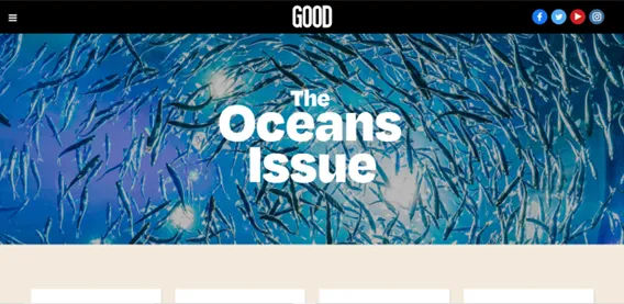
Good exemplifies easily readable, accessible typography on its site.
© Good, Fair Use
Use Responsive Typography
Use a typeface that works well whatever its size. Your design will have to scale well across different devices, and so should the typefaces you use. Make sure the text stays legible and aesthetically pleasing whether users view it on a smartphone, tablet, or desktop. Remember too that mobile devices are behind the majority of experiences. So, envision small screen sizes and how your text looks on these.
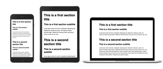
Remember that things look different on different devices; that includes your typography.
© Adrian Bece, Fair Use
Use Visual Contrast in Typography
You can adjust visual contrast through color, size, or typeface variations. Use it to highlight specific messages or areas of the page, improve readability and guide user attention. However, don’t rely solely on color to convey information. Remember other factors, and this is especially important for accessibility purposes.
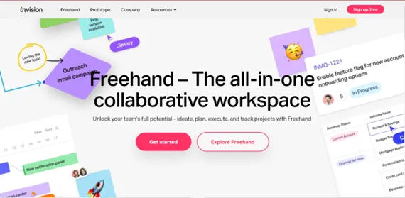
InVision’s home page shows a highly effective use of contrast.
© InVision, Fair Use
Consider the Role of Animated Copy in Typography
When you animate the copy, especially banners or headers, you can catch users' attention and increase engagement rates. However, make sure the animations are light and aesthetically pleasing to avoid distracting users.
Use a font that reflects your brand identity
Select a font that best reflects your brand’s values and personality. Of course, if you’re designing for an established brand, follow their style guide to preserve the brand identity.
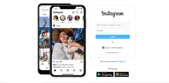
Instagram’s simple yet stylish font is a powerful brand identifier as well as easy on the eye.
© Instagram, Fair Use
Do your user research and usability testing
To confirm you have the best typography going in your visual design. User testing can reveal great insights about how well you’ve matched effective text to an intuitive design overall.
Remember that typography should not overpower the content
The main goal in UX and UI design is to make the content easier to read and understand. If too much is going on within the design, it can distract from the message. Therefore, strive for balance, with a view to cater to the many potential contexts involved in a user journey. Overall, remember that the right typography can make your design speak to users on more levels than one.


