Your constantly-updated definition of Design Handoffs and collection of videos and articles. Be a conversation starter: Share this page and inspire others!
98 Shares
What are Design Handoffs?
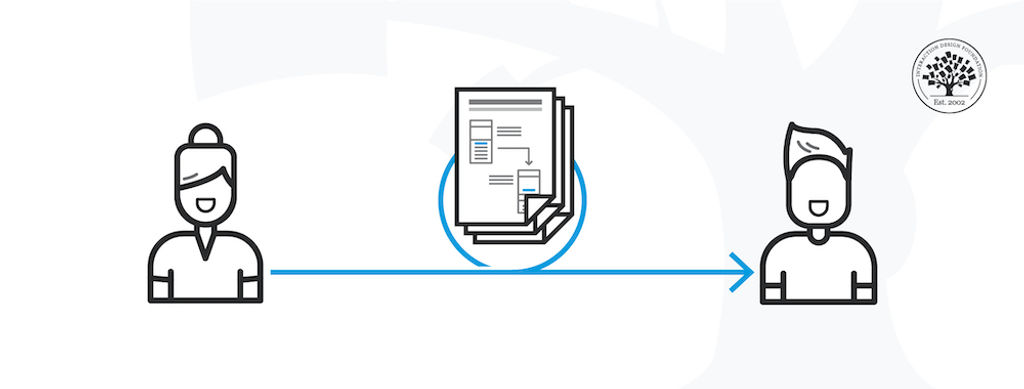
Design handoff is the process of handing over a finished design for implementation. It involves transferring a designer’s intent, knowledge and specifications for a design, and can include visual elements, user flows, interaction, animation, copy, responsive breakpoints, accessibility and data validations.
Apart from the specifications (the “what”) of the design decisions and changes, the design handoff may also include problem statements and business logic (the “why”) that enable software developers to better understand the design context.
The design handoff bridges a designer’s vision and the final product built by software developers. A poorly implemented design leads to a broken user experience. As Szymon Adamiak, the Co-founder of Hype4 Mobile, explains in this video, a smooth handoff and a tight collaboration between designers and developers is crucial for a good end-user experience.
Transcript
Transcript loading ...
What Should You Include in a Design Handoff?
Most teams continually iterate and improve their products to stay ahead of the competition. Every improvement or new feature you design will involve a design handoff. What you include in the handoff depends on the type of project you’re working on, the stage of product development, and the nature of design changes you need to communicate to the developers.
If the changes are primarily visual (say, changes in the screen layout), your design software’s built-in specifications (e.g., inspect, developer mode) should provide all the technical information the developer needs. In this case, you only need to inform the developer that the design has been updated. Most design tools now allow you to add comments and tag users directly in the design file to direct your team members’ attention to the design changes.
If the changes are more complex, for example, changes in the underlying user flow and business logic, you will need to add that information to the designs you share.
In most design tools, developers can easily extract this information without much input from the designer.
For images and icons, check with the developers about the type of files they need (file extensions, image resolutions, naming conventions and file size restrictions). Relying on vector-based icons (for example, .svg file formats) is often the easiest for designers and developers.
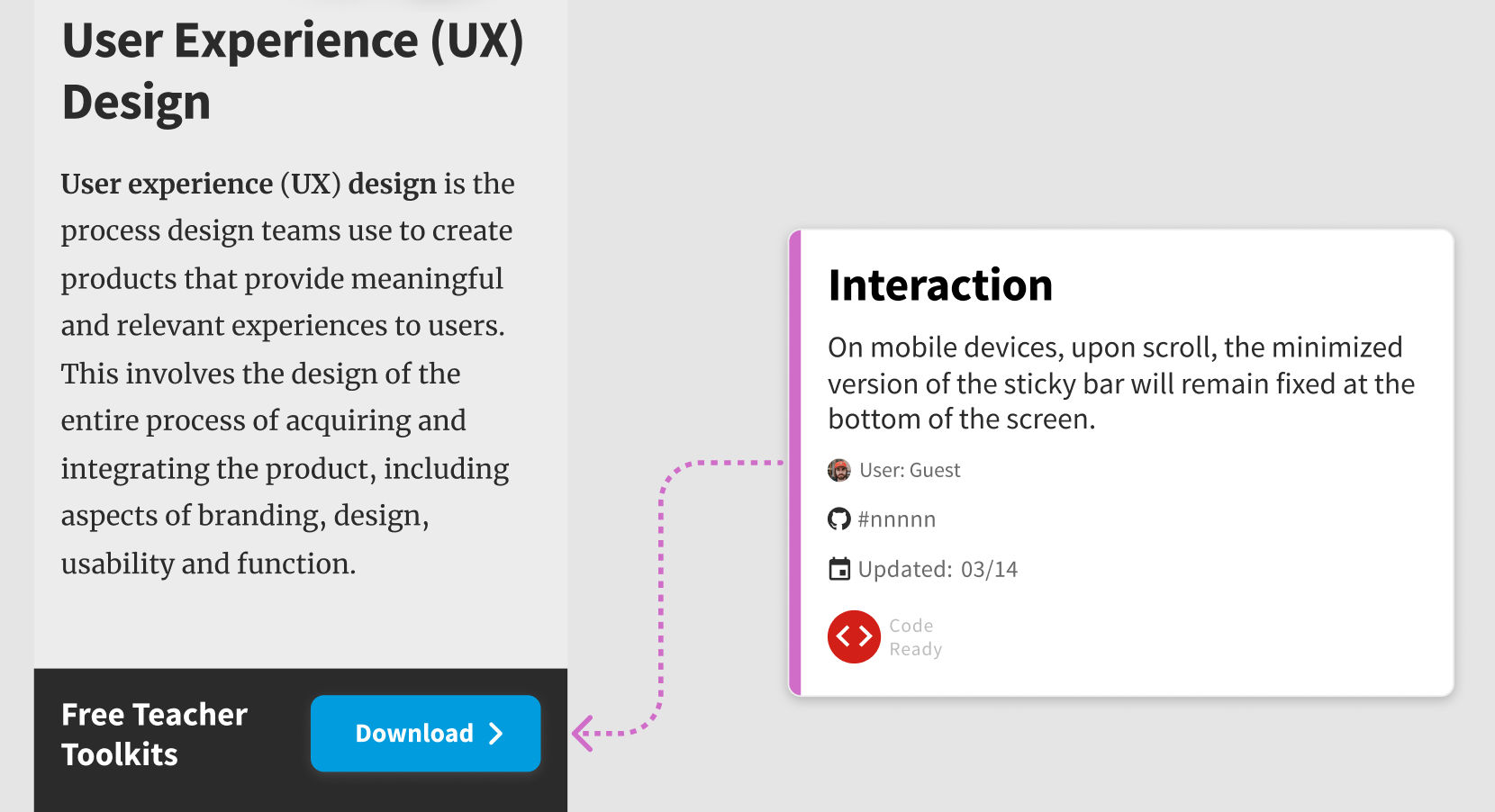
Interactive elements: Include notes about what happens when users interact with elements such as buttons and inputs. For example, what do disabled buttons look like? What happens if the user hovers over a clickable icon?
Form elements and data validations: In the case of forms, remember to include rules such as minimum character count, whether an input is mandatory or optional, and the format of input to be expected (email, phone number, etc.).
Error states: Define what will happen in case of user errors. These include the style and placement of error messages on form fields and the dedicated 404 pages.
Loading and empty states: How will a page look while the content is being loaded? What if there isn’t any data available to show on an interface?
Animations: Use prototypes or gifs to show how you’d like transitions and other moving elements to appear on your interface. Some tools will also allow you to export the motion to code that developers can tweak and use directly in the application.
Copy: Always use realistic (or as close to final as possible) copy in your mockups. Real copy looks different than “lorem ipsum” and will help you visualize what the end user will see.
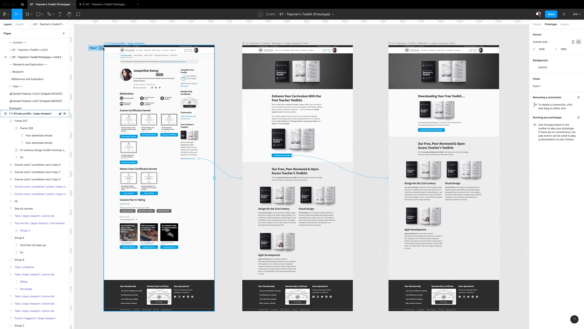
Flows: Use flowcharts, wire flows and prototypes to show the developers what happens when a user clicks/taps on a specific part of the user interface. Flows help developers understand how obscure screens are connected with the rest of the application.
Accessibility information: Accessibility is often an invisible aspect of interface design. Remember to include information such as tap target size and image alt text. Define what different elements will look like when the user navigates the interface with a keyboard—which elements are focusable, and what the outline will look like when the element is in focus.
Responsive design breakpoints: Since users can access your content on different devices, you must provide information on how the design will elegantly “break down” as the screen size reduces.
It is best to provide three resolutions for your designs (mobile, tablet and desktop). At the very least, include two resolutions (mobile and desktop).
Include information on how the layout differs from one resolution to the next. Which elements are removed? Do the images get replaced? Do the layout and order of elements change?
Questions About Design Handoffs? We've Got Answers!
Why are design handoffs important in product development?
Design handoffs are important in product development because they ensure a smooth transition from design to development.
First, they prevent misunderstandings. Clear handoffs give developers the details they need, reducing guesswork and mistakes.
Second, they improve efficiency. Well-documented designs speed up development by providing exact specifications, assets, and interactions.
Third, they maintain design consistency. Without proper handoffs, developers might misinterpret layouts, colors, or spacing, leading to an inconsistent product.
Fourth, they allow for better collaboration. Designers and developers work more effectively when they share feedback and clarify expectations early.
Finally, they reduce rework. A strong handoff minimizes errors, so teams spend less time fixing issues later.
Using tools like Figma, Zeplin, or design system guidelines, teams can create smooth handoffs that align the product from concept to launch.
Yes, design handoffs can—and often should be done—incrementally when building interactive systems. An incremental handoff approach helps improve collaboration, reduce miscommunication, and allow for continuous feedback between designers and developers. Here’s how you can approach it:
1. Early Collaboration & Continuous Handoff
Instead of waiting until the entire design is complete, designers can start sharing early wireframes and prototypes with developers.
Developers can provide feedback on technical feasibility before finalizing designs.
2. Feature-Based or Component-Based Handoffs
Break the handoff into features or components rather than an entire page or flow.
Developers can start implementing UI components as they are finalized rather than waiting for the full design.
3. Utilizing Design Systems
If a design system is in place, handoffs become smoother since many components are predefined and agreed upon.
Updates to components can be shared incrementally without disrupting the entire system.
4. Using Version Control & Design Tools
Tools like Figma, Zeplin, or Storybook allow for real-time updates and incremental sharing.
Version control helps track changes and avoid inconsistencies.
5. Agile & Sprint-Based Development
Aligning design handoffs with development sprints ensures that developers always have something to work on.
Designers can refine upcoming designs based on developer and stakeholder feedback.
6. Documentation & Communication
Maintain incremental documentation rather than a massive final handoff document.
Use comments, annotations, and regular check-ins to clarify design decisions.
7. Prototyping & Usability Testing
Share low-fidelity prototypes early and iterate based on feedback.
Incremental usability testing helps validate designs before full implementation.
Incremental handoffs have many benefits, including that they reduce bottlenecks, enhance collaboration, increase flexibility for changes, and help catch technical issues early.
What common mistakes should designers avoid during handoffs?
Some common mistakes occur during handoffs and hinder a smooth transition from design to development.
First, designers should not leave files disorganized. Unlabeled layers, unused elements, and messy structures slow down developers and cause confusion.
Second, they should not provide vague specifications. Developers need clear details on colors, typography, spacing, and interactions to build accurately.
Third, they should not forget interactive prototypes. Without prototypes, developers may misinterpret navigation and animations.
Fourth, they should not deliver assets in the wrong formats. Providing incorrect resolutions or missing files leads to delays and extra work.
Fifth, they should not ignore documentation. Explaining design decisions, accessibility needs, and user behaviors helps prevent misunderstandings.
Last, but not least, they should not skip developer collaboration on the handoff. A walkthrough of the design and open communication prevent mistakes, ensure alignment, and help bring their vision to life accurately.
Design systems play a key role in handoffs by ensuring consistency, efficiency, and clarity between designers and developers.
First, they provide reusable components. Buttons, forms, and navigation elements follow predefined styles, reducing guesswork and speeding up development.
Second, they standardize typography, colors, and spacing. Developers don’t need to interpret design choices, as the system defines them clearly.
Third, they improve collaboration. Designers and developers work from the same guidelines, reducing misunderstandings and inconsistencies.
Fourth, they simplify updates. If a change is needed, updating the design system applies it across the entire project, ensuring uniformity.
Last, but not least, they support scalability. As teams grow, a shared system helps new designers and developers onboard quickly without disrupting workflows.
By using design systems, teams create seamless handoffs, reduce errors, and ensure the final product remains visually and functionally consistent.
How can designers and developers work better together?
Designers and developers can work better together by improving communication, collaboration, and understanding of each other’s processes.
First, they should involve each other early. Developers should provide technical input during design, and designers should understand development constraints to work with.
Second, they should use a shared design system. Standardized components, typography, and colors ensure consistency and speed up work.
Third, they should document and explain decisions. Clear annotations on spacing, interactions, and accessibility prevent misunderstandings.
Fourth, they should establish (and have) regular check-ins. Frequent reviews help catch issues early and ensure alignment before development begins.
Fifth, they should remain flexible. Designers may need to adjust layouts based on technical limitations, and developers should respect the design vision.
Lastly, they should test together. Reviewing prototypes and final builds as a team ensures the product matches the intended experience with nothing lost in “translation.”
By working closely, designers and developers create better products with fewer errors and smoother workflows.
AI is improving the design handoff process by assisting with automation, reducing errors, and enhancing collaboration between designers and developers. WhileAI cannot replace human oversight, it streamlines repetitive tasks and enhances workflow efficiency.
First, AI assists with generating design specifications. Tools can automate the extraction of spacing, colors, typography, and layout details, reducing manual effort while still requiring human review for accuracy.
Second, AI helps convert designs into code. Some platforms translate design elements into front-end code like HTML, CSS, or React components. However, AI-generated code often requires manual refinement to align with best coding practices.
Third, AI identifies potential inconsistencies. AI-powered tools can scan for missing assets, alignment issues, and deviations from design system standards. However, while AI can flag errors, final verification still requires human judgment.
Fourth, AI enhances documentation and communication. AI-driven tools can assist in generating design documentation and answering developer questions, but it’s essential that they function as supplements rather than replacements for direct collaboration.
Fifth, AI streamlines asset management. It can automate the export and optimization of images, icons, and fonts into the correct formats and resolutions, ensuring they’re ready for development without manual adjustments.
Last, but not least, AI helps with accessibility testing. It can scan designs for contrast issues, readability concerns, and potential WCAG compliance violations, providing designers early feedback on accessibility improvements.
By integrating AI as a supportive tool rather than a replacement for human expertise, teams can create smoother, faster, and more accurate design handoffs while maintaining design intent and quality.
How does a design handoff work in a component-based design system?
A design handoff in a component-based design system ensures consistency and efficiency by using reusable elements.
First, designers build with predefined components. Buttons, forms, and navigation elements follow set styles, reducing custom work.
Second, designers document component behavior. They specify how each element functions, including states, interactions, and accessibility requirements.
Third, developers reference the design system. Instead of recreating elements, they pull standardized components from the system, ensuring accuracy.
Fourth, updates happen centrally. If designers change a component, the update applies across all instances, keeping the product consistent.
Fifth, handoffs become faster and smoother. Since both teams use the same system, developers spend less time interpreting designs, and designers avoid redundant work.
Finally, testing ensures alignment. Designers and developers review components together to confirm they match the intended design.
By using a component-based system, teams create scalable, cohesive, and easily maintainable products.
Why? Because design skills make you valuable. In any job. Any industry.
In This Course, You'll
Get excited when you experience how easy it is to transition into tech and land your dream job with User Experience (UX) design skills. No design background? No problem. You already have transferable skills, so it's easy to fast-track your career!
Learn to combine logical thinking with creativity. Do you enjoy creativity and structure? Do you communicate ideas clearly? UX designers turn ideas into services, experiences, and products. This course helps you structure your existing skills and apply them in an innovative, creative context. You'll use hands-on methods that empower you to continuously test and optimize your products and services from idea to delivery.
Make yourself invaluable when you use the very fabric of being human, such as empathy and intuition, to make users and customers smile. More smiles, more impact, greater salary potential. You'll find out what your users need and want, and you'll build products, experiences, and services that help them succeed. You can benefit from UX design in any job, any industry. As AI becomes part of everyday work, timeless human-centered UX design skills help you decide what problems are worth solving and how solutions should actually work for people. This approach turns AI from a tool into your new superpower, keeping your work useful, relevant, and centered around peoples’ needs, even as technologies change.
Gain confidence and credibility when you master a range of powerful, real-world UX design skills such as user research, user interviews, personas, customer journey maps, sketching, task analysis, low-fidelity paper prototyping, and usability testing. It's easy with downloadable templates.
Craft your personal portfolio with step-by-step guidance. It's completely optional. Your portfolio is your gateway to transition into a career in tech or design. You'll be able to apply your new skills immediately in your current job. If you're new to UX design, this course is the best place to start. Your path to tech starts here. UX design is your way in.
It's Easy to Fast-Track Your Career with the World's Best Experts
Master complex skills effortlessly with proven best practices and toolkits directly from the world's top design experts. Meet your experts for this course:
Don Norman: Father of User Experience (UX) design, author of the legendary book “The Design of Everyday Things,” and co-founder of the Nielsen Norman Group.
Rikke Friis Dam and Mads Soegaard: Co-Founders and Co-CEOs of IxDF.
Mike Rohde: Experience and Interface Designer, author of the bestselling “The Sketchnote Handbook.”
Stephen Gay: User Experience leader with 20+ years of experience in digital innovation and coaching teams across five continents.
Alan Dix: Author of the bestselling book “Human-Computer Interaction” and Director of the Computational Foundry at Swansea University.
Ann Blandford: Professor of Human-Computer Interaction at University College London.
Cory Lebson: Principal User Experience Researcher with 20+ years of experience and author of “The UX Careers Handbook.”
Get an Industry-Recognized IxDF Course Certificate
Increase your credibility, salary potential and job opportunities by showing credible evidence of your skills.
IxDF Course Certificates set the industry gold standard. Add them to your LinkedIn profile, resumé, and job applications.
Be in distinguished company, alongside industry leaders who train their teams with the IxDF and trust IxDF Course Certificates.
In your work as a designer, you will find yourself working closely with different stakeholders, and none more common than software engineers or developers, who are responsible for implementing your designs. Designers and developers share a common goal — to do what’s best for the user and for the bus
Social shares
716
Published
Read Article
How to Ensure a Smooth Design Handoff
In your work as a designer, you will find yourself working closely with different stakeholders, and none more common than software engineers or developers, who are responsible for implementing your designs. Designers and developers share a common goal — to do what’s best for the user and for the business. But the day-to-day realities of their collaboration aren’t so clear-cut and idyllic. The main reason: miscommunication. Here are some tips to help you maintain smooth relations with “the other side.”
Communication is the most important skill a designer must have. In fact, every deliverable a designer creates is a form of communication: personas, journey maps, storyboards, sitemaps, user flowswireframes, prototypes, usability reports all communicate insights and ideas to different stakeholders.
While designers envision an experience, developers execute it and bring it to life. A poorly implemented design leads to a broken experience. Designers and developers must thus work closely and are collectively responsible for delivering a good user experience. Working together smoothly is not automatic. Developers must develop their ability to interpret a design accurately, and designers must ensure they understand the development complexity of their design decisions.
What Is a Design Handoff?
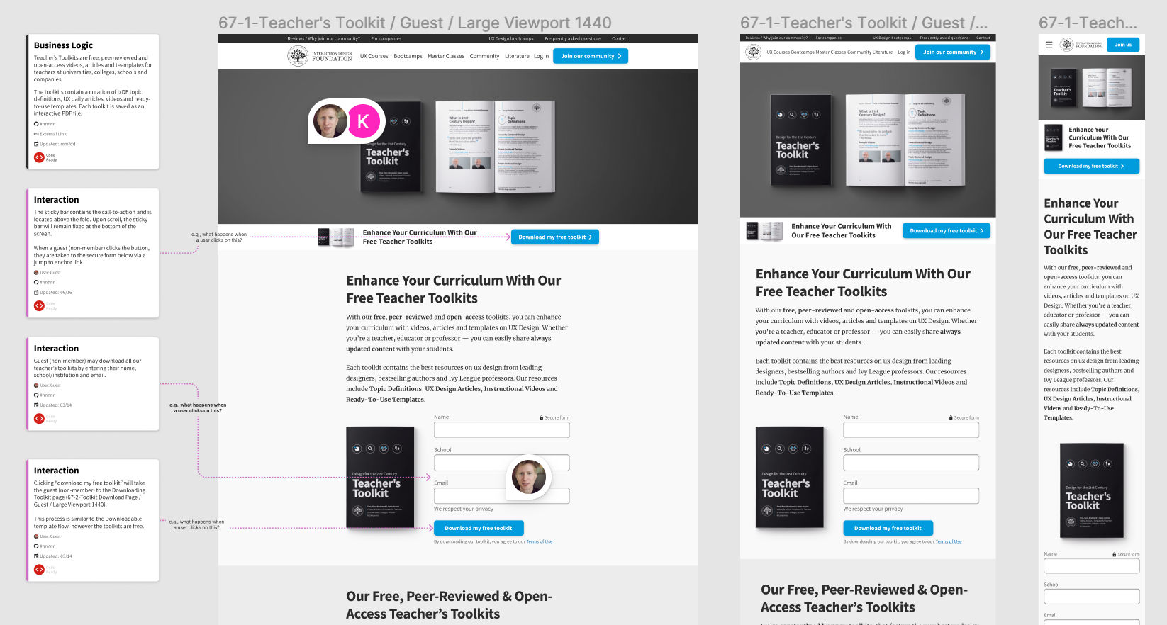
An example of Figma’s Inspect feature. The above screenshot depicts the final design handoff for the IxDF Teacher Toolkit.
Design handoff is the process of handing over a finished design for implementation. It typically involves transferring knowledge about a design as specifications, including, among other things, layouts, flows, colors, typography, icons and images, interaction, animation, copy and instructions on responsive breakpoints, accessibility and data validations.
Design handoffs originate from the Waterfall methodology, when designers worked independently on a project, and handed off the finished designs in one go to engineers to implement. The design handoff was a one-time, clearly-defined deliverable. In an agile work environment, however, design handoffs are neither one-time, nor fixed.
How to Avoid Friction in Design Handoffs?
Ask any designer or developer, and they’ll tell you of bad experiences they had working with “the other side.” So, let’s face it: when designers and developers work together, conflicts, friction and mutual struggles occur. But why does this happen, and how can you mitigate them?
The main cause of friction in design handoffs is miscommunication and a lack of knowledge of each other’s work.
In this video, Szymon Adamiak, co-founder of Hype4 Mobile, and a front-end developer shares his insights on how you can communicate better:
Transcript
Transcript loading ...
You can further improve your communication by involving developers early:
Seek their inputs on solutions and find out what’s possible and what’s not. Knowing that a solution is feasible will save headaches and revisions down the line.
Explain the rationale behind design decisions. If the solution is not feasible (the symptom), this explanation (the root problem) will give engineers context to propose alternate solutions that solve the actual problems.
Common Gaps in Design Handoffs
One of the most common mistakes designers make is in designing for the ideal scenario. In practice, users will likely begin with not-so-ideal use cases. Here are the different scenarios that are most likely to occur as well as most likely to be skipped during design and handoff:
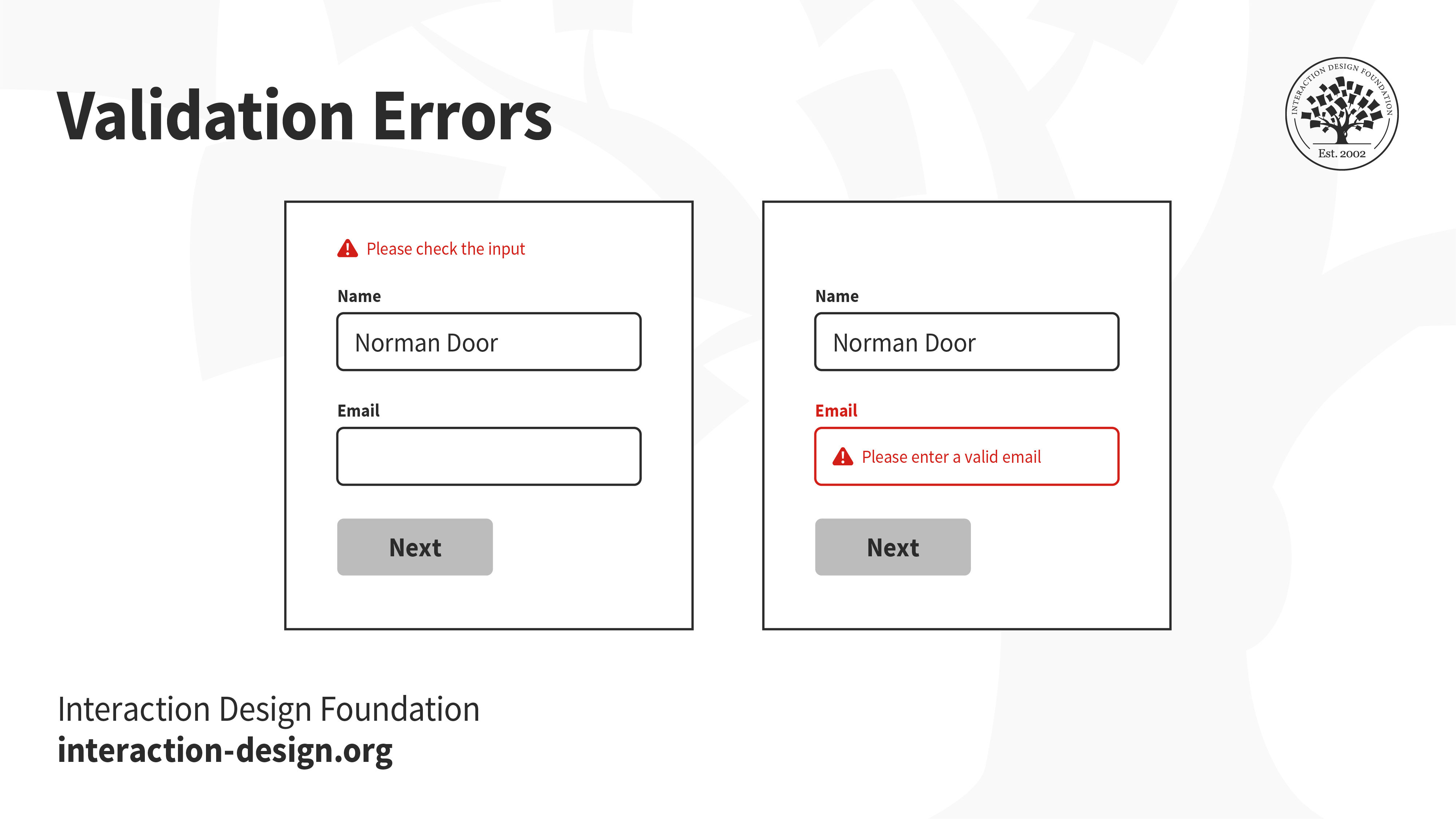
1. Validation Errors
When users interact with your product, especially while filling out forms, it is likely that they will make mistakes. Ideally, your interface should set up users to succeed. However, errors are not always preventable, and there will always be edge cases that you cannot foresee. How do you communicate these errors with users?
A vague error message at the top that says “please check the input” does little to help users recover from errors. In fact, it might even stress them out. On the other hand, highlighting which form fields have errors, even scrolling to the exact location and showing clear instructions on how to rectify the errors will set them up for success.
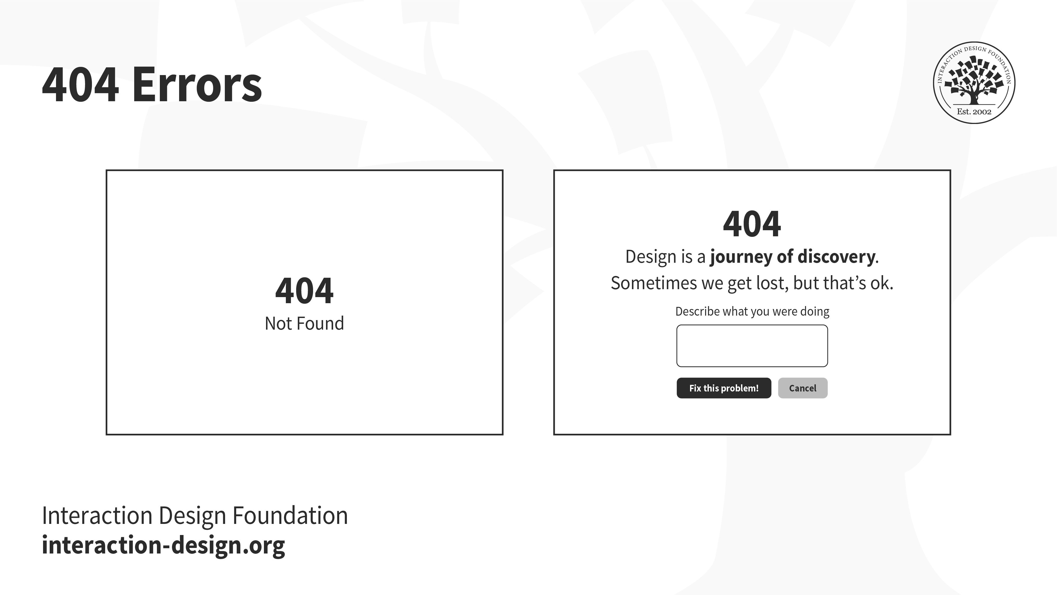
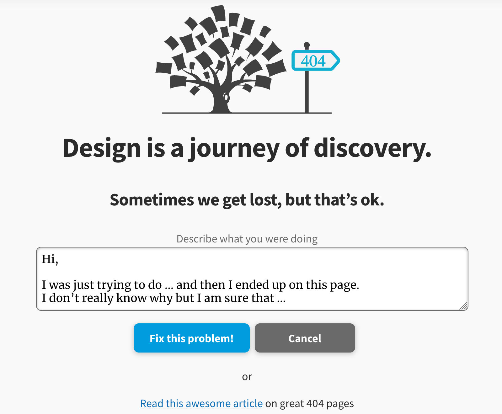
The internet is full of broken links. You might have seen the ubiquitous 404 error pages — when users are looking for something and end up in the wrong place. Hitting a broken link can be a frustrating experience. Make sure you utilize the real estate to help users find their way back.
Error codes like 404 and 503 mean very little to most people, and failing to design elegant error pages is not only unempathetic, but also a wasted opportunity to reassure, or even delight users.
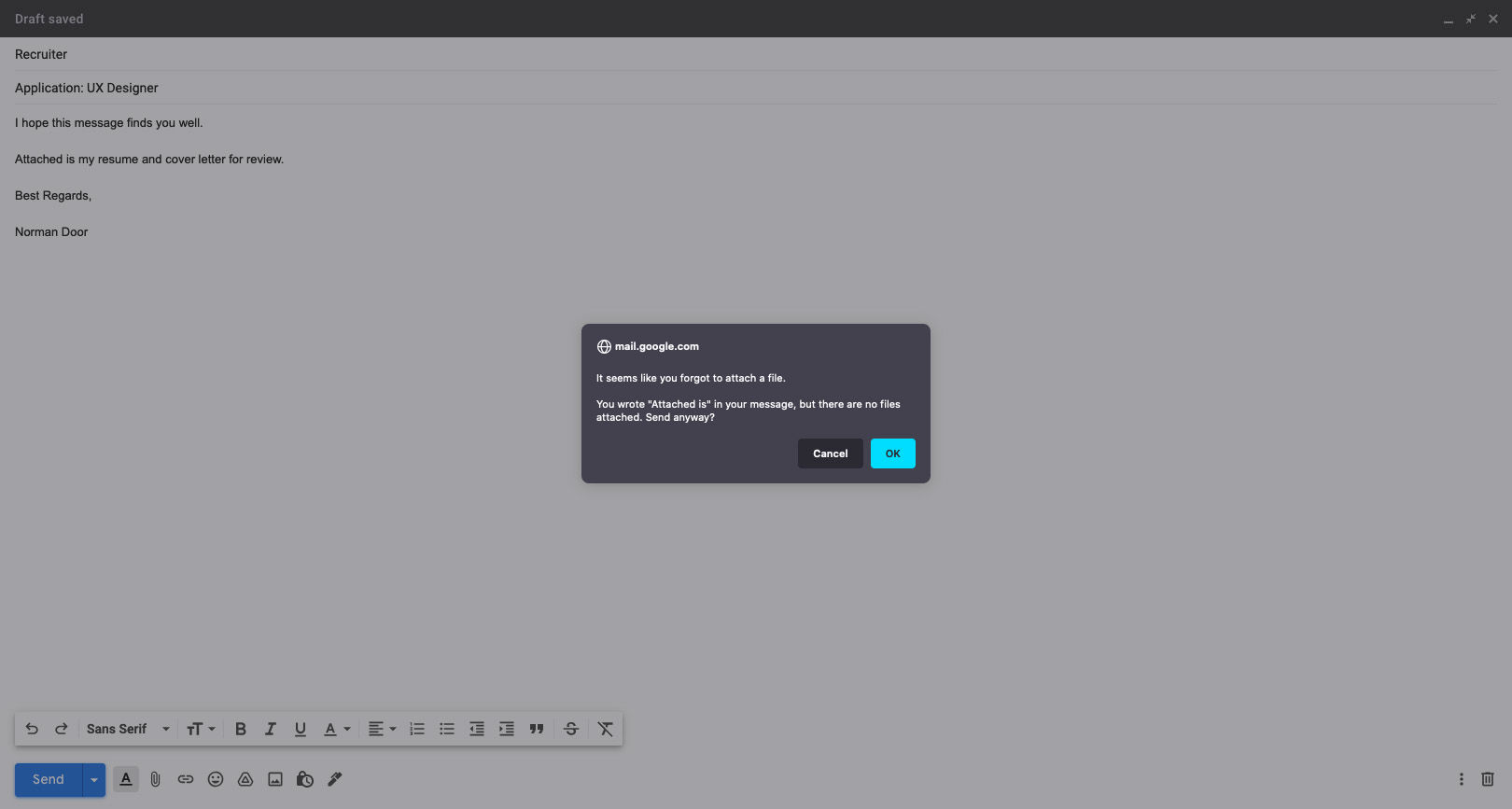
Have you ever accidentally deleted something, or hit the back button without saving your work? When designed right, a timely alert can avert such disasters.
Gmail knows its users well! If you’ve ever forgotten to attach a file to your email, this alert, prompting you to check your message before sending, is one that will certainly not annoy you.
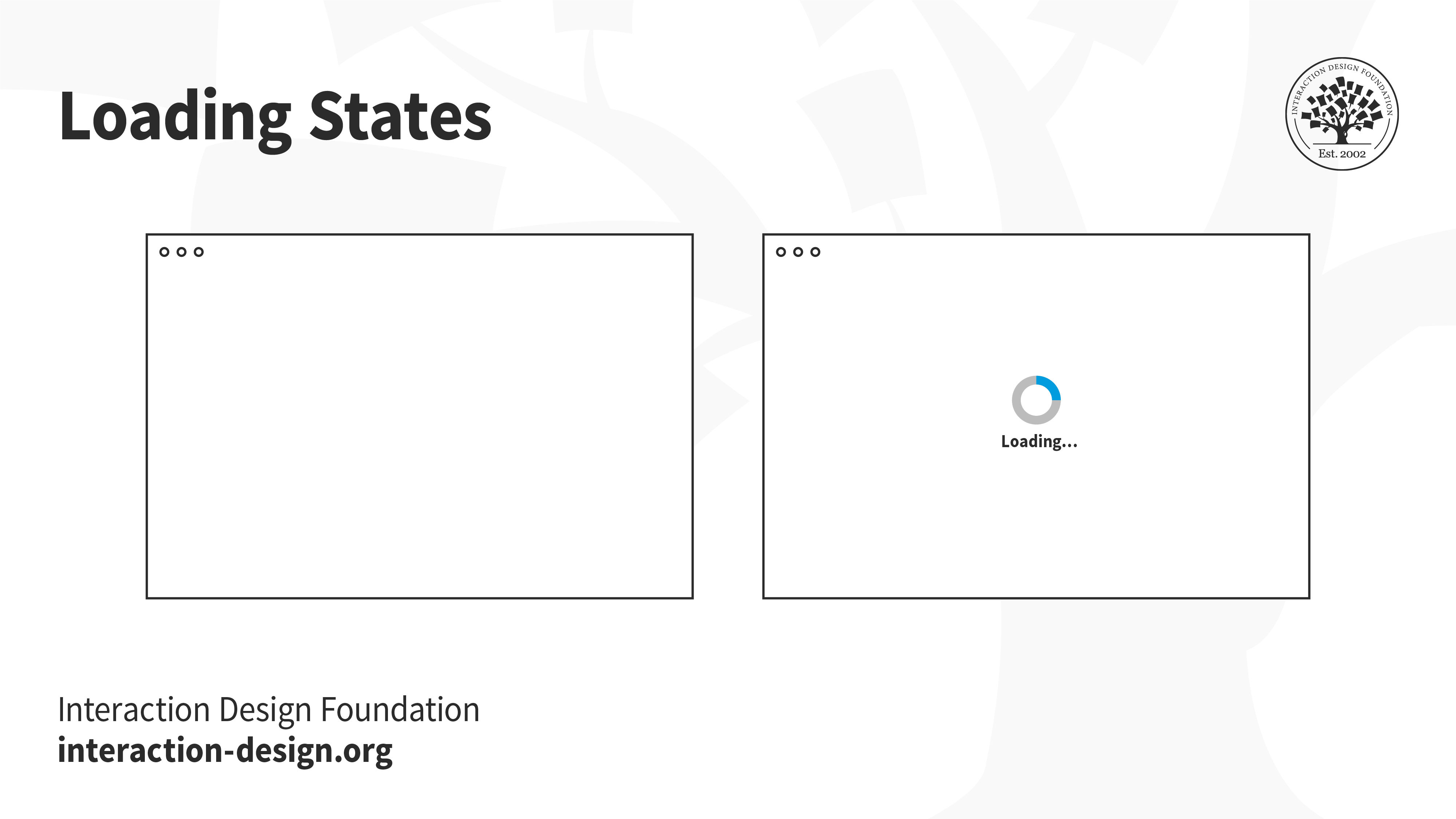
Whether at the boarding gate of an aircraft, or at an apartment elevator, people hate waiting for something to happen — especially if they have nothing to do while waiting. A loading state can be an opportunity to engage with users, and at the very least, let the user know that something is happening.
Letting users know that something is on the way is much better than showing a blank page. If users are engaged, they will be more likely to stick around and wait, instead of leaving. The loading state alone is not enough, of course. If the page loads slowly, then users will leave — loading state or not.
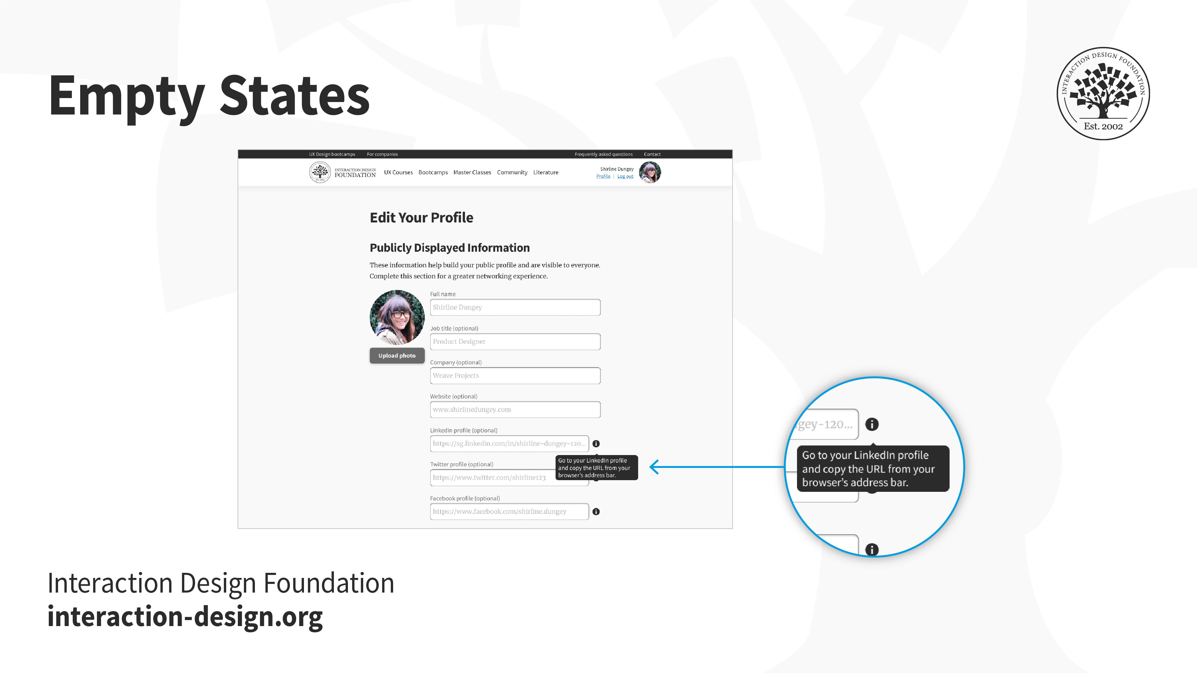
Not every application will begin with lots of data. Think back to the first time you opened an email account, or when you first set up your social media account. You likely had no emails, no drafts, no posts. An empty screen can be extremely intimidating for users, especially in applications that have several functionalities — where does the user begin?
Onboarding screens, product walkthroughs and hints are some ways to nudge users into taking action towards filling up and using the empty space.
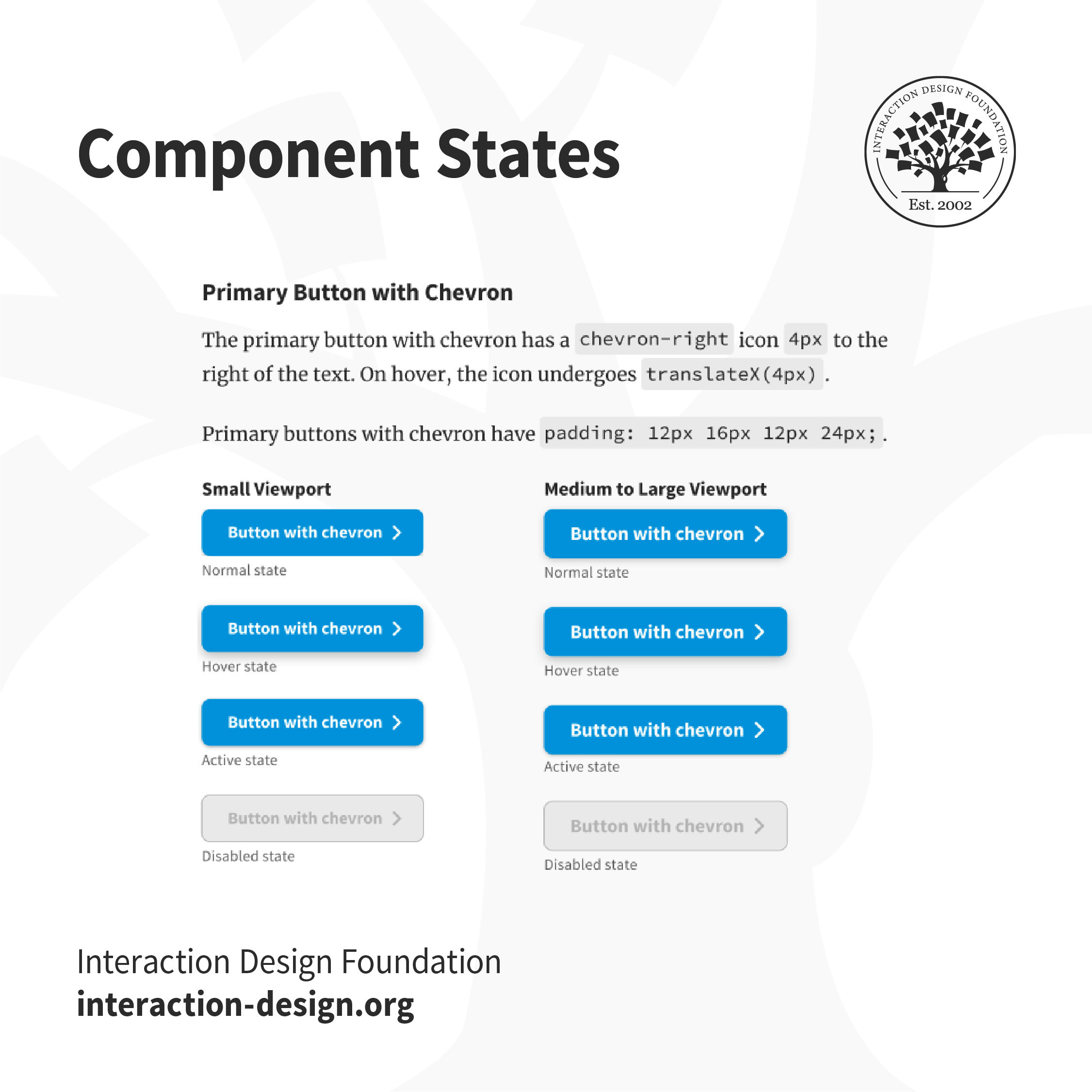
Hover over a button, or tap on a link. How do you know whether something will happen if you click or tap on it? And what after — how do you know if the system has realized you’ve interacted with it? Make sure you create the different states of interactive elements to keep users informed about what’s going on.
Users won’t know if an element is interactive, or that they have successfully interacted with it unless the interface informs them. For example, in the IxDF design system, buttons that are disabled are grayed out, to indicate that users can’t interact with them. The “Hover” state has a subtle shadow to inform users that they can interact with it.
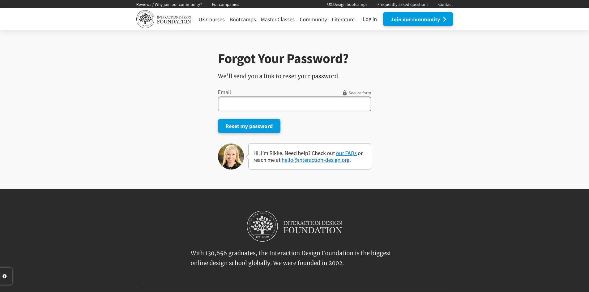
One of the most frequently used functionalities, the reset password screen and flow is one of the most crucial, and mundane aspects of the user’s logging in process. Failure to design this well can be extremely frustrating, especially since users are likely already frustrated at not being able to recall their passwords.
You can help your users reset their passwords in a number of ways such as verification codes, back-up emails, etc. No matter what you decide, ensure you let users feel secure in the process.
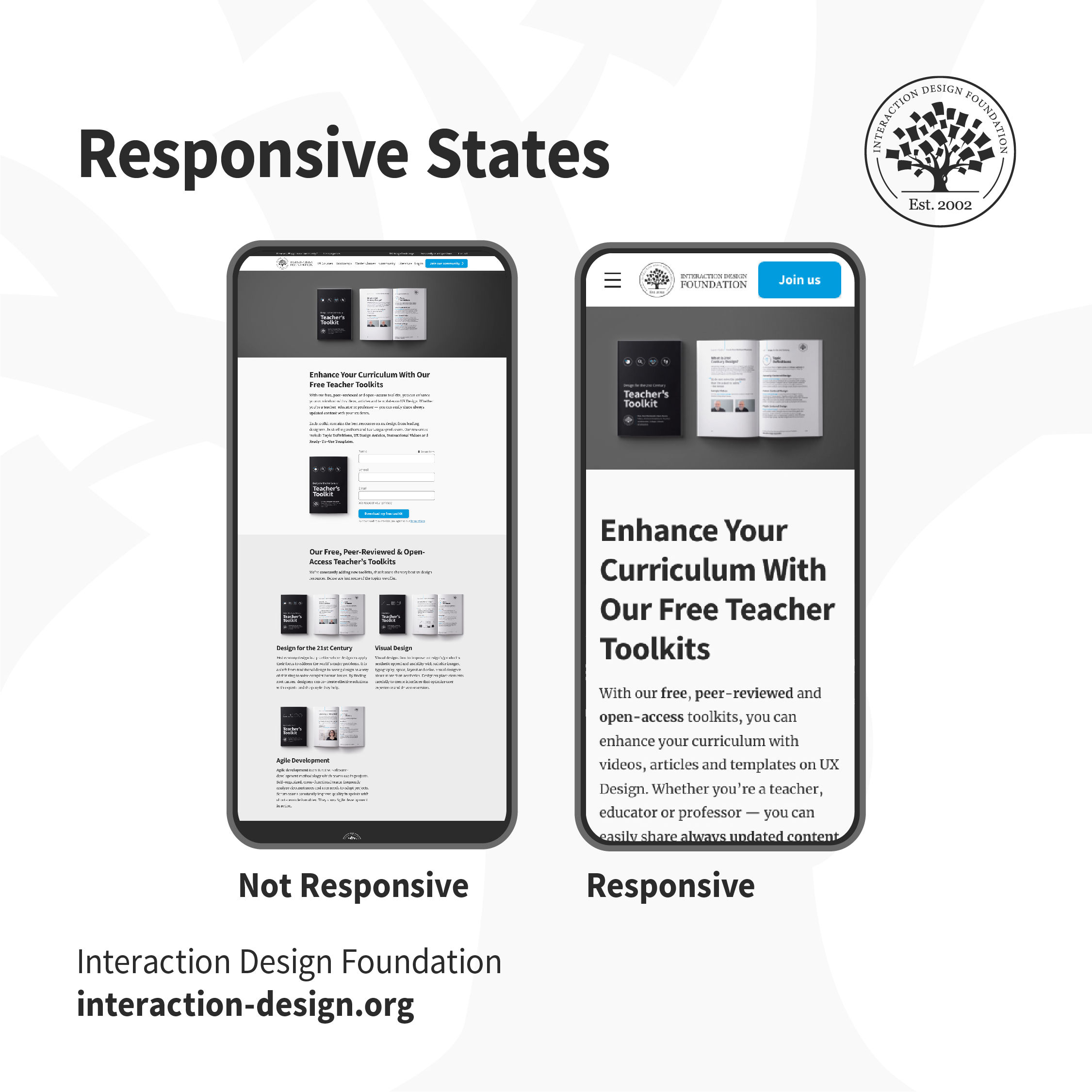
8. Responsive States (e.g., Mobile, Tablet, Desktop)
Users access applications through multiple devices. Creating a mockup for a single device is not sufficient. Define how the applications and content responds to different devices and screen sizes so that users can easily use the product.
Which one of these would you find easier to use? When the content adapts to the form factor of your device, buttons are tappable, text is legible and the product is usable.
A good designer-developer collaboration goes a long way in delivering a smooth user experience. On many teams, designers and developers often do not understand the challenges faced by each other, which ends up causing friction. One of the best ways to minimize conflict is through efficient communication — understanding what challenges developers face, which assets they require and explaining the rationale behind design decisions. Involve developers early in the design process to understand technological constraints in advance. This has the side effect of saving you any rework, later on, to work around implementation issues.
AI is replacing jobs everywhere, yet design jobs are booming with a projected 45% job growth.
With design skills, you can create products and services people love. More love means more impact and greater salary potential.
At IxDF, we help you from your first course to your next job, all in one place.


