Visuals are one of the most essential and exciting parts of your UX/UI design case study—they’re fun to create and boost engagement. Your hard work and ingenious designs will take center stage and show off your capabilities as a designer. But your final designs are not the only visuals that get their opportunity in the spotlight. Anything visual you create throughout the design process will enrich your portfolio and give more profound insights into your design skills. Find out what visuals you can include in your UX/UI design case studies and four valuable tips to keep in mind (including some handy tools!)
The Journey Matters: Showcase Visuals That Tell Your UX/UI Story
“It’s not the destination, it’s the journey.”
— Ralph Waldo Emerson, Essayist, Poet and Philosopher.
When you think of visuals in your UX case study, you might jump straight to beautiful images of your final design. However, you’ll sell yourself short if you do that! Your UX case study should tell a story of your journey from problem statement to final design. You can include many more visuals—not only the final product!
Remember, your case study’s visuals should align with your portfolio’s visual identity. In this video, Morgane Peng, Design Director at Societe Generale CIB, explains how to approach the visual design of your portfolio:
UX/UI Design Deliverables, Documentation and Works-in-Progress
Showcase your design process through your visuals. This approach will demonstrate that you understand design methods, processes and workflows. Images of your works in progress also help you tell your story—think of it as a behind-the-scenes mini-documentary.
Some of the works in progress you can show include:
Sketches of your design ideas, inspirations, paper prototypes, etc.
Videos or photos of sessions. For instance, user interviews or user testing sessions you’ve conducted.
Photos of your notes. These can include ideas, user feedback you’ve jotted down during an interview, critique from colleagues, etc.
Post-its or whiteboards that you used in discussions or ideation sessions. These images allow you to show your hard work and, as a bonus, keep your word count low.
Wireframes that show the first few iterations of your design.
Illustrations and Information Visualization
Besides images, you can also create illustrations to tell the story of your design process. You could, for example:
Use charts and graphs to visualize the results of your user research, for instance, the results of an online survey with 50 users. Information visualization is a great way to summarize key points in an easy-to-digest format.
Draw timelines and journey maps to outline your design process or illustrate your understanding of users. For instance, you can use a user journey map to highlight “a day in the life” of your user.
Use diagrams and graphs to demonstrate the impacts of your work in an aesthetically appealing way. Visually communicate how you’ve increased conversion rates, how well-received your app is, etc.
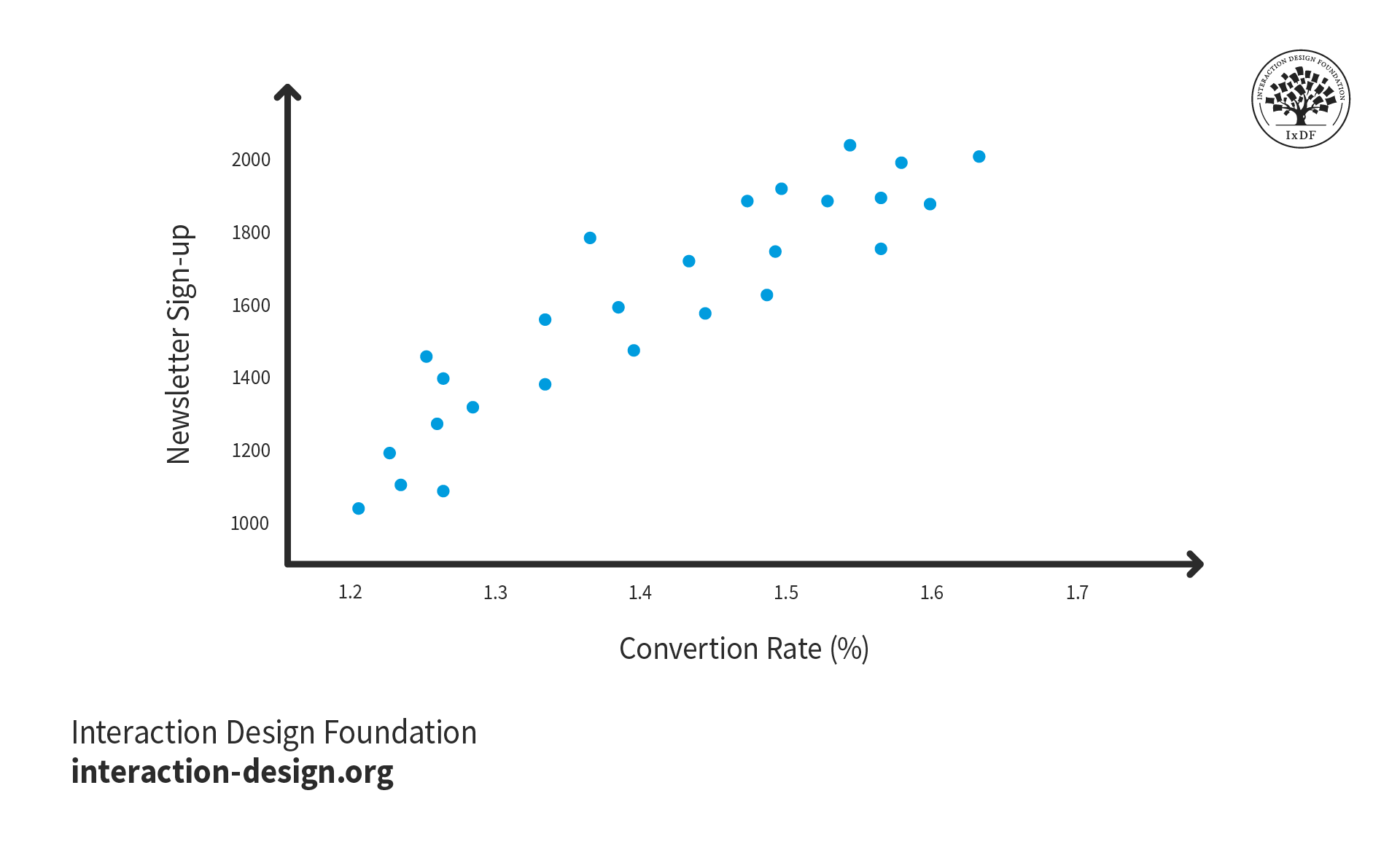
Where possible, use numbers and figures to quantify the success of your designs. For example, you could write, “My redesigned newsletter sign-up page increased subscribers, which boosted conversions.” However, if you have the analytics available, a better option would be to include a chart that shows the real numbers. These figures will give potential employers concrete evidence of the impact of your designs.
© Interaction Design Foundation, CC BY-SA 4.0
The Final Product or Prototype
Now that the hiring manager knows all about your journey, they’re ready for the grand finale. Don’t hesitate to display your amazing final product in your UX case study. Show a few photos, a video or even an embedded interactive version of your prototype to wow recruiters. Use annotations to clearly explain design decisions and final features that meet your users’ needs.
If you did not create the final design but your work contributed to it, you should still highlight your impact. Perhaps a series of user interviews you conducted shaped the layout of an app. Don’t be afraid to show off these achievements and do so in a visually pleasing way. For example, you could create an interactive diagram of the app with hotspots that reveal your contributions.
Consider how to best present your final designs to maximize engagement. This product page from Arturia features an interactive diagram of a keyboard that uses hotspots to reveal information. This approach keeps the interface clean but allows users to dive deep into its features. You can employ similar design patterns in your case studies to keep your layout tidy and aid exploration.
© Arturia, Fair Use
4 Essential Tips to Maximize the Impact of Your UX/UI Design Case Study Visuals
Now that you have a clear idea of what visuals to include in your UX case study, it’s time to create and implement them. Use these four top tips to help you in the process.
1. Strike the Right Balance: Distribute Your Visuals Throughout Your Case Studies
Your UX case study is as much about your process as it is about the final product. We can’t emphasize this enough. Your visuals should showcase your entire journey from start to finish. Therefore, you should spread your visuals throughout your UX case study.
You may find yourself with many photos in only one part of your design process. If this happens, consider how to spread out the images and ensure you have enough for each section. You may need to create new visuals for other sections or revisit your project files for missed opportunities.
Always remember to photograph and document your design process! If you want to include visuals in each section of your case study, you need to capture them. You don’t want to be in a situation where you need photos of your user testing session only to realize you forgot to take them! That said, there are some visuals you can recreate in a pinch. For instance, you could redraw some sketches if you threw them away (or didn’t do them in the first place!)
© Interaction Design Foundation, CC BY-SA 4.0
To achieve a good balance of photos to text, aim for between 60% and 80% text and 20% to 40% images. This ratio will allow you to show off your process without overwhelming the user. If you want to allow users to view more photos, carousels and slide shows are great options as they keep the layout clean.
2. Use Visuals to Bring Your Story to Life
Remember that your visuals have a purpose: to help tell the story of your design project. You should not add images, graphs, or videos purely for aesthetic reasons. Think about how each visual enables you to communicate your design process—and if it doesn’t, remove it.
For example, you can include a photo of a wall of Post-it notes to showcase an intense brainstorming session you conducted. A photo like this will demonstrate your ability to ideate solutions to your users’ problems.
You can also create a collage of multiple pictures of hand-drawn sketches of a prototype to show the progress of your design. Prototypes show how you developed your design based on research, feedback and ideation. The point is that each visual you add needs to serve a purpose.
3. Harness AI to Make Your Portfolio Pop
If you don’t have a background in visual design, the prospect of creating visuals for your UX case study may intimidate you. However, recruiters expect UX case studies to look good—even if you have a non-visual role like a UX researcher. After all, your UX case study is a designed product itself and has to be as smooth and pleasant as possible.
Thanks to developments in artificial intelligence (AI) technology, you have a range of tools available to help you. Here are just a few ideas to utilize AI in your case studies:
AI color palette generators provide infinite ideas and options. Pick one or two colors that fit your style and personality, and let the generator build a color palette around them. Alternatively, randomize entire color schemes until you find one that you like. Use your new color palette for everything—charts and graphs, infographics and your portfolio as a whole.
AI design generators take inputs like images and text and create custom graphics. For example, you could make a banner or poster for your case study that uses your color palette.
AI video editors combine your images and videos into engaging content. For example, you can create a short video to give an overview of your prototyping or user testing sessions.
AI information visualization generators turn your figures into attractive charts, graphs, and more. With the speed and options of the generator, you may find a way to represent your data you would not have imagined before.
4. Optimize Your Images for Instant Access
If there’s one consideration we designers tend to forget about UX case study visuals, it’s file size optimization! You need to make sure that the images you use are sufficiently high-quality yet light on data. You don’t want to sour your recruiter’s experience and make them wait a few seconds for each image to load, do you?
To optimize your images, we suggest these three options:
ImageOptim is a web and Mac app that uses an advanced algorithm to optimize your images. The web app doesn’t have a pretty interface, but its powerful image compression algorithm will help you considerably reduce file size.
TinyPNG is a similar web app that’s more user-friendly but focused on PNGs. It’s excellent for compressing PNG images with transparency. We recommend you use ImageOptim to optimize JPEG images and TinyPNG to optimize PNG images.
WebP is an image format developed by Google and optimized for the web. It expertly retains high quality at low file sizes. You may find WebP more challenging to use than an image compressor, but you will likely get better results.
In general, we recommend you keep each image below 100KB. However, image optimization is all about the balance between image quality and file size. The more you optimize your images to be lightweight, the more details you’ll lose. Use your judgment to choose alevel of quality you can accept while maintaining a manageable file size.
The Take Away
Visuals are essential to your UX case study—even if you have a non-visual UX role. Your images should demonstrate your progress from the starting point to the finish line to be truly impactful. Therefore, you should include visuals of your works in progress as well as your final design. You can also use visuals to make data more digestible—for instance, the results of a survey you conducted.
We have four tips for creating visuals for your UX case study:
Focus on your process, not just the final design.
Make sure every single visual you include helps tell the story of your project.
Leverage AI to create visuals if you don’t have the skills. Plus, you’ll save some time.
Use image optimization to keep load times to a minimum.
Happy visualizing!
References and Where to Learn More
Want to create a portfolio that gets you hired? Take our course, Build a Standout UX/UI Portfolio: Land Your Dream Job, and learn how to showcase your skills, tell compelling project stories, and impress employers.
Find out more about sketching for your portfolio in Mike Rohde’s Master Class, How to Elevate Your Portfolio: Sketching Your Design Process.
Read UX Planet’s Complete List of UX Deliverables to inspire your case study visuals.
Our article, Create a Winning UX/UI Portfolio: Optimize with AI, provides more ideas on how to leverage AI in your portfolio.
Discover Google’s help guide on the WebP format and learn how to easily convert your images.
Images
Hero image: © Interaction Design Foundation, CC BY-SA 4.0