Navigation in user experience (UX) design refers to the system that lets users move through a digital interface—such as a website or app—efficiently and intuitively. It is crucial as it directly affects user experience, engagement and satisfaction. Designers aim for good navigation when they create simple, consistent menus, with clear labels and recognizable symbols. They also conduct usability testing to refine navigation paths and ensure users can find information quickly and easily.
Why is Navigation Important in UX Design?
Great navigation is a vital part of how users enjoy a positive user experience, and it’s something that can make or break how people feel about a product like a website or mobile app. Designers need to understand their users—deeply—and think carefully about how to organize information for them. The findings they get from research will be vital to create navigation that's simple yet effective for users. The reason navigation plays a crucial role in user interface (UI) and UX design is that it acts as a silent guide. Through helpful navigation, users can find information, explore content and interact with applications or websites without obstacles.
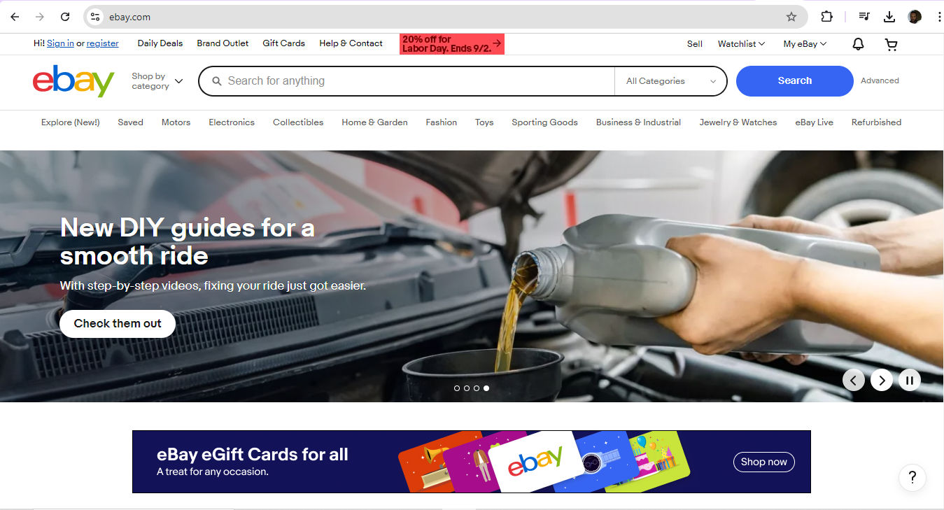
Welcome to eBay—where do you want to go? Perhaps a click on My eBay to see some possibilities?
© eBay, Fair Use
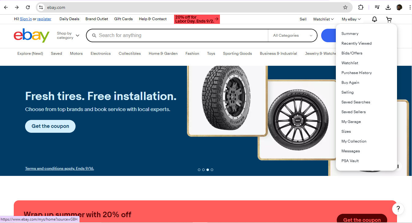
This is one way to help define navigation, amid a wealth of choices on eBay. Users enjoy a smooth ride in terms of their UX navigation—to sell, search, monitor and more.
© eBay, Fair Use
Because it’s so important to provide users with hassle-free access to solutions for their problems, designers who make effective navigation in their solutions help to boost their users’ understanding of what to do. That intuitiveness is essential. What’s more, effective navigation builds confidence and makes the product or website—and the brand behind it—more trustable.
From the moment they arrive on a landing page, through all the web pages users get to and on into the actions they take to convert—for example, if they become customers and buy something or sign up for a newsletter—users must find the entire experience seamless. What helps that is easily accessible navigation—and what helps the designers who understand exactly why users access a digital solution in the first place is user research.
UX Strategist and Consultant, William Hudson explains essential points about UX research:
Be it a site containing blog posts or an e-commerce giant with many thousands of product pages, when paths are clear and menus are simple, users feel far more comfortable and confident while they’re navigating a digital product. Success breeds success, too, as this ease of use encourages users to explore more. From that, they build a positive association with the brand. Plus, smooth navigation adds a touch of professionalism on top of that trustworthiness. When designers prove they care about the user's experience, users can get on with what they’re there to do—achieve their goals and forget that they’re interacting with the brand through a device.
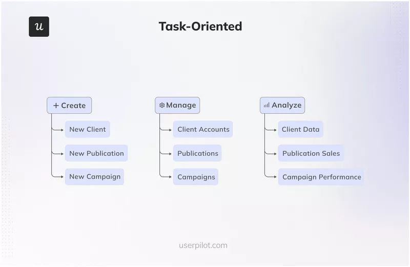
Naturally, the definition for navigation extends beyond websites to software and back to the early days of computing. Consider company intranets and desktop computers, for example—both can feature navigation possibilities that include factors like permissions. This task-oriented navigation structure gears the UX around certain user tasks—and so it’s best suited to apps or systems that ask users to complete specific tasks.
© Userpilot, Fair Use
What Types of Navigation Are There?
Designers have several common types of navigation to pick from—depending on the size of the website or app, the type of content and the users’ needs:
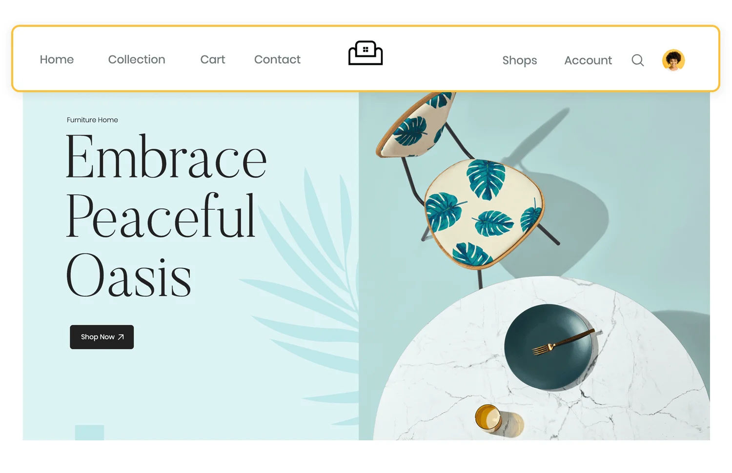
1. Top Navigation
A horizontal bar at the top of a website or app, it’s especially suitable for sites that have much content.
© Jennifer Pelegrin, Fair Use
2. Side Navigation
A vertical bar on the left or right side, this one’s ideal for websites with extensive content that requires quick navigation without scrolling—but has other uses, too.
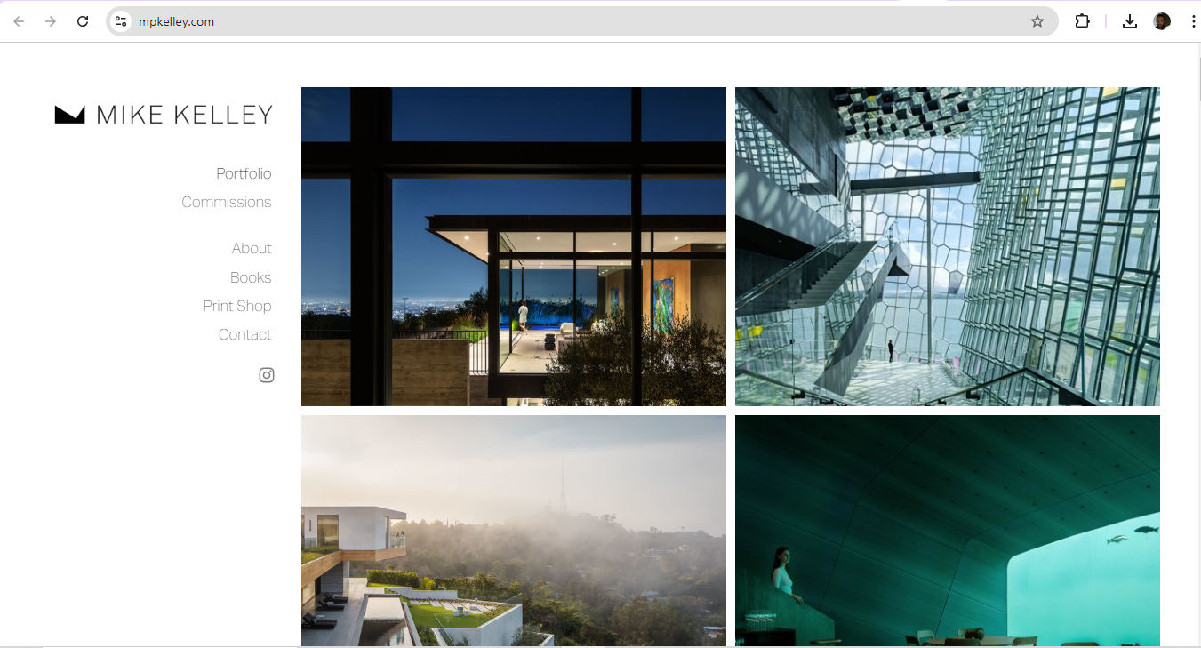
© Mike Kelley, Fair Use
3. Breadcrumb Navigation
A trail of links showing the user's current location, this navigation pattern is perfect for sites with nested content.
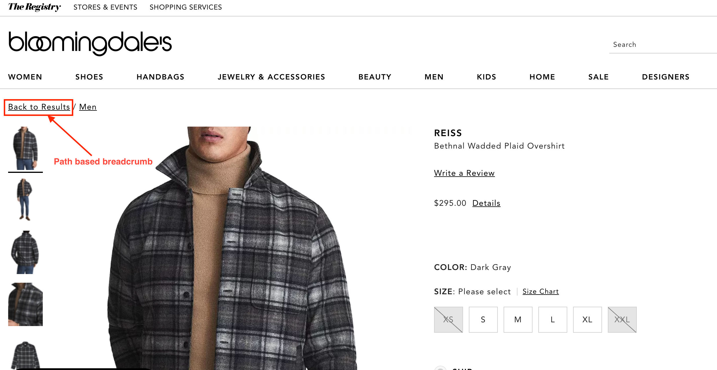
This is an example of path-based breadcrumbs—note how users can see at a glance where they are in the site and how to get back.
© Caroline Forsey, Fair Use
4. Dropdown Navigation
Allowing users to access a list of options by clicking a single button, it’s great for feature-rich applications.
5. Full-Screen Navigation
Ideal for knowledge-sharing or skill-building platforms, full-screen menus are especially helpful on smaller screens where excessive information might overwhelm users—they have a variety of uses.
© Aleksandar Igrosanac, Fair Use
6. Hamburger Menu
A compact button, usually placed in the top-left corner, it reveals a list of contents when clicked.
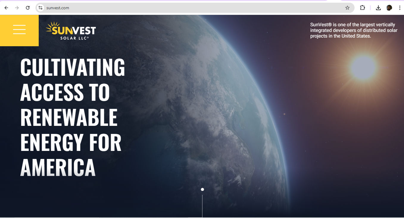
© Sunvest Solar, Fair Use
7. Gesture-Based Navigation
An invisible—yet essential—part of mobile app design, it relies on user gestures for interaction.
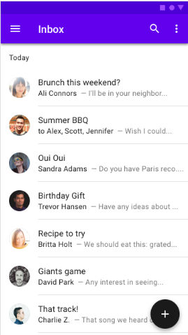
8. Bottom Bar
A sticky menu at the foot of an app, this provides direct access to key features.
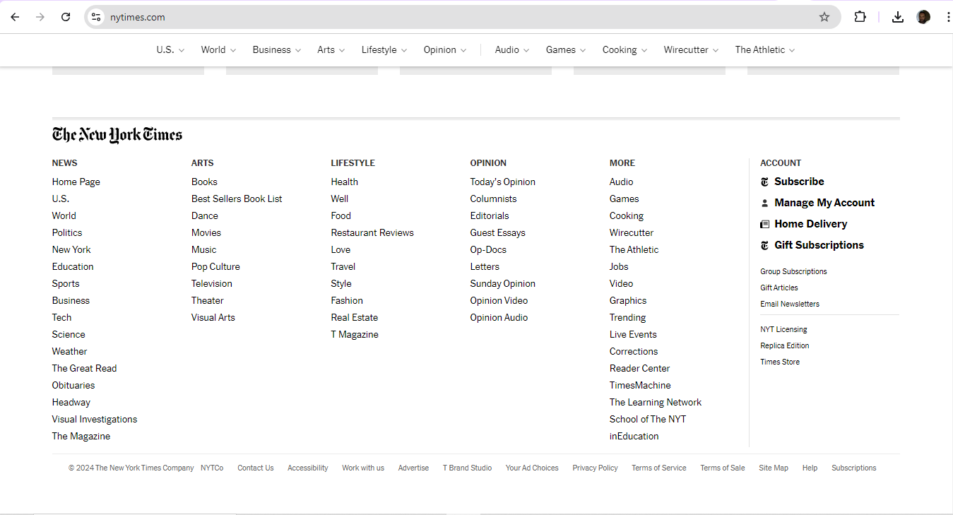
© The New York Times Company, Fair Use
Why Is Information Architecture Vital for Navigation?
Information architecture (IA) is possibly the most vital ingredient for designers to organize and structure content so they can help users understand and navigate a website or app better. It's more than just navigation, as it covers the overall organization, labeling and structure of information.
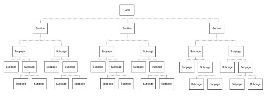
A deep or 5-level hierarchy—a site’s hierarchy will determine how many levels users need to go through to access subpages from the home page or point of entry. Designers need to get a clear idea of what to work with to facilitate the best navigation for users.
© Stephanie Lin, Fair Use
There are three key parts to IA:
Organizational structure: This defines how a designer groups information, including categories and how they relate to each other.
Content structure: This is about how information shows up, including its hierarchy and types of content used.
Navigation structure: This outlines the paths and tools that users use for moving through the information—like menus, links and search functions.
Designers have numerous things to consider with these structures. For example, users on a government site might need to access certain web pages in order and sequential navigation—with “Previous” and “Next” labels and arrows—would be an effective solution. In any case, when a designer needs to construct navigation from scratch, card sorting can be a helpful tool. It allows designers to research how users group and organize information.
UX Strategist and Consultant, William Hudson explains important points about information architecture:
What Are Common Navigation Patterns and When To Use Them?
There are various navigation patterns—each has its own strengths and best uses.
1. Horizontal vs. Vertical Navigation
Horizontal navigation bars are a popular choice for many websites. They work well for sites with a small to moderate number of top-level items—and they often appear at the top of company websites and blogs. They're familiar to users and don't take up much vertical space.
Vertical navigation, on the other hand, is great for sites with many categories. It often features in dashboard applications and content management systems. Vertical menus can hold more items and users find them easier to scan. As more users tend to look at the left side of the screen, left-side vertical navigation is a highly noticeable feature.
To choose between horizontal and vertical navigation, it’s important to consider:
Content amount: Horizontal works for fewer items, vertical for more.
Screen space: Horizontal frees up vertical space for content.
Future growth: Vertical is easier to expand later.
User familiarity: Horizontal is more common and may feel more natural to some users.
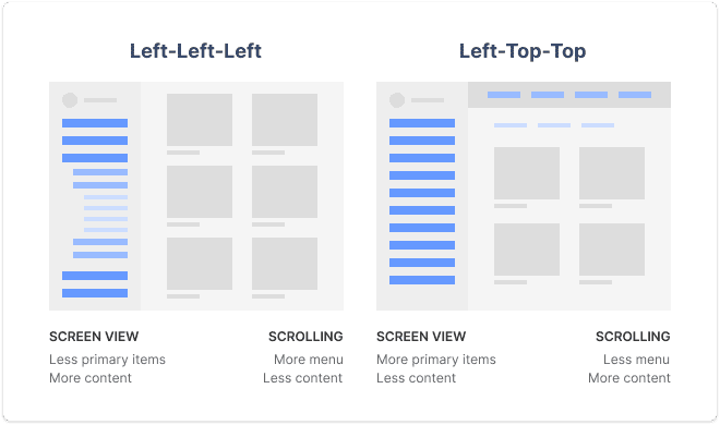
Vertical and horizontal user experience navigation considerations for designers to suit to their digital solutions.
© Snow, Fair Use
2. Mobile Navigation Considerations
As mobile usage grows, designers must adapt navigation for smaller screens. Here are some popular mobile navigation patterns:
Hamburger menu: This icon—three horizontal lines—reveals a hidden menu when tapped. It's space-efficient but can hide important options.
Tab bar: A row of icons at the bottom of the screen for quick access to main sections, it works well for apps with 3-5 key areas.
Bottom navigation: Similar to tab bars—but with labels—it's becoming more common on both iOS and Android.
Floating Action Button (FAB): A circular button that hovers over content, it provides quick access to a primary action.
The plus-sign button is a clear FAB for users.
© Google, Fair Use
What Are UX Design Navigation Best Practices?
To create successful navigation designs, consider the following key elements, starting with navigation definition:
Pick the right pattern for the UI content and the target users: This is fundamental, and it’s the best way to start on the path to truly user-centered designs, since navigation is the backbone of a digital product.
Keep clarity and consistency top of mind: Use clear labels and familiar UX copy throughout the design to help users understand where they are and where they can go.
Use meaningful labels: Boost SEO and provide relevant information by using specific, descriptive labels instead of generic terms like "products."
Consider mega menus: Mega menus might work better than dropdown menus for better usability; that’s because they’re larger, divided into contextual groups and visible at once.
Senior UX Consultant, Vitaly Friedman explains important points about mega menus:
Align the navigation with user goals: It’s vital to cater to primary user groups and their goals when designing navigation. User personas can help capture these primary groups effectively.
Author and Human-Computer Interaction Expert, Professor Alan Dix explains important points about user personas:
Conform the navigation to users’ mental models: These are the internal representations and expectations that users have about how a website or app should work—something that their previous experiences and interactions with digital products will have shaped. That’s why it’s extremely important to make the navigation and user flow be in line with what users already know and expect—for example, to purchase flight tickets. As with the consistency of design elements, consistency in how an intuitive and user-friendly navigation works for users and helps make it feel familiar and natural to them is crucial for design success and trust in the brand behind it.
Chief Operations Officer at The Team W, Inc., Guthrie Weinschenk explains essential aspects of mental models:
Use progressive disclosure: It’s important in navigation because it helps prevent overwhelming users with too much information at once. Designers should gradually reveal information and options as users progress through a website or app, and so guide them through the experience in a more manageable and intuitive way. Users can then focus on the most relevant content and tasks—with lower cognitive load while they enjoy greater overall usability. Progressive disclosure can help prioritize important information and actions, too—pointing users to easily find what they need without feeling overwhelmed.
UX Strategist and Consultant, William Hudson explains important points about progressive disclosure:
Do prototyping and testing well: It’s vital to use prototyping to understand the digital product, its direction and what success means for the target audience and users in general. Designers should test their navigation design to ensure it meets user needs.
Author and Human-Computer Interaction Expert, Professor Alan Dix explains important points about prototyping:
Factor in responsive design: Make sure that navigation menus and links display correctly on all devices, regardless of screen size or resolution.
CEO of Experience Dynamics, Frank Spillers explains key points about responsive design:
Include an effective search functionality: Put in a well-designed search function to help users quickly find information—something that’s especially vital in large or complex sites.
Insert location indicators: Use breadcrumbs or highlight current menu items to help users understand where they are within the app or website.
Have a strong visual hierarchy: Vary the design of UI elements to indicate the hierarchy of the site—use different font sizes, styles or icons to distinguish between primary and secondary navigation.
Watch our video about visual hierarchy to understand more about why it’s vital:
Design well for mobile UX: This is especially important as more users access sites and apps on handheld devices—so:
Keep it simple: Limit the number of main navigation items.
Make touch targets big enough: Aim for at least 44x44 pixels.
Use clear labels: Avoid jargon or unclear icons.
Consider context: Think about how users hold their phones and where their thumbs can reach.
Frank Spillers explains essential aspects of context and content for users:
Do proper user testing and make iterations accordingly: Testing is crucial to make sure products work well and meet user needs. Designers and UX researchers should evaluate a product with a group of representative users to see if it's easy to use and if users can achieve their goals. Effective navigation analytics tools can help them observe how users get on with the navigation in their designs. Here are several ways to conduct user testing:
Usability testing: Watch users as they try to complete tasks with the product, to pinpoint any issues and get their feedback on how to improve things.
William Hudson explains important points about usability testing:
A/B testing: Compare two versions of the product with different features—or designs—to see which of them works better.
William Hudson explains essential aspects of A/B testing:
In any case, to test navigation with users, it’s important to:
Set clear goals for what a designer wants to learn.
Choose the right participants who represent the target audience.
Use realistic scenarios that mimic real-world use.
Collect both qualitative and quantitative data.
Analyze the results and use them to improve the product.
Test early and often throughout the design process.
Design for accessibility and inclusivity: Accessible designs are a legal requirement in many jurisdictions—and when designers design for the diverse needs of a wide range of users, they’ll help all users, too. So, designers should:
Incorporate features such as alternative text for images, clear and concise labels, and keyboard navigation options.
Make sure that color contrast meets accessibility standards and provide options for font size adjustment.
Remember to user test with individuals with different abilities to find any usability issues—and make improvements to create a more inclusive navigation experience.
Watch our video on accessibility to understand how fundamental a part of design it is:
What Are Key Metrics to Measure and Optimize Navigation Performance?
To gauge how effective their UX and UI navigation designs are, UX professionals track several key metrics and key performance indicators (KPIs). These offer them insights into how users interact with a product's interface and help designers spot areas for navigation UI/UX improvements. Here are some important ones:
1. Search vs. Navigation Ratio
This measures whether users prefer to use the search function or navigate through menus to find information. To calculate this, designers set specific tasks for users and observe their behavior. The percentage of successful users who used search is what designers compare to those who used navigation. For example, in a test with 20 participants, if 12 used search and 8 used navigation, the ratio would be 60% search to 40% navigation.
2. Click-Through Rates
These refer to the percentage of users who click on a specific link or button within a navigation menu. It measures the effectiveness of the navigation design in guiding users to their desired destinations. A high CTR indicates that users are successfully finding and engaging with the content they’re looking for, while a low CTR may indicate usability issues or a lack of clarity in the navigation structure.
3. Bounce Rates on Navigation Pages
These refer to the percentage of users who leave a website or app after they’ve viewed just one page within the navigation—showing a lack of engagement or dissatisfaction with the content or user experience. High bounce rates may suggest issues with the navigation design—like confusing labels or a lack of clear call-to-action buttons.
4. Time Spent on Navigation-Focused Pages
When designers carefully analyze the average time users spend on these pages, they’ll be more likely to find areas where users are maybe getting stuck or experiencing difficulties.
5. User Navigation Paths
These refer to the specific routes and sequences that users take when they’re navigating through a website or app—giving valuable insights into user behavior, preferences and the effectiveness of the navigation design. If designers analyze user navigation paths, they can find popular or frequently used paths—as well as any paths that may lead to dead ends or confusion.
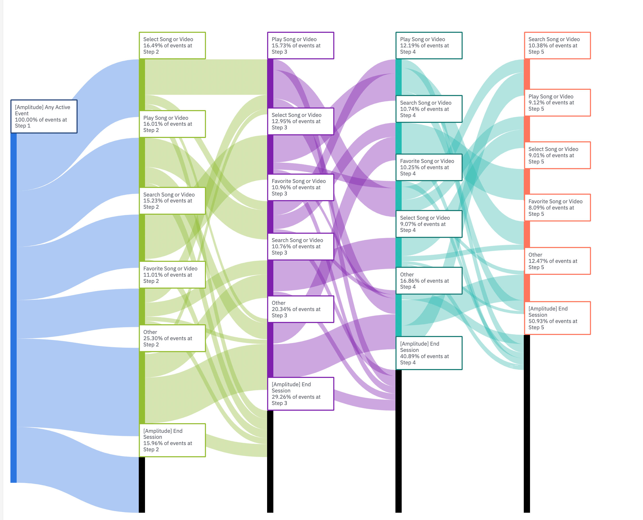
This Amplitude Sankey diagram displays common user flows in an app—note the overlapping pathways.
© Page Laubheimer, Fair Use
Why is Navigation in UX Design Important in UX Portfolios?
First, it’s important to understand some key aspects about UX portfolios and how they function as designs in themselves for potential employers and clients to access, use and base their decisions on.
Design Director at Societe Generale CIB, Morgane Peng explains important points about UX portfolios:
A designer’s ability to create effective navigational structures in interfaces is a crucial skill to showcase in their portfolio for several reasons, since it:
1. Demonstrates Problem-Solving Skills
Effective navigation showcases how able a designer is to solve user problems from organizing content efficiently. It highlights their understanding of how users interact with a product and how they guide users to achieve their goals. So, the case studies designers show should include how they built up to making the navigation in the end product as one of its key features.
2. Reflects User-Centric Design
To include navigation in a portfolio shows how a designer prioritizes the user’s journey and makes sure that users can easily find what they need in seamless and enjoyable experiences.
3. Exhibits Design Thinking
To do navigational design well calls for critical thinking and strategic planning. Designers can—through their case studies and how they present the portfolio as a design for prospective employers and clients to navigate—illustrate their ability to think through complex design problems and create intuitive solutions.
UX Strategist and Consultant, William Hudson explains key aspects of design thinking:
4. Highlights Technical Skills
It takes a designer’s knowledge of various design tools and techniques to design navigation UX well—so evidence of this can showcase how proficient a designer is with these tools and their technical capabilities.
5. Demonstrates Attention to Detail
Good navigation is often subtle yet essential. A designer who showcases it in their portfolio highlights their attention to detail and their understanding of the nuances that make a design effective.
Morgane Peng explains additional helpful points about UX portfolios for designers:
Overall, navigational UX is like the best-designed highway for the seamless journeys that users should enjoy. So, designers need to prove they understand not just where these individuals want to go but also why, when and how—as well as that all-important “who” element they’ll take away as an impression of a brand they should want to keep coming back to long into the future.


