Your constantly-updated definition of Information Radiators and collection of videos and articles. Be a conversation starter: Share this page and inspire others!
98 Shares
What are Information Radiators?
Information radiators are visual artifacts displayed prominently in a team’s workspace to convey key information to all team members. Also known as “big visible charts,” they ensure everyone on the team has access to updated information at all times, thus facilitating transparency and preventing miscommunication.
Transcript
Transcript loading ...
Examples of Information Radiators
The term “information radiator” can be applied to a range of artifacts. Anything that is important for the team to know can be considered an information radiator.
UX teams often use radiators such as personas, key user stories, “voice of the user” quotes and user journeys to constantly remind the team about the purpose of the project and to keep users front and center.
Teams may also put up posters and crucial guidelines as constant reminders; for example, a list of dos and don’ts for creating accessible designs, moodboards and design principles.
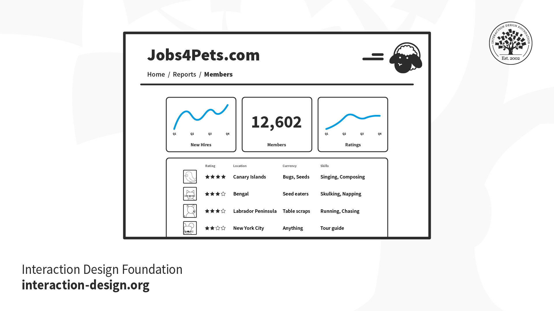
The Kanban board is widely used in the software industry by agile teams. It shows project status in real-time and helps teams know who is working on what at any given point in time.
A team may choose to display metrics such as application usage, revenues and error reports, to help teams stay clued in to product performance.
The most effective information radiators are highly visible, interactive ones, that spark conversation and on which team members can add annotations and constantly update. Many collaborative UX sessions, such as journey mapping, result in radiators that teams can continue to reference throughout the project.
In remote teams, where team members do not have a shared physical space, digital dashboards and tools can serve similar functions. For example:
Team members can view usage analytics or statistics about customer complaint tickets on a team dashboard. With digital tools, teams can also take advantage of automation to set up notifications in the team’s digital workspace. These could include daily/weekly snapshots or exception reports—when a key metric deviates significantly from the normal range.
Using collaborative, virtual whiteboards, teams can create shared spaces that contain all key information related to a project, including moodboards, personas, journey maps, etc.
Being a fully remote team, the IxDF relies heavily on digital whiteboards. For example, course instructors of the Agile Methods for UX design conducted a value proposition mapping activity and continued to refer to it during course development.
Just because anything can be an information radiator, doesn’t mean everything should. Select only the most relevant information that is important for everyone on the team to know about. For example, it’s important to include user personas, essential in design as fictitious representations of real users to help team members direct their focus well. A saturated space with too many radiators can overwhelm the team, or worse, team members may ignore the information, thus defeating its purpose.
Questions About Information Radiators? We've Got Answers!
What are information radiators in UX and product design?
Information radiators are visual displays, like dashboards, kanban boards, or status monitors, that share real-time project, design, or user data with teams to promote transparency and collaboration.
Coined by Alistair Cockburn in Agile methodology, information radiators “radiate” important data openlyso team members can see progress, blockers, metrics, or updates at a glance. In UX (user experience) design, this includes usability test findings, heatmaps, or KPIs (key performance indicators) displayed in the design studio. Product teams use them to track sprint goals, user feedback, or A/B test results. These tools align stakeholders, reduce silos, and keep user needs front and center for everyone involved in a product to refer to.
Watch this video for a brief introduction to information radiators, with Laura Klein: Product Management Expert, Principal at Users Know, Author of Build Better Products and UX for Lean Startups.
Transcript
Transcript loading ...
How did the term “information radiator” come from Agile development?
The term “information radiator” originated in Agile development (Alistair Cockburn coined it to describe visual displays that broadcast critical project information in shared workspaces), making status and progress instantly accessible.
In early Agile environments, teams used whiteboards, sticky notes, or printed graphs to make work visible. Cockburn observed that these visual tools acted like radiators, constantly emitting information without user interaction. They supported Agile principles like transparency, fast feedback, and collaboration. Over time, digital versions like dashboards and kanban boards carried this concept into UX and product design, the idea being to ensure everyone sees real-time updates and blockers.
Cockburn emphasized that information radiators work best when they're large, easy to interpret, and placed in high-traffic areas. Their effectiveness drops when hidden in tools or emails.
How do I design an effective information radiator for my UX team?
Start by identifying the key metrics your UX team needs to see daily. Choose data that directly impacts your work, such as user research completion rates, design review schedules, usability testing results, or sprint progress. Place your radiator in a high-traffic area where team members naturally gather.
Use large, clear visuals that people can read from several feet away. Color-code different types of information and update the display regularly to maintain relevance. Include both current status and trends over time so your team can spot patterns.
Make the radiator interactive when possible. Allow team members to update certain sections themselves, which increases engagement and ownership. Focus on actionable insights instead of vanity metrics. If the information doesn't help your team make better decisions or adjust their work, remove it. Test different formats and gather feedback to refine what works best for your specific team culture.
Discover more about design sprints and how they help teams reach goals effectively and efficiently.
What are some examples of information radiators used in design teams?
Design teams use information radiators like usability dashboards, sprint progress boards, feedback walls, and live design system health monitors to share insights and stay aligned.
Usability dashboards visualize testing results—task success, pain points, or user quotes. Kanban boards (physical or digital) show design tasks by status: To Do, Doing, Done. Feedback walls collect internal or external critiques for discussion.Live Figma embeds or style guide monitors show if UI components comply with the system. These radiators make progress visible, foster collaboration, and speed up decision-making by putting information in everyone's line of sight and keeping things top of mind.
Actionable Insights
Post test findings after each usability session to keep feedback fresh.
Use tools like Trello, Notion, or Jira as shared design task boards.
Embed design systems into dashboards to track consistency in real time.
Watch as Laura Klein discusses Kanban in this video:
Transcript
Transcript loading ...
Can I display stakeholder feedback or design decisions as a radiator?
Yes, you can and should display stakeholder feedback or design decisions as an information radiator; it fosters transparency, alignment, and accountability across teams.
Design walls, feedback dashboards, and decision logs make stakeholder input and design rationale visible to everyone. When placed centrally (physically or digitally), they prevent repeated discussions, reduce confusion, and document how and why design directions evolved. Use tools like Notion, Confluence, or Trello to display quotes, approvals, unresolved issues, or major decisions. Tag each entry with status (like “approved,” “pending,” “disputed”) so everyone can get a quick understanding.
Actionable Insights
Create a “Design Decision Log” board accessible to all stakeholders.
Highlight trade-offs or conflicting feedback to foster constructive discussion.
Update it in real-time to reflect the most current direction.
Watch as Morgane Peng: Designer, speaker, mentor, and writer who serves as Director and Head of Design at Societe Generale CIB, briefly discusses challenges designers can face from people who don't understand their role:
Transcript
Transcript loading ...
How do I use an information radiator in a design sprint?
Use an information radiator in a design sprint to visualize team progress, centralize user insights, and align everyone on goals, tasks, and feedback—day by day.
In a design sprint, information radiators like sprint boards, sketch galleries, or insight walls serve as shared visual anchors. Map out the sprint agenda and update it daily.Display user personas (vital tools and deliverables in design as fictitious representations of real users), key challenges, test findings, or stakeholder feedback to keep the sprint focused.Use sticky notes, kanban boards (e.g., Trello or Miro), or live dashboardsto track ideation, prototyping, and testing phases. Radiators reduce the chances of misalignment and boost participation by showing what's been done and what's up next.
Actionable Insights
Begin with a sprint goal board that evolves daily.
Post sketches, decisions, and assumptions in real time.
Dedicate a wall or virtual board to user feedback as it arrives.
Want to know more about personas and how to use them effectively? Personas and User Research: Design Products and Services People Need and Want will show you how to gather meaningful user insights, avoid bias, and build research-backed personas that help you design intuitive, relevant products. You'll walk away with practical skills and a certificate that demonstrates your expertise in user research and persona creation.
What are common mistakes when designing information radiators for UX?
Common mistakes when designing information radiators for UX (user experience) include cluttered layouts, outdated data, poor visibility, irrelevant content, and lack of ownership. These issues reduce clarity and hurt trust in the tool.
Radiators work best when they communicate essential info quickly. Cluttered or overly detailed displays overwhelm viewers. If data isn't updated regularly, teams ignore it—it's something that's fallen by the wayside. If an info radiator is in low-traffic areas, such as buried under obscure digital tabs, it kills its value. Including vanity metrics or too much data makes interpretation harder. Without someone responsible for upkeep, it quickly becomes obsolete; nobody's job becomes everybody's blind spot and anybody's guess as to if they're even using a radiator anymore.
Actionable Insights
Keep it visual and minimal—think charts, color codes, and simple text.
Assign a team member to update and curate the radiator.
Regularly review what data is useful and retire what's not.
Discover important points about visual hierarchy to help display information most effectively.
What information should I include in a UX-focused information radiator?
A UX-focused information radiator should include usability metrics, user feedback, design decisions, sprint status, and current pain points—visually organized for quick team reference. User personas (vital tools and deliverables in design as fictitious representations of real users) are also helpful for UX teams to keep focused.
Insert core KPIs (key performance indicators) like task success rate, NPS (net promoter score), error frequency, or drop-off points.Post qualitative insights such as quotes from usability tests, common user complaints, or behavioral patterns. Add current design challenges, pending decisions, or open questions. Use visual tools, such as heatmaps, charts, sticky notes, or tagged quotes, to increase clarity. Keep content relevant to the sprint or product phase and update it regularly to reflect live feedback.
Additional Tips
Include a “Voice of the User” section with rotating insights.
Highlight top usability issues alongside progress toward resolving them.
Designate a team member to refresh the board weekly.
How do I keep remote teams engaged with a digital information radiator?
To keep remote teams engaged with a digital information radiator, make it visually digestible, easy to access, and woven into daily workflows using collaborative tools like Notion, Miro, Trello, or Figma.
Remote teams benefit most from radiators that update live and integrate with their daily tools. Pin the radiator in shared channels, such as Slack or Microsoft Teams, and use clear visuals, such as charts, progress bars, or tagged sticky notes, to highlight updates. Include sections for feedback, blockers, and team wins to keep morale up.Encourage asynchronous participation with comment features or reactions. Rotate ownership weekly to keep it fresh and collaborative.
Additional Tips
Use automated integrations (e.g., Jira → Notion) to keep data fresh.
Schedule quick reviews during stand-ups to reinforce its importance.
Include “shout-outs” or feedback summaries to humanize the board.
Watch as Laura Klein explains helpful points about cross-functional collaboration:
Transcript
Transcript loading ...
What are some recent or highly cited articles about information radiators?
Agile Alliance. (n.d.). Information radiators. Agile Alliance Glossary. Retrieved June 18, 2025, from https://agilealliance.org/glossary/information-radiators/
The Agile Alliance defines information radiators as visible displays—handwritten, printed, drawn, or electronic—placed in prominent locations so team members and stakeholders can glance at project status instantly, such as automated test counts, velocity, incident reports, or CI/CD health. Their key value lies in fostering transparency, enabling rapid course correction, and enhancing team-wide situational awareness without requiring explicit communication. Used in Agile environments through dashboards, task boards, and charts, information radiators simplify complex data into accessible formats, thereby streamlining collaboration, accountability, and decision-making in UX and interaction design contexts.
This forward-looking research examines the evolution of interactive information radiators (IIRs) in the context of emerging technologies and changing work practices. The authors explore how developments in augmented reality, virtual reality, artificial intelligence, and hybrid work environments will impact the design and use of information radiators for knowledge workers. The study presents a comprehensive scenario-based analysis of future information radiator systems, discussing implications for workplace design, collaboration patterns, and information consumption behaviors. The research contributes to understanding how traditional information radiators must adapt to support distributed teams, integrate with emerging technologies, and maintain their core functions of providing awareness, serendipity, and social connection in future work environments.
Earn a Gift! Answer a Short Quiz at the End of This Page
Earn a Gift, Answer a Short Quiz!
1
2
3
4
1
2
3
4
Question 1
Question 2
Question 3
Get Your Gift
2
3
4
2
3
4
Question 1
Question 2
Question 3
Get Your Gift
3
4
3
4
Question 1
Question 2
Question 3
Get Your Gift
4
4
Question 1
Question 2
Question 3
Get Your Gift
Try Again! IxDF Cheers for You!
0 out of 3 questions answered correctly
Remember, the more you learn about design, the more you make yourself valuable.
Improve your UX / UI Design skills and grow your career!
Join IxDF now!
Congratulations! You Did Amazing
3 out of 3 questions answered correctly
You earned your gift with a perfect score! Let us send it to you.
1
Check Your Inbox
We've emailed your gift to name@email.com.
Improve your UX / UI Design skills and grow your career! Join IxDF now!
Learn More About Information Radiators
Make learning as easy as watching Netflix: Learn more about Information Radiators by taking the
online IxDF Course Agile Methods for UX Design.
Why? Because design skills make you valuable. In any job. Any industry.
In This Course, You'll
Get excited when you discover that agile isn't just about speed; it's about clarity, confidence, and doing work that delivers better results faster.As AI reshapes how teams work, you stay in demand when you can use timeless human-centered design skills to bring clarity and direction to fast decisions and keep projects focused on real human needs. Agile skills help you stay competitive in any job and across all industries. Today, 95% of organizations use Agile development methods to quickly adapt and avoid delays, bottlenecks, and costly failures in the design and development process.
Make yourself invaluable with the high-demand skills that companies are looking for. Agile methodologies often top job requirement lists because they help teams deliver more value in less time. Agile empowers you to feel in control, make faster, smarter decisions, and do meaningful work without burning out. Whether you're in User Experience (UX) Design, marketing, or management, this course will give you the skills you need to find solutions in less time and drive business success with higher-quality deliverables. You'll improve communication with developers, product managers, and other stakeholders, breaking down silos for a more collaborative team dynamic. You'll learn the secret to navigating different Agile environments with ease and experience the satisfaction of real progress.
Gain confidence and credibility as you get hands-on with proven techniques like continuous discovery, Minimum Viable Products (MVPs), and design slicing. It's easier than you think! No matter your background, you can easily learn to master Agile Methods for UX Design. You'll get comfortable with Agile patterns and anti-patterns and learn how to tailor your design and research to different teams. With step-by-step guidance and downloadable resources like the glossary of Agile terms and the product roadmap, you'll have everything you need to excel in any Agile environment.
It's Easy to Fast-Track Your Career with the World's Best Experts
Master complex skills effortlessly with proven best practices and toolkits directly from the world's top design experts. Meet your experts for this course:
Laura Klein: Product Management Expert, Principal at Users Know, and author of “Build Better Products” and “UX for Lean Startups.”
Teresa Torres: Product Discovery Coach at Product Talk, speaker, and author of “Continuous Discovery Habits.”
Adam Thomas: Product Management Expert who has worked with top companies like Google, BP, and SmartRecruiters.
Get an Industry-Recognized IxDF Course Certificate
Increase your credibility, salary potential and job opportunities by showing credible evidence of your skills.
IxDF Course Certificates set the industry gold standard. Add them to your LinkedIn profile, resumé, and job applications.
Be in distinguished company, alongside industry leaders who train their teams with the IxDF and trust IxDF Course Certificates.
We conducted research with hundreds of people working on agile teams about their experiences in order to understand some of the biggest design problems they encounter. Designers who work in sprints of one or two weeks can be under pressure to deliver fast, skip research and cut corners, which can pr
Social shares
748
Published
Read Article
Designing the Smallest Possible Thing
We conducted research with hundreds of people working on agile teams about their experiences in order to understand some of the biggest design problems they encounter. Designers who work in sprints of one or two weeks can be under pressure to deliver fast, skip research and cut corners, which can pretty quickly ruin a product’s user experience. One way to work in agile teams is to learn how to design small. We need to shift our mindset from "design everything at once" to "design the smallest possible thing."
One of the most challenging aspects of being a designer on an agile team is the fundamental idea of shipping code quickly and often. Designers working on a team doing one- or two-week sprints can feel tremendous pressure to cut corners, skip research and jump straight from idea to execution. Of course, we also realize that these are surefire ways to design the wrong thing, and badly.
In discussions about the difficulties of designing on agile teams, one of the most common complaints is that there is just no time! And that’s true in many cases. If designers want to work agilely and still design great, user-centered products, we need to stop designing faster and learn how to start designing less.
"We need to stop designing faster and learn how to start designing less." - Tweet This
We need to shift from a mindset where we design everything all at once and move toward a mindset of designing the smallest possible thing that can deliver value to our users. So, what does that look like?
Why We Design Small
Before we get into the how, let’s talk about why it’s so important to design, build and ship small things. It is not, as one might sometimes imagine, solely for the purpose of frustrating designers and researchers who sometimes like to have a holistic view of the things they are designing for often excellent reasons.
Finding the smallest thing we can to deliver value to a customer or user gives us quite a few benefits. For one, we get to deliver a potentially valuable thing to somebody who can start using it immediately instead of making them wait for dozens of other, unrelated features or changes. Frequently, very small changes or bug fixes can mean an enormous improvement in the user’s experience of a product.
Sometimes, of course, a change can have no impact whatsoever, or even a negative impact, and that’s a really good thing for us to find out as soon as possible too. By shipping smaller things more frequently, we have more chances to get feedback on our ideas and execution.
If something is going to be a massive failure, sometimes you can find out very early by shipping a small version of it. Imagine all the features you wouldn’t have created at all if you’d known how they would perform! Imagine all the value you could deliver to users if you weren’t busy building enormous versions of things that nobody wants. Delivering small features early gives you information that can help your team make a decision about whether the rest of the feature is worthwhile.
By breaking things down into shippable chunks, we can deliver value early and often and get feedback on our ideas before sinking tons of resources into them. That doesn’t sound so bad.
Unfortunately, it’s really hard to do well—and if you do it badly, it’s much worse than just designing everything up front.
Why It’s So Hard to Get Right
It doesn’t seem like it should be harder to design small things than it is to design large things, and yet many designers struggle with it for excellent reasons.
First, as designers, we’re often trained to think about products and experiences holistically. This is a good thing! We want to know the entire experience a user will have with a product. Indeed, we know that designing things in several pieces can provide a disjointed and inconsistent experience.
One designer we spoke with explained it perfectly. Her team was tasked with designing the information architecture for a very large site with many different categories of content. The engineers wanted to get started working on the code for searching the content, but she felt uncomfortable delivering the taxonomy for only one category, because she knew that—once they looked at other categories—they would find many more things that would require searching once she’d evaluated the other types of content in the system. After all, you don’t search for books using the same criteria that you would use to search for shoes or cars. She didn’t want an incomplete model that would just have to be changed later.
This leads to another reason it can be difficult to design on agile teams. Many of the people we spoke with reported that they very rarely got to iterate and improve a design once it was in the wild. When teams don’t return to incomplete or narrow versions of features, it can cause designers to shove as many details as possible into version 1.
And, of course, it can be very traumatic for designers to know that a feature is out in the world, imperfect and never to be improved. That is our work. We want it to be perfect. We want it to solve problems for people. We want to include it in our portfolios without blushing. These are all perfectly reasonable reactions, and they make it much harder to compromise and agree to design a small version of something when we are convinced that something bigger would be better.
What Designing Small Means
Just because something is difficult to get right doesn’t mean it necessarily has to produce a worse outcome. It may just take a bit more work to do well. Despite the well-founded complaints of many of the designers we spoke with, designing smaller things doesn’t have to mean designing worse things.
In fact, many of the people we spoke with found tremendous value in delivering value in smaller chunks, provided they remembered a few key things.
Often we refer to the first version of something that comes out as an MVP or Minimum Viable Product. Unfortunately, people often miss the very important “viable” part of that term. When you create the very first version of a new feature or product, it may be small, but it also has to be viable. It shouldn’t be buggy or impossible to use or otherwise bad.
Remember, we build something small and get it in front of users in order to learn something. That’s the whole point of producing something that people can start using. All we learn when we ship a bad or buggy or unusable product is that people don’t like things that are bad! Then, we have to figure out whether people aren’t using our new feature because it’s not the right thing or it’s the perfect thing but so poorly executed that nobody can stand using it.
Small Isn’t an Unrelated Mishmash of Features
Another difficult thing about designing, building and shipping in small increments is that we can lean toward shipping a lot of little features that get prioritized because they can be built quickly.
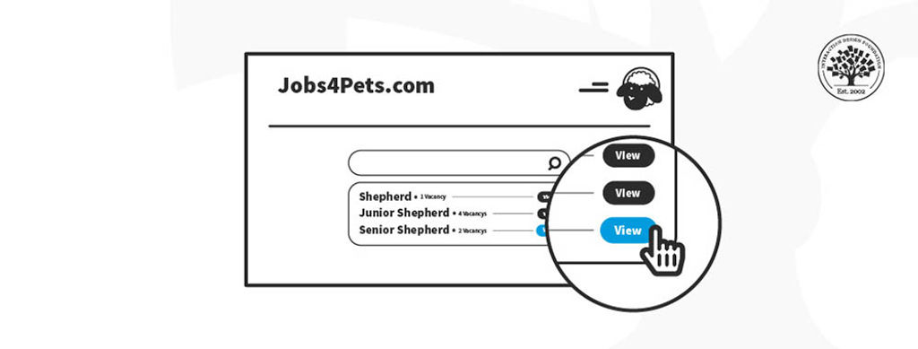
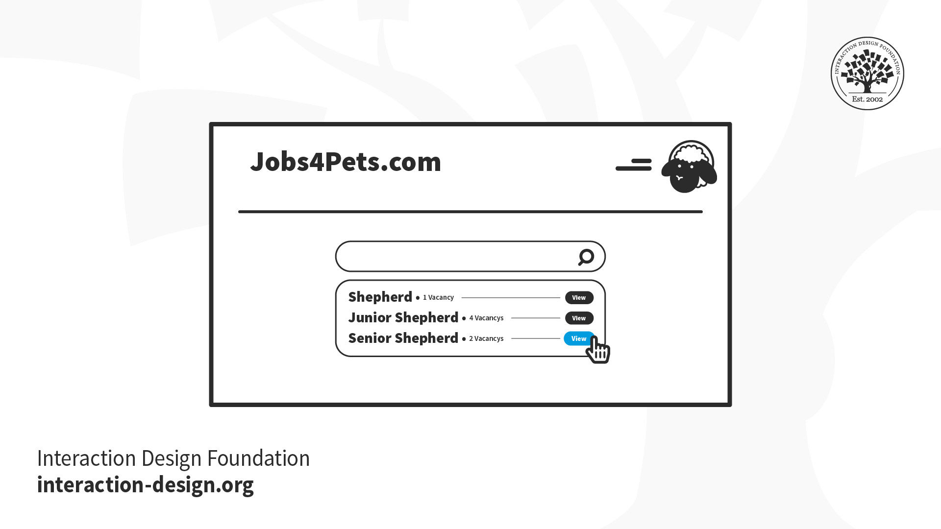
Imagine you’re building an interface that lets people search and apply for jobs. There are many things to include. For example, you need job postings with descriptions of the jobs that users get from potential employers. You need an interface that asks job seekers to submit their information. You need a system that lets potential employers review the applications. You’ll probably want some sort of profile or account pages that let both sides of the process store their information so that they don’t have to re-enter everything every time they post or apply for a job.
Each of these larger systems has multiple smaller features inside it. For example, the application process might have a feature that lets the job seeker pause an application and come back to finish it later. Or the posting feature might let employers repost a job description if they need to hire another person.
Now, as a designer, you might think you need to release all of those things to make the job board useful. But that’s really not true. What you do have to do, though, is make sure that you design and build things in the right order. You wouldn’t design the ability to repost a job before you designed the interface that let people post a job in the first place, right? And you wouldn’t want to design the interface that lets people apply for a job before you figured out a way to let them look at different jobs they might want.
Every time you design and release something, it should be something useful, and it should build on the existing interface in a rational way.
Small Is Useful
Most importantly, whatever you release should be useful to the expected user. If you have a very large user base, it might not immediately be useful to absolutely everybody, but it should be something that can be used by a specific segment of your customers, at least enough that you can get feedback on it and make it better in the next iteration.
Can you think of the smallest possible thing you could build for a job posting site that would make it useful? What is the least amount of design work you could do to deliver something that could be tested with users?
How Do You Design Small?
There are a multitude of techniques for designing small things that are still useful and usable and that can be improved and grown through iteration. For example, you can:
Understand the Goal
The most important part of designing small is understanding the core goal of the feature or product you’re creating. If your goal is too big or poorly understood, it’s very easy to just continue adding feature after feature because “somebody might want it.”
For example, imagine you’re designing the job board mentioned earlier. If it’s a general job board for any sort of job and any sort of user, you’re going to design it very differently than if it’s a job board for a highly specific industry in a particular location. Aiming too broadly will affect everything from your search options to the number of jobs you expect to show, to the requirements for the application form.
By zeroing in on the specific value you want to deliver to a well-defined set of users, you will already be on your way to designing a small, focused feature or product that will ultimately serve you much better than a large feature designed for “everybody” and useful for nobody.
Experiment with One
Let’s say you’re designing a reporting dashboard for your job searching site. It can be tempting to ideate broadly and try to understand all the possible different reports that employers and job seekers will want and then design them all.
While it’s perfectly reasonable to spend a bit of time to understand which reports may be most useful, consider only fully designing and building one at a time, preferably prioritized by which you think will deliver the most value based on your research. Why would you make your users wait to see the most valuable report just because you haven’t finished designing the least valuable one? What if you’re wrong and people don’t need reports at all? By designing and releasing one report at a time, you’ll learn more quickly while hopefully delivering value to your users on a regular basis.
This obviously doesn’t just apply to reports. If you have multiple similar things that you’re planning on releasing, look at whether it’s possible to start with one and then add more later.
Start without Code
Often when we are asked to design a new feature or product, there are many different ways we could design it. We can spend a ridiculous amount of time in meetings debating the best way to implement something.
Ideally, we’d get to build many different versions of something and just see which ones people like better, but this leads us to another problem: code is expensive. Prototypes and experiments, on the other hand, can be quite cheap.
Instead of jumping straight to designing fully realized features that will immediately be built by engineers, try designing experiments to learn the best way to build something. Try a concierge test or a Wizard of Oz experiment. Build a few interactive prototypes to test with users.
There is no rule that designers can only design pixel-perfect interfaces. We can also be experiment designers.
Don’t Deliver to Everybody at Once
One thing that makes designers hesitate about shipping an imperfect or unfinished design to people is not wanting to disappoint their users. After all, launching something that’s half-baked can end up reflecting very badly on the product and the company.
On the other hand, offering something that’s a work in progress to a small group of users who may have opted into early releases is an entirely different story. Testing out a new design on a few dozen or even a few hundred users can offer tremendous value to the team in the form of crucial insights and potential problems without risking disappointment for the whole user base.
Stop thinking that you have to launch every new feature with a press release and a marketing push. You’re still delivering value to users, even if you’re only delivering it to a few dozen beta testers or some internal folks who have volunteered to try things out. You’ll find that you’re a lot less concerned about failure if it’s done on a smaller stage, and you’re a lot less likely to fail if you’ve tested out your designs on smaller audiences first.
Accept Some Imperfection
With all that said, it’s important for teams to get over any fears of imperfection we may have. The truth is, none of our products will ever be perfect; moreover, in many cases, we don’t even know what perfect is. Obviously, we should not be shipping software that doesn’t work or is buggy or insecure to people. But we also don’t need to spend days or weeks obsessing over every pixel and every bit of polish if we’re not even sure that the feature is useful.
Think of all the hours spent grinding out gorgeous designs for products that nobody ever uses. Think of how much more useful it would have been to spend those hours testing ideas and finding a product that people actually want to use before putting the work into making everything perfect.
Commit to Iterating
Of course, if you’re going to accept imperfection, your team had better also be willing to commit to iteration. When we asked designers to tell us their biggest complaints about working on agile teams, many responded that they hated that their teams never iterated. They worked really hard to ship things fast and then never went back to refactor or improve the features. Sometimes they didn’t even measure the results of the features.
This is explicitly anti-Agile. Agility requires iteration. It requires improvement and refactoring. If you never go back to improve (or kill) your imperfect features, then nobody will feel safe releasing something they think might be imperfect. We have to commit to learning from our users and constantly improving features and products that are already in the wild, not just shipping endless features into the great abyss of user indifference.
The Take Away
One of the reasons agile teams can struggle with design and research is that it can be a challenge to design small, discrete things that still fit into a greater product vision and don’t sacrifice quality. If designers want to get more agile, they should learn how to make small things, get feedback and embrace experimentation, iteration and refactoring.
References and Where to Learn More
Here’s a primer on Concierge and Wizard of Oz tests from Kromatic: Concierge vs. Wizard of Oz Prototyping
AI is replacing jobs everywhere, yet design jobs are booming with a projected 45% job growth.
With design skills, you can create products and services people love. More love means more impact and greater salary potential.
At IxDF, we help you from your first course to your next job, all in one place.