Screenshot of the Attribute Explorer interface, showing multiple vertical histograms side by side. Each histogram represents a data attribute with adjustable sliders for filtering. Some histogram bars are highlighted in yellow, indicating selected ranges,

Information Visualization an Introduction to Transformable Information Representations

• 8 min read

686 Shares

The more complex the data set, the more likely it is that a traditional static information visualization is going to struggle to deliver a useful end product for the viewer of the visualization. In order to combat this problem, it is possible to use computer software to develop interactive visualizations that allow the user to take some control over the way that data is either rendered or presented.

There are two common ways to introduce interactivity into information visualizations – manipulable models and transformable models. This article is concerned with the latter, transformable models of information visualization.

In his book, “Introduction to Information Visualization” Riccardo Mazza offers 5 common techniques to deliver transformable representations:

  1. Data Filtering at the Input Stage

  2. Data Reordering

  3. Dynamic Querying

  4. Magic Lenses

  5. Attribute Exploration

Let’s take a look at each of those in a little more detail:

Data Filtering at the Input Stage

A dynamic interactive visualization can be created so that the user may choose which data attributes that they want to examine. This is done prior to the visualization being rendered and the user will apply any number of filters to the data set before the data is inputted into the final rendered visualization.

Data filtering is used to deliver:

  • The elimination of data (or attributes of that data) that don’t need to be rendered because the user has no use for them.

  • The narrowing down of data so that analysis can be carried out based on varying attributes or instances of the data range.

Narrowing down data ranges can be incredibly useful to analysts. For example, a telecoms analyst might wish to examine the efficiency of particular telecoms products and their data throughput over time. They could apply filters to examine each product individually and then compare each visualization against the others in order to compare these products.

Author/Copyright holder: Unknown. Copyright terms and licence: Fair Use.

Data filters are available in many software packages that handle data – they are normally easy to apply using drop downs, range specifiers, etc.

Data Reordering

Users of Excel (as seen below) or even Word will be very familiar with the idea of data reordering. It is commonly used in tables where the user chooses to sort data by a particular attribute for example by alphabetical order or by order of value.

This kind of processing can help make it abundantly clear whether a dependent relationship exists between the sorted attribute and any other attributes within the data.

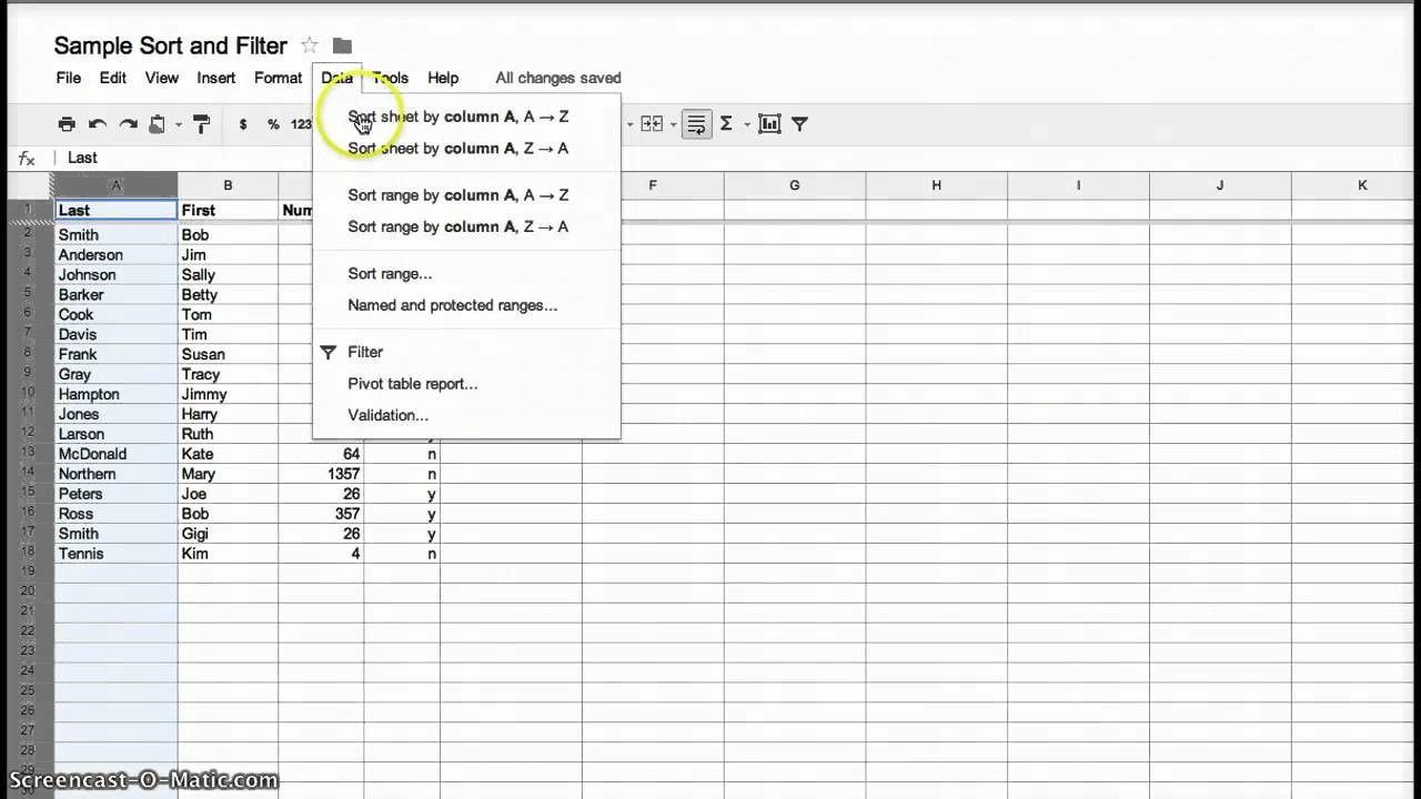
Author/Copyright holder: Stacci Barganz. Copyright terms and licence: Fair Use.

Dynamic Querying

Data is stored in databases and that means that it can be queried directly from the database. Unfortunately, in order to query a database directly – the user needs to know the query language and fully understand how relational databases work. This is a problem in most environments because users don’t tend to have these skills and providing them, via training and education, is both expensive, time consuming and has little guarantee of success.

The alternative is to develop simple software tools which can be easily understood by the user that generate “dynamic queries” (e.g. the software translates the action of the user into a specific query for the database) that transform an information visualization. These tools often come in the form of graphical interface elements such as clickable calendars, radio buttons, sliders, etc.

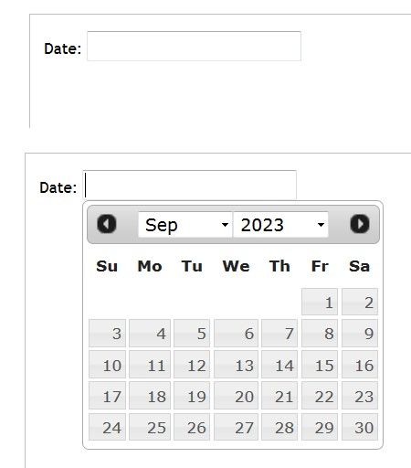
Author/Copyright holder: Rfc1394. Copyright terms and licence: CC BY-SA 3.0

Above, one of the most common dynamic querying tools in use – the humble date picker.

Magic Lens

The Xerox PARC laboratory team developed the magic lens. It’s a software tool that allows the user to place a lens over a part of an information visualization and then filter the data that is seen under the lens. The user has control over the placing of the lens and controls with which to filter the data set. It is possible to use more than one lens and overlap them to carry out different filtering operations simultaneously.

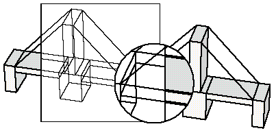
Author/Copyright holder: Wolfgang Aigner. Copyright terms and licence: PubL

Above the magic lens is applied to a 3D model of a bridge.

Attribute Exploration

Bob Spence, the engineering and information visualization expert, developed a tool in 1994 called the Attribute Explorer. It used cursors and histograms to examine a dataset via visual representations.

The attributes of the data are displayed as a histogram. When a user filters one histogram by a certain attribute, all other histograms are filtered at the same time.

This form of information visualization is quite difficult to understand without watching the explanation video for it. This video can be found here.

The Take Away:

Using transformable information representations gives the user control over the data which is being displayed in the model. This can be very useful to deliver models that provide value to the user when large data sets (which would be confusing if rendered in their entirety) are being represented. There are 5 common techniques for rendering models transformable and they are: data filtering at the input stage, data reordering, dynamic querying, magic lenses and attribute exploration.

Ronald Coase, the economist, said; “If you torture the data long enough, it will confess.” Transformable information representations allow users to easily “torture” data.

References & Where to Learn More:

More about Bob Spence.

Lisa Tweedie, Bob Spence, David Williams and Ravinder Bhogal, “The Attribute Explorer.”

Eric A. Bier, Maureen C. Stone, Ken Pier, William Buxton, Tony D. DeRose. Toolglass and Magic Lenses: The See-Through Interface. Proceedings of SIGGRAPH '93, 1993.

Riccardo Mazza, Introduction to Information Visualization, Springer, ISBN 878-1-84800-219-7

Hero Image: Author/Copyright holder: pushandplay. Copyright terms and licence: CC BY 2.0

Learn More in This Course:

AI for Designers

11 days
13 % booked
View Course

What You Should Read Next

  • Read full article
    Information Overload, Why it Matters and How to Combat It - Article hero image
    Interaction Design Foundation logo

    Information Overload, Why it Matters and How to Combat It

    Designers often need to convey information to the users of their designs. Specialists in information visualization design in particular find themselves presenting data over and over again to their users. However, it’s important when developing your designs that you don’t create “information overload

    Social shares
    1.2k
    Published
    Read Article
  • Read full article
    How to Design an Information Visualization - Article hero image
    Interaction Design Foundation logo

    How to Design an Information Visualization

    Designing information visualizations offers you endless possibilities when it comes to end products, and it would be impossible to provide step-by-step instructions for all these possibilities. However, it is fair to say that while the end products may vary dramatically – the process by which we rea

    Social shares
    984
    Published
    Read Article
  • Read full article
    Preattentive Visual Properties and How to Use Them in Information Visualization - Article hero image
    Interaction Design Foundation logo

    Preattentive Visual Properties and How to Use Them in Information Visualization

    A preattentive visual property is one which is processed in spatial memory without our conscious action. In essence it takes less than 500 milliseconds for the eye and the brain to process a preattentive property of any image. This is good news for information visualization designers and graphic des

    Social shares
    978
    Published
    Read Article
  • Read full article
    How to Visualize Your Qualitative User Research Results for Maximum Impact - Article hero image
    Interaction Design Foundation logo

    How to Visualize Your Qualitative User Research Results for Maximum Impact

    When thinking about visualization of research results, many people will automatically have an image of a graph in mind. Do you have that image, too? You would be right in thinking that many research results benefit from a graph-like visualization, showing trends and anomalies. But this is mainly tru

    Social shares
    966
    Published
    Read Article
  • Read full article
    How to Conduct Focus Groups - Article hero image
    Interaction Design Foundation logo

    How to Conduct Focus Groups

    Focus groups have long been a popular tool in market research and have become more popular in user research in the recent past too. They consist of a group of between 5 and 10 users who work with a moderator/facilitator/researcher. The moderator will pose questions from a script to the group. Their

    Social shares
    926
    Published
    Read Article
  • Read full article
    Visual Mapping – The Elements of Information Visualization - Article hero image
    Interaction Design Foundation logo

    Visual Mapping – The Elements of Information Visualization

    Information visualization requires mapping data in a visual or occasionally auditory format for the user of the visualization. This can be challenging because while some data has a spatial relationship built in (for example, temperatures in cities around a country) many data sets don’t have a tradit

    Social shares
    907
    Published
    Read Article
  • Read full article
    The Properties of Human Memory and Their Importance for Information Visualization - Article hero image
    Interaction Design Foundation logo

    The Properties of Human Memory and Their Importance for Information Visualization

    It is important to know that while neuroscience has progressed dramatically over the last decades; there is no complete understanding of how human memory works. We know, for example, that data in the brain is stored in clusters of neurons but we don’t know how, precisely, it is stored or even how it

    Social shares
    903
    Published
    Read Article
  • Read full article
    Guidelines for Good Visual Information Representations - Article hero image
    Interaction Design Foundation logo

    Guidelines for Good Visual Information Representations

    Information visualization is not as easy as it might first appear, particularly when you are examining complex data sets. How do you deliver a “good” representation of the information that you bring out of the data that you are working with?While this may be a subjective area of information visualiz

    Social shares
    900
    Published
    Read Article
  • Read full article
    Information Visualization – A Brief Introduction - Article hero image
    Interaction Design Foundation logo

    Information Visualization – A Brief Introduction

    Have you ever thought about how much data flows past each of us in an ordinary day? From the newspaper you read at breakfast, to the e-mails you receive throughout the day, to the bank statements generated whenever you withdraw money or spend it, to the conversations we have, and so on?There is a ti

    Social shares
    873
    Published
    Read Article
  • Read full article
    How to Show Hierarchical Data with Information Visualization - Article hero image
    Interaction Design Foundation logo

    How to Show Hierarchical Data with Information Visualization

    Hierarchical data is essentially a specialized form of network data – in that while entities within the dataset do not have dependent relationships; they are all related to each other by the principle of containment. They, unlike standard data networks, do not use the principle of connection.A hiera

    Social shares
    846
    Published
    Read Article

Top Articles

Top Topic Definitions

Feel Stuck?
Want Better Job Options?

AI is replacing jobs everywhere, yet design jobs are booming with a projected 45% job growth. With design skills, you can create products and services people love. More love means more impact and greater salary potential.

At IxDF, we help you from your first course to your next job, all in one place.

See How Design Skills Turn Into Job Options
Privacy Settings
By using this site, you accept our Cookie Policy and Terms of Use.
Customize
Accept all

Be the One Who Inspires

People remember who shares great ideas.

Share on:

Academic Credibility — On Autopilot

Don't waste time googling citation formats. Just copy, paste and look legit in seconds.

Feel Stuck? Want Freedom?

Join 326,035+ designers who get one powerful email each week. Learn to design a life you love.

Next email in
1
day
8
hrs
53
mins
40
secs

Free forever. No spam. Unsubscribe anytime.