Interactivity in visual representations can come in the form of either manipulable representations or transformable representations. A transformable representation enables the user to adjust the processing for the visual mapping so that the data is structured in different ways. There are 5 common techniques used for developing transformable information representations, including filtering, data reordering, dynamic querying, magic lenses, and attribute exploration.
Transformable Information Representations
Your constantly-updated definition of Transformable Information Representations and collection of videos and articles.
Be a conversation starter: Share this page and inspire others!
196 Shares
What are Transformable Information Representations?
Learn More About Transformable Information Representations
Make learning as easy as watching Netflix: Learn more about Transformable Information Representations by taking the online IxDF Course Information Visualization.
Why? Because design skills make you valuable. In any job. Any industry.
Get an Industry-Recognized IxDF Course Certificate
Increase your credibility, salary potential and job opportunities by showing credible evidence of your skills.
IxDF Course Certificates set the industry gold standard. Add them to your LinkedIn profile, resumé, and job applications.

Be in distinguished company, alongside industry leaders who train their teams with the IxDF and trust IxDF Course Certificates.

All Free IxDF Articles on Transformable Information Representations

Information Visualization an Introduction to Transformable Information Representations
The more complex the data set, the more likely it is that a traditional static information visualization is going to struggle to deliver a useful end product for the viewer of the visualization. In order to combat this problem, it is possible to use computer software to develop interactive visualiza
- Social shares
- 686
- Published
Read Article

Information Visualization an Introduction to Manipulable Information Representations
Static representations of data have been with us for millennia; a single image of a data set can be incredibly useful but with the increasing complexity of data sets a static representation can also be inadequate to the task of delivering value to the user of the information visualization.Ed Dunbill
- Social shares
- 622
- Published
Read Article
Information Visualization an Introduction to Transformable Information Representations

The more complex the data set, the more likely it is that a traditional static information visualization is going to struggle to deliver a useful end product for the viewer of the visualization. In order to combat this problem, it is possible to use computer software to develop interactive visualizations that allow the user to take some control over the way that data is either rendered or presented.
There are two common ways to introduce interactivity into information visualizations – manipulable models and transformable models. This article is concerned with the latter, transformable models of information visualization.
In his book, “Introduction to Information Visualization” Riccardo Mazza offers 5 common techniques to deliver transformable representations:
Data Filtering at the Input Stage
Data Reordering
Dynamic Querying
Magic Lenses
Attribute Exploration
Let’s take a look at each of those in a little more detail:
Data Filtering at the Input Stage
A dynamic interactive visualization can be created so that the user may choose which data attributes that they want to examine. This is done prior to the visualization being rendered and the user will apply any number of filters to the data set before the data is inputted into the final rendered visualization.
Data filtering is used to deliver:
The elimination of data (or attributes of that data) that don’t need to be rendered because the user has no use for them.
The narrowing down of data so that analysis can be carried out based on varying attributes or instances of the data range.
Narrowing down data ranges can be incredibly useful to analysts. For example, a telecoms analyst might wish to examine the efficiency of particular telecoms products and their data throughput over time. They could apply filters to examine each product individually and then compare each visualization against the others in order to compare these products.
Author/Copyright holder: Unknown. Copyright terms and licence: Fair Use.
Data filters are available in many software packages that handle data – they are normally easy to apply using drop downs, range specifiers, etc.
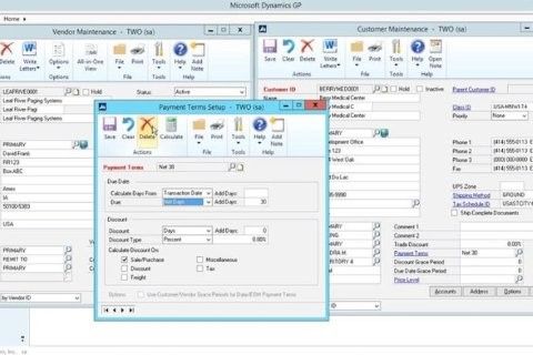
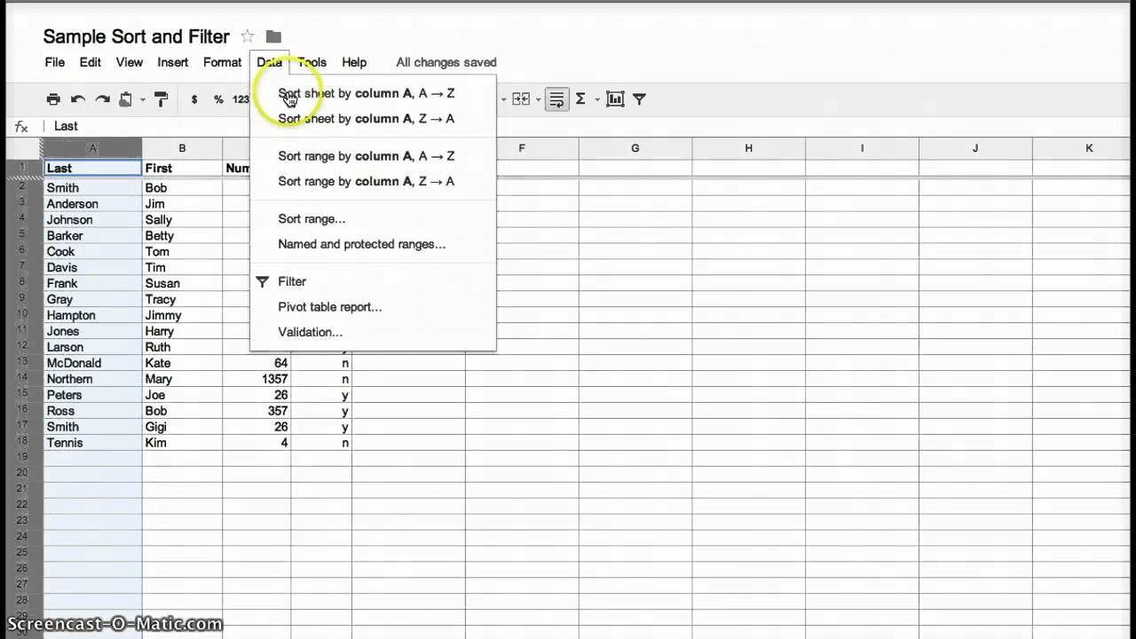
Data Reordering
Users of Excel (as seen below) or even Word will be very familiar with the idea of data reordering. It is commonly used in tables where the user chooses to sort data by a particular attribute for example by alphabetical order or by order of value.
This kind of processing can help make it abundantly clear whether a dependent relationship exists between the sorted attribute and any other attributes within the data.
Author/Copyright holder: Stacci Barganz. Copyright terms and licence: Fair Use.
Dynamic Querying
Data is stored in databases and that means that it can be queried directly from the database. Unfortunately, in order to query a database directly – the user needs to know the query language and fully understand how relational databases work. This is a problem in most environments because users don’t tend to have these skills and providing them, via training and education, is both expensive, time consuming and has little guarantee of success.
The alternative is to develop simple software tools which can be easily understood by the user that generate “dynamic queries” (e.g. the software translates the action of the user into a specific query for the database) that transform an information visualization. These tools often come in the form of graphical interface elements such as clickable calendars, radio buttons, sliders, etc.
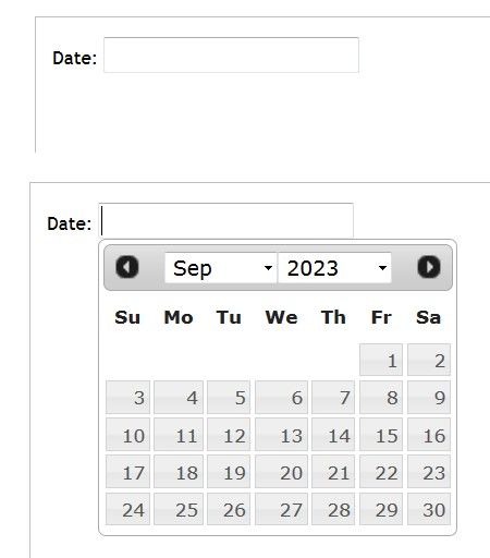
Author/Copyright holder: Rfc1394. Copyright terms and licence: CC BY-SA 3.0
Above, one of the most common dynamic querying tools in use – the humble date picker.
Magic Lens
The Xerox PARC laboratory team developed the magic lens. It’s a software tool that allows the user to place a lens over a part of an information visualization and then filter the data that is seen under the lens. The user has control over the placing of the lens and controls with which to filter the data set. It is possible to use more than one lens and overlap them to carry out different filtering operations simultaneously.
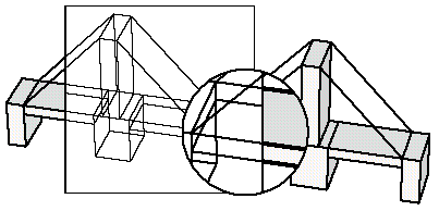
Author/Copyright holder: Wolfgang Aigner. Copyright terms and licence: PubL
Above the magic lens is applied to a 3D model of a bridge.
Attribute Exploration
Bob Spence, the engineering and information visualization expert, developed a tool in 1994 called the Attribute Explorer. It used cursors and histograms to examine a dataset via visual representations.
The attributes of the data are displayed as a histogram. When a user filters one histogram by a certain attribute, all other histograms are filtered at the same time.
This form of information visualization is quite difficult to understand without watching the explanation video for it. This video can be found here.
The Take Away:
Using transformable information representations gives the user control over the data which is being displayed in the model. This can be very useful to deliver models that provide value to the user when large data sets (which would be confusing if rendered in their entirety) are being represented. There are 5 common techniques for rendering models transformable and they are: data filtering at the input stage, data reordering, dynamic querying, magic lenses and attribute exploration.
Ronald Coase, the economist, said; “If you torture the data long enough, it will confess.” Transformable information representations allow users to easily “torture” data.
References & Where to Learn More:
More about Bob Spence.
Lisa Tweedie, Bob Spence, David Williams and Ravinder Bhogal, “The Attribute Explorer.”
Eric A. Bier, Maureen C. Stone, Ken Pier, William Buxton, Tony D. DeRose. Toolglass and Magic Lenses: The See-Through Interface. Proceedings of SIGGRAPH '93, 1993.
Riccardo Mazza, Introduction to Information Visualization, Springer, ISBN 878-1-84800-219-7
Hero Image: Author/Copyright holder: pushandplay. Copyright terms and licence: CC BY 2.0
Feel Stuck?
Want Better Job Options?
AI is replacing jobs everywhere, yet design jobs are booming with a projected 45% job growth. With design skills, you can create products and services people love. More love means more impact and greater salary potential.
At IxDF, we help you from your first course to your next job, all in one place.