A Design Map

Your constantly-updated definition of a Design Map and collection of videos and articles.
Be a conversation starter: Share this page and inspire others!

0 Shares
Save

Get 1 Powerful Email Each Week

Join 315,229 subscribers.

What is a Design Map?

A design map is a visual tool that shows you exactly how a user moves through your product. It captures what they do, what they feel, and where problems might appear. Think of it as a GPS for your design process: it shows you the route from start to finish and highlights where your users might get lost.

When you create design maps early in your project, you build a shared vision of the user's experience across your entire team, from designers and developers to stakeholders. This saves you from expensive late-stage fixes.

In this video, William Hudson, User Experience Strategist and Founder of Syntagm Ltd, explains how you can use design maps to align user needs, system constraints, and implementation decisions in one clear framework.

Transcript

Why Design Maps Guide You to Better User Experiences

Tamara Adlin and John Pruitt created design maps as part of their Persona Lifecycle methodology in 2006. They saw teams struggle to organize collaborative design sessions and built a simple system that anyone could use, regardless of discipline or role.

Design maps solve a problem most product teams struggle with: How do you move from user understanding to solution creation while you keep everyone on the same page?

The answer lies in their visual simplicity and collaborative structure. Design maps bridge the gap between the "who" (your personas) and the "how" (your designs). They transform abstract user research into concrete design directions while they keep creative possibilities open.

Without design maps, your team discovers misalignment when it's already too late:

You design a screen based on one interpretation of user needs. Your developer builds a feature based on a different understanding. Your product management team expects something else entirely. The team only discovers these disconnects during implementation, when fixes consume weeks of work and delay launches. Design maps prevent this waste.

How Design Maps Work to Provide User Clarity to Designers

Design maps started as physical sticky note sessions on walls or large sheets of paper. Teams gather around, add colorful notes, move them around, and build the user's journey together. The color system makes it simple: blue for steps, pink for ideas, yellow for questions, and green for context.
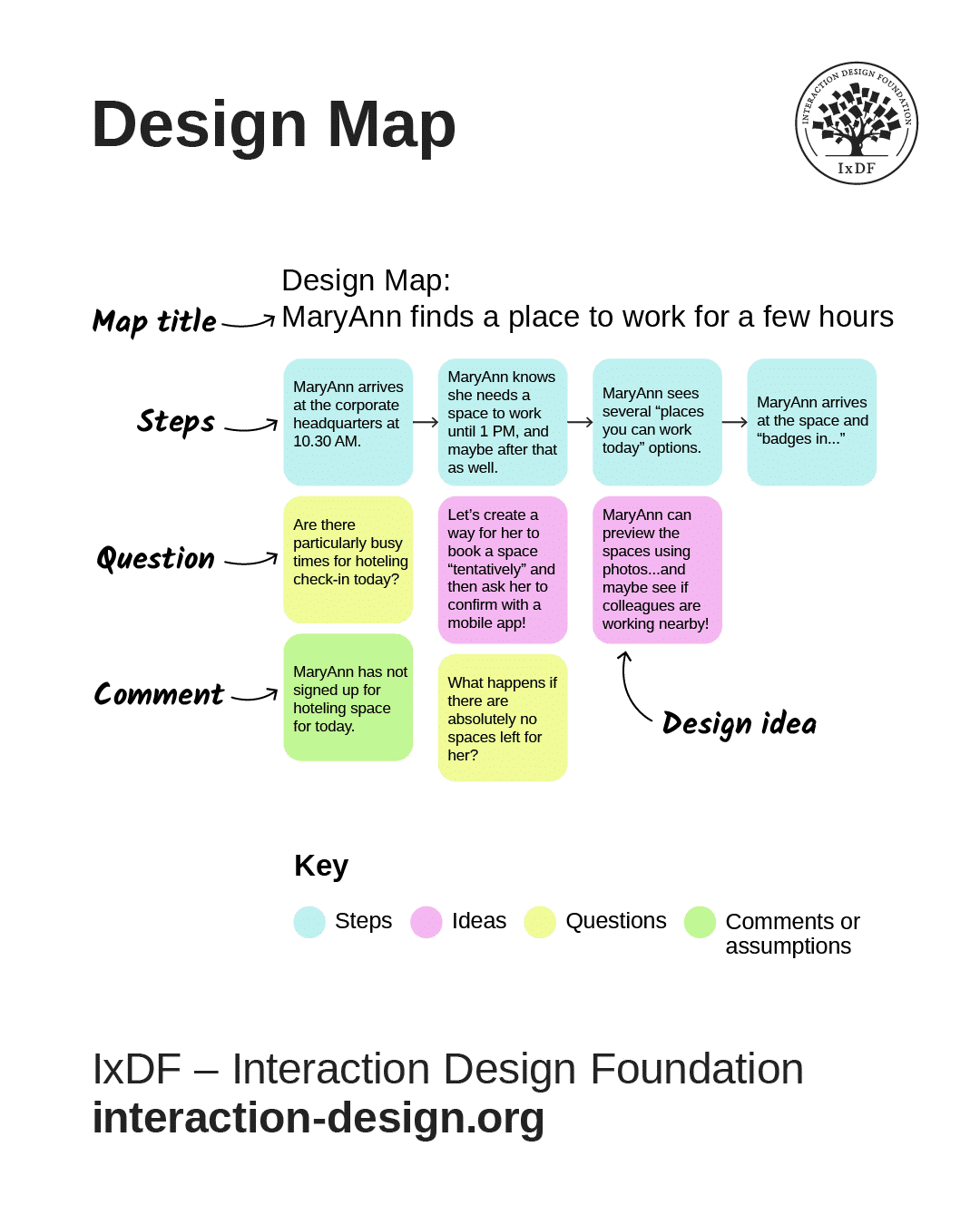
A design map. Explained in the text below.

Design maps are a collaborative visual tool that combines stories of use with comments, questions and ideas from the project team.

© Interaction Design Foundation, CC BY-SA 4.0

You can create design maps physically with sticky notes or digitally with tools like Figma, Miro, or FigJam. Every design map includes:

  1. A title, which includes the persona name and the specific goal. Example: "Design Map: Maya schedules a team meeting."

  2. Steps (blue) show what users do in sequence, from left to right. Keep them conceptual: "Opens calendar" and "Checks availability" work. "Clicks the blue button in the top right" is too detailed.

  3. Questions (yellow) capture uncertainties you can't resolve immediately. Write the question down and keep moving. You'll address these through research or testing later.

  4. Comments (green) explain context: "Mobile users struggle here" or "Users often forget passwords at this step." They help your team understand the why behind each action.

  5. Design ideas (pink) record every solution your team suggests. Even ideas you don't implement immediately often prove valuable later.

This organized system does three things:

it lets you manage complex discussions without drowning in details, it enables quick visual scans of how the map evolves, and it creates a shared language across different team members and stakeholders.

In this video, William demonstrates how to assemble all the basic elements of a design map and how you can use it to align your team and create user-centered results.

Transcript

Now that you understand the system, you can run your own session. Plan for 60–90 minutes for your first design map session. Schedule follow-up time to address questions or complexities that surface. This helps keep you and your team focused and productive.

Step By Step: Create a Design Map That Delivers Results

The ideal time to use design maps after you develop solid personas because you need to understand your users first (through research and persona development). Then, you can use design maps to explore how those users interact with your proposed solution. Once you finish this process, you can move into more detailed design work like prototypes.

This ensures you think through user flows before you commit to specific interface solutions, which saves you from the need to redesign screens that don't support the user's actual needs.

You can follow along with our free, easy-to-use guide designed to help you build design maps, which includes a full-page example map, a fillable map for practice, and simple stories of use.
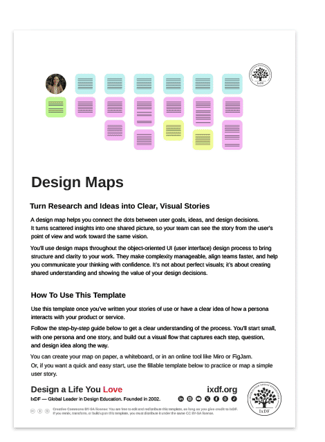
Advance Your Career With This Free Template for “Design Maps”
Design Maps
Optional
Optional
We respect your privacy
Get 1 powerful email each week: Learn Design and AI From the Best.

Here’s how to get started.

Step 1: Gather Your Map Team

You need participants from varied roles. Include people from design, development, product management, and other functions that influence the product. This diversity of perspective strengthens the final result.

Assign one person as the workshop facilitator to guide the session, manage time, and ensure the process stays on track.

Step 2: Choose a Single Focus

Start with one persona and one goal. Don't try to map multiple personas or multiple goals in the same session. This focus keeps the work manageable and ensures you can explore the experience in enough depth to generate useful insights.

Frame the central question: What might it feel like for this specific persona to use our new product to achieve this specific goal?

In this video, discover why designing for one specific individual (rather than trying to serve everyone) leads to better solutions for your entire user base.

Transcript

Step 3: Map the User's Steps

Work from left to right, and capture the sequence of actions the user takes. Use blue sticky notes for steps. The facilitator must balance detail with momentum. Encourage participants to describe processes without excessive depth (you don't need separate sticky notes for every form field).

But don't oversimplify either. Complex processes shouldn't collapse if they involve more nuance.

Here are some example steps:

  1. Mary arrives at the corporate headquarters at 10:30 AM.

  2. Mary knows she needs a space to work until 1 PM, and maybe after that as well.

  3. Mary sees several “places you can work today” options.

  4. Mary arrives at the space and “badges in…”
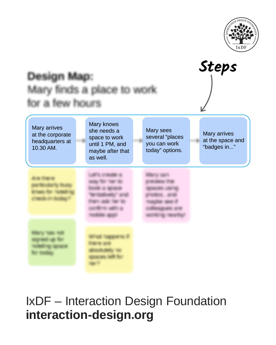
Example of the steps of a design map. Explained in the text above.

Blue sticky notes arranged left to right show the user's step-by-step journey through the experience.

© Interaction Design Foundation, CC BY-SA 4.0

Step 4: Add Layers of Insight

As you establish the step sequence, add the other elements.

  • Record comments in green below the steps they reference. These provide context and considerations.

  • Capture questions in yellow when uncertainties arise, but don't let debates derail the session. Record the question and move forward.

  • Note design ideas in pink as possibilities emerge from discussion.

The structure allows you to read across rows to follow the complete process, or read down columns to explore specific moments in greater detail.

Here are some examples:

  • Question: Are there particularly busy times for hoteling check-in today?

  • Question: What happens if there are absolutely no spaces left for her?

  • Design idea: Let’s create a way for her to get to book a space “tentatively” and then ask her to confirm with a mobile app.

  • Comment: Mary has not signed up for a hoteling space today.
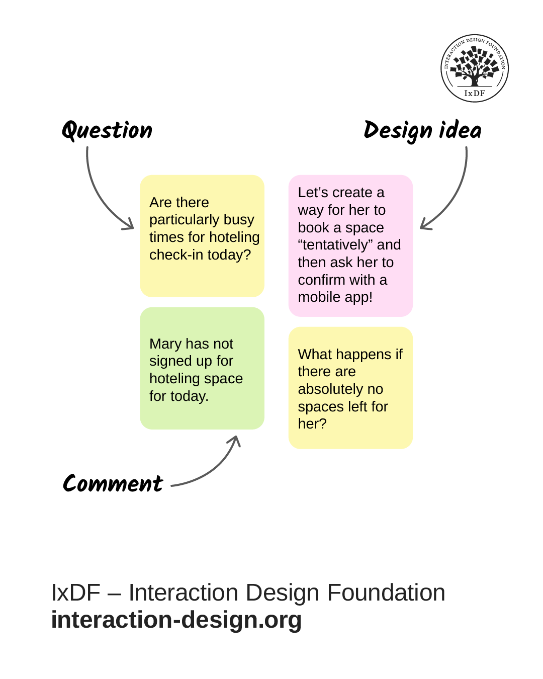
Examples of questions, design ideas, and comments on a design map. Explained in the text above.

Pink, yellow, and green notes add ideas, questions, and context below each step in the user's journey.

© Interaction Design Foundation, CC BY-SA 4.0

Step 5: Iterate to Deepen Understanding

Design maps help you think, and they change as your understanding grows. As you learn more and discuss implications, you'll modify elements throughout the map. Maps become more complex and detailed as your understanding deepens. This signals progress, not problems.

You'll typically see fewer yellow question notes as uncertainties transform into steps, comments, or ideas. When you change comments as you iterate, review everything "downstream" (to the right) of that change to assess ripple effects and ensure consistency.

Benefits of Design Maps for You and Your Team

Design maps turn the hours you invest in research, discussions, and planning into a shared understanding that everyone on your team can see and act on. Here's what they deliver:

  • They create alignment across your team. When designers, developers, product managers, and stakeholders look at the same map, they see the same user reality. This shared understanding prevents miscommunication and reduces the back-and-forth that slows projects down.

  • They simplify complexity. Design maps use a simple color-coded system that anyone can understand, regardless of their discipline. You don't need special training to contribute or to grasp what the map shows.

  • They reveal opportunities and problems early. When you map the experience before you build anything, you spot friction points, missing steps, and design opportunities when they're easy and cheap to fix.

  • They keep you focused on user goals. It's easy to get distracted by technical constraints or stakeholder requests. Design maps anchor every discussion back to what the user needs to accomplish.
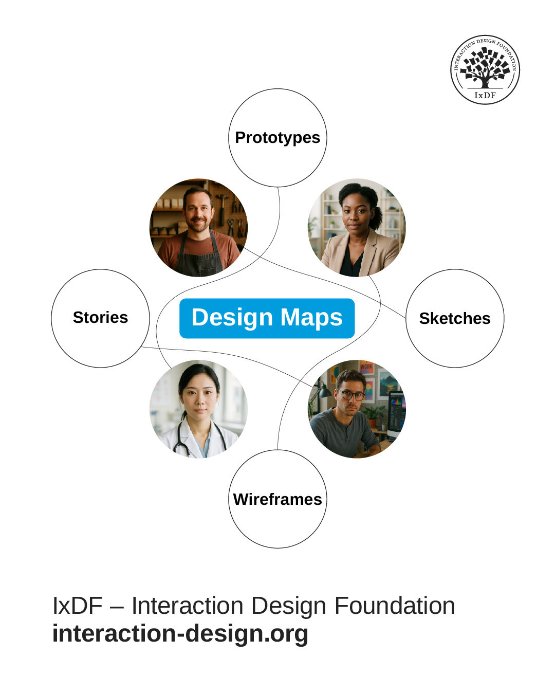
Design maps link personas to the core design questions and artifacts shaped in the research process. They unify our stories, sketches, wireframes, and prototypes into one coherent view of the system.

© Interaction Design Foundation, CC BY-SA 4.0

When Design Maps Help (and When They Don't)

Design maps aren't a universal solution, but they excel in certain scenarios. Here's when they deliver the most impact.

  • Explore new products or features before you build them. Catch problems with sticky notes instead of after you've written code. A session might reveal your checkout flow confuses users or that you've missed a critical step.

  • Align teams around a shared vision. When designers, developers, product managers, and stakeholders work on the same map, everyone builds the same mental model. The map becomes your single source of truth.

  • Compare different approaches. Create three maps that show three ways your persona completes a task. Lay them side by side. The comparison reveals strengths and weaknesses before you commit to a direction.

  • Turn research into action. Design maps pull your persona documents off the shelf and put them to work. They transform what you know about users into decisions about what you'll build.

Design maps can't solve every problem. Avoid them in these situations and choose a more appropriate approach instead.

  • Your personas need more work. Design maps require solid personas with clear goals and behaviors. Without that foundation, your mapping session drifts. Strengthen your research first.

  • You need detailed interface specs. Because design maps work at a conceptual level, they won't tell you button colors, form layouts, or element placement. Switch to wireframes or mockups instead, and then attach these to your maps for clarity and completeness.

  • You want to document what exists now. Design maps explore future possibilities. To capture current processes, use tools like reality maps instead.

  • Your project is already in late stages. Create design maps early when they can still influence your direction.

Design Better Experiences Through Collaboration

Design maps give you a visual language to explore how users will experience your product before you invest time and resources in development. The color-coded sticky note system makes complex discussions manageable. The collaborative process aligns your team around a shared understanding of user needs. The iterative approach helps you refine ideas and spot problems early.

The next time you start a new feature or product, follow these three steps:

  1. Gather your team and choose one persona with one clear goal.

  2. Grab sticky notes (or open Figma, Miro, or FigJam) and map the user's journey from start to finish.

  3. Use the color system to capture steps, questions, comments, and ideas as you work.

You'll spot misalignment before it costs you weeks of rework. You'll discover friction points when they're easy to fix. You'll generate solutions you wouldn't find alone. Most importantly, your team will build based on a shared mental model.

Design maps turn research into decisions, conversations into clarity, and ideas into products that work for real people. Start your next project with a map, and your users will thank you for it.

Questions About Design Map?
We've Got Answers!

What is a design map in UX design?

A design map is a visual collaboration tool that shows how your product or feature could work to support specific user goals. You create design maps with a simple color-coded system: blue sticky notes for user steps, pink for design ideas, yellow for questions, and green for context.

Unlike customer journey maps that track current user interactions or service blueprints that document processes, design maps focus specifically on ideation and collaborative problem-solving during the design phase. This makes them particularly valuable for aligning cross-functional teams around user needs before you commit to detailed wireframes or prototypes.

Why are design maps important in the UX process?

Design maps transform abstract user research into concrete design decisions while you build team alignment. UX mapping methods provide dual benefits: the collaborative creation process builds shared understanding, while the resulting artifact guides future decisions. Design maps use a simple color-coded system that makes participation accessible to everyone, regardless of their role or expertise. This democratizes the design process and helps cross-functional teams develop genuine empathy for users through visual representation of their experiences.

When you create design maps, you reduce miscommunication by establishing a single source of truth that everyone can reference. You also spot potential problems early (before development) when they cost far less to fix.

At what stage of the UX design process should you create a design map?

You should create design maps after you develop personas but before you start prototyping. Adlin and Pruitt call this the "adulthood phase" of the persona lifecycle, when you have sufficient user understanding to make the map meaningful while still leaving room for ideation and exploration.

Complete user interviews, persona development, and current-state documentation (reality maps) first. Then schedule a collaborative design mapping workshop with cross-functional participants (product managers, designers, developers, and stakeholders) to envision the future experience together.

Design maps fall under the ideation stage of the design thinking process. In this video, learn how design thinking helps teams understand users, challenge assumptions, and create solutions through collaborative ideation workshops.

Transcript

How do you create a UX map from user research data?

You create a design map through a structured workshop with cross-functional team members, using four colors of sticky notes to organize user research insights. Start by selecting one persona and one specific goal to map. Use blue sticky notes to build the user's journey from left to right, asking "What does this user do first? What next?" to establish each step.

Below each step, add pink notes for design ideas, yellow notes for questions and uncertainties, green notes for context and assumptions. Yellow question notes drive progress. When you encounter something unknown, capture it and move forward rather than derail the session. "Puddles" of yellow notes reveal areas that need additional research.

After the workshop, photograph the map, digitize it for ongoing reference, and return to address the captured questions through follow-up research or team discussion.

How do UX maps support alignment between product, design, and development teams?

Design maps create alignment through shared experience, common vocabulary, and visible decision-making frameworks. Teams who participate in mapping activities together develop stronger working relationships and execute decisions faster.

The creation process builds co-ownership. When you and your team (product managers, designers, and developers) all contribute sticky notes to the same map, you develop personal investment in the outcomes.

Design maps provide a common reference point for discussions. Instead of debating abstract concepts, you can point to specific steps on the map. "This pink note suggests we add autocomplete but look at these yellow questions about user expectations. Should we research this first?" The visual format grounds conversations in user experience rather than opinion.

Regular map reviews keep teams synchronized as products evolve. Schedule periodic sessions to update maps based on new research, released features, and changed priorities. This practice ensures your shared artifact remains relevant and continues to guide aligned decision-making.

How can I use design maps to identify pain points and opportunities?

You identify pain points and opportunities by analyzing visual patterns that emerge on your design map, particularly clusters of colored sticky notes that reveal problem areas. Look for "puddles" of yellow question notes, which indicate uncertainty and confusion, and clusters of green context notes, which suggest complex constraints. Both patterns point to moments that deserve investigation and improvement.

Review each step and assess how users feel at that moment; pain points cluster where negative emotions accumulate, while opportunities exist where you can transform frustration into satisfaction. There are three pain point levels: interaction-level usability issues visible in detailed steps, journey-level problems across the end-to-end experience, and relationship-level issues affecting long-term satisfaction. Evaluate your pink design ideas against pain point severity to prioritize high-impact opportunities.

Finally, compare your design map to your reality map. The largest gaps between current and ideal experience often represent your highest-value opportunities where your product can make the biggest difference.

Pruitt, J., & Adlin, T. (2006). The persona lifecycle: Keeping people in mind throughout product design. Morgan Kaufmann.

The Persona Lifecycle by John Pruitt and Tamara Adlin is a foundational text in user-centered design, known for introducing a structured, end-to-end framework for creating and maintaining personas throughout the product lifecycle. Unlike simplified treatments of personas, this book addresses both the theory and practical implementation, including how personas can be validated, socialized, and applied across teams.

Kalbach, J. (2020). Mapping experiences: A complete guide to creating value through journeys, blueprints, and diagrams (2nd ed.). O’Reilly Media.

Jim Kalbach’s Mapping Experiences is one of the most influential books on mapping in UX and service design. It introduces a structured, practical framework for creating and using various types of maps. Kalbach shows how these maps connect user insights to business goals, fostering alignment across teams.

What makes this book especially relevant is its emphasis on turning research into action. It guides UX teams in not only visualizing user experiences but also using maps as collaborative tools to drive design decisions and innovation. The second edition updates the original with more detail, real-world examples, and templates for modern digital and cross-channel experiences.

Earn a Gift, Answer a Short Quiz!

1
2
3
4
1
2
3
4
Question 1
Question 2
Question 3
Get Your Gift

Question 1

Why should you use design maps in the early stages of your project?

1 point towards your gift

  • To document every interface detail before you write code
  • To align your understanding of user needs before you create solutions
  • To compare metrics from past product releases

Question 2

What does the color-coded system in a design map help you do?

1 point towards your gift

  • Spot steps, questions, comments, and ideas at a glance
  • Add colors that match the final product palette
  • Group all technical risks into a single visual block

Question 3

When should you avoid a design map?

1 point towards your gift

  • When you want to explore new features before you build them
  • When you want detailed interface specifications for layout and visual choices
  • When you want to turn persona insights into early design directions

Learn More About a Design Map

Make learning as easy as watching Netflix: Learn more about Design Map by taking the online IxDF Course Object-Oriented UI Design: Build Interfaces Users Love.

Why? Because design skills make you valuable. In any job. Any industry.

In This Course, You'll

  • Get excited about transforming messy requirements into smooth, user-centered interfaces. Object-oriented UI design is a methodology most designers haven't been formally taught, which means most teams still assemble features without a system behind them. They end up with interfaces that confuse users and cost development time. According to Forrester's research, a clear, intuitive UI can double conversion rates. Object-oriented UI design makes that achievable: You base your interface on a conceptual map of the objects (things) your users care about, so it reflects how they naturally think. This approach also bridges the gap between UX and development. Master this methodology, and you'll design interfaces that grow with your product, collaborate seamlessly with developers, and work with a systematic approach that's becoming the new standard in UX and product design.

  • Make yourself invaluable by keeping design and development in sync. You'll stop losing user-friendliness in translation, because you'll learn to speak the shared language of stories of use, epics, constraints, conceptual models, and design maps. You'll understand development constraints and technical realities, so you avoid impractical designs, bugs, and expensive redesigns and keep projects on track. Pruitt and Adlin’s persona-weighted feature and prioritization matrices will enable you to prioritize what matters most, avoid wasted effort, and guide teams toward solutions that serve users. The result? Faster workflows, better decisions, smarter collaboration. You become the go-to person everyone trusts to drive real impact on critical projects.

  • Gain confidence and credibility as the designer who cuts through complexity and delivers clarity. No more guessing, no more "just add one more feature." You’ll have a structured framework for interface design built around Cook and Daniels' three levels of detail: essential, specification, and implementation. You'll know how to analyze requirements, prevent feature creep, and scale interfaces that stay consistent, intuitive, and loved by users. And when you replace your team's abstract user stories with researched persona stories, you'll foster empathy for real users and put them at the heart of product development. This will make you a respected partner in every cross-functional collaboration.

  • Craft your personal portfolio with results that show your skills. In these optional activities, you'll write compelling user stories, create wireframes and prototypes, and deliver design maps that show how you move from requirements to implementation-ready UI. You'll integrate your new skills as you create career assets that demonstrate something most candidates can't show: You can deliver designs users love and development teams can easily build.

Learn From Industry Leaders

Master complex skills with proven best practices and toolkits directly from industry leaders. Meet your expert for this course:

  • William Hudson: User Experience Strategist and Founder of Syntagm Ltd.

Earn Industry-Recognized Certificates

Industry giants trust our courses to train their teams, and prestigious universities integrate our content into their curricula. Add your certificates to your LinkedIn profile, résumé, and job applications.

Our clients: IBM, Harvard University, University of Cambridge, NASA, Adobe, Stanford, Massachusetts Institute of Technology, LinkedIn
Course Certificate

39% of Today's Skills Will Change by 2030

The World Economic Forum expects 39% of today's skills to be transformed or become outdated by 2030.

The good news is that jobs in UX / UI design and AI are among the fastest-growing professions globally.

Build Skills That Keep You Relevant

Privacy Settings

By using this site, you accept our Cookie Policy and Terms of Use.
Customize
Accept all

Be the One Who Inspires

People remember who shares great ideas.

Share on:

Academic Credibility — On Autopilot

Don't waste time googling citation formats. Just copy, paste and look legit in seconds.