Anchoring

Your constantly-updated definition of Anchoring and collection of videos and articles.
Be a conversation starter: Share this page and inspire others!

98 Shares

What is Anchoring?

Anchoring is a cognitive bias that occurs if someone presents information in a way that limits an audience’s range of thought/reference. To suggest values or list options this way is to frame a “desirable” choice/reply. As anchoring can distort users’ needs, problems and more, it can impair ideation for design teams.

Learn about anchoring and what it means in design.

Transcript

“We’re blind to our blindness. We have very little idea of how little we know. We’re not designed to know how little we know.”

— Daniel Kahneman, Psychologist and economist noted for his work on the psychology of judgment and decision-making as well as behavioral economics

Anchoring means Shaping Selections

Used intentionally, anchoring (also called priming or focalism) can be an effective technique. Parents who ask their children “How often do you want to tidy your room: every day or every other day?” can appreciate its value. It’s also an age-old marketing strategy—appearing in everything from restaurant menus to car showrooms—that encourages customers to pick items because they’re a “good deal” compared with the most expensive offering (the anchor). Anchoring is often used in user experience (UX) design. When designers apply it, they take advantage of users’ inability to make wholly critical judgments in the moment, and so prompt them towards actions that should be desirable for both the users and the brand.

However, anchoring can also occur unintentionally and derail successful ideation for design teams by causing people to accept distorted views. Anchoring occurs when someone introduces a piece of information that will influence everyone regarding how they judge further bits of information, thereby leading them to jump to conclusions. 

Anchoring’s two dimensions are:  

  1. The offered values (e.g., quantity, measurements), by which:

    • Framing with larger values will prompt respondents to think big (e.g., estimate with larger numbers).

    • Framing with smaller values will prompt them to think small (e.g., estimate with smaller numbers).

  2. The wording:

    • E.g., soft qualifier terms such as “just roughly” help respondents feel more confident about what are actually inaccurate answers.

We can see how wrong such conclusions can be in an example where people were asked to estimate the Eiffel Tower’s height using scales which acted as anchors. In this example, many respondents grossly overestimated the tower’s height – simply because the larger scale anchored their view of an acceptable answer. Had anchoring not occurred, they would’ve been free to consider the tower’s height in absolute terms and try for a good guess, rather than think in terms relative to someone else’s viewpoint. So, instead of serving as a guideline, the scale was misleading.

Cognitive Anchoring Effect

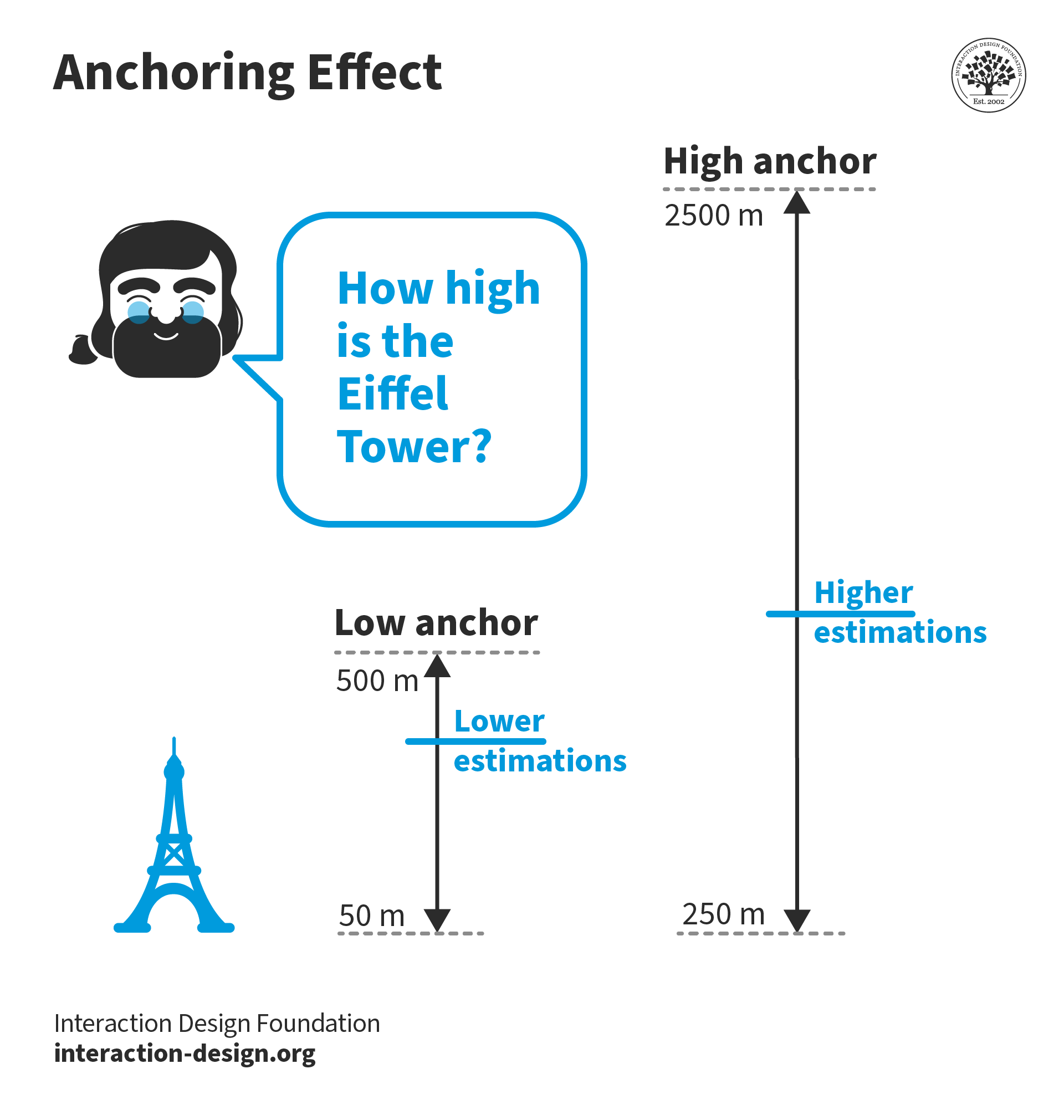
© Interaction Design Foundation, CC BY-SA 4.0

Anchoring Shoves Minds inside a Box 

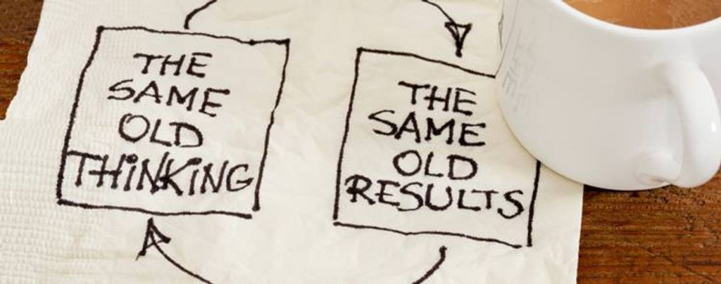
The danger of anchoring is it leads to fixation and people being trapped in a set way of seeing an issue. What makes anchoring so challenging is that, as a bias, it can be extremely hard to notice. One wrong word when describing (e.g.) users’ needs can push people onto the wrong train of thought. Whatever your design process (e.g., design thinking), it’s vital to go in with an open mind and define the problem accurately. Only when you and your team have a well-rounded understanding of what your users would love to have in a solution can you proceed with the least amount of bias. A key ingredient is a good, solid problem statement, the wording of which must be balanced. The danger is that someone can mis-frame the design challenge so it prompts the team to waste time, effort and resources on an inaccurate description. For example, consider this problem statement (i.e., where certain users need to do something because of some compelling insight):

“Remote-working designers in heavy industry need to have app-controlled giant (about 1-cubic-meter) 3D printers installed in their homes because they’ll want an immediate, hands-on feel of sophisticated prototypes; however, the sheer expense of such printers means they’ll want these on a for-lease basis.”

Here, we’re suddenly caged with a set of parameters (e.g., unwieldy, rentable printers) that don’t let us ideate freely. If the problem is that designers working from home would like a way to have prototypes of engineering device/structure models more immediately available, why have we suddenly become fixated on rentable 3D printers (which also may retain sensitive data in their buffers)? 

Here are some tips to prevent anchoring bias:

  • Frame/reframe problem statements and questions to your team and users in a way that permits objectivity. Word things so that others can leverage their imagination, rationality and judgment without being hemmed in by subjective views or assumptions

  • Don’t rush to treat symptoms with solutions. Pay close attention to your user research and how you empathize with your users. What’s the big-picture view? How do the users’ needs look from a holistic aspect? If you jump to conclusions early on, you can cause others to miss the real problem and chase shadows of it instead.   

  • Encourage divergent thinking, lateral thinking and out-of-the-box thinking as much as possible – instead of committing to a potentially flawed view of the users, their contexts and problem/s involved.

Remember, bias can also creep into the later stages of ideation (in convergent thinking) and beyond, so be careful how you word things.  

Questions About Anchoring?
We've Got Answers!

What does anchoring mean in UX design?

In UX (user experience) design, anchoring means showing users a starting point—like a price, option, or number—that shapes how they see everything that comes after it. This first piece of information or frame for what comes next sticks in their mind and sets the tone for their decisions.

For example, if a pricing page lists a premium plan at $199 first, users may see the $99 plan as a better deal, even if it’s still expensive. The $199 “anchors” their expectations. Designers use this technique to guide choices, highlight value, or make other options look more appealing by comparison.

Anchoring taps into a psychological bias—hence the term anchoring bias. People rely too heavily on the first thing they see when making decisions. Smart UX designers use this to subtly—and ethically (which is a vital consideration)—steer user perception and behavior, especially when presenting choices in navigation, pricing, or product comparisons.

Watch as Author and Human-Computer Interaction Expert, Professor Alan Dix explains important points about anchoring:

Transcript

Take our course Creativity: Methods to Design Better Products and Services.

Where do we see anchoring bias most often in digital products?

You’ll find anchoring bias most often in digital products where users make choices—especially on pricing pages, subscription plans, or product listings. E-commerce sites, for example, often show the original price first, then the discounted price. That higher “anchor” makes the discount feel more valuable.

Online services also use anchoring when they list a premium plan first. That higher price makes the mid-tier option look like a better deal, so sets off the latter as being the one users will more likely subscribe to. Even when sorting options—like hotel listings or flight search results—the first few results anchor user expectations about cost or quality.

Designers use this bias to influence how users compare, choose, or value what they see. It works because people naturally lean on the first number or option they see, and judge everything else in relation to it as a kind of “yardstick”—even if that anchor isn’t the most logical starting point.

Watch as Author and Human-Computer Interaction Expert, Professor Alan Dix explains important points about anchoring:

Transcript

Take our course Creativity: Methods to Design Better Products and Services.

How can I design onboarding flows with smart anchoring?

To design onboarding flows with smart anchoring, set a clear and helpful first impression. First, show users the most relevant or valuable option—whether it’s a popular feature, a recommended plan, or a suggested next step. That first item becomes the anchor, shaping how users see everything else.

Use this momentum to reduce friction. For example, pre-select the most common setup or show a “most popular” label. These nudges help users feel confident and move forward faster.

Keep the layout clean and focused. Too many choices can weaken the anchor’s effect—and might make users hesitate in analysis paralysis. Guide users with short explanations, simple visuals, and clear call-to-actions.

Test and refine. If most users follow the suggested path, well done—your anchor works. If not, try a different order or highlight. Smart anchoring in onboarding removes decision fatigue and helps users start strong—without feeling pushed or “guided” according to what your brand’s interests might be and not theirs.

Watch as Author and Human-Computer Interaction Expert, Professor Alan Dix explains important points about anchoring:

Transcript

Take our course Creativity: Methods to Design Better Products and Services.

How does anchoring interact with other biases like confirmation bias?

Anchoring and confirmation bias often “team up” to shape how users make decisions. Anchoring sets the stage by planting a first idea—like a price, option, or feature—that becomes the reference point. Then, confirmation bias kicks in and nudges users to seek out info that supports that first impression.

For example, if a pricing page shows a $99 plan first, users may anchor to that and then scan the rest of the page for signs that justify choosing the $49 plan instead. Confirmation bias pushes them to notice benefits of that cheaper option while ignoring its downsides.

Because of how price options and the like can “interplay” like this, this combo can skew how users compare options or interpret content. That’s why designers should use anchoring carefully—and ethically. When you present a first choice or default, make sure all other options are easy to compare and understand. That helps users make better, more informed decisions and come away with a healthy, trusting view of your brand.

Watch as Author and Human-Computer Interaction Expert, Professor Alan Dix explains important points about anchoring:

Transcript

Take our course Creativity: Methods to Design Better Products and Services.

How can I use anchoring in microinteractions or UI animations?

While anchoring is typically associated with numbers or choices, you can apply the principle of anchoring in UI animations by subtly shaping how users perceive information flow and interaction timing.

For example, a button that pulses before expanding into a menu creates an expectation: the pulsing draws attention and prepares the user for interaction. This temporal anchor frames the menu as a logical next step.

Similarly, if a tooltip consistently slides in from the same direction (say, the top), users begin to associate that motion pattern with guidance or helpful tips. This spatial consistency acts as an anchor, orienting users and making the interface feel more predictable.

You can also anchor attention using timing and sequence:

  • Presenting one option slightly earlier than others

  • Highlighting the default choice with a subtle motion cue

  • Using progressive disclosure that animates content in a specific order

These techniques help set mental “starting points” that influence how users navigate or interpret what follows.

But be careful: anchoring in motion should be subtle and intentional. Overuse of animation can feel distracting—or even manipulative. If users feel they’re being pushed in a particular direction without clarity, they may lose trust in the interface or brand.

Empathic design means guiding, not forcing. Use motion to support user focus and decision-making—not to overwhelm or steer unfairly. That’s smart, ethical anchoring in microinteractions.

Watch as Author and Human-Computer Interaction Expert, Professor Alan Dix explains important points about anchoring:

Transcript

Take our course Creativity: Methods to Design Better Products and Services.

What are some recent or highly cited scientific articles about anchoring?

Yasseri, T., & Reher, J. (2019). Fooling with facts: Quantifying anchoring bias through a large-scale online experiment. arXiv preprint arXiv:1911.12275.

Yasseri and Reher conduct a large-scale online experiment to quantify the presence of anchoring bias in judgment. Their findings reveal a strong and complex relationship between provided anchors and participants' predictions of future events. The study highlights the need for careful monitoring and regulation of information distribution online to facilitate less biased decision-making, which is pertinent for UX design in digital platforms.

Thaler, R. H., & Sunstein, C. R. (2021). Nudge: The Final Edition. Yale University Press.

Nudge: The Final Edition by Richard H. Thaler and Cass R. Sunstein is a comprehensive update to their groundbreaking 2008 book on behavioral economics. This edition reflects over a decade of additional research and practical application, including their governmental experience and the global rise of “nudge units.” The authors continue to emphasize “choice architecture”—strategically structuring decisions to improve outcomes without restricting freedom. This edition incorporates new insights on topics like COVID-19, climate change, and bureaucratic "sludge." It’s a foundational resource in public policy and UX design, showing how subtle design cues influence behavior. The book’s practical, theory-based strategies have reshaped approaches in economics, health, and governance.

Kahneman, D. (2011). Thinking, Fast and Slow. Farrar, Straus and Giroux.

In this seminal work, Daniel Kahneman, a Nobel laureate in Economic Sciences, delves into the dual processes of human thought: the fast, intuitive System 1 and the slow, deliberate System 2. He examines how these systems interact to shape our judgments and decisions, often leading to cognitive biases such as anchoring. Kahneman illustrates how initial exposure to a number or value can unduly influence subsequent estimations and decisions, a phenomenon known as the anchoring effect. This book is significant for its comprehensive exploration of cognitive biases, providing readers with a profound understanding of the mechanisms behind human thinking and decision-making.

Ariely, D. (2010). Predictably Irrational: The Hidden Forces That Shape Our Decisions (Rev. and expanded ed.). HarperCollins.

Dan Ariely challenges the notion of human rationality in economic behavior, presenting compelling research that demonstrates how individuals consistently make irrational decisions in predictable ways. He discusses various cognitive biases, including anchoring, to explain how initial information can skew our perceptions and choices. For instance, Ariely explores how the first price presented for a product can serve as an anchor, influencing our willingness to pay. This book is important for its accessible and engaging examination of the irrational tendencies that pervade human decision-making, offering valuable insights for both consumers and professionals.

How can I test if anchoring is influencing user behavior?

To test if anchoring influences user behavior, run A/B tests where you change the order or presence of the anchor and compare results. For example, show one group a pricing page that lists the most expensive plan first and another group the cheapest plan first. Then measure which plans users choose more often.

You can also switch default values, like pre-selecting a mid-tier option, and track how often users stick with it. If behavior shifts noticeably between versions, anchoring likely has something to do with it.

Heatmaps and user session recordings add more context. For example, in eye-tracking studies, if users focus on the first item they see and spend less time exploring others, anchoring might be at work. First-click studies can help add more context, also. Surveys or interviews can help, too—ask users what stood out or influenced their choice. When people keep pointing to that first thing they saw, you’ve probably found your anchor.

Watch as Author and Human-Computer Interaction Expert, Professor Alan Dix explains important points about anchoring:

Transcript

Take our course Creativity: Methods to Design Better Products and Services.

When should I avoid using anchoring in UX design?

Here are key scenarios where you should avoid using anchoring in UX (user experience) design:

Don’t use it when it can mislead users—Never use it to deceive or manipulate users; it works against user trust and can damage your brand’s reputation. For instance, something like a highly bloated “original price” next to a discounted one to exaggerate how much money people can save is a problem if that original price was never charged.

Don’t use an anchored option if it doesn’t match user needs—Don’t push users towards a choice just because it helps your business. For instance, a highlighted pricing tier as being “recommended” although most users would prefer a basic or middle-level one can annoy users. They can think they’re paying for unnecessary features or end up with buyer’s remorse.

Don’t use an anchored option if it undermines informed decision-making—If you include a very strong anchor (like “Save 65%!”) without adding context about what users actually get, it can push them towards poorly considered choices.

Don’t use it when testing or learning is the priority—If you’re testing your early design or if it’s in an exploratory phase, don’t insert anchors that could bias user behavior. They might prefer one over the other based on that and not reveal evidence about what they truly prefer about a design. That distorted feedback could lead to wrong conclusions on the design table.

Don’t use anchoring when dealing with vulnerable or distracted users—In high stakes, stressful, or emotional situations, avoid anchoring. Areas such as healthcare, finance, or crisis management are risky and potentially dangerous areas. Think of the stresses people are under and how unfair and unethical it would be to try to get them to, for example, pick an option for paid mental health resources.

If you’re in doubt, ask yourself some questions:

  • Does this help users make a better decision for themselves?

  • Am I being open and transparent about options and trade-offs?

  • Would this still feel fair if the user knew exactly what I was doing?

  • What could users be experiencing in their situations when they encounter my design? Might they be worried about money? Their health? Might they be in a crisis situation? (Their welfare, health, and other interests come first.)

Watch as Author and Human-Computer Interaction Expert, Professor Alan Dix explains important points about anchoring:

Transcript

Take our course Creativity: Methods to Design Better Products and Services.

How do I avoid misleading users with anchoring?

To avoid misleading users with anchoring, always pair it with clarity and transparency. If you set a high price first or highlight a default option, make sure users can easily compare all choices. Use clear labels, honest descriptions, and consistent formatting so nothing feels hidden or pushed unfairly.

Give users control in their user experience with your brand. Let them explore without pressure by avoiding dark patterns like hiding cheaper plans or making premium options overly dominant. Use anchors to guide, not trick.

Check your data, too. If users consistently pick an option that isn’t right for their needs—just because it’s first—you may be leading them astray. If this is so, make sure you adjust your design.

The goal is to support good decision-making, not just boost conversions. When users feel confident and informed, they trust your product more—and that long-term trust matters far more than a quick win. Especially in an age of instant and visible feedback, trust is vital.

Watch as Author and Human-Computer Interaction Expert, Professor Alan Dix explains important points about anchoring:

Transcript

Take our course Creativity: Methods to Design Better Products and Services.

Earn a Gift Earn a Gift, Answer a Short Quiz!

1
2
3
4
1
2
3
4
Question 1
Question 2
Question 3
Get Your Gift
Interaction Design Foundation logo

Question 1

What is anchoring in decision-making?

1 point towards your gift

  • A cognitive bias where initial information influences subsequent judgments.
  • A method to increase the speed of decision-making processes.
  • A strategy to make sure all decisions are free from cognitive bias.
Interaction Design Foundation logo

Question 2

How do designers use anchoring to influence user decisions effectively?

1 point towards your gift

  • They make sure to base all user choices on logical reasoning.
  • They provide fewer options to speed up the decision-making process.
  • They set a high initial price to make subsequent prices seem more reasonable.
Interaction Design Foundation logo

Question 3

What is a negative effect of unintentional anchoring in design processes?

1 point towards your gift

  • It can lead to faster consensus in team decisions.
  • It can cause teams to focus too narrowly on initial ideas or data.
  • It ensures all design outcomes are user-centered.

Learn More About Anchoring

Make learning as easy as watching Netflix: Learn more about Anchoring by taking the online IxDF Course Creativity: Methods to Design Better Products and Services.

Why? Because design skills make you valuable. In any job. Any industry.

In This Course, You'll

  • Get excited as you learn to innovate and get creative, even when you feel blocked! Did you know that creative thinking is the second most important skill hiring managers look for, across all jobs and industries? This course will give you the skills to design innovative solutions and products that stand out. It's easier than you think! No matter your background, you can effortlessly learn to tap into creativity. You'll apply proven methods to break out of habitual thinking, spark new ideas anytime, and capture them before they disappear!

  • Make yourself invaluable with divergent and convergent ideation techniques that have real business impact. In a world where AI can generate endless ideas, you stay in demand when you know which ideas to explore, which to combine, and which to move forward. Timeless human-centered design skills help you focus creativity on real needs, and that’s how you can turn AI from a tool into your new creative superpower. Companies that prioritize creativity achieve 67% more organic revenue growth. Creativity is just as valuable in finance, engineering, and healthcare as it is in creative professions. Every industry thrives on innovative ideas. In this course, you'll use ideation methods like multiple classifications and three-way comparisons to see opportunities others miss and bring bold ideas to life.  

  • Gain confidence and credibility with 15+ downloadable templates to fast-track your creativity! You'll learn how to use busywork to enable your creativity in daily planning and foster a creative team environment. You'll apply step-by-step strategies to beat procrastination, bias, and fixation, and ensure your creative process remains productive—even under pressure. You'll get hands-on experience and walk away with a polished case study for your portfolio if you choose to complete the optional ideation project. If you want to solve big problems, improve lives, and build a better world with innovative solutions people love, then this course is the perfect place to start.

It's Easy to Fast-Track Your Career with the World's Best Experts

Master complex skills effortlessly with proven best practices and toolkits directly from the world's top design experts. Meet your experts for this course:

  • Alan Dix: Author of the bestselling book “Human-Computer Interaction” and Director of the Computational Foundry at Swansea University.

  • Don Norman: Father of User Experience (UX) Design, author of the legendary book “The Design of Everyday Things,” and co-founder of the Nielsen Norman Group.

Get an Industry-Recognized IxDF Course Certificate

Increase your credibility, salary potential and job opportunities by showing credible evidence of your skills.

IxDF Course Certificates set the industry gold standard. Add them to your LinkedIn profile, resumé, and job applications.

Course Certificate Example

Be in distinguished company, alongside industry leaders who train their teams with the IxDF and trust IxDF Course Certificates.

Our clients: IBM, HP, Adobe, GE, Accenture, Allianz, Phillips, Deezer, Capgemin, Mcafee, SAP, Telenor, Cigna, British Parliament, State of New York

All Free IxDF Articles on Anchoring

Read full article
Behavioural Economics Ideas that You Can Use in UX Design - Article hero image
Interaction Design Foundation logo

Behavioural Economics Ideas that You Can Use in UX Design

The theory of behavioural economics has evolved rapidly over the last 4 decades or so. There was a point when economists assumed that all decisions people make are rational decisions. This is because economics is a rational discipline. Whenever a deviation occurred from expected “rational behaviour”

Social shares
592
Published
Read Article

Behavioural Economics Ideas that You Can Use in UX Design

Behavioural Economics Ideas that You Can Use in UX Design

The theory of behavioural economics has evolved rapidly over the last 4 decades or so. There was a point when economists assumed that all decisions people make are rational decisions. This is because economics is a rational discipline. Whenever a deviation occurred from expected “rational behaviour” an equation was modified to fit the results observed… and then economists slowly began to work with psychologists. They started to examine the assumption of rational behaviour and quickly began to see that it doesn’t exist.

In a nutshell, that’s what behavioural economics is the understanding that human beings don’t always act rationally and that we can predict that irrationality to some extent. We can also make use of that irrationality when it comes to designing experience. We can play to people’s preferences even when that preference doesn’t make a lot of sense when viewed rationally.

Let’s take a look at some examples of behavioural economics and the implications for designing experiences:

The Effect of Decision Paralysis

Early economic theory felt that the more choice you present an individual with – the happier that they will be. Choice represents freedom and rationally the more choices we have, the freer we are to make decisions and we will feel good about this.

In practice this turns out to be untrue. There’s a famous experiment involving varieties of jam in a supermarket taste test. The experimenters set up a table where customers could taste, and then if they wanted to, they could purchase jam.

One table was set up with 24 different varieties of jam on it. The second had just 6 varieties. What happened?

Well the table with the most choice was the most visited table. People tasted a lot of jam when they had 24 options to choose from. However, despite this, the people who visited the table with just 6 options to choose from bought TEN TIMES as much jam as those who visited the table with 24 options!

It turns out that traditional economic theory isn’t right. While people do like choices, there’s a moment when there are too many choices to be made. This result has been found time and time again in many different observations and experiments.

So what’s going on? The theory is that human beings are not very good at processing lots of information. In general, we can only handle 7 pieces of information (plus or minus 2 pieces) at any one time.

The more data we have to process, the more occupied the brain becomes and eventually when it can’t handle any more data; it stops trying to handle the data. People bought less jam from the table with 24 choices because they couldn’t hold all 24 choices in their minds when making a decision. So they made no purchasing decision at all. 6 varieties of jam, on the other hand, was easy enough to process and purchasing decisions were made much more frequently because of this.

The lesson for UX designers is that sometimes less really is more. Learning to manage the brain’s bandwidth can enable you to coax users into making decisions and purchases.


Author/Copyright holder: Trail Blazer Coaching. Copyright terms and licence: All rights reserved Img source

The Effect of Attribute Priming

If you have two comparable products but with distinct differences between the two, is it possible to influence your customer’s choice between the products without any hard sell involved?


Author/Copyright holder: Soe Lin. Copyright terms and licence: CC BY-ND 2.0

Researchers say it is. They have observed a phenomenon called “attribute priming” which is simply talking about an attribute of the product to a customer before they begin making a purchasing decision.

For example; in a computer store researchers were asked to approach people who wanted to buy new laptops. They were instructed to ask, half the people approached, about their memory requirements for their laptop and to ask the other half about their processor needs.

So what happened? They found that those asked about memory tended to invest in laptops with larger amounts of memory and those that were asked about processors bought laptops with higher-spec processors.

It turns out that getting someone to think about an attribute of a purchase influences their purchasing decisions. This experiment has also been repeated with food choices. The choice mentioned to a customer tended to influence them to buy the choice that had been spoken about.

That means we can encourage a choice just by mentioning it – you don’t have to adopt a “salesy” approach – you just talk about the choice. Which is very handy for UX designers looking to influence decision making.


The Effect of Free Stuff

Is it possible to discount two items by the same amount of money and in the process reverse people’s preferences for the items? (E.g if they like A more than B before the discount, can you get them to like B more than A afterwards?)

It turns out there is a way to do it. Researchers took Hershey’s Kisses and Lindt’s Lindor Chocolate Truffles. They made them available to buy for 1 cent and 15 cents respectively. Both of these prices are much lower than would be paid in a mart for the products. The participants overwhelmingly preferred the Lindor Truffles. The discount and perceived quality of the product driving their choices.

Then the researchers dropped the price of both by a single cent. The Kisses were now free and the Lindor Truffles were 14 cents. This changed people’s approach and the preferences immediately reversed. This despite the fact that nothing had really changed. The truffles were still 14 cents more than the Kisses. The levels of enjoyment at eating them would not change. What had changed is that Kisses were now FREE.

People love free stuff. It’s why when you go to a supermarket the offers are buy “1 get 1 free!” and not “Buy 2 and get 50% off!” though they’re the same thing.

The power of free can be used to drive commitment in decision making. It’s one of the reasons that most businesses trying to build a list online have a free product in exchange for sign-up. It’s something that UX designers can tap into when they know it exists.


Author/Copyright holder: drip&ju. Copyright terms and licence: CC BY-NC-ND 2.0

Summary

Behavioural economics has a lot to teach UX designers. We expected to see a lot more developments in this field that have practical implications for the design of products. The three techniques above are just a handful of the techniques already discovered in this field.

 Header Image: Author/Copyright holder: Unknown. Copyright terms and licence: Unknown. Img Source

Feel Stuck?
Want Better Job Options?

AI is replacing jobs everywhere, yet design jobs are booming with a projected 45% job growth. With design skills, you can create products and services people love. More love means more impact and greater salary potential.

At IxDF, we help you from your first course to your next job, all in one place.

See How Design Skills Turn Into Job Options
Privacy Settings
By using this site, you accept our Cookie Policy and Terms of Use.
Customize
Accept all

Be the One Who Inspires

People remember who shares great ideas.

Share on:

Academic Credibility — On Autopilot

Don't waste time googling citation formats. Just copy, paste and look legit in seconds.