Do you sometimes feel that it’s difficult to keep up with all the latest trends? From time to time do you feel overwhelmed with everything you need to learn?
If your answer to those questions is “Yes,” then we have some good news. Our courses are designed to help you stay up-to-date with all the latest technological and design-related developments. But, more importantly, they equip you with timeless knowledge that will help your career progress for many decades to come. If you were to focus on only today’s technology and design trends, your knowledge would soon become outdated and you’d end up constantly following in the footsteps of other designers rather than being innovative and leading the way.
When you gain timeless knowledge and skills through courses from the Interaction Design Foundation, you will be able to stand on the shoulders of history’s design giants.
“If I have seen further it is by standing on the shoulders of Giants.”
— Isaac Newton, who discovered the laws of gravity, was an English physicist, mathematician, astronomer, alchemist, inventor, theologian, and natural philosopher.
By doing so, you’ll be able to see much more, and much further, into the field of design and technology—and you’ll also be able to actively draw upon the successes and failures of your design predecessors such that you create innovative products for the future.
Another prominent figure in history, Steve Jobs, also believed in standing on the shoulders of giants, although he worded it in a slightly different way:
Every great artist, every great designer, is influenced by what has been done before his/her time. It essentially means that if you want to be a great designer, it’s not enough to look at today’s trends and new innovations. In this video, Steve Jobs emphasizes this fact by quoting Pablo Picasso, who famously said: “Good artists copy; great artists steal.”
Copying is, as it sounds, unimaginative, in an industrial or design context. It can result in anything from ridicule to legal trouble. Stealing, ironically enough, is not anywhere near as bad—at least, it’s not as bad in a design sense. That’s because “stealing,” in the sense of what Steve Jobs said, requires you to modify the original item or idea by adding your fresh, unique interpretation.
Courses from the Interaction Design Foundation will expose you to—and help you learn from—the very best designs. And we’ll help you make use of that knowledge in your day-to-day design practice. At the same time, you’ll also learn how to avoid the worst—and sometimes fatal—design errors of your predecessors.
“Technologists are not noted for learning from the errors of the past. They look forward, not behind, so they repeat the same problems over and over again.”
— Donald A. Norman, inventor of the term “User Experience” and Chairman of the Executive Board of the Interaction Design Foundation
By grounding yourself firmly with timeless design principles that explain past design successes and failures, you will thus be able to prevent the increasingly common problem of being caught up by the latest trends (and repeating the same, avoidable mistakes).
Design Skills Based on Psychology and Sociology Are Timeless
You will often hear the phrases “user-centered,” “human-centered,” “customer-centered,” or similar terms.
A focus on the human means a focus on human psychology. Technology and design may change over time, but human psychology—our desires, emotions, and motivations—changes very little. Therefore, from a purely psychological perspective, what made a user interface successful in the 1970s is the very same as what makes a user interface successful today.
The success and failure of a design are not just about one user sitting in front of a screen. They’re the result of a broader, more social interaction, which means that a designer must have a toolbox full of concepts and methods drawn from sociology. Simply put, sociology is the study of social human relationships, and such knowledge is therefore necessary to us as designers.
In a similar way to psychology, sociology remains fairly stable because groups of humans still have roughly the same dynamics today as they did 100 years ago. Therefore, design knowledge and design skills based on sociology are a stable foundation to stand on, even when it seems like the world is moving at an ever-increasing pace. That platform of stable knowledge will be a key ingredient to the success of your personal career, as well as the success of the companies for whom you work.

© SRI International, CC BY-SA 3.0, via Wikimedia Commons and LinkedIn Sales Navigator on Pexels
Our courses feature examples from different centuries—for example, let’s compare the two men in the pictures. They live in different centuries with technologies that—from a technical point of view—are completely different. However, the designers of each system have applied the very same psychological and sociological knowledge, methods, concepts, and insights in spite of the fact that so many technological advances have taken place in the decades between the two. The two men’s technology may be vastly different, but their psychological apparatus is identical, and their needs to get things done in collaboration with their colleagues (sociologically) are also identical.
The Ever-Present Need for Timeless Design Knowledge: 3 Button Designs from 3 Different Decades
A simple button… that should be pretty easy to design, right? Well, as you will see, that’s not exactly the case. Even a simple button can prove to be a massive design challenge.
On the upside, the three examples below show that the knowledge required to design buttons correctly has remained stable over the past three decades. This is an encouraging take-home point for you: the timeless knowledge you gain through taking courses from the Interaction Design Foundation will help your career for many decades to come!
Button 1 (Late 1970s): Press Here to Avoid a Nuclear Catastrophe!
We’ll start with an example from back in 1979. The Three Mile Island accident was a partial nuclear meltdown that occurred on March 28, 1979, in Pennsylvania, United States. It was the worst accident in U.S. commercial nuclear power plant history and was rated a “5” on the 7-point International Nuclear Event Scale. The following image shows the control room and the wealth of buttons and confusing controls that turned out to be the cause of the catastrophe.

The control room where badly designed buttons and labels caused nothing less than a nuclear accident. Here, President Jimmy Carter is touring the Three Mile Island 2 (TMI-2) control room on April 1st, 1979.
© John G. Kemeny, Public Domain
The nuclear accident began with failures in the non-nuclear secondary system and was worsened by a valve being stuck open, which allowed large amounts of nuclear reactor coolant to escape. However, the nuclear power plant operators did not make any attempts to close the valve. Why? Well, a whole team of investigators spent the following months investigating just that.
During the investigation, they discovered that the user interface in the reactor control room had big usability problems. Despite the critical valve being stuck open, a status indicator on the control panel seemed to indicate that the valve was closed. In fact, the status light did not even indicate whether the valve was open or closed, but only whether it was powered or not! The status indicator, therefore, gave false evidence of a closed valve, and when the control room operators were unable to interpret the meaning of the light correctly, they could not correctly diagnose the problem for several hours. By this time, major damage had occurred.
As the Father of User Experience, Don Norman, explains: “The control room and computer interfaces at Three Mile Island could not have been more confusing if they had tried.”
In other words, the design of a simple “on/off” button—and accompanying status indicator—can cost vast numbers of human lives and nuclear catastrophes. And when they do, we often do not blame “bad design” (which we should) but instead, blame it on the “humans” and call it “human error.” In fact, over 90% of industrial accidents are blamed on “human error.” If it were 5%, we might believe it—but 90%? That means that humans are almost always to blame for accidents.
Don Norman sums it up elegantly:
“Pinning the blame on the person may be a comfortable way to proceed, but why was the system ever designed so that a single act by a single person could cause calamity? Worse, blaming the person without fixing the root, underlying cause does not fix the problem: the same error is likely to be repeated by someone else.”
— Donald A. Norman, in “The Design of Everyday Things”
Button 2 (2000): Press a Button to Decide Who Gets to Rule Our Country
Our second seemingly “simple button,” and one that drew enormous attention, was the set of buttons of the so-called “butterfly ballot,” which was used in 2000 in Palm Beach County, Florida, for the U.S. presidential election. George Bush needed to win in Florida to become president, and he got some unexpected help from the button design of the electronic voting system.
In the image below, the Democratic Party is listed second in the column on the left. However, if you had pressed the second button in the yellow column of buttons, you would have actually voted for the Reform Party, listed in the right column. To vote for the Democratic Party (listed second), you need to press the third button in the yellow column. Thus, George Bush’s rival, Al Gore from the Democratic Party, lost many thousands of votes, which instead went to the Reform Party.
Poor designs can lead to confusion and—potentially—chaos and major democratic problems when large numbers of voters mismark their ballots. Being a designer is an enormous responsibility, but you should embrace it! Design helps us prevent nuclear catastrophes, and it even helps us get the people we trust to run our countries.
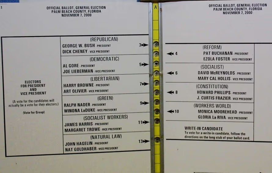
Behold the infamous butterfly ballot, which caused thousands of voters to vote for the wrong party—unintentionally. After an intense recount process and the decision of the United States Supreme Court in Bush v. Gore, Governor George W. Bush officially won Florida's electoral votes by a margin of only 537 votes out of almost 6 million cast, and, as a result, the entire presidential election. The process was extremely divisive, and led to calls for electoral reform in Florida.
© Anthony, Public Domain
Button 3 (2015): Press Here to Suddenly Switch Off Your Engine While Driving at High Speed
Let’s take a look at an example of yet another seemingly “simple button.” In 2015, precisely 13,574 cars of the American brand Lincoln were recalled because the Start/Stop button of the car had to be moved. The reason? Drivers accidentally pushed their cars’ Start/Stop button while driving at full speed. Turning a car off while it’s driving at high speed is hardly the safest move, especially if you’re not expecting it.

The designers at Lincoln had placed the Start/Stop button right below the “S” button, which stands for “Sport”. Drivers would usually intend to press the “Sport” / “S” when driving at high speeds, and their attention would obviously be limited because they needed to keep their eyes on the road. The result was that some drivers unintentionally pressed the “Engine Stop” button instead of the “S” button right above it. This caused their cars to stop abruptly while driving at high speed.
© Lincoln, Fair use

Lincoln had to recall the 13,574 cars and then move the button to the top of the column of buttons – as a kind of “usability patch”. By placing the “Sport” / “S” at the very opposite end of the column, they lowered the likelihood of the drivers’ accidentally pressing “Stop engine” while driving at high speed.
© Lincoln, Fair use
The Take Away
The examples we have provided above are not only incredibly interesting to examine, but they also provide valuable learning points that tie back to how we create our courses.
They show that designers have, time and again, committed design mistakes because they have ignored or overlooked the way our minds operate. They underscore how important it is for us, as designers, to take into consideration human psychology and sociology. Sometimes, a simple design flaw can cause an extremely costly disaster!
The examples also show that design is way more than learning about the hottest trends, but also taking a considered look at past successes and failures and then distilling timeless design principles from them. This goes back to why we started the Interaction Design Foundation and why we chose to focus on imparting timeless principles rather than chasing the next big design style. Many principles of great design are universal and timeless as they are based on psychology, sociology, studies of our present and past technology, as well as the interaction between humans and technology. Not even the design of a single button is an easy win—but it can be if you have the right knowledge!
References & Where to Learn More
Read Don Norman’s influential book, The Design of Everyday Things, Revised and Expanded Edition.
Find out about the consequences of bad design in Don Norman’s essay, Human Error? No, Bad Design.
Learn more about Steve Jobs and Apple Computer from the PBS television show Triumph of the Nerds.
Read the U.S.NRC’s Backgrounder on the Three Mile Island Accident.