
Have you ever felt overwhelmed when performing a task such as registering an account or completing an online purchase? Ever felt puzzled when it wasn’t clear which steps to take? Nearly every website and application supports tasks that have different stages to go through. From adjusting your MAC OS X system preferences, to registering an online account, the system helps you perform your tasks with minimal effort. Learn how to use responsive enabling to optimize the user experience of your designs.
The Design Problem
At certain stages in a task, sub-components are either necessary or redundant. However, you do not want to take the user to a different location for all the different elements within a task, as that adds extra time to the process and the user would benefit from seeing all of the components of a task at once. Conversely, presenting all of the components of a task at once could be confusing, especially if redundant elements are enabled. So, between whisking users from screen to screen and flooding them with choice, you need a third way, one that’s more in proportion to their needs at a given moment.
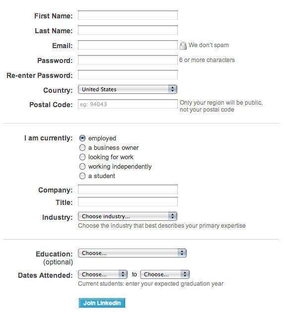
Author/Copyright holder: LinkedIn. Copyright terms and license: Fair Use.
You could improve this LinkedIn registration form by using the responsive enabling design pattern. In this case, a student would not need the company and title fields to be enabled.
The Design Solution
The gradual process of enabling users to interact with certain user interface elements as and when they need them is referred to as ‘responsive enabling’. Initially, the user is shown all of the information and user interface elements, such as checkboxes, radio buttons, and input fields, in one panel, window, or page, but only those items necessary for the first sub-component of the task are enabled (i.e., active or 'interactable'). As the user makes a selection, more options are enabled, while other, redundant options are deactivated (but still visible).
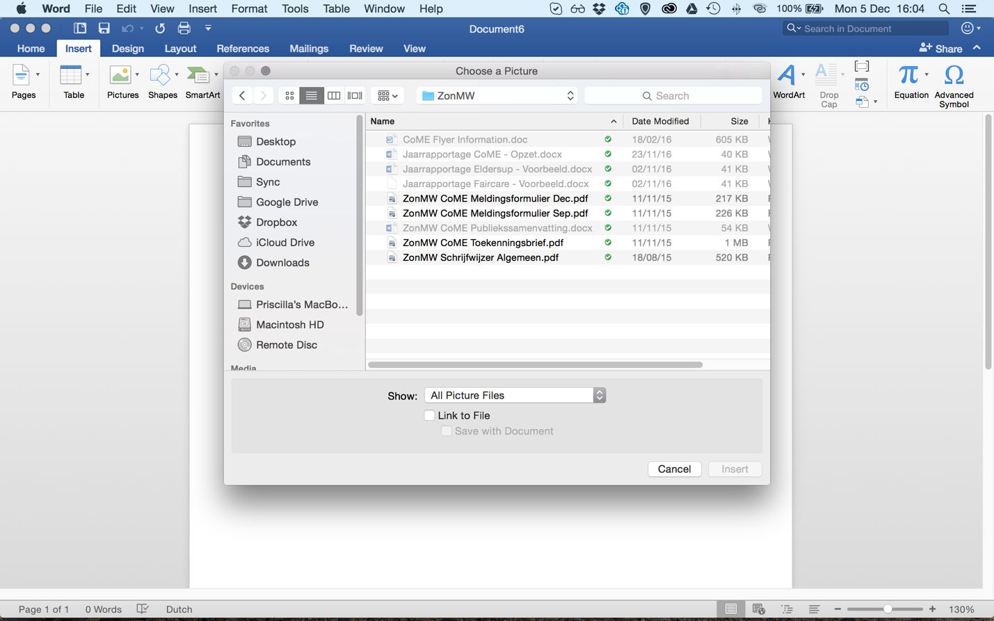
Author/Copyright holder: Microsoft. Copyright terms and license: Fair Use.
When inserting an image in Microsoft Word, responsive enabling allows the user only to select picture files by default. This way, the system avoids any errors. However, to provide full flexibility for users, it is possible to have the system show other document types. At the very least, it will assure them they haven’t mysteriously lost any of their files.
Why Choose a Responsive Enabling Design Pattern?
There are often times when the user should be helped through a task—especially when there are a number of different components and sub-tasks involved. If users are presented with all of the options at once, it could prove overwhelming for them. They could quickly lose their focus, which would more than likely make the task more frustrating and time-consuming. Responsive enabling ensures the component elements of a task are only active at the point the user needs them, keeping the user's focus on the necessary elements within the user interface and restricting the potential confusion of keeping other elements, related to different components and sub-tasks, within view.
Responsive enabling also prevents errors by restricting the available selections through the different steps of a task. At first, the user may not realize that certain elements are irrelevant to their current intentions – at best, resulting in time wasted on mentally filtering out these options and, at worst, leading to erroneous selections. Therefore, by enabling the options relevant to each stage of a task, while disabling all others, you restrict the potential for error and the number of options the user must consider – a two-fold benefit of using responsive enabling. This benefit is also stressed by Jennifer Tidwell, interaction designer and author of Designing Interfaces: Patterns for Effective Interaction Design:
"...the user can't do things that would get him into trouble, as the UI has "locked out" those actions by disabling them. Unnecessary error messages are thus avoided."
—Jennifer Tidwell

Author/Copyright holder: Pixabay. Copyright terms and license: CC0.
In some contexts, like in the laboratory environment shown here, errors can have serious repercussions. If this is the case for your design, we recommend you to use all design patterns that will prevent errors. Responsive enabling is definitely one to consider.
Using responsive enabling can be particularly beneficial when designing user interfaces that will be used by those unfamiliar with certain tasks, such as setting internet options or—as is the case in the example image below—changing default format settings. Unlike other designs, such as progressive disclosure, responsive enabling does not hinder users who regularly carry out or are familiar with a particular task, as all the options are presented at once. Placing all of the options in view allows regular or familiarized users to plot their movements in advance, which can help reduce the time it takes to complete the overall task.
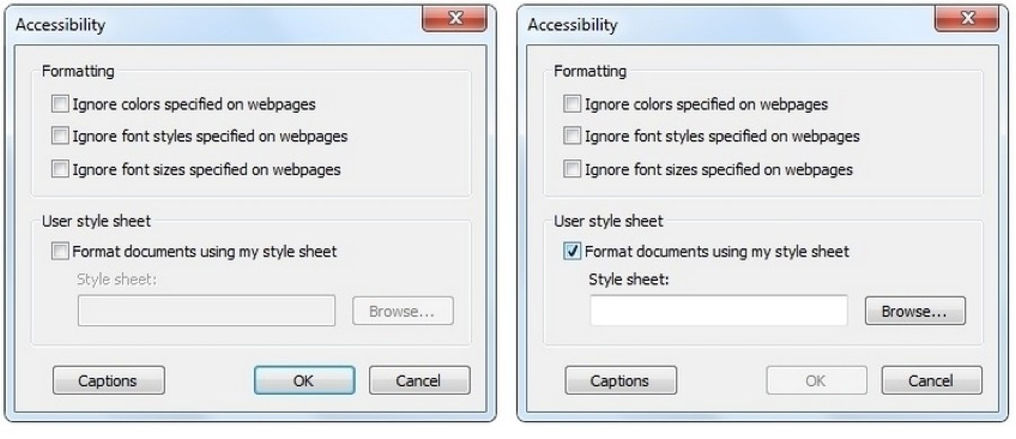
Author/Copyright holder: Microsoft. Copyright terms and license: Fair Use.
Changing default format settings through responsive enabling, has the advantage that all options remain in view, so users can anticipate on their next action. This may help to reduce the time it takes to complete a task.
Best Practice: How to Implement Responsive Enabling
Arrange the different information and user interface elements necessary to complete a task into one panel, window, or page.
Decide which elements are necessary for each component of a task or each sub-task. Place the information and user interface elements relevant to a particular stage in a task close together.
Connect items so that selections result in the activation of relevant user interface elements and information and the disablement of irrelevant elements and information.
Distinguish enabled items from disabled options using color. When the user arrives, the elements and information required to complete the first stage should be active, while all other elements should be disabled. If there are a number of possible first stages, such as choosing one of the 'Formatting' options or inputting a customized 'User Style Sheet' in the example above, allow the user to select any one of these options from the moment they arrive. Once again, when a selection has been made, disable the elements that are now redundant.
Allow the user to reactivate disabled elements by selecting another user interface element. For example, when the user has inputted a customized 'user style sheet', in the 'Accessibility' panel above, he or she can revert to the other 'formatting' options by clicking one of the checkboxes arranged vertically.
Ensure that there is a natural flow to the active and inactive elements, so as to coax the user through the task(s) as quickly and efficiently as possible. User testing is a great way to achieve this.
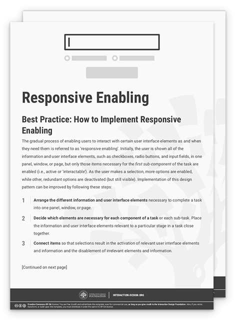
To help you get started implementing responsive enabling, you can download and print our “Responsive Enabling” template:
Potential Problems with Responsive Enabling
By deciding which options are available at each point of a task or sub-task, you are removing control from the user. Therefore, it is essential to link items according to the way users would ordinarily tackle a problem and the frequency with which tasks are carried out. So as to determine whether your current design supports the nature and regularity with which certain tasks are performed, you might want to consider conducting a small-scale usability test. Just a few users can provide the insight necessary to arrange and link items. However, before you enlist a sample of the intended users, ask yourself some questions: Is an action disabled for a good reason? Are all of the elements a user needs for a particular task/sub-task active at the right stage? Can the user return every element to an active state? If not, the following problem occurs.
When options are disabled without a clear indication why, a usability problem termed 'Mysteriously Dimmed Menu Items' (as coined by Bruce Tognazzini) arises. In order to avoid this problem, when a user selects an option, the resulting changes to active and disabled elements should be instantly perceptible and directly linked to the selection. For example, when the user clicks the 'Format documents using my style sheet' checkbox—in the panel shown above—the input field directly below is activated. If the checkbox and corresponding input field were placed further apart or in separate, delineated areas of the panel, the users might wonder why the latter is disabled when they arrive there. To avoid the 'mysteriously dimmed menu items' problem, you could include a note in the system help and documentation informing the user why controls are disabled. However, a more immediate and direct method is through the use of proximity in the user interface. The closer items are to one another, the more likely the user will perceive them as grouped. You can utilize this Gestalt perceptual phenomenon to help the user determine why certain controls are enabled and others disabled.
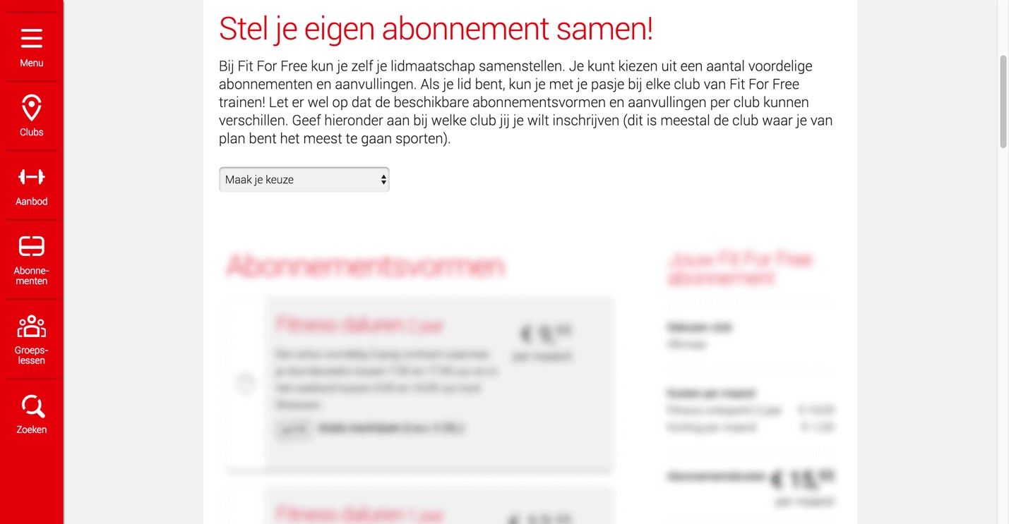
Author/Copyright holder: Fit for Free. Copyright terms and license: Fair Use.
This website from a Dutch fitness company uses the progressive disclosure design pattern. However, as a user, you can see that prices are dimmed at the moment. This might make you wonder what will happen to the prices after making the first selection. It may be relevant to show a little bit more information at this point, to prevent users from getting the feeling they are dealing with mysteriously dimmed menu items.
The Take Away
In order to assist people through a task, it may be helpful to show all steps they should take, but focus the user’s attention to the step that is currently relevant. You can do this by using the Responsive Enabling Design Pattern, enabling only those parts of the user interface that are relevant to the current step in the task process. Depending on the user’s input, you can proceed by enabling the next relevant input fields, radio buttons, or checkboxes, slowly guiding your user in the right direction. This can make complex tasks easier to perform and less prone to mistakes. As you’re removing control from the user, you should be careful to decide which options are available at each point of the task. Also, the user should be able to understand why an item is enabled or disabled. Failing to do so leads to what is known as ‘mysteriously dimmed menu items’, taking away from the user experience.
References & Where to Learn More
Hero Image: Author/Copyright holder: Negative Space. Copyright terms and license: CC0.
Jenifer Tidwell, Designing Interfaces: Patterns for Effective Interaction Design, 2010
Martijn van Welie, Pattern Library, 2008


