When users start to get to grips with your mobile app, they will need a little help from time to time. The good news is that standard design patterns can reduce design time for help in mobile apps. Here are some practical guidelines that you can use to improve the UX of help in general.
You should not plan on users needing help to use your interface. In other words, make your app or mobile user experience (UX) design as fool-proof as possible. Keep things simple, so that users won’t need to be saved by your help system. As UX consultant Larry Marine once said, “Help Doesn’t”. What he means is that if users need help, your design has already failed them—or they are so stressed by that point that help can add more frustration.
Users sometimes need help. Mobile apps are still new enough that only some users are familiar with conventional usage patterns. Most mobile apps will likely introduce new concepts or ideas at some point in their interaction with the user. The good news is that there are some excellent general best practices for help design and some popular user interface (UI) design patterns that you can utilize too.
For example, if a Facebook user gets locked out of their account, they will need help!
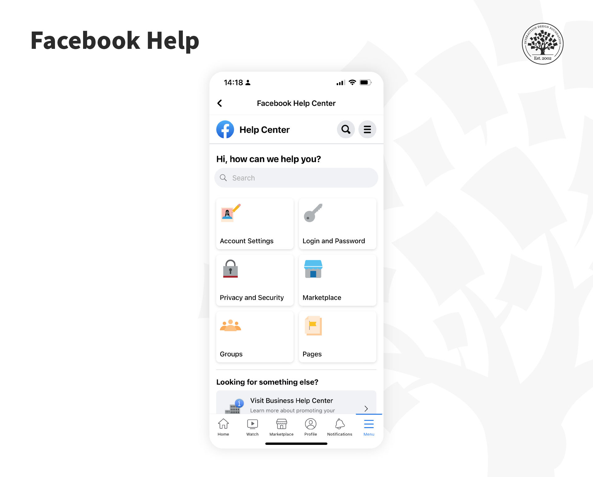
The Facebook Help Center recently underwent a redesign; it features a more streamlined and user-friendly interface with improved search capabilities.
© Facebook, Fair Use
Help is for more than just those emergency cases, most notably contacting customer support. This is a challenge because the business model in the Gig Economy is to hide contact and make it very difficult to talk to a human. Ethical UX should say that contacting customer support should be easy and transparent (not require circular loops and drill-downs to find that magic contact link).
In some cases, help can be part of the UI experience, such as with onboarding. However, be careful you don’t default to onboarding—you can tire users and lose their interest or motivation by making them walk through help-like screens. Streamlined and the right information a user needs is critical to effective app onboarding. Test with users to be sure.
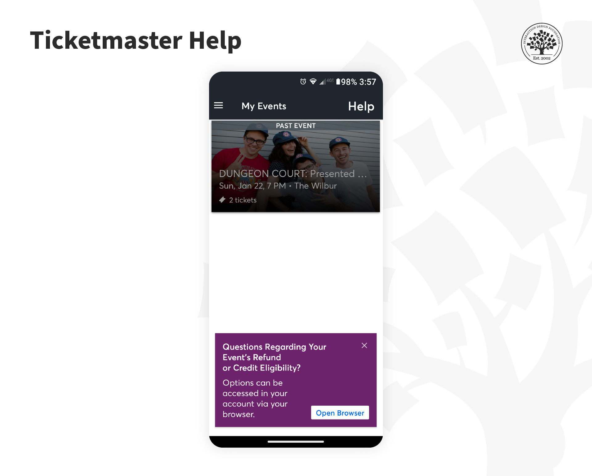
Ticketmaster offers its users visible help in the Events screen.
© Ticketmaster, Fair Use
Five Best Practices to Provide Help
The general best practices to provide help consist of a shortlist of five simple steps to aid the user:
Make help and support easy to find. In apps, people are most likely to look to the toolbar for this. Be transparent about how to contact help. Offer a database question-answer next to a live chat or call option. Instead, many companies prioritize automated self-help options and hide the contact link.
Provide more than one form of help or support. This can come from tutorials, self-service FAQs, click-to-call to speak to an agent, notifications, etc.
Offer tutorials/introductions when a user first interacts with an app. There should always be the ability to skip this and return to it later.
Show in-app help content when you add/change a functionality, and when users access rarely used functionalities.
Help videos can be handy but only if the user has complete control over playback—this includes the facility to start/stop/pause, move to the section they want to view and the playback’s volume.
To place the help contextually, such as in the Ticketmaster app, is a good idea. Users might have a question or issue about the transaction that just occurred.
Six Great Help Design Patterns
Catriona Cornett, a UX designer at RelateIQ, writing for Inspire UX, offers six simple help design patterns for mobile applications.
Demonstrations
Tutorials
Single-Screen Overlays
Walkthroughs
Tips
Single-Screen Summaries
Demonstrations
A demo is generally a video or animated walkthrough of key functionalities. They are best kept short and relate to a specific area of functionality. You can use more than one demo if the user benefits from it.
Demos show the user the app without the need to work through many screens to do so; they clearly articulate relationships between app elements and can articulate on and offline usage. They should contain play controls, only be used when the app first launches and be annotated sufficiently to allow the user to recognize their value.
They may only be entirely successful in helping the user if more is incorporated within the demo with a clear context indication. It is easier to remember too much information by putting it into practice.
Live demos, like "you try it now", can be helpful. Better yet are onboarding or starting screen experiences that nudge users to do the task to learn it. E.g., Take a Photo now, Create a contact, Test your Audio, and so on.
Tutorials
Tutorials guide the user through the interface with simple explanations of interactions and UI elements.
While you don’t want to show a very long tutorial to a user on the first interaction, you can use tutorials to demonstrate as much of your functionality as you want—just make sure they are easy to find later.
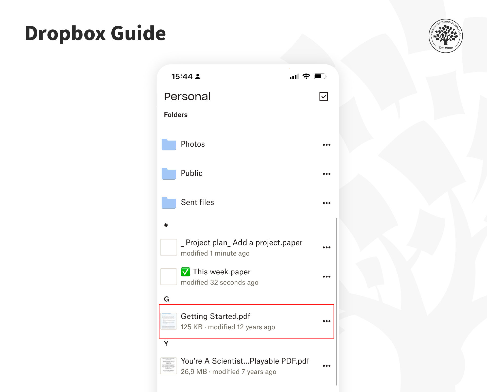
Dropbox adds a “Get Started” guide in the user’s folder so that it's easy for them to find it later.
© Dropbox, Fair Use
Explainer videos are more prevalent on Desktop experiences (using animations), but be careful. They are often overused and can get many people tired or bored. Do not assume video will save you from orienting a user—they might not watch it. Though, a short, personable video might be just the thing.
In your help strategy, refrain from patronizing your users. A great example of a short explainer was a video from former Talk Show host Ellen Degeneres for her app, a group quiz game called Heads Up. In 1 minute or so, she explains to users how to play the game and gives energy and excitement to this multi-user game where you hold the phone up to your forehead and the other person acts out the word for you to guess.
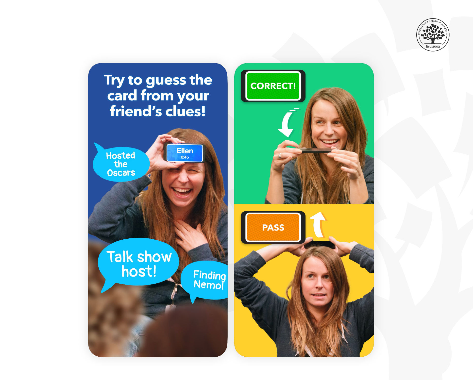
The popular mobile game "Heads Up" by Ellen DeGeneres features an introduction video that not only showcases the fun and engaging nature of the game but also provides a brief tutorial on how to play.
© Warner Bros., Fair Use
Single-Screen Overlay
An overlay is placed over the screen and explains up to five points of interest. The overlay should be easily dismissed when the user is done with it.
Overlays can be used throughout the application where necessary. It would help to keep explanations simple to ensure readability. There should always be a means to recover an overlay if it is closed accidentally.
Overlays are great to explain concepts within the context of any given interaction and can be helpful when unusual or uncommon functionalities need to be explained.
They are not as good when you need to explain highly complex functions (not enough space on-screen) or processes that move from screen to screen.
Walkthrough
A walkthrough takes a user through a process from start to finish, explains and then gets the user to carry out each step. This can be very useful to encourage further use of the application or to encourage a user to try out different possibilities within an app.
The best walkthroughs are limited to some essential tasks within the app and begin with clear objectives.
Ensure that your walkthroughs don't interrupt the user’s own journey with the product—deliver them “just in time”, not “all the time”. Very complex tasks can be overwhelming with a walkthrough; consider splitting tasks to make them simpler to carry out.
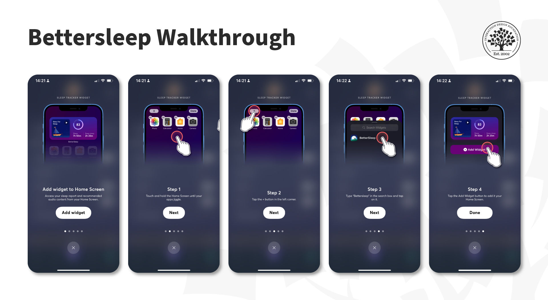
Walkthroughs are commonly used to help users learn how to use the app effectively.
© Bettersleep, Fair Use
Tips
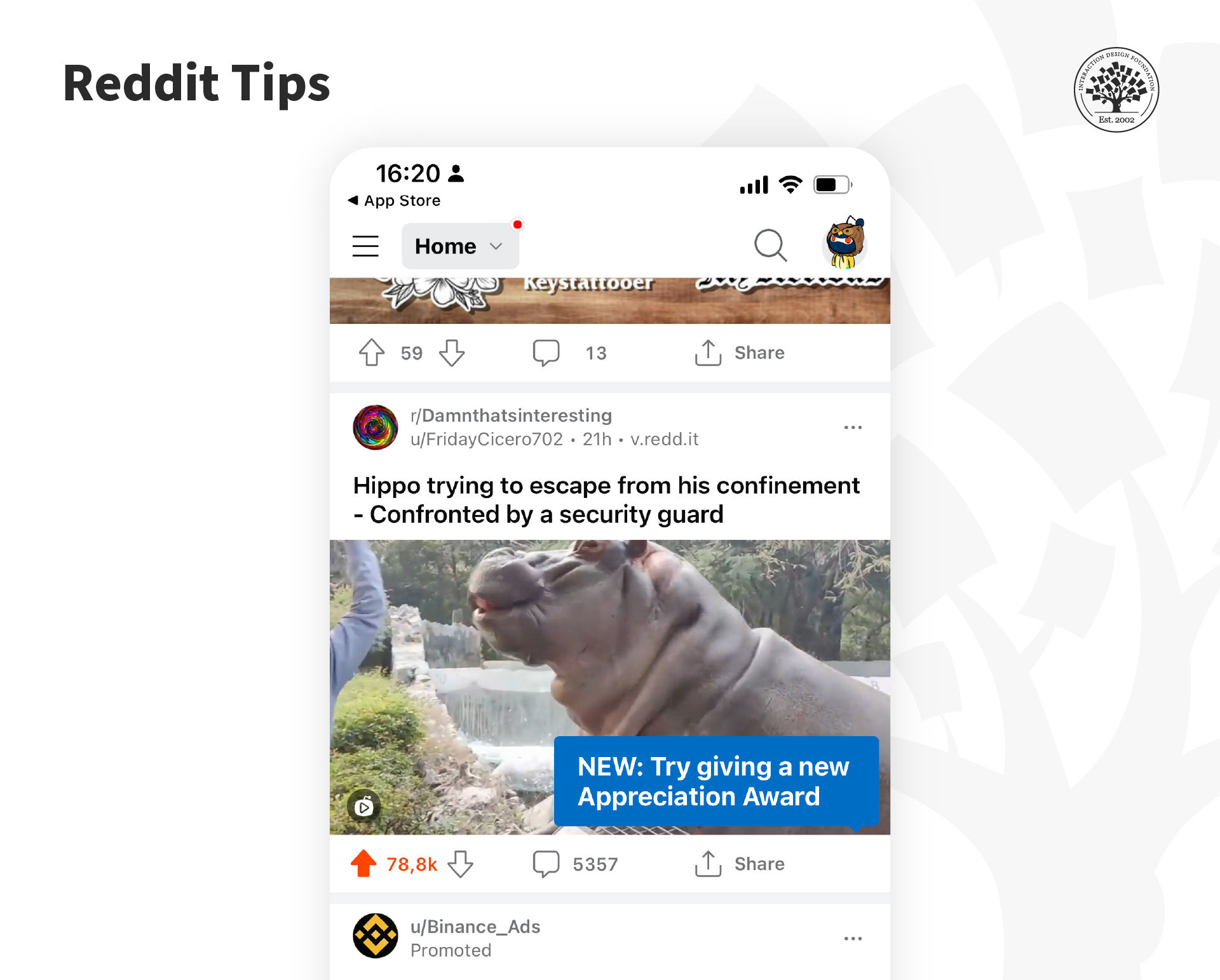
The Reddit app uses tips to show people new functions.
© Reddit, Fair Use
Tips deliver a single piece of information exactly when the user needs that information. They can appear when an app first opens, when a user enters a screen, or when someone completes a process step. They are great to introduce new functions.
There should always be a way to turn off tips. They are best used to convey simple ideas and shouldn’t replace tutorials, walkthroughs and other forms of help.
Single-Screen Summaries
A single-screen summary is an overlay with a short bit of text that describes the current screen's purpose. The user can close it, or it can vanish within a few seconds (around five seconds). Designers recommend implementing single-screen summaries when the user accesses a screen for the first time and not to show it every time the user visits the same screen.
The main drawback to single-screen summaries is that they usually get lost in the mix, and the user cannot retrieve them once they decide to dismiss them.
The Take Away
To provide help in mobile applications should always involve user research; what do users need when they have stress cases or panic for help? How should onboarding properly support them without boring them or losing their engagement? What can’t they do without assistance? Once you understand these issues—you can use some simple rules and patterns to develop valuable help for your users.
References and Where to Learn More
See NNGroup’s tips on how to Minimize the Need for Customer Service to Improve the Omnichannel UX .
Read this article about implementing help content effectively.
Learn how Shopify improved its customer service by applying UX principles.
Hero image: © Interaction Design Foundation, CC BY-SA 4.0