
Updates can take many different forms. The updates on the activities of your favorite contacts in a social media application are very different from the updates that the same company behind the social platform implements in its terms and conditions. The first are updates that you want—or even crave—and will search for far more actively than the latter, which, as essential as they are, can be annoying when they happen unexpectedly. Both types do have one thing in common, though: the user experience surrounding them is something we as designers can enhance with the right update alerts. Here, you will find practical tips on implementing this design pattern.
The Design Problem
The 21st century is a fast-paced ‘time zone’—not least for those who remember the speed of communications in the 20th. In just over a decade, the word ‘update’ would transform from meaning an activity many users let their laptops (or base or tower units) do last thing at night into a needed ‘fix’ for users many times throughout the day on their smartphones. When using websites and applications, users tend to like seeing what’s happened since they last visited. Often—for the better (e.g., if a user spots a chance to meet up with a nearby friend), or the worse (e.g., if the user is at work but can’t keep away from the smartphone despite a warning or three from the boss)—that last visit will be only a matter of minutes ago. Updates, as far as we’re concerned as designers, occupy two distinct categories: 1) those that tell users what their friends have been up to on a social media website; and 2) those that inform users of important changes made to their accounts or the terms and conditions of their use.
When considering the dimensions of our design problem here, we would do well to keep in mind two other points. One of these is the user’s context—namely, that users might notice updates while they’re walking, for instance. The other involves a curious fact about technology and the human attention span. Indeed, an update may just take a moment to register in a user’s mind. Even so, the user’s threshold for tolerating blocks of data input in the era of the handheld device deserves our careful attention here, especially when we consider how easily a user’s thought process can be derailed by unnecessary ‘noise’. In 2015, scientists working for Microsoft conducted a survey on 2,000 participants in Canada; they also used electroencephalograms to examine the brain activity of 112 other subjects. According to the results, the average human attention span had dropped from 12 seconds in 2000, roughly at the beginning of the mobile revolution, to 8 seconds—or by a third of what it had been. As goldfish are believed to have attention spans of nine seconds, that puts the average human in a unique position as regards the comfortable capacity to remain attentive to an event. A researcher at the University of Western Ontario’s Brain and Mind Institute posited that the reason for the phenomenon is down to the very human need to devour information.
"When we first invented the car, it was so novel. The thought of having an entertainment device in the car was ridiculous because the car itself was the entertainment. After a while, travelling for eight hours at a time, you'd had enough of it. The brain is bored. You put radios in the car and video displays. Why? Because after the first 10 minutes of the drive I've had enough already. I understand this. Just because we may be allocating our attention differently as a function of the technologies we may be using, it doesn't mean that the way our attention actually can function has changed."
— Bruce Morton, Canadian psychology professor with the Brain and Mind Institute
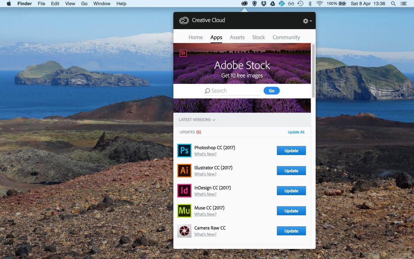
Author/Copyright holder: Adobe. Copyright terms and license: Fair Use.
As more and more software applications provide subscription-based services, such as Adobe for their creative suite, update alerts are likewise becoming increasingly important. Without proper alerts, users may continue using an outdated version of an application for too long, losing out on bug fixes or exciting new features. The trick is in how we announce such updates.
The Design Solution
Updates are a fact of life, not an option—that said, we have a great deal of choice concerning getting the presentation right. Short update alerts can be a highly visible and effective means of informing users of important and personally relevant changes. We can also use these updates—also referred to as vitality or activity streams—on all pages of a website or application, and we can engineer the content according to the user's current position. Therefore, we can use update alerts to inform users of general changes (i.e., those that relate to the overall user experience) or of context-specific changes, such as bulletins showing users what status updates their friends have made whenever they log in to their personal homepages.
Why Choose an Update Alert Design Pattern?
Update alerts provide our users with interesting and important information immediately, saving them from expending the time and effort in actively seeking these out. For example, a social media site tends to provide update alerts consisting of the activity of a user’s friends (e.g., status updates, news stories, new pictures, and new connections). If users were to go and find this information ‘manually’, it would take much longer and mean their having to go from profile to profile and scrolling through each different user's contents. That’s a huge chunk of inconvenience to handle when time and battery levels are at a premium. So, this is our cue for entering the user experience with our best solution.
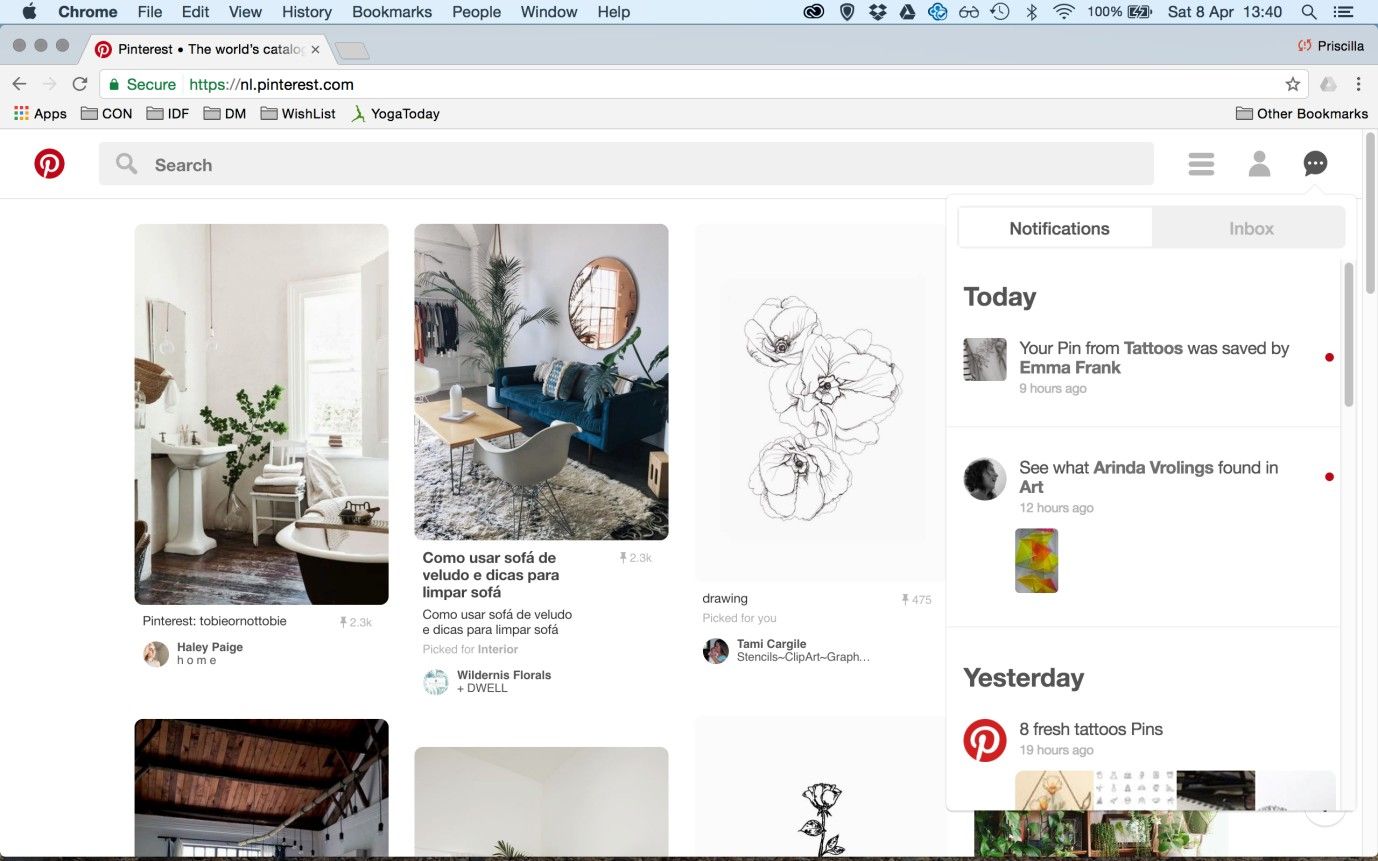
Author/Copyright holder: Pinterest. Copyright terms and license: Fair Use.
Pinterest provides short snippets of information on activities you may be interested in. For example, notifications appear for pins that are saved by other users, for pins added by people you follow, and for pins related to previous searches.
Best Practice: How to Implement Update Alerts
Condense each individual update into a small piece of information, without sacrificing the meaning of the event. For example, someone might have uploaded a photo from a recent visit to the Sistine Chapel in the Vatican City and have tagged a number of people. While the users who know this traveler might be interested to know all of this information, they only need to know what type of activity has taken place, so they can investigate further if they wish to do so.
The updates should be a snapshot of the activities from the user's friends and family, rather than an exhaustive catalogue of all the events ever to have taken place. Therefore, starting the updates from a certain time is the best idea, such as updates from the day or week the user has signed in.
The updates should ideally contain inline links that navigate the user directly to the related contents, saving that user from having to wade through the people's accounts. Generally, you should ensure the user can go to the event itself within the other user's timeline and can click through to the other person's account. For example, the user's profile image might appear at the head of the update, which the user can click – diverting him or her straight to that person's account.
Ensure the update alert is eye-catching, without dominating the whole screen. In order to draw the user's attention to the alert, the background is usually 'greyed-out', but still visible, which gives the appearance of a figure/ground distinction, so the updates seem more prominent within the display.
While updates might be interesting to users, users must be able to close the update panel quickly. Once the panel is closed, allow the user to resume his/her original activities immediately.
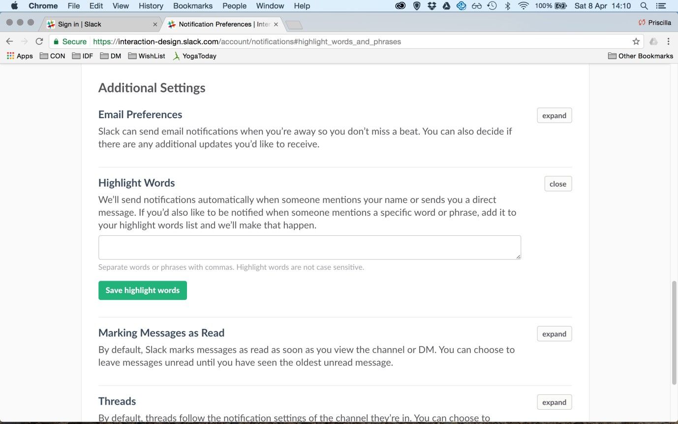
Author/Copyright holder: Slack. Copyright terms and license: Fair Use.
Slack allows users to indicate specific words for which they want to receive update alerts. This option can be found a little bit ‘deeper’ in the account settings, as it is not something most users will require.
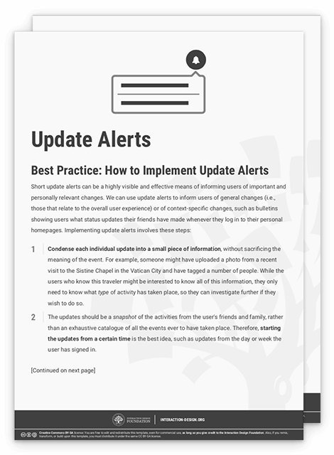
To help you get started implementing update alerts, you can download and print our “Update Alerts” template:
Potential Problems with Update Alerts
Typically, update alerts appear when the user signs in to an account, such as a social media profile, displaying a list of activities that have taken place since the user last logged in. Ensuring the update alert is concise is vital, so the user can consume the information quickly. If the update message were to consume a whole page, the aim of saving the user time and effort to get an overview of new, interesting events would be diluted. So, consider your update alerts to be information 'snacks', simply used to give your users a taste of what is going on, instead of inundating them with a blow-by-blow account of the activities that have happened in their absence.
The Take Away
Short update alerts can be a highly visible and effective means of informing users of important and personally relevant changes. We can use them to inform users of general changes (pertaining to the user experience overall) or of context-specific changes (pertaining to the activities of contacts on social media). Typically, update alerts appear when the users sign in to their accounts, displaying a list of activities that have taken place since they last logged in. It is important that the update alert is concise, so the user can consume the information quickly. So as not to disrupt the user’s flow, update alert panels must also allow themselves to be closed quickly. They are succinct headlines and captions, not deluxe, in-depth stories. With update alerts tailored to enable users to stay on top of events at a glance, you can positively influence the user experience and create fluent and engaging interactions.
References & Where to Learn More
Jenifer Tidwell, Designing Interfaces: Patterns for Effective Interaction Design, 2010
Martijn van Welie, Pattern Library, 2008
Hero Image: Author/Copyright holder: Johan Larsson. Copyright terms and license: CC BY 2.0.


