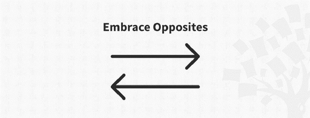
Embrace opposites is an ideation method which designers use to explore their design space by finding overlaps between different categories or opposites. When they chart and compare two apparent opposites, they might find features that are common to both—and ones that are not—and spot new design opportunities.
“The opposite of a correct statement is a false statement. But the opposite of a profound truth may well be another profound truth.”
— Niels Bohr, Pioneering physicist behind atomic structure and quantum theory
In this video, Alan Dix, author of the bestselling book “Human-Computer Interaction” and director of the Computational Foundry at Swansea University, explains how to find design possibilities by comparing utterly different things.
Appearances can Deceive – Go Behind the Scenes with Embrace Opposites
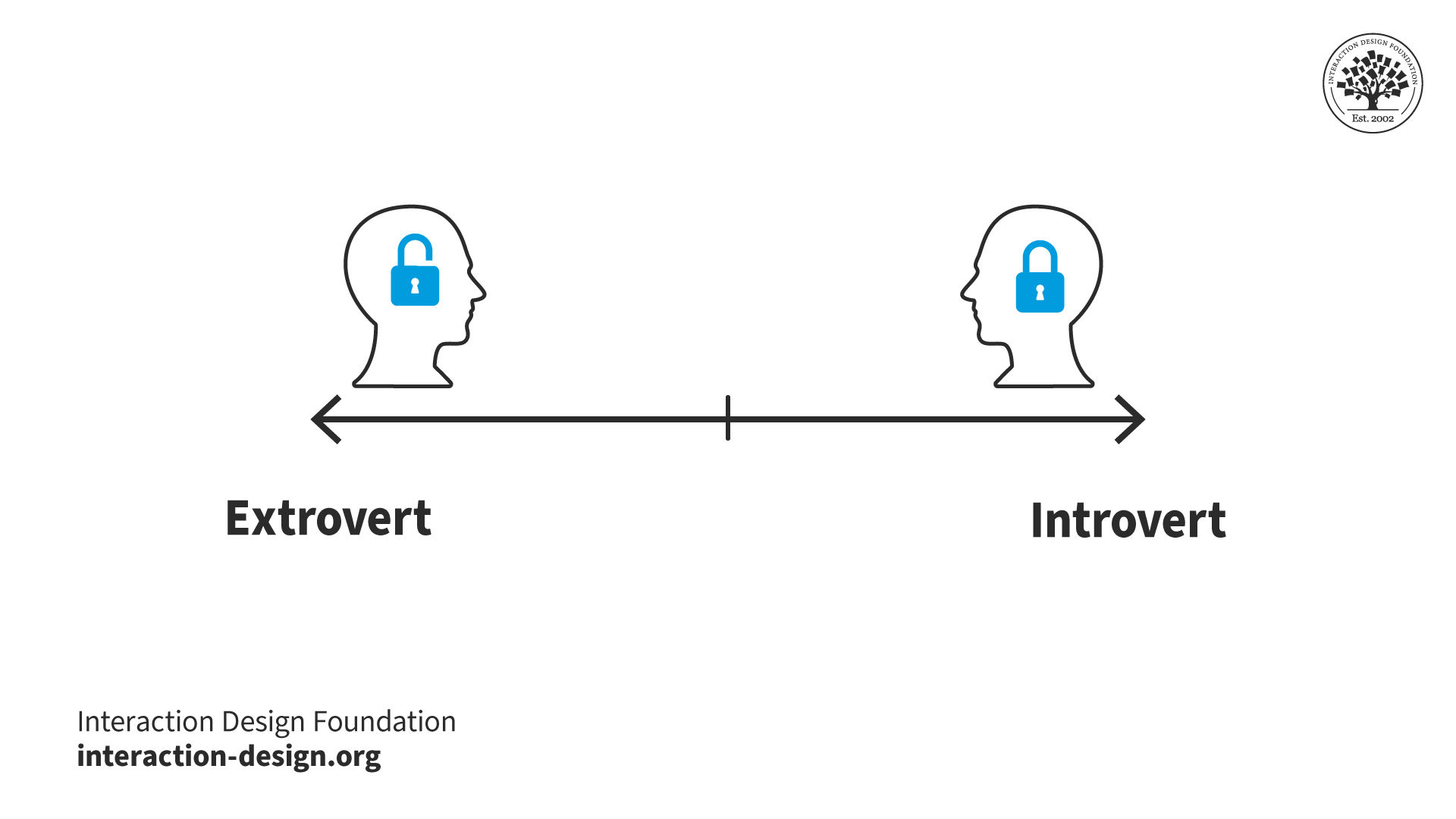
In our complex world, it’s simpler to differentiate things by thinking in terms of dichotomies or opposites (e.g., books and websites) even when they have overlapping attributes. Distinguishing things this way helps us make quick decisions: (e.g.) “good” or “bad” as absolute values, without considering the many degrees in between that describe something’s/someone’s qualities. However, reality is usually too complicated to categorize with “either/or” labels. Often, things that seem totally opposed (e.g., political parties, personalities) share characteristics. For example, what does an “introvert” look like? Or an “extrovert”? Can someone be both?
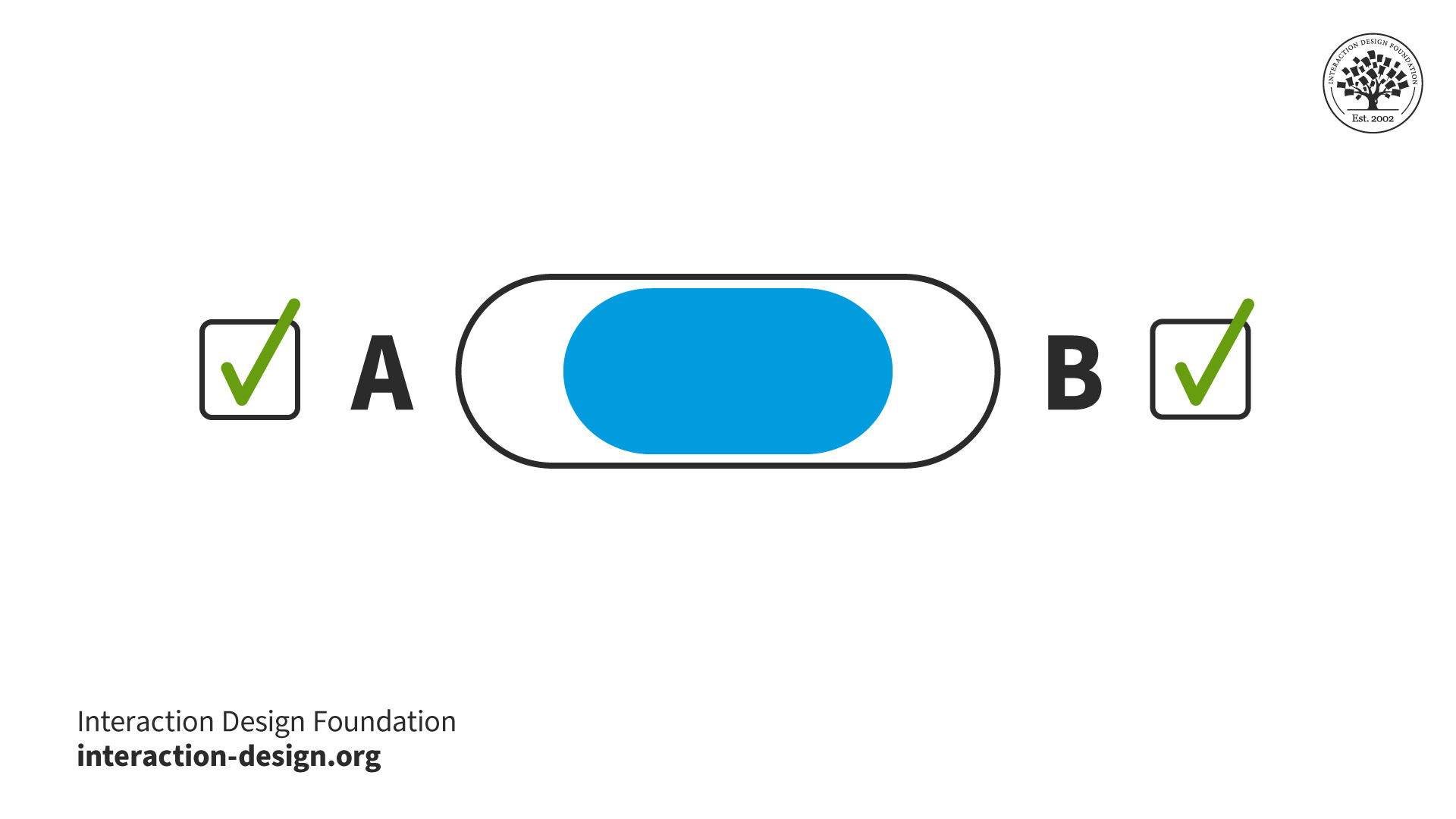
In ideation, you can embrace opposites to see if you can enrich a problem and focus on designing innovative features. For example, consider a simple switch:
© Interaction Design Foundation, CC BY-SA 4.0
If A is “Off” and B is “On”, these are categorical distinctions. However, if A and B were other items that were opposed or distinct (e.g., menus and radio buttons), you might see them in dimensional terms, instead, and ask if they share features. Also, you might be able to design for a combination of these, perhaps with more of one than the other:
or:
© Interaction Design Foundation, CC BY-SA 4.0
© Yu Siang and Interaction Design Foundation, CC BY-SA 3.0
So, you can get a deeper understanding of a design problem and the elements you’re working with if you analyze the categories and dichotomies you perceive. Dimensions tend to be richer than categories, but trickier to work with. To envision this, let’s re-approach our extrovert-introvert dichotomy. We might flip it into a graph, so:
© Interaction Design Foundation, CC BY-SA 4.0
becomes:
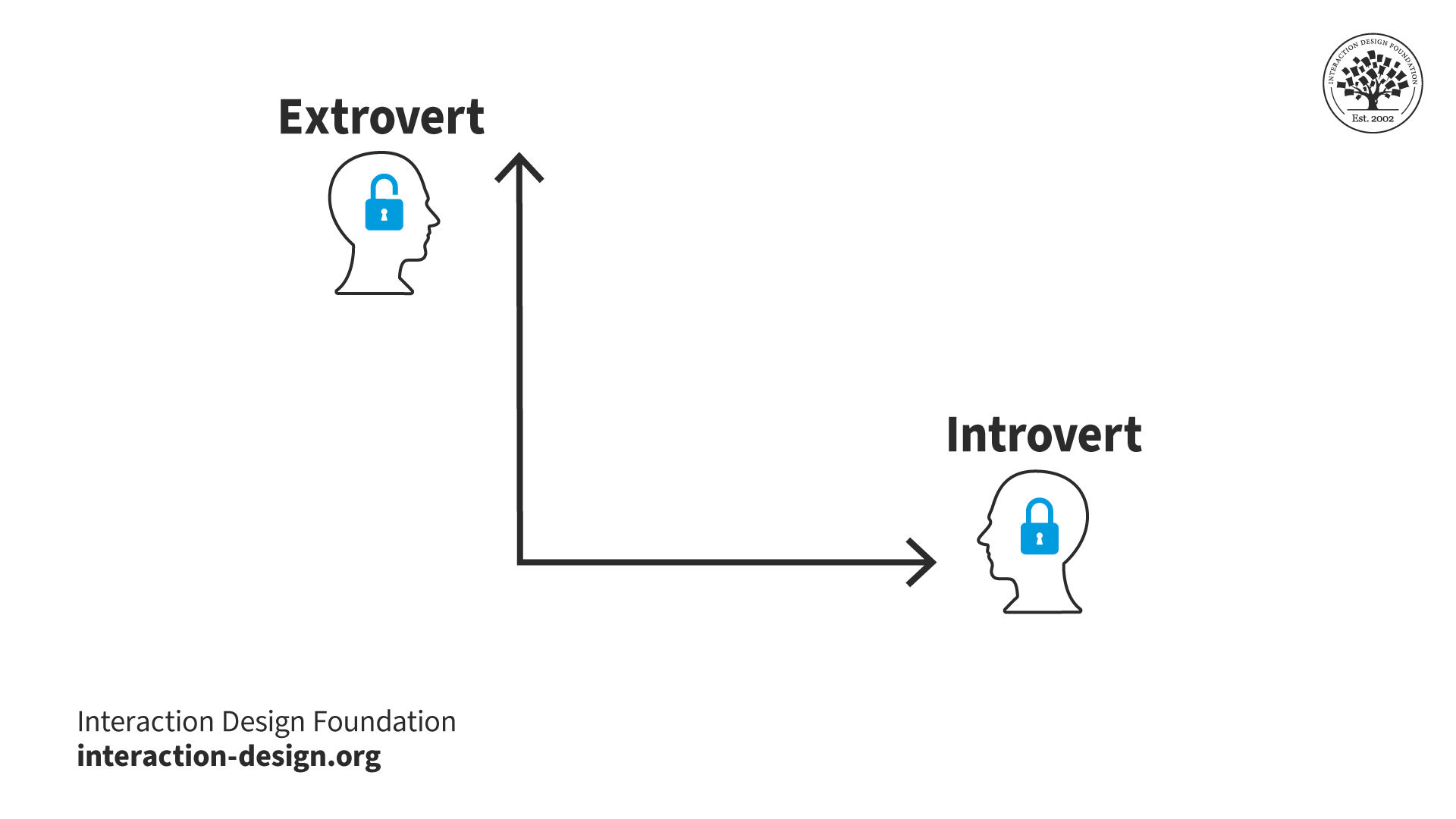
© Interaction Design Foundation, CC BY-SA 4.0
This makes it easier to look for common elements and neutral ones if we divide our graph into 4 squares, where:
Top left = More Extroverted
Top right = Design Possibilities!
Bottom left = Neutral
Bottom right = More Introverted
So, you might find a dimension to manipulate in your own project. It might be (e.g.) a menu (A) that pulls down and includes radio buttons (B) – anywhere where elements of both apparent opposites work simultaneously. At least, you can confirm when “opposites” are indeed distinct.
How to Embrace Opposites
Try these steps to identify design possibilities:
Create an overview of your different categories or opposites in a current design problem. You might say that the desktop version of an application and the mobile version of the application belong in two different categories: desktop and mobile.
Dissolve the categories and ask yourself, “In what ways can my application be both desktop and mobile?”. On the surface, it can’t (users either use their phones or desktops to view your application). But are there any situations where it can? A tablet is in some ways between the two. It has a big screen like a desktop, but a smartphone’s touchscreen interactivity.
List all the overlaps you find.
Go through your list and consider how significant the overlap for each item is, whether it’s mostly one or the other (remember our x-and-y-axis graph above). Now, place the items on your list there. For example, a tablet is probably midway between a desktop and a smartphone, but a laptop with a touchscreen is more like a desktop computer than a smartphone.
Consider the consequences of the overlaps for your design. Should you use the same interaction principles for all these devices? If not, how many versions do you need? If your application is specialized, maybe the mobile with a touchscreen is the perfect device, and you should forget about all the other versions.
© Interaction Design Foundation, CC BY-SA 4.0
Make Things Opposite
Embrace opposites is also helpful if you disagree with the design goal:
Reverse your problem statement. E.g., you wanted to help people feel more inclined to use public transportation than their cars. Now, imagine you wanted to make people more inclined to use their cars. What would that take? How can you try to make people spend even more time in their cars? How can you make it even nicer to drive the car and less attractive to use public transportation? E.g., you could:
Simply decrease the number of bus routes in the area;
Have it so there’s only one bus in the morning, one in the evening;
Make bus tickets more expensive;
Lengthen the routes;
Have the driver play really loud techno music on routes which elders often use.
Now, turn those insights around. E.g., you could research to see what areas most people are taking busses in. Then, you could make more busses available more frequently in those areas and offer fewer busses where there are rarely any passengers.
Overall, remember that determining the opposite of something can be complicated. However, the effort can pay big dividends.