Now that we’ve started covering the topic of proportion in design (beginning with the Golden Ratio article), let’s look at another vital subject. Getting a firm grasp of the Rule of Thirds will empower you to fine-tune your eye to bring out the best of the elements in your design by placing them where they belong best.
What Is the Rule of Thirds?
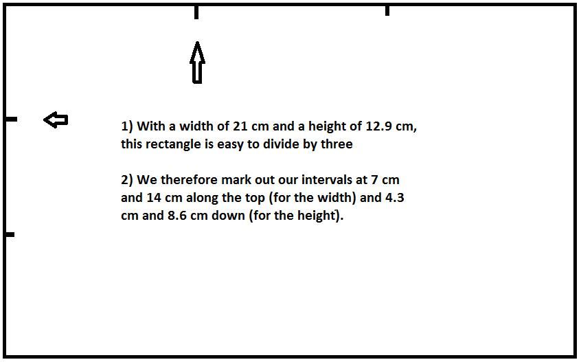
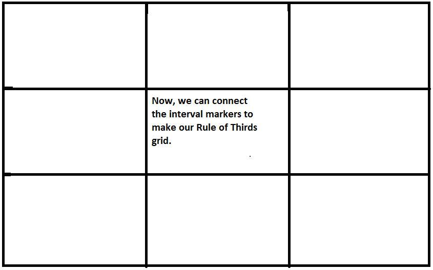
The Rule of Thirds is another way to look at the layout of a design (be it a web page, a painting or a photograph). The idea is straightforward; you place a simple grid overlay (divided equally into thirds, both horizontally and vertically) on the space to be used for the design. This makes a grid of nine equal-shaped boxes. To do this, we make two sets of parallel lines at even places over a background. So, going from the top left, measure the width of your background. If you’ve got a width of 36 cm, mark out points at 12 cm and 24 cm. Then, look at the height. So, again going from the top left, measuring down, we get a reading of 24 cm. Therefore, mark out points at 8-cm intervals (8 cm and 16 cm down). Now that we have our grid points set, we can make the grid!
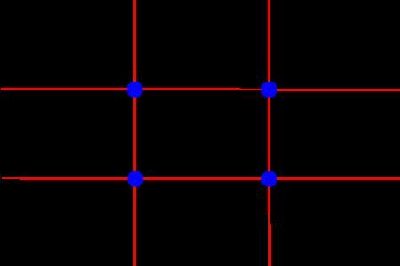
From this page (https://commons.wikimedia.org/wiki/File:Photo_3x3....) you can download both the landscape and portrait templates.
If you’re near a piece of paper or want to switch to a drawing application, try this experiment. Using your ruler, measure the width and height (or length and width, if you have paper, turning it so it’s in landscape aspect), and then mark out the points to get the intervals for your grid lines. If you’re doing this on paper, be sure to measure and mark both top and bottom points, as well as the left and right ones to ensure that the lines will be parallel. Once you’ve got the points marked, draw the lines to make your grid. Notice how those two sets of lines make nine equal-sized boxes. Notice, too, how the lines meet at four points towards the center.
For aesthetic appeal, breaking the design up (horizontally and vertically) so that each third has a similar theme is a valuable way to make a design more interesting. The engraver, John Thomas Smith coined the term “Rule of Thirds” in 1797 in his work “Remarks on Rural Scenery”, wherein he acknowledged the power of dividing paintings up using this grid technique to maximize the effect on the beholder’s eye.
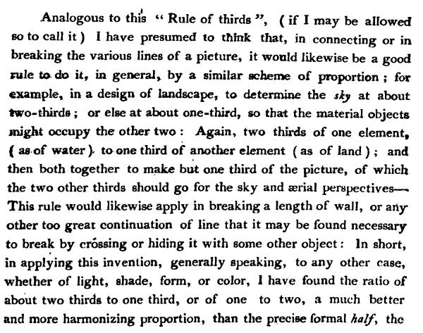
Look at the work of famous photographers – the subject of a photo is rarely centered, because photographers will incorporate the rule of thirds when framing their shots (and indeed, many cameras will offer the grid overlay in the view finder or on live view so that photographers can compose their shots with this rule in mind).
The most important part of the grid is where the lines cross. These are focal points (or “sweet spots”, as those in the industry call them). In a photograph, you might want a person’s eyes or smile on such a point to help tell the story of the image. You have four sweet spots to use. With a little thought, and depending on what’s going on in the image (is there a mountain in the background, etc.?), you can show what’s happening with the most impact. Does your subject look confident that he or she is about to climb that mountain? Remember, a picture can tell a thousand words.
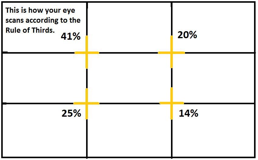
This is why the grid is so valuable, and it applies to what we do as designers, too. In web and app design, we can place the call to action or a key element on a sweet spot, since we know that the eye will automatically fall towards the four intersection points. It’s important to note that these four sweet spots differ in their appeal to the eye, underlining the fact that going for symmetry in your design is not always the best option. We’ll look at how these sweet spots differ in more detail a little later.
The Rule of Thirds is your main ally when you’re aiming for the best visual results. By training your eye to make your design’s key elements fall in line with the appropriate sweet spots, you’ll be making the best use of your other big ally here: your user’s eye. It doesn’t matter if you’re overlaying your grid over a landscape or a portrait image or background on which to design. As long as you have nine boxes with four intersecting sweet spots, you’re perfectly equipped.
Like the Golden Ratio, the Rule of Thirds is ever-present, and the results of its application surround us. Speaking of the Golden Ratio, let’s see how it relates to the Rule of Thirds in our quest to make the best layout designs.
The Golden Ratio and the Phi Grid
When we examined the Golden Ratio, we saw how to make an ideal rectangle (by taking a side of length 1, multiplying it by a “golden” number (1.618), and making our width 1.618). The resulting shape is one that we recognize as the most pleasing rectangle because its proportions conform to the Golden Ratio.
We shall return to our grid and the Rule of Thirds in a moment. First, let’s quickly see another kind of grid, called the Phi Grid. In looking at it, we’ll understand how the Golden Ratio was once applied to grid design.
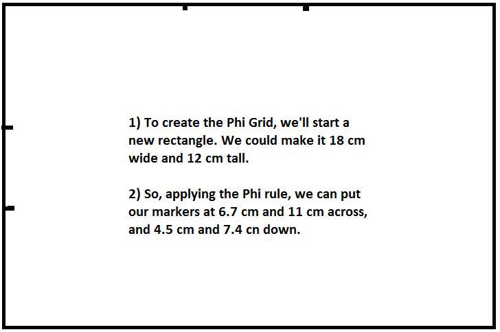
Before the Rule of Thirds grid (that we drew above) came to be, early designers used something else. This involved the Golden Ratio in that, in the nine boxes formed when such a grid was drawn, instead of being equal in size, there were four rectangles (all four corner boxes) of 1:1.618 proportions. So, if we had a background with a width of 1.54 cm and a height of 1.02 cm, we would put our horizontal markers at 0.59 cm and 0.96 cm, respectively. For the vertical markers, we insert interval points at 0.39 cm and 0.63 cm.
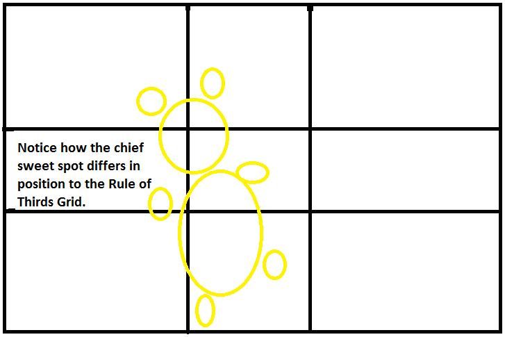
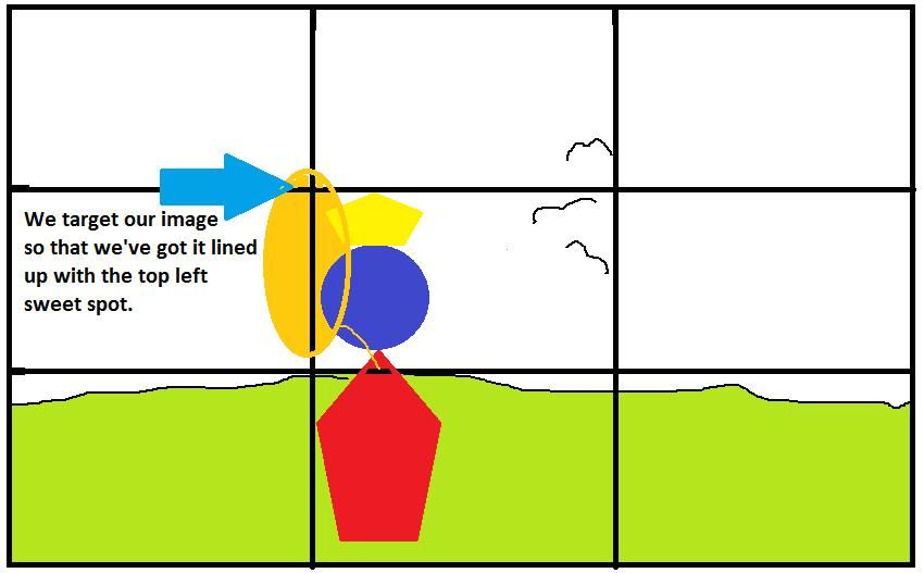
Needless to say, the Phi Grid takes more work to create than the Rule of Thirds grid. However, it’s believed to foster thoughts of better visual harmony in users and can provide good balance by dividing space mathematically. Also, using the Phi Grid is great for ensuring alignment, especially in landscape images where a horizon line adds strength to the picture. Because the points where the grid lines meet are much more central in a Phi Grid, the user’s eye falls naturally on these four “sweet spots”. See the images below, noting how these spots “target” the subject.
For all its benefits, the Phi Grid has its difficulties. While there are still four sweet spots in it, focused in the center (a feature it has in common with the Rule of Thirds grid), it can distract designers, making some of them lose sight of their elements. Worse, the more complicated process of working with the grid can become long and involved. Rather than paying off, the hard work of using the Phi Grid advantageously can fluster designers.
The Phi Grid and the Rule of Thirds grid compared:

How to Apply the Rule of Thirds in Your Design
Happily, the Rule of Thirds allows us to make a far simpler grid, as we’ve seen. It’s the more widely used of the two varieties, mostly due to its simplicity. While it incorporates aspects of the Phi Grid (in that there are four intersecting sweet spots and nine boxes), a Rule of Thirds grid means we can apply the principles of divine proportion while sparing ourselves having to work with a calculator.
As web designers, we can also use the Rule of Thirds by aiming to put the most important content on any given page in the top third. You might think this odd, because surely that’s above the intersections or sweet spots. However, in web design, we’re dealing with pages that scroll. On many modern devices, the whole web page may not fit on the screen. Therefore, by placing content “above the fold”, we are applying the Rule of Thirds. The user’s eye will still fall on all the right places.
It also fits with the visual hierarchy in the way that we consume information (in nearly all languages, we read from the top to bottom of the page). Research has shown that the eye tends to scan images in such a way that, with our four sweet spots, over two-fifths of the user’s attention will be drawn to the top-left sweet spot. The eye will then drop to the bottom-left sweet spot, where it generally gives a quarter of its attention. From there, it travels up to the top-right sweet spot, which draws a fifth of its attention, before falling to the final sweet spot in the bottom right.
From this, we notice that users tend to read in a style that’s comparable to a capital “F” (giving priority to the top left, then down, then up and across to the top right, and, lastly, with not so much emphasis on the bottom right). Consequently, the top-left sweet spot is your prime chance to “grab” your user!
The Take Away
The Rule of Thirds has been helping artists and designers for at least over 200 years. It is a universal concept that artists and designers use by creating a grid of nine boxes in order to draw the user’s eye to specific areas on the design. Made by measuring, marking and drawing two sets of vertical and horizontal parallel lines that intersect at four points, this grid gives you the ability to consider your designs in a different way. These intersecting focal points are called “sweet spots”.
The Rule of Thirds is related to the Golden Ratio and the appealing proportions the latter creates. An earlier grid, the Phi Grid, is perhaps a finer representation of divine proportion, but it’s not as straightforward. Featuring four of its nine boxes shaped as rectangles with the proportions of the golden ratio (1:1.618), it may be considered to offer more pleasing views, but it can be unwieldy to use in designing.
As users and designers, we generally scan an image visually in an F-shape. By starting with most of our focus given to the top-left sweet spot, we look down to the bottom-left sweet spot before going up to the top-right one, and then, and with the least attention, we scan the bottom-right sweet spot.
Therefore, as a designer, you have a prime opportunity to take advantage of this innate tendency, maximizing the impact of your design by appealing to your user in this way.
Whether you’re designing manually or with the aid of software, you’ll find the Rule of Thirds an invaluable aid in targeting the key points of your design and communicating these to your users. It is important to remember that you can use the rule for both landscape and portrait designs.
Where to Learn More
Daniella Alscher, Visual Hierarchy: Principles and Patterns, 2019.
Friedman, V. (2008). Applying Divine Proportion To Your Web Designs. Smashing Magazine.
Cousins, C. (2012). Understanding the Rule of Thirds in Web Design. Codrops.
Cousins, C. (2015). Looking at Design Images: Phi Grid vs. Rule of Thirds. Design Shack.
Resources
Hero Image: © John R. Daily, Fair Use