UX design for Augmented Reality (AR) has some different guidelines than what is used for screen-based UX. Designers must consider the space and the physical limits of what is comfortable for the human body. Also, as AR overlays physical space, you must be very aware of the cognitive load because you add to the existing distractions of the real world.
In this video, UX consultant Frank Spillers covers the main guidelines for AR design. These are invaluable tips that will make your designs much more user-friendly.
General Guidelines for Spatial UI
Let's summarize Frank's guidelines for spatial design in AR:
Design for context intelligence: Have your program sense and respond to the environment. Use space to trigger new content automatically when the user gets near.
Minimize abstract UIs: Affordances are the best tool to make UIs intuitive, especially 3D ones. Don't force users to interpret what things mean. If something looks interactable, make it interactable. Work with real physics and the environment. Use real physics and respect the boundaries of physical space; don't put an interactable object beyond a wall or window. Avoid "secret UIs" or hidden features that users need to use.
Use real physics: Have objects behave and interact in a way that mimics their real-world counterparts. A rubber ball should bounce, and the door handle should open a door.
Direct manipulation: Use natural interactions—for example, simple hand gestures like pressing a button, rotating, or grabbing an object. Use eye tracking or triggers based on the user's proximity. AR is not a suitable medium to flip through menus in, so make interactions as simple and intuitive as possible.
Expect interruptions: AR is highly interruptible. Don't make experiences with uninterruptible content like long videos or animations, especially if they cannot be paused. Allow the user to drop in and out of the experience quickly. It’s very similar to how mobile apps work.
Respect user spatial memory: Don’t overwhelm users with multiple interactions simultaneously. Instead, use contextual tutorials, which tell the user what they need to know in the moment.
When you design for mobile and desktop, you are limited to the area of the screen. For AR, the area you can work with is limited only by the physical limitations of our vision—more specifically, our field of view and view distance.
How to Design Around Field of View
Users will be more comfortable if they aren't constantly forced to swivel their heads. This is true in all Extended Reality (XR) platforms. Place important content in front of them. The ideal horizontal placement for content is within 30 degrees off-center on either side. More than 30 degrees from the center is strenuous on the neck and shouldn't be used often. Content beyond 50 degrees is physically impossible for most people.
These rules apply primarily to content that moves with the user's gaze, like a heads-up display. If you have a scene in front of the user, ensure the main content doesn't exceed these areas. Otherwise, they might miss something when they turn their bodies. For example, you don't want two scenes playing simultaneously on either side of the user. Additionally, if the user uses a phone instead of a headset, the holograms might be cut off, breaking immersion.
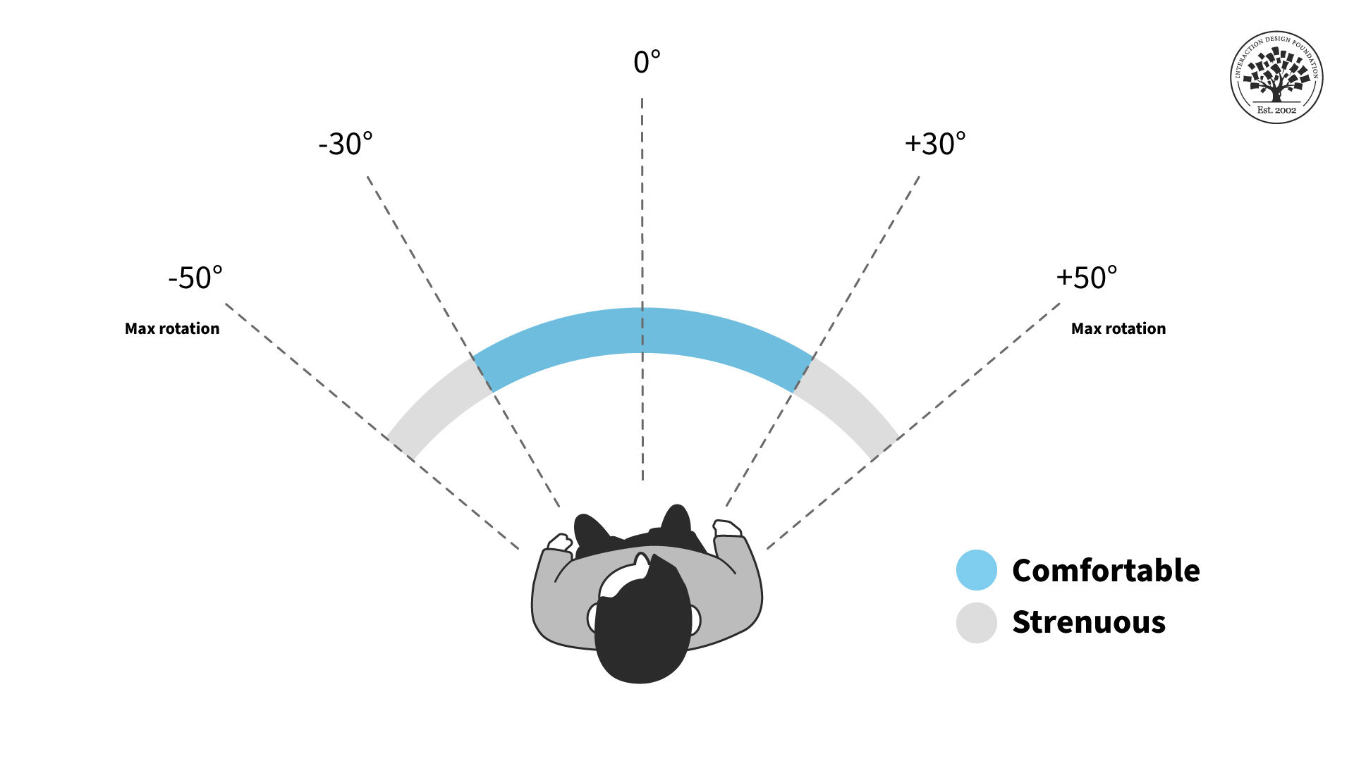
AR content should stay within a certain field of view to reduce neck strain.
© Interaction Design Foundation, CC BY-SA 4.0
For the vertical field of view, the chance of neck strain is less of an issue but still present. You shouldn't have users look straight up or down for long periods, especially when they walk around. The ideal content placement for vertical rotation is the 40-degree area slightly above the center of vision or horizon line.
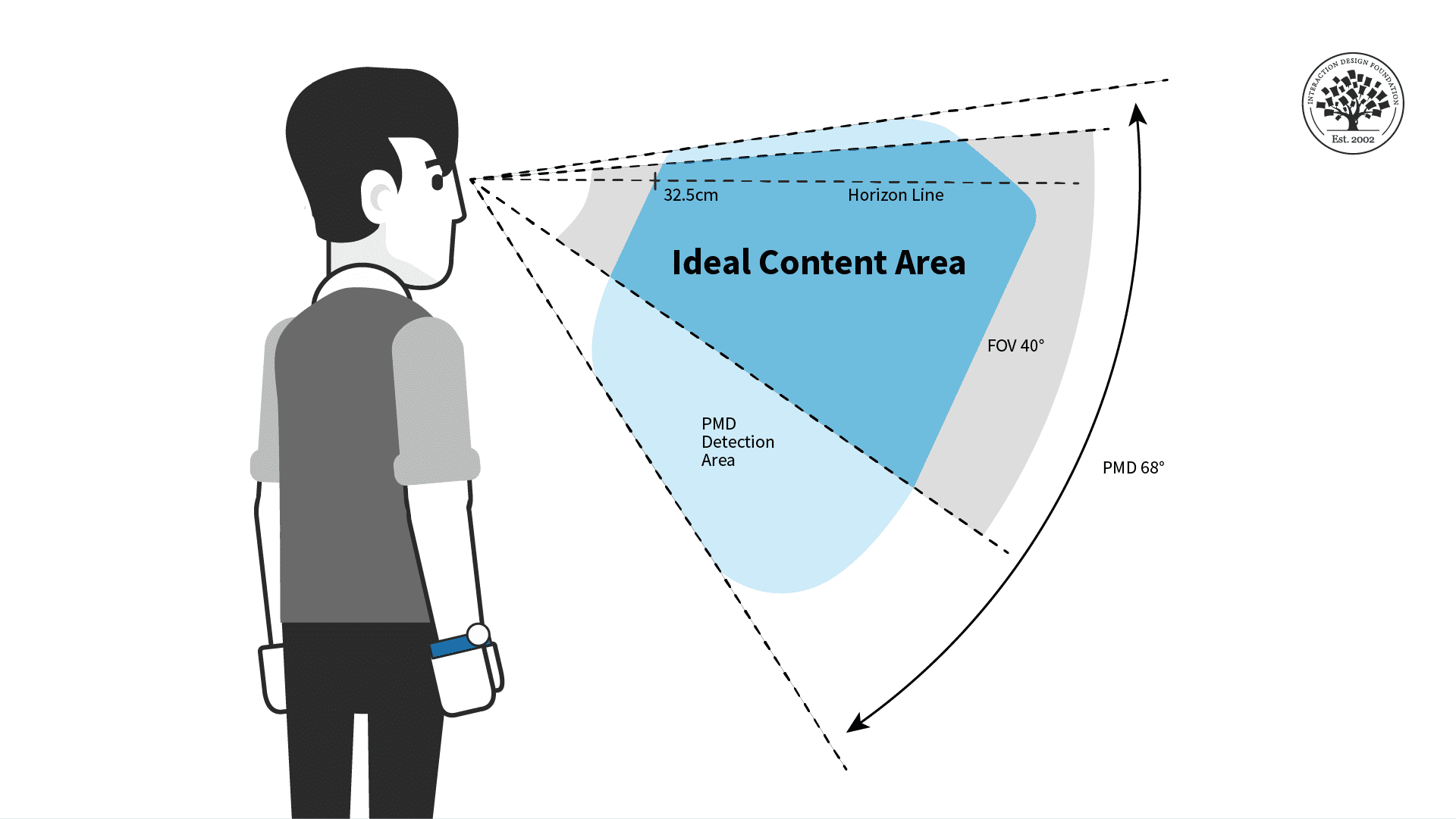
For prolonged interactions, put AR content in the ideal horizontal area displayed above for the most comfort.
© Interaction Design Foundation, CC BY-SA 4.0
Place your AR experiences in the most comfortable viewing angles to make users more relaxed and less tired. Remember that other factors might adjust the viewing angles and ideal distance.
While you design, consider whether the user is sitting, reclining, standing, or walking. While walking, you generally want users to face the direction they are walking in. While seated, the user may be more comfortable but unable to turn their whole body unless they adjust their seat. If possible, have your content automatically adjust for these different scenarios, and adjust once the user is in motion.
Remember that every human body is different, so give the user tools to adjust their field of view if they have neck pain or other conditions. Above all, you want to ensure the user has everything they need to be comfortable with your product.
FOV Design Tips and Best Practices
The user should always control the camera movement. Let them drive. Don't shake the camera, purposely lock rotation, or turn the user's camera for them.
Be sensitive to issues around dizziness or vertigo. You shouldn't need users to spin constantly to see everything.
Avoid abrupt movements and be mindful of people's reflexive reactions. For example, users will react to objects that fly toward their faces. If you need to bring content to or from the user, move it slowly and smoothly toward them for the most comfort.
Use shorter animations than you would in a desktop or VR experience. Remember that AR is for short bursts of activity and design around distractions.
Avoid timed challenges, like limited window rewards that are only available for a few seconds. This is primarily a safety issue, but it is also a good idea because these can be easy to miss if the user is looking elsewhere.
Allow the user to see the world in the background. AR users don't expect to be fully immersed without warning. It may be unsettling or dangerous to obscure their whole environment with content.
Lastly, you will want to place content at a comfortable distance away from the user, especially for prolonged interactions.
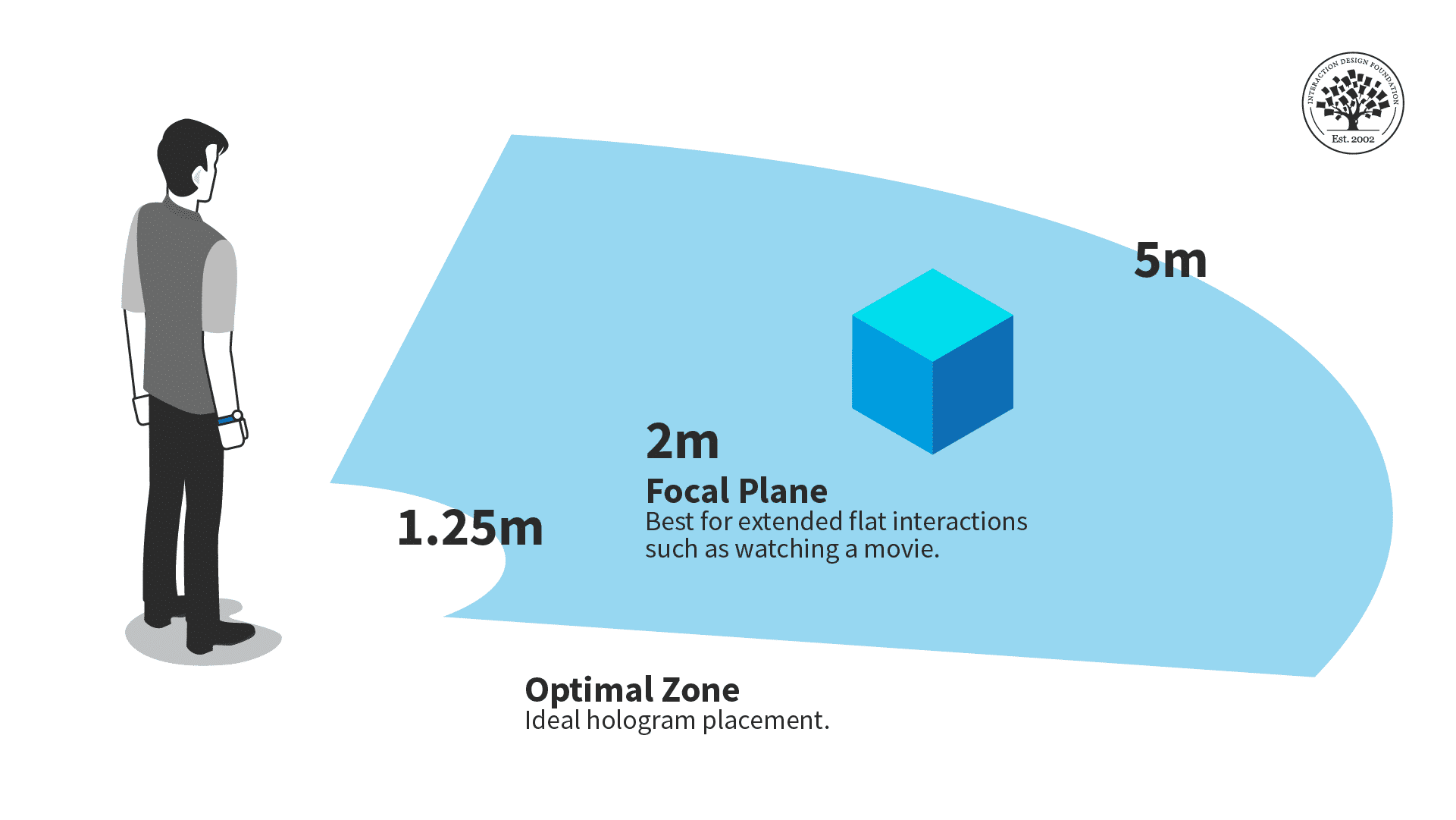
The optimal zone for AR content is between one and a quarter meters and five meters.
© Interaction Design Foundation, CC BY-SA 4.0
Ideally, you should place objects within five meters of the users and beyond one and a quarter meters. Users might overlook your content, want more personal space, or collide with the holograms if things are too close. Too far, and it might be hard for the user to see.
Consider situations where a user can move closer or farther from your content. While seated, the optimal distance is critical, as the user can't adjust the distance themselves. A walkable experience can be more flexible with distance, but ensure your content works best in the optimal view distance.
For example, audio or animations should trigger once the user reaches the right distance.
The Take Away
Because of how it interacts with physical space, AR needs to follow specific guidelines to make an experience that isn't unpleasant for viewers.
Object placement should fall within a central area in the user's field of vision, and objects shouldn't be too close or far away from the user.
References and Where to Learn More
For a comprehensive and In-depth Guide to Mixed Reality from Microsoft, read Design Guidance for Mixed Reality.
For more on user focus and forced functions in AR, see "Forcing functions"- an interaction design technique used but not widely understood.
This article outlines positional memory and its importance in AR: Did you move your user's cheese? All you need to know about 'Positional Memory'
See UX Planet's graphic on the field of view guidelines in How to start designing for AR/VR.
Read more about spatial design for AR in Creating Augmented and Virtual Realities: Theory & Practice for Next-Generation Spatial Computing.
Hero Image: © iStock, Fair Use