
An important task for you as a designer is to help the user carry out tasks as efficiently as possible. Software companies such as Adobe and Microsoft are experts at this. They frequently use a design pattern called ‘center stage’ to help the user focus on what’s important. Center stage is one of the design elements involved in establishing visual hierarchy; so, check out this user interface design pattern to see how you can assist the user with the overall layout of your graphical display. The benefits will be self-evident as engagement increases.
The Design Problem
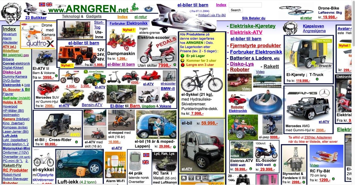
The most important information, panel, window, or set of tools should be represented as such in the user interface. When the users are performing a task, they need a central area for carrying out actions and operations, while other subsidiary panels, toolsets, etc. need to be instantly accessible. Our eyes (and minds) have a natural tendency to look for a focal point in or on useful (or beautiful) items or designs we choose to examine. Take the Norwegian website shown below, for example. In this web shop, a main task would be to select or even buy a product. However, as the user interface doesn’t put any product categories at center stage, users are very likely to get distracted by the many options that overflow the page. Naturally, this is an extreme example, but the same is true for more subdued pages. Looking at this image, your eyes might hover slightly over the bicycle in the yellow-white box that’s somewhat in the middle.
However, it’s far from the notion of center stage—rather than inspire you to deduce what to do next in an intuitive way, it’s drowned out by a carnival of images and text. Without being unkind to the designer involved, we might imagine that someone had made a (not especially good) flyer for this store, left it in a company scanner and the image had accidentally turned up where the real webpage should have been. Instead of being a resource for guiding users comfortably to a desired outcome by showing carefully considered information, it’s just a sea of data, patched together with a legion of disjointed pictures. The sad thing is, while this company probably has great deals on show, there’s zero in the way of an intelligible storyline happening here.
Author/Copyright holder: Arngren. Copyright terms and license: Fair Use.
This Norwegian web shop does not support the main task of a user optimally: selecting or buying a product. People get distracted easily by the many options that overflow the page. The items shown above aren’t jumping out at us—rather, we have to peer hard into this design so as to pick out what’s what and how much it costs. That’s hard work, not good user experience.
The Design Solution
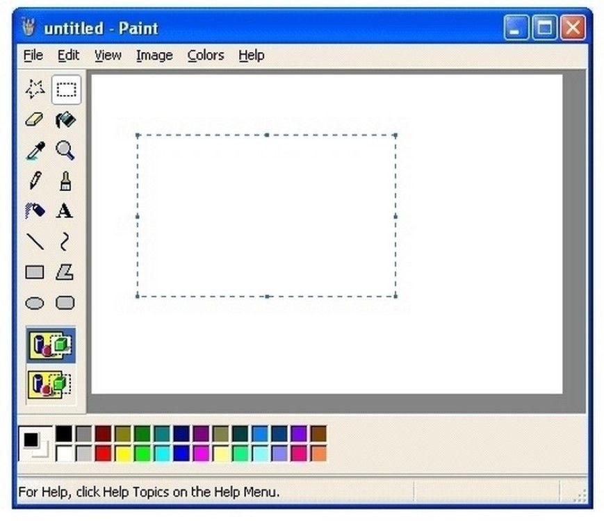
Avoid ‘splatter’ like this – first by determining the hierarchy of what you want to present. Place the most important element of the graphical user interface in the largest subsection, and put the supporting tools, sets of actions, etc. in other, less prominent panels. By putting the most important information or frequently used panel center stage, you draw the users’ attention towards it and allow them to maintain focus on it when carrying out their tasks. Center stage is a common user interface design pattern, appearing in most applications, such as websites, spreadsheets, and software packages (e.g., MS Paint and Gimp).
Author/Copyright holder: Microsoft. Copyright terms and license: Fair Use.
MS Paint uses center stage as a design pattern to attract attention to the main task of a user: manipulating elements on the canvas. Here, we have no real excuse for not being able to deduce what we might do next.
Why Choose a Center Stage Design Pattern?
The user interface arrangement should offer the users strong visual cues as to what is important and which elements are related to their primary aim. By using size to highlight the most important element in the user interface, you can ensure that the users’ attention is immediately drawn to the most relevant and significant region of the display. They can then instantly determine that all other panels perform ancillary functions and are related to the central panel. In other words, they can detect at a glance that these other panels offer supporting functions that offer you the ability to manipulate what happens in the main panel at center stage. If you keep this concept in mind as you proceed, by the time you have made your first prototype, you will have facilitated an effective setup which users should be able to take to naturally and intuit what happens next in their user experience ‘story’.
“Just as the lead sentence in a news article establishes the subject matter and purpose of the article, so the entity in center stage establishes the purpose of the UI.”
—Jenifer Tidwell, Web consultant and author
Best Practice: How to Implement Center Stage
First, you must determine which panel, toolset, or window is the most important part of the user interface. This will usually be obvious from the outset, as it is usually the user’s central operating panel, such as the panel containing the user's text document, spreadsheet, or 'canvas'.
Make this panel the largest in the user interface, and ensure all others are smaller. Some user interface design experts recommend the center stage panel should be at least twice as large as the next largest user interface element, such as a tool bar.
Use color to distinguish the contents of the panel from the panel itself. Typically, the central area of the largest panel is white and the surrounding regions are grey.
Use headlines to help distinguish the panels from one another and to assist the user in identifying specific toolsets, groups of actions, and any other ancillary panel.
Arrange the different elements according to the users’ expectations. Placing the primary panel center stage is important, but arranging the other panels to help the users carry out their desired actions as quickly and accurately as possible is also a vital consideration. Therefore, although the other panels and toolsets perform a supporting role, they should not be hidden from view; nor should they occlude the user's view of the main panel.
Author/Copyright holder: Balsamiq. Copyright terms and license: Fair Use.
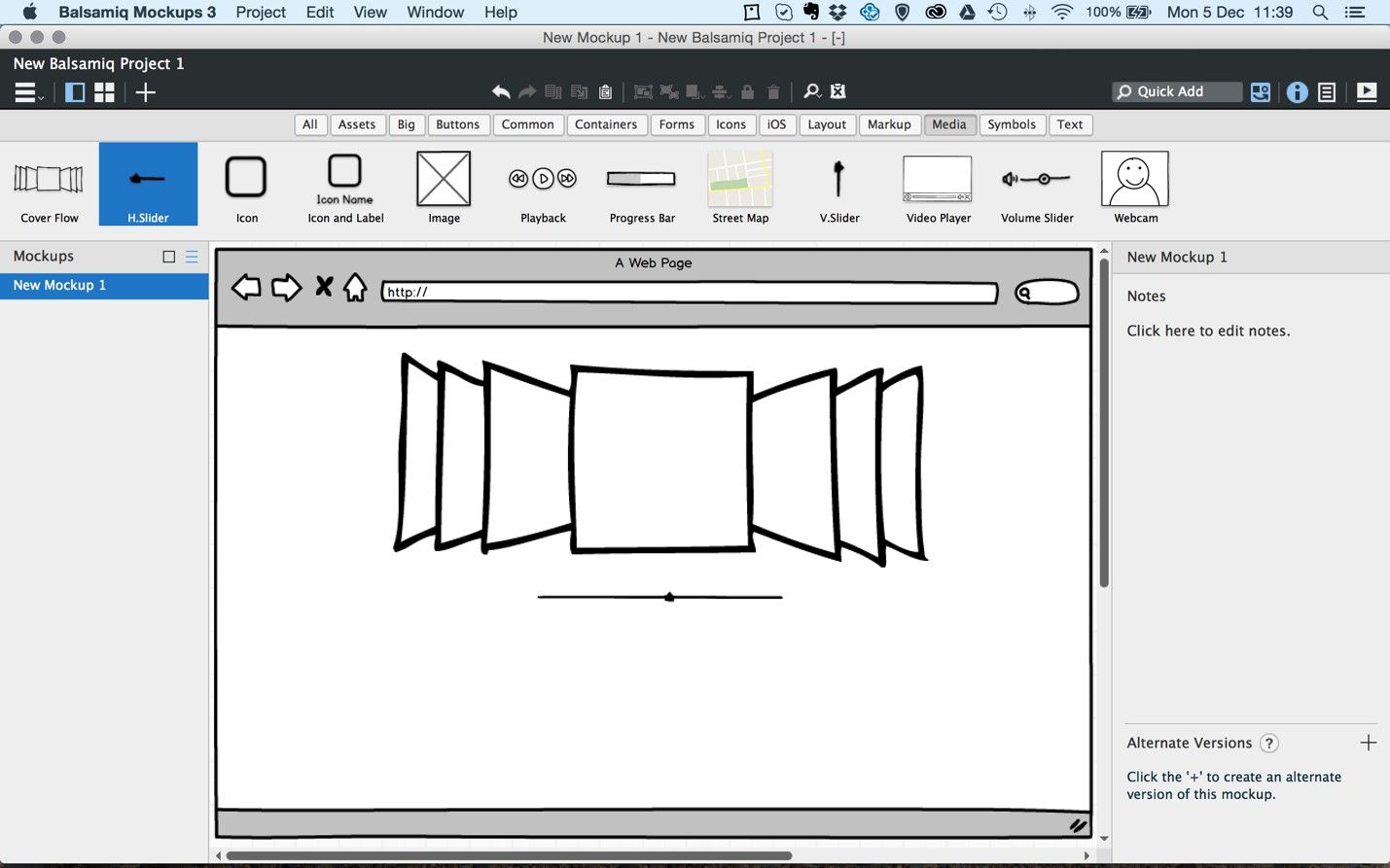
This example from the mockup application Balsamiq shows how you can implement center stage. The most important panel is the largest. Color and headlines are used to distinguish the main panel from others, and the panels are positioned around the main stage according to the user’s tasks. In very little time, you can deduce where to find tools you need and what functions the various panels and buttons perform.
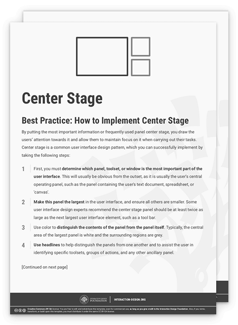
To help you get started implementing center stage, you can download and print our “Center Stage” template:
Potential Problems with Center Stage
How do you know what the best possible arrangement of panels around the center stage looks like? The simple answer is this: you don't. All users are different, and so will have different aims and methods of completing their tasks. For instance, when using a paint software package, the user might be concentrating on one particular segment of the picture at hand; so, the secondary panels should not be placed in this region, as doing so might restrict the user's view. Another point is keeping the most needed functions sharply in mind so that you can enable users to find these easily, compared to more special-interest or advanced functions only expert users would typically want to access. Regardless of how well you think you know your target users’ tendencies as a group, alone in your design studio, you simply won’t be able to do much more than second-guess how each as an individual will take to your initial design concept in an exact way. Of course, the only way to get some indication of if you did it right is to get feedback from users. So, don’t be afraid to test—and be ready to learn and iterate! Before you get to that stage, though, you can help yourself by remembering a golden rule: never allow a user to freeze in confusion at anything you design—always look for elements that might raise eyebrows or “How do I do X or Y on this?” questions that will arise if executing an action isn’t obvious. That hesitation will be the first step on the (short) path to a user’s utter frustration with your offering.
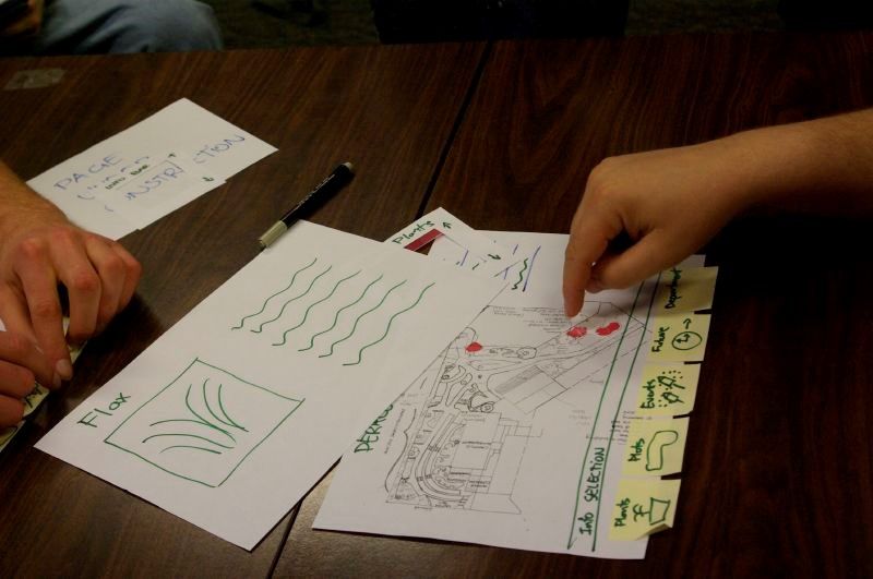
Author/Copyright holder: Samuel Mann. Copyright terms and license: CC BY 2.0.
Really, the only way to know for sure if you arranged the panels around center stage in the right way is to test with users. If you do so in an early stage of design, through paper prototyping, you can iterate quickly... and save yourself a lot of angst later on.
The Take Away
Let the most important part of your design take center stage, with this powerful design pattern. It helps your users to focus their attention and not get distracted by elements that keep them from their main task. Simply implement this design pattern by taking the most important piece of content and making it the largest in the interface. Some user interface design experts recommend the center stage panel should be at least twice as large as the next largest user interface element, such as a tool bar. By conducting several quick and dirty paper prototype tests, you will be able to determine the best configuration of panels around your center stage. This way, you optimally support users’ tasks, and you manage to avoid headaches in later stages of the design process. Best of all, you’ll have a design that will endure.
References & Where to Learn More
Jenifer Tidwell, Designing Interfaces: Patterns for Effective Interaction Design, 2010
Martijn van Welie, Pattern Library, 2008
Hero Image: Author/Copyright holder: Steve Bowbrick. Copyright terms and license: CC BY 2.0.


