As designers, we have a powerful ally in color. It can let us work towards a number of different goals. You can use it to reinforce or highlight an idea, to provoke an emotional response from the user or to draw attention to a specific part of your website. This is, of course, in addition to making your website aesthetically pleasing to the eye.
Author/Copyright holder: Inhabitat. Copyright terms and licence: Fair Use
In many cases, the color scheme chosen for a website will also reflect the company’s branding and values.
Color and Branding
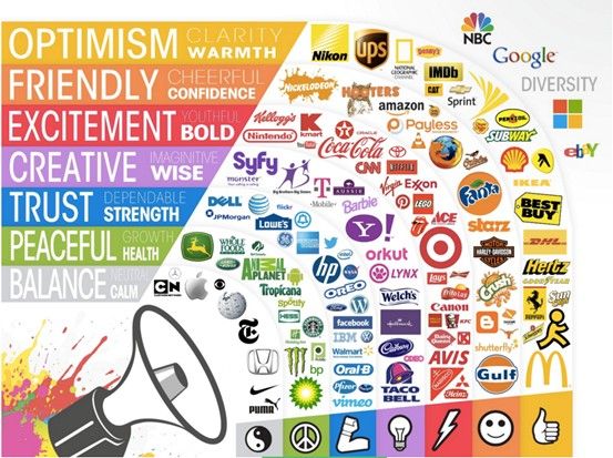
The color scheme for a website can contribute to the overall brand perception of products or services. Based on research by CCICOLOR, the Institute of Color Research, users judge products online within the first 90 seconds of their initial view of the product. Between 62% and 90% of this judgment will be based upon the color scheme. Their findings showed that color can reflect the personality of the brand:
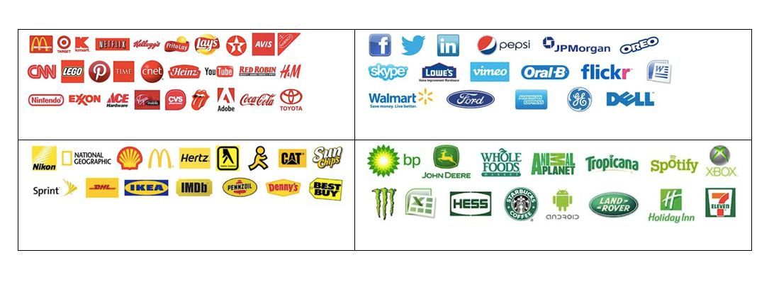
Red is said to reflect power, passion, and energy. It can be used to alert the user or attract the user’s attention in a design or brand. Red colors are found on the websites of CNN, MacDonald’s, KFC, YouTube, and Adobe.
Orange can mean friendship, unification, and youth. One example of using orange is Fanta, which you might expect to be in concert with their core branding (orange Fanta was once the only Fanta – the brand has come a long way in recent years and dramatically expanded its offerings).
Yellow is said to reflect happiness and enthusiasm. This isn’t surprising; it’s the primary color that we associate with the sun and with the brightness coming from a light bulb. An example of using yellow in a logo is DHL, the international carrier.
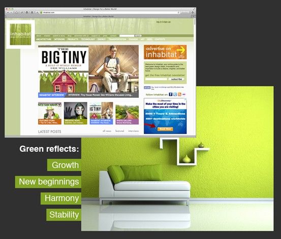
Green is said to reflect growth and the environment. The Inhabitate website for sustainable development makes use of green, chiming in with the color’s environmental connotations.
Blue is said to reflect calm, safety, and reliability. It’s a wise color to use; customers tend to feel more at ease with it. Many business sectors widely use blue, and you can find it on the websites and branding of AOL, Facebook, HP, PayPal, EA Games, DELL, and many others.
Author/Copyright holder: Webpage FX. Copyright terms and licence: Fair Use
Color and User Experience
Color certainly plays its part in delivering a better user experience on websites. In particular, the right choice of color will ensure the usability and legibility (readability) of information displayed on screen.
The right contrast between text and background is an essential part of the user experience; if your customers can’t read your content easily, they’re going to go elsewhere. Think for a moment about red text on a blue background. That color combination is hard to read; our eyes can’t focus on these shades at the same time. The same goes for blue text on a red background. The colors vibrate, making us strain our eyes.
We have another tool. You can also “deprioritize” text by reducing the level of contrast compared to the background, helping the reader skip through non-essential text when skimming or speed-reading.
The vibrancy of a color can help instill an emotional experience. Bright colors give energy (which is why so many calls to action are in bright red or orange) and a sense of immediacy. News websites often use red text to call attention to breaking or important news. Softer, less vibrant colors can help a user be more relaxed when approaching navigation.
Author/Copyright holder: Matt Siltala. Copyright terms and licence: All rights reserved
How Do Colors Complement Each Other?
To deliver a harmonious color scheme, it’s important to focus on the details of the colors chosen. There are several things to consider during this process:
Tints, Shades, and Tones
You can generate many variations of a single “hue” on the color wheel. Make a tint by adding white to the hue, a shade by adding black, and tonality by adding gray.
The easiest scheme in which to achieve balance through tints, shades and tones is the monochromatic (single color) scheme.
Contrast
Contrast is simply a measure of the variation between two colors. Colors on opposite sides of the color wheel offer the greatest level of contrast, as do black and white. Contrast can be used to achieve balance or to draw a user’s attention to a certain feature or area of text.
It’s important to keep a careful eye on the use of contrast; overdo it and you’re more likely to confuse users than to help them.
Vibrancy
We can use the vibrancy (or brightness) of a color to add additional emotional content to a color with brighter shades, generally reflecting increased energy (and thus positive emotions, such as happiness), and darker shades, offering reduced energy and thus calmer, quieter spaces.
Additive vs. Subtractive Colors
We choose modern color schemes based on the systems used to display or print designs. The two most common systems are CMYK (Cyan, Magenta, Yellow and Key – Black) and RGB (Red, Green and Blue).
CMYK is a subtractive color system in that, in the absence of any of the four colors, the output is white. Colors are calculated (including black) as a percentage of each of the four colors. CMYK is typically used for print.
RGB, on the other hand, is an additive system. It begins with black, and colors are added to achieve hues up to and including white. The values of each color are assigned from 1 to 256 and offer more than 16 million combinations for the palette. This is because RGB is typically used on digital screens, and the underlying system is based on binary pairs.
It’s worth noting that, from a human eye’s perspective, there’s little difference between the two palettes. Our eyes can, perhaps, distinguish all 10 million colors created by the CMYK scale, but the 16 million of the RGB scale often differ too subtly for the eye to tell the difference. Neither palette is “better” than the other from a visual perspective.
The difference is important from a design perspective because the two systems are used to produce different outputs – print and screen. Conversion between the two systems can be imprecise and yield varying results when viewed.
Online Color Scheme Applications
The good news is that if you’re stuck choosing a color scheme for your users, there are plenty of online tools to help with the job. You can download (and in some cases export settings for other programs) color palettes from the sites listed below:
Don’t forget to seek feedback on your color schemes from your users before moving ahead with them.
The Take Away
Color is a powerful tool for you. Choosing a color scheme for a website is especially important for branding, as research has shown. Take a company like DHL, which uses yellow (believed to reflect happiness and enthusiasm). Now, consider DHL’s business - carrying goods and documents that we value. It helps to instil happiness in the customer.
As a designer, you can optimize user experiences by choosing the right colors. This will help to ensure:
Usability and legibility (readability) for the user. We can choose the best color combination to make sure that customers keep reading what we’ve written.
An emotional experience in the user. This involves the vibrancy of the color chosen. Bright colors give energy and a sense of immediacy or urgency. We can use them to call attention to our products, services or important messages. Softer, less vibrant colors can help a user feel more at ease - especially useful for industries such as banking.
Using colors to your advantage means knowing what goes into them. Looking at the color wheel (from which we can make any color), we have:
Tints – We add white to a hue (the part of a color that makes it discernible as red, green, etc.) to make a tint.
Shades – We add black to a hue to make a shade.
Tones – We add gray to a hue to make a tone.
To get a balance through tints, shades and tones, it’s easiest to use the monochromatic (single color) scheme.
You should also consider the following for our color schemes:
Contrast – We can draw a user’s eye to a certain feature or achieve balance in our design by using the measure of variation between two colors, or black and white. Be careful with contrast: overdoing it will confuse readers. Focus it on what’s important.
Vibrancy – Vital for provoking an emotional user response. Feelings are important, so tap into them with your color scheme choice. Use brighter shades to reflect more energy and positive emotions like happiness; use darker shades to calm your user.
Choose your color scheme based on whether your design is for screen display or print. CMYK (Cyan, Magenta, Yellow, and Key – Black) is the subtractive color system used for print, capable of 10 million color combinations. RGB (Red, Green, and Blue) is the additive color system used for screen display, allowing over 16 million color combinations.
Many online tools can help you find the right color palette. Above all, check with your users that the color schemes you like work for them. That feedback will save your time and expense before you move ahead.
Where to Learn More