Like a naughty kid who wants the Oreo cookies you just told him he couldn’t have, dark pattern designers are masters at slipping things into your shopping basket without your knowledge. Here, we will show you how they do that, and get away with it. We will give you some examples that behave in ways you’ll instantly recognize from many of the purchases you may have made, or considered making, on the web. And, although you’ll learn how to implement them in your future designs, we’ll also challenge you to take a responsible attitude towards your users. That balance is what lies behind a win-win situation for everyone involved.
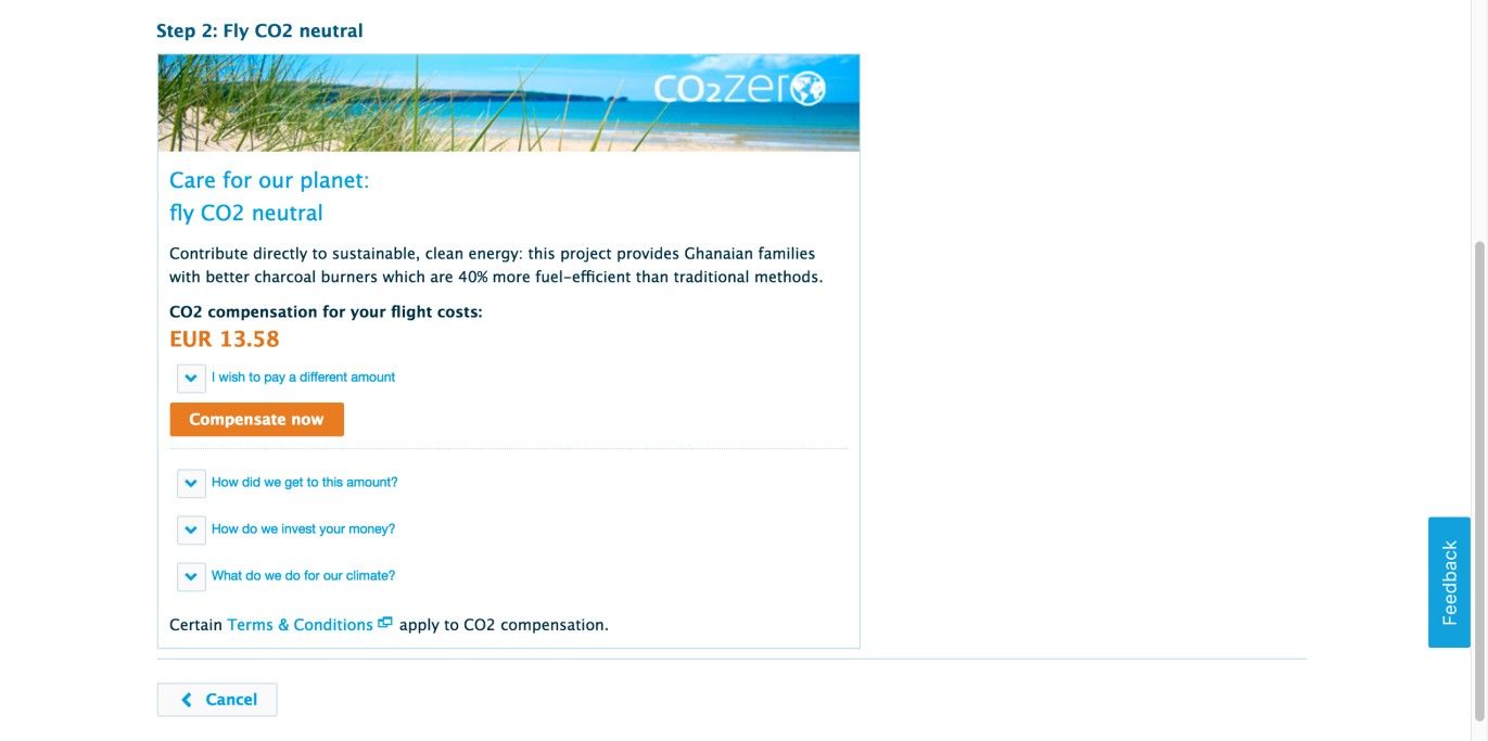
Designers often take actions on behalf of users that may end up being annoying but not costly to the user, such as subscribing users to newsletters unless they select or deselect a checkbox. However, there are also times when designers use unethical tactics to get you to buy things you really do not want. For example, when you are booking a flight from the Dutch Royal Airlines web page, a charitable donation on your behalf is made to compensate for your carbon footprint. Although we believe this is an environmentally responsible step to take, they don’t ask you explicitly and try to trick you into accepting it, which makes it a dark pattern.
Author/Copyright holder: KLM. Copyright terms and license: Fair Use.
Sometimes, dark patterns can be used for charitable purposes. For example, the Dutch Royal Airlines use the ‘sneak into basket design pattern’ to get people to contribute to a CO2 compensation organization. They go even as far as not accepting an amount of zero Euros when a user attempts to adjust the amount to pay.
Why is this classified as a dark pattern?
Harry Brignull, dark pattern expert, states that this maneuver is the equivalent of a supermarket worker putting things into your shopping cart without your knowledge, items which only come to your attention when you reach the checkout, if they even do so at all. Therefore, unless you carefully go through all of the information before completing the transaction, you may well end up buying things you did not want or need.
Dark pattern designers might suggest this method merely shows users what they could buy and makes the task of purchasing items as straightforward as possible. However, by placing things in the users’ baskets, instead of simply showing them a list of possible additions to their purchases, these designers are effectively slipping things in without the users’ permission. Governments now acknowledge the danger of this design pattern, which is why it is outlawed by the European Commission, under the consumer rights directive. As of 2017, we’re not aware of any comparable laws in other nations, so check with your local authorities on what your situation is. As ever, be wary of client organizations who insist on your working this technique into your design for them. Don’t worry – we’re going to show you the benefits of being more upfront with users, and your future clients are likely to agree with the rationale we provide.
“The Directive on Consumer Rights aims at achieving a real business-to-consumer (B2C) internal market, striking the right balance between a high level of consumer protection and the competitiveness of enterprises.”
—The European Commission
Companies can no longer add additional products to a shopping basket when additional fees apply. It involves all cases in which a user would have to take action (e.g., unchecking a box) to avoid paying these extra costs. If the product or service (e.g., a newsletter subscription) is free, the consumer rights directive does not apply. So, if you find an instance of the ‘sneak into basket’ pattern, and you feel as though you’re being tricked into spending more money than you intended, don’t hesitate to check your local laws and contact the authorities when appropriate!
A more responsible way to persuade people to buy items related to the ones they have already placed in their shopping basket is to give them suggestions. These suggestions can be based on the products that other customers often buy together, or based on what the company thinks would make a sensible combination. In any case, by presenting the products as suggestions—rather than adding them to the shopping basket behind the user’s back—you’re more likely to add to a positive user experience and can expect returning customers. Amazon does this masterfully by offering you additional selections according to what other buyers have bought in addition to the item you are considering.
Let’s take a scenario to show just how great the benefits of offering suggestions can be, and how the emotions associated with not having that liberty can sour the user’s experience in an instant. For example—and using the concept of a donation to alleviate the carbon footprint as our axis—let’s consider three users: Adam, Ben, and Carl. Adam’s a family man; he understands environmental concerns and would be only too happy to donate in this way. Ben’s a busy designer – he’s too caught up in his creative work to give the topic a whole lot of thought other than some tacit recognition that things aren’t the best with the state of the planet. Carl is a corporate manager; he thrives off generating sales and adding value to a company he has high hopes for rising up in. While he is aware of emissions issues in the atmosphere, it’s a low priority to him. Let’s say we’re designing for our imaginary client airline, and all three men need to book their flights with us. For the sake of argument, we’ll split what happens into two alternate realities – what they may just think and do if they have the choice to make a small donation to help with the carbon footprint, but also what they might do if they are more or less compelled to make some donation, if they are to fly with us at all.
Adam | Ben | Carl | |
Possible reaction if not given a Suggestion to Donate and Fee appears in Shopping Cart | “Yes, that’s fine for me. Some people mightn’t like that, though.” He clicks to agree without giving too much further thought. | “Hang on; where did that come from? Hey, why can’t I set it to zero?!” Not very impressed, he sets it to the lowest donation option. | “Forget it. Why should I have to help foot the bill for your social conscience?” Disgusted, he mutters something about ‘rampant liberalism’ and looks for another airline. |
Possible reaction if given Suggestion to Donate for Carbon Footprint | “Oh, yes; let’s do that. That’s a good idea, actually!” He agrees to the suggestion, happy to consider he’s doing his part. | “Hmm... No, not today, thanks. Maybe some other time.” He does not agree to it but has at least considered the option. | “Forget it, thanks. I’ve got a plane ticket to order.” He does not agree to it, but at least he doesn’t leave so as to try seeking another airline. |
Notice the difference—the freedom involved in asking is what will keep users more likely to maintain a friendly disposition. Adam may or may not agree to add a donation on that occasion, but that is probably a better risk to take than earning Ben’s irritation and Carl’s outrage by putting it in the shopping cart without checking that it’s okay. At the philosophical level, we can argue that Adam is the most responsibly minded in this context; however, Carl reserves the right to disagree (he may say he only needs the world for another 40–50 years or so and his kids’ generation will—hopefully!—figure out a way to deal with matters). It’s not that he hates the planet; he just doesn’t want to be forced to ‘love’ it in this way. Ben’s goodwill is of particular concern here, as he might well represent the silent majority in many parts of the world. Keeping him happy is paramount in this regard. While enforcement of some fee may seem justifiable in a few contexts, remember this equation: enforcement = lack of user choice. If users are dealing with governmental entities such as tax bureaus, they will (to a certain extent) put up with that lack of choice. Otherwise, they are well within their rights to switch off and go elsewhere (if a competitor can be found)... or reluctantly agree to the terms and have none-too-salutary things to tell their friends later. Users want to get things done; they don’t want to be force-fed ideals.
“Because to take away a man’s freedom of choice, even his freedom to make the wrong choice, is to manipulate him as though he were a puppet and not a person.”
—Madeleine L’Engle, American Newbery Medal-winning writer
So, keep this concept in mind at all times, regardless of how small an add-on may be (people will or will not do things on principle, after all). Similarly, many users will be wise enough to notice any catches in a company’s offers – for instance, if it has low prices but tries sneaking in items/services/tariffs as ‘strings attached’. The value of asking and preserving the users’ full freedom of choice can prove priceless in keeping them trusting and loyal to a brand. Aside from good manners, there is an added potential benefit in that people like Ben, in our example, will see the option to donate and may think more on the subject later, perhaps even research the matter, and maybe even make a donation the next time.
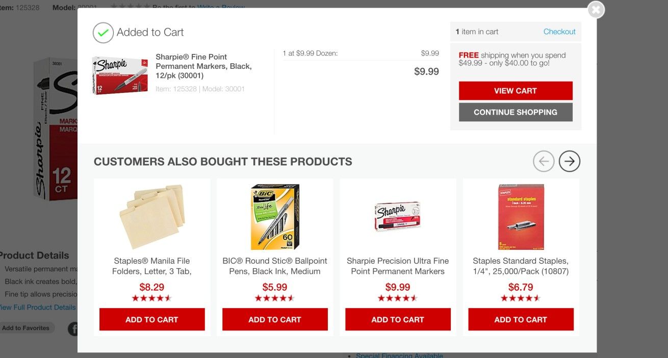
Author/Copyright holder: Staples, Inc.. Copyright terms and license: Fair Use.
A more responsible way to persuade people to buy items related to the ones they already placed in their shopping basket is to give them suggestions. The Staples website gives the customers these suggestions based on what other customers bought. This provides users with a mix of what’s popular and what’s a useful combination with products in their basket.
The Take Away
Sneaking products into the user’s basket is a dark design pattern that is prohibited in Europe and other parts of the world. Therefore, finding this design pattern in the wild has become quite difficult. However, sometimes you can still come across products that you don’t want to purchase. And even when the underlying sentiments are admirable—like in the case of compensating for the CO2 emissions from a flight you book—it is designed with another stakeholder than yourself in mind. If this is the case, and you’re convinced you’ve encountered this dark pattern on a website, you might want to report it to the appropriate authorities. As a designer, always remember the positive impact you can make through asking users if they would like to buy add-ons – that politeness will not only help keep them open to suggestion, but it will also mean the organization you’re designing for will at least not have to worry about disgruntled users telling embittered tales about it and/or casting cynical aspersions as to its motives. Keeping your fingers out of the basket means keeping the ‘door’ open in this sense.
References & Where to Learn More
Hero Image: Author/Copyright holder: Steven Depolo. Copyright terms and license: CC BY 2.0.
Jenifer Tidwell, Designing Interfaces: Patterns for Effective Interaction Design, 2010
Martijn van Welie, Pattern Library, 2008
Harry Brignull’s website dedicated to dark patterns