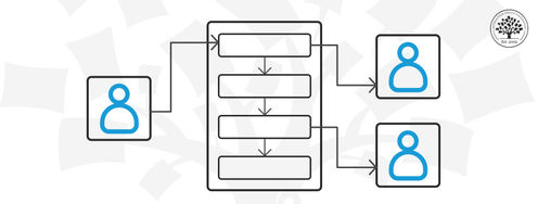
Which apps do you use throughout your day? Maybe you manage your projects on Trello, use Notion as an internal docs site, and maybe, just maybe, you do some swiping on Tinder during your lunch break. Despite looking nothing alike, these three highly successful apps are organized around the same idea: Give users a small number of meaningful objects, let them act on those objects directly, and the interface will feel intuitive without explanation.
Cards. Blocks. Profiles: These UI components are the central concepts around which Trello, Notion, and Tinder organize everything else. We can call them objects. Users recognize them immediately, know what they can do with them, and build their entire workflow around them. That clarity is the result of an object-oriented approach to design, where an object is any user-meaningful thing the interface makes visible and actionable. Each object has:
Attributes: The properties users can see and edit, such as a Card’s title, label, or due date.
Operations: The actions users can perform on it, such as moving, deleting, or liking.
Apply the object-oriented wisdom of these three apps to your own work, and watch how it moves you from someone who produces screens to someone who shapes products. That's the kind of ability stakeholders and hiring managers are desperate to discover.
In this video, William Hudson, User Experience Strategist and Founder of Syntagm Ltd, traces Amazon's homepage across two decades to show how its core objects (the Basket, the Account, and Search) survived four complete visual overhauls without changing at all, and why that stability is the clearest sign of a product built around the right things.
Put the objects users care about first, keep operations tied to those objects, and let the structure scale outward from there. Here's how each of these apps does it, and what you can bring into your own work to build intuitive apps users love.
Trello's Card Makes a Complex Workflow Instantly Clear
The Card is the central object in Trello. Even an email pulled into your Trello board becomes a Card, and functions the same familiar way as any other Card.
© Trello, Fair use
Open Trello for the first time, and you'll likely understand it within minutes. Boards hold lists. Lists hold Cards. Drag a Card between lists to move it. There’s nothing to read and nothing to configure.
That immediate clarity comes from a clean object hierarchy: Board contains List contains Card. Each level contains the one below it, and each object has a stable identity. A Card is always a Card, whether it appears in a list, on a calendar, in a table, or on a timeline. The object stays consistent as its representation changes.
Those views are where the object model pays off most visibly. Switch from the board view to the calendar, and you're looking at the same Cards through a different lens. A planning task that would require a separate tool in a feature-first product is handled in Trello by simply re-rendering the same objects.
Drag-and-drop makes this feel natural in a specific way. When you drag a Card from "In Progress" to "Done," you move the actual object instead of updating a status field or navigating a dialog. The gesture maps directly onto the user's mental model.
Cards also gain meaning through the attributes attached to them:
Labels show the category at a glance.
Checklists sit inside the Card itself, so a single task can contain its own sub-tasks without users leaving the Card context.
Start and due dates attach to the Card object and then surface automatically in Calendar and Timeline views.
What to Copy: Make Your Object's Affordances Do the Onboarding
Design your objects so their nouns (attributes) and verbs (operations) are obvious on the surface. A Card you can drag, open, label, and assign teaches users what it can do just by existing. When the object communicates its affordances, onboarding largely takes care of itself.
In this video, discover how affordances emerge from the relationship between an object’s properties and a user’s abilities, helping you design interactions that feel natural and intuitive.
Separate your data model from how you display it. If the same object can appear on a board, a calendar, and in a table row, users remain familiar even as they explore new views.
Notion's Block Scales to Almost Anything
You build a Notion Page with Blocks and nothing else. Everything, from simple text to a database, is a Block.
© Notion, Fair use
Notion takes the core object idea to the next level. Where Trello defines a clear hierarchy of distinct object types (Board, List, Card), Notion standardizes on a single universal object: the Block. Everything in a Notion Page is a Block. Headings, paragraphs, images, to-do lists, code snippets, embedded databases. They're all Blocks, and they’re all treated the same way.
Different Block types then add their own attributes and operations on top of that shared foundation:
A toggle Block hides and reveals nested content.
A database Block can be viewed as a table, a board, a calendar, or a gallery.
This represents a powerful object-oriented principle where one object type can take many forms and behave differently depending on its context, with each form sharing the same basic rules but adding its own capabilities on top. In programming, this is called polymorphism: You learn Blocks once, then discover that some Blocks are far more capable than they first appear.
This matters for users because the manipulation rules never change:
Select any Block and you see the same handle you can drag to reorder.
Click the menu to duplicate, transform, or delete the Block.
There’s no separate mode for "editing text" versus "managing content." One object type with one set of rules is applied everywhere.
Notion's Table of Contents (ToC) Block is a subtle but elegant example of encapsulation. You can’t edit the ToC directly. To change what it shows, you must edit the page's headings. The Block derives its content from its sources and exposes only what users need to manipulate: Move it, style it, or delete it. The internal mechanism is completely hidden, and the interface is simpler for it.
What to Copy: Give Users One Object to Master
When stakeholders propose a new feature, a universal object model gives you something concrete to evaluate it against. You can show exactly where the new feature sits, what complexity it introduces, and whether it fits the structure users already understand: A system-level argument that’s very hard to dismiss.
To get there, identify your product's most fundamental object and make its manipulation rules universal. When users master one object, they can apply that knowledge across the board, and their cognitive load drops dramatically.
Use encapsulation to protect users from complexity they don't need. Notion's Table of Contents Block prevents partial edits and broken states by keeping its internals inaccessible. When you hide what users don't need to control, it's a design decision, not a limitation.
Tinder's Profile Enables Smooth Growth, Even with Complexity
Tinder continues to add successful new features, though many of these, like the double date, are simply built upon the existing Profile object.
© Tinder, Fair use
Tinder simplified online dating around a single object: the Profile. One person's Profile appears at a time. Swipe right to like. Swipe left to pass. Nothing else is required.
This is object-oriented thinking at its most radical. The swipe gesture itself is a form of direct manipulation. It is the thing you’re acting on, not a link to somewhere else. The gesture maps so cleanly onto the action that new users understand it without instruction. And because the Profile is the central object, new capabilities simply become new operations on it:
Super Like is a more emphatic version of Like.
Rewind takes back your last swipe.
Boost promotes your profile in your area.
The object stays at the center, and capabilities grow around it without users needing to learn anything new.
The Match is where the object model becomes especially interesting. You can't message someone just because their Profile appears in your Discovery feed. The Chat object is gated behind a relationship between two Profile objects: the Match. This relationship has its own operations, such as Message and Unmatch. This keeps the Profile object clean and reflects social reality, which is exactly why it feels natural rather than arbitrary.
Tinder also demonstrates how to scale without fragmenting. The Likes You page and Top Picks are just different views of the same Profile objects, with the same operations available.
What to Copy: Grow Capability Through Operations, Not New Features
Build your core functionality around a single, well-defined object and a small number of clear operations. When users know the object, they know the product. Complexity comes later as new operations and new views on the same object, not as separate features that require the user to learn entirely new concepts.
Use relationships between objects to control what actions are available and when. Tinder's Match is a concept users understand intuitively. You can only have a conversation after both people have expressed interest. When app logic reflects real-world logic, your users will find it natural rather than frustrating.
The Take Away
Before you design a screen or feature, ask what objects your users actually care about. What do they call them? What do they expect to be able to do with them? How do those objects relate to each other?
Think like this, and you're already becoming the object-oriented designer the room turns to when things get complicated. You can explain clearly when a feature will fracture the user's mental model. You can show stakeholders and developers alike why one direction serves users better than another.
Trello, Notion, and Tinder each reduce an often-complex domain to a small number of meaningful objects, then scale outward through attributes, operations, relationships, and multiple representations. Users only need to understand the objects and not the underlying system. It's how these leading apps turn complexity into a solution that feels intuitive from the first click.
In an increasingly automated world, the ability to decide which objects matter, how they relate, and where complexity should be hidden operates at a level automation cannot reach. That is exactly what employers are looking for in the designers they build teams around. And that makes object-oriented design your secret career advantage.
References and Where to Learn More
Want to build successful object-oriented interfaces like Trello, Notion, and Tinder? Take our course, Object-Oriented UI Design: Build Interfaces Users Love, and master how to identifythe objects and relationships that matter to your users, build conceptual models that guide every design decision, and create interfaces that feel intuitive from the first click. You'll walk away with practical skills, a hands-on project for your portfolio, and a certificate that demonstrates your ability to design products that users love and teams love to build.
Discover more about conceptual models and how they help you build products that feel natural to users in our article, Conceptual Models: The Hidden Structure Behind Your Next Great Interface.
Explore affordances further and master how to use them to create intuitive designs with our article, What are Affordances?
Hero image: © Interaction Design Foundation, CC BY-SA 4.0