The classical Greek philosopher Aristotle (384-322 b.c.e.) made many groundbreaking discoveries about the way people interact, masterfully breaking down a phenomenon such as public speaking into its constituent parts. Aside from his famous three appeals (logos, pathos, and ethos—the fundaments of any act of persuasion), his observations on the art of storytelling are another great gift to the fund of wisdom we can use in UX design. By focusing on each of these—Aristotle’s seven aspects of storytelling—we’ll be on the right track to building designs that bring our users on board.
UX Designing with Aristotle – The Seven Ways to Win in Storytelling
How do we, as UX designers, plug Aristotle’s three appeals (logos—the facts of an argument, pathos—the emotional dimension of an argument, and ethos—our appearing as good-natured experts) into our designs? Well, first, let’s remember that we “speak” through our designs. The user’s experience flows across many moments, as opposed to being restricted to a single point in time. Therefore, in order to appeal to them, we use a technique called storytelling. Aristotle’s essay “Poetics” outlines the parts of good storytelling, and it was a formula for writing classical Greek tragedies. Like authors or artists, we can take this timeless and universally valid framework and adapt it to suit UX design. So, we have:
Plot
Character
Theme
Diction
Melody
Décor
Spectacle
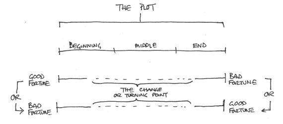
A typical plot tells the change in a character’s fortune (from bad to good or good to bad). It’s the basic storyline, such as “retired graphic designer wants to modernize skill set, goes to college, has some difficulties but succeeds”. In UX design, we define the plot at the start of our project to keep a clear vision through the process. A good plot will help the other elements fall into place. For example, if we were designing a site for a company that offered high-end landscaping, we might have this scenario to consider: “Rick wants to add some trees to his back garden, but he doesn’t know which are best or which will do well in his soil type and climate.” So, we’d make our website in such a way that he’d find the best trees to plant in his garden and would buy the ones that can survive and thrive in his part of the country. Here, we combine the goal of the interactive product with the path to take our users there. Plot accounts for a good part of what goes into what we design. However, it’s still only a skeleton; we need more.
© Paul Hazel, All rights reserved
Next, we look at the characters in UX design. Here, we define our target audience, because our users are most of what “characters” is about (although the brand image of our company is another consideration, because that “character” will interact with users, too). So, in our landscaping company, we understand that our users (characters) are people like Rick, who live in suburban settings, have some expendable income and are fond of trees. From their point of view, they see the image we convey in our logo (“Trevor’s Terrific Trees”), showing the image of the founder carefully pruning a young tree (they’ll see the founder, Trevor, on the site, too).
Now that we’ve established plot and characters, we can move on to theme. Theme can be tricky: it’s here where we have to differentiate our company from competitors. Yet, to establish trust with users, we have to make our design conform to the standard of our industry. So, with the same plot and characters as our competition, in this phase we need to create a concept that appeals to users over what our competitors have. In our landscaping company, we could focus on the beauty of, say, bamboo or palm trees, and even use the green background to make our call-to-action buttons stand out. We want users to enter the ideal garden that we’re creating for them, making it so real that they enjoy being there, as if it were a real garden. We can give them ideas for their own gardens in the process.
Diction is the fourth consideration. It is how our site “talks” to the user, i.e., formally or informally. That tone will greatly influence how users perceive our design. Here, because we represent a high-end landscaping company, we have to design in such a way that our audience will believe us as a helpful authority who is well aware that we’re asking them to spend on high-quality, larger trees that we deliver. Typically, the size of the potential investment we’re asking of our users determines how much text we must provide to show that we know exactly what concerns they might have and introduce our trees, including the fine details of each species and which environment suits it best. Therefore, we would include long copy to inform potential customers, who could then match this detailed information against the types of soil they have.
© Zurb, All rights reserved
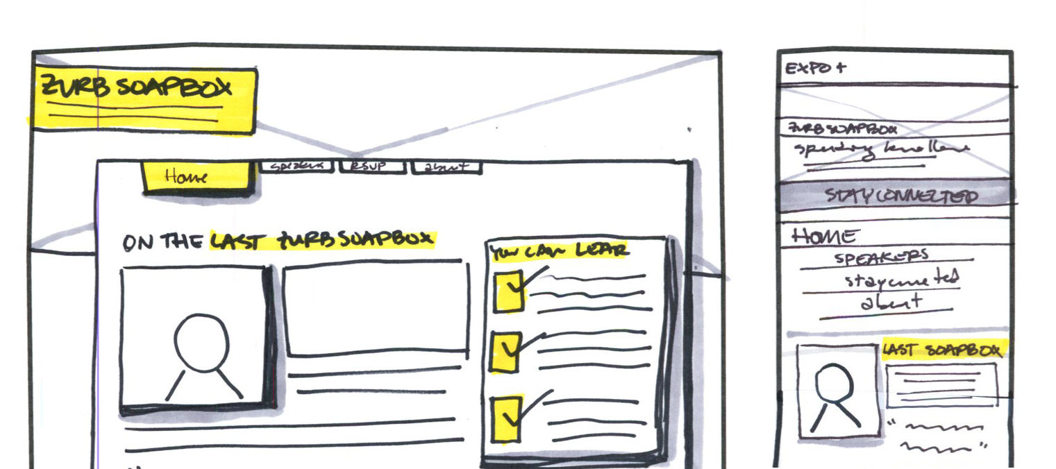
Melody is our next component. It’s the total set of design patterns and is the logical base that users will recognize. Because we’ve based our design on the industry standard, we’ll have our buttons (e.g., “Tree compatibility”, “Know your soil type”, etc.) set out in a way that users expect (they may have visited many sites before landing on ours to compare prices, service terms and feedback). From there, they can immediately understand the layout and interact accordingly.
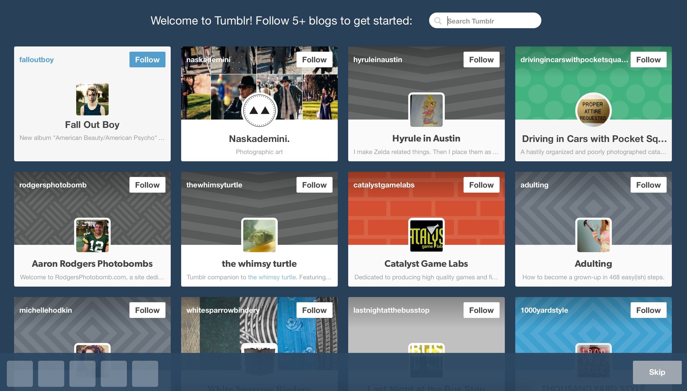
© Tumblr, Fair Use
Décor is purely graphic design. It places emphasis on the “setting” that we’ve already established. This is how we show our UX design. In the case of our landscaping company, we can select the décor from many options. Here, we can determine whether we want a modern or a classical look, or a simple or a detailed look. Because Trevor’s Terrific Trees offers a wide range of possibilities, from cold-climate conifers to warm-climate palms, our users will have many options to explore for their garden ideas. We might want a classical look that implies authority, making it detailed but not overly so (remembering Hick’s Law, to keep it as simple as possible). We’re reassuring our users, graphically, that we know what they want and we know the business of tree-keeping inside out.
Lastly, we leave our users with the spectacle of our design. These are its special features, the little aspects that can impress users. These will stick in their minds, so that when they’re describing our design, they’ll say: “That’s the one with the x or the y.” X or Y are features they weren’t expecting to see, such as a little character who appears on the screen to help the user if the session has been inactive for longer than five minutes. In our landscaping company, we could have a feature where we let users create a drawing space. If our user, Rick, had a garden that was nine meters wide and six meters long, he could use his mouse to tap on which trees he would like to place where in his garden. If he put them too close together, we could show the latest tree walking off the screen and include a caption, “Sorry, there’s not enough space there for that tree to grow.”
The Take Away
Applying an adaptation of Aristotle’s storytelling framework (plot, characters, theme, diction, melody, décor and spectacle) empowers us to engineer designs that stand out from the competition. We can make our users laugh or get them hungry to learn more. Knowing who they are and what they want are vital steps to taking us the rest of the way, making a design that connects exactly on their wavelength. Above all, we want them to have a good UX, follow through on a call-to-action, and remember us (becoming loyal and telling their friends).
Where to Learn More
van Geel, J. (2011). “Aristotle’s Storytelling Framework for Interactive Products”. JohnnyHolland.org.
Thomas, S. (2015). “From Aristotle to AI: the evolution of storytelling [Digital Edge]”. Memeburn.
Here is a great pair of articles from Smashing Magazine, offering a deep and entertaining examination of effective storytelling in UX design: