A heads-up display (HUD) is the persistent information layer a game places on screen during play, like health bars, ammunition counts, mini-maps, objective markers, ability cooldowns, and contextual prompts. It puts critical data in front of players at the exact moment they need it, so their attention stays on the action the data supports. When it's well designed, players don't notice it exists. They just play.
In this video, Celia Hodent, PhD, Game UX Strategist and author of The Gamer's Brain, explains what a HUD is, how it works, and why thoughtful HUD design shapes the way players engage with a game.
HUD Design Makes or Breaks the Player Experience
A player in the middle of a fight has almost no conscious attention to spare, and only a fraction of a second between registering a threat and deciding how to answer it. In that moment, the HUD either serves them or it doesn't. When it does, players feel something they rarely stop to name: the sense that the game is completely on their side.
Most traditional UI design assumes users can stop and think, weigh their options, and return to a task without consequence. A player in an active fight doesn't have that luxury. They track enemies, manage resources, read the environment, and form a plan simultaneously, and a HUD that works with that reality gives players exactly what they need at exactly the right moment, without ever requiring them to search for it.
This is why HUD design is its own discipline within game UX design. You need to understand how players distribute attention during intense play, how visual hierarchy functions against dynamic backgrounds, and how the informational demands of a combat moment differ from those of an exploration moment.
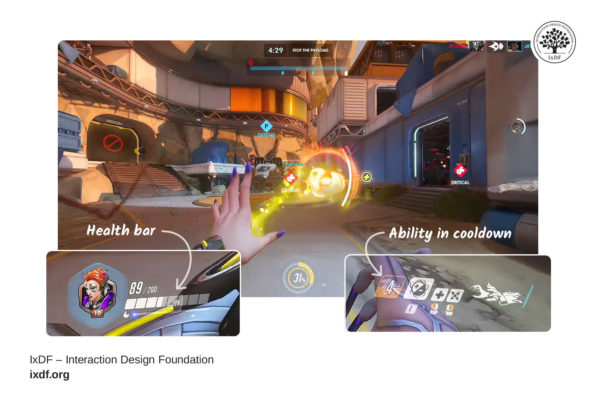
© Blizzard Entertainment. Footage CC BY No Copyright Gameplay. Modified by Interaction Design Foundation.
Overwatch's HUD places every critical element close to where players' eyes rest naturally during a fight, so information lands without pulling attention away from the action.
Overwatch shows what it looks like when a HUD is built for that reality. Each hero's ability cooldowns sit at the bottom of the screen, close to where players' eyes rest naturally during a fight, and an ultimate ability announces itself through a glowing icon, a charging sound, and a screen-wide animation that all converge at the same instant. The display carries plenty of data, but players absorb it without conscious effort because every element sits exactly where their attention already goes.
The Four Types of HUD
The foundation of a HUD is based on its relationship to the game world, and that choice shapes every visual, tonal, and cognitive decision that follows. There are four main types, each with a distinct position on the spectrum between immersion and readability. Let’s take a look:
A non-diegetic HUD sits outside the story entirely. Health bars, ammo counters, and mini-maps exist for the player but not for the character, which gives you precise control over placement and readability. Non-diegetic HUDs are the most common choice across the industry for that reason, but every element competes with the world for attention.
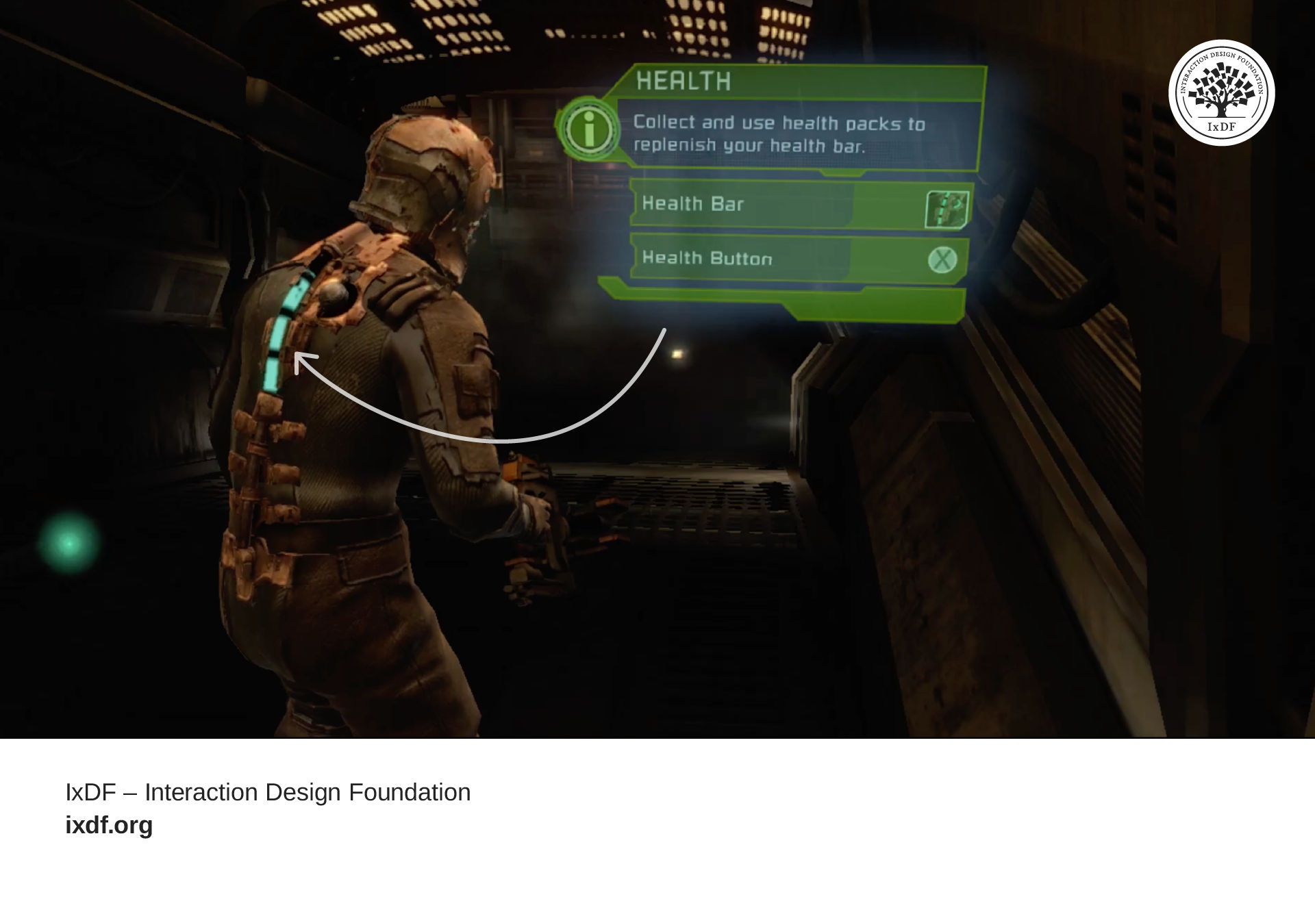
© Electronic Arts. Footage CC BY Game Footage Archive. Modified by Interaction Design Foundation.
In Dead Space, Isaac's health meter is part of his suit rather than an interface overlay. Players track their status without ever looking away from the environment.
A diegetic HUD carries information inside the world itself. In Dead Space, Isaac Clarke's health meter is part of his suit, a physical object in the game's fiction. The information stays just as available, but nothing sits outside the story to deliver it, and the interface becomes part of the experience.
A spatial HUD anchors information to objects in the three-dimensional environment. Floating health bars and damage numbers live in the game's 3D space and scale with distance, which makes them feel more grounded than a flat overlay without requiring full fictional integration.
A meta HUD communicates through the presentation layer itself. Blood on the screen, desaturation as health drops, vignetting at the frame edges: these deliver game state through visual sensation rather than through added elements.
Many modern games combine all four types into a single system, known as the adaptive or contextual HUD. Uncharted removes the weapon display entirely outside of combat and surfaces it only when a fight begins. The information stays available throughout; the HUD simply brings it forward at the moment it serves players and pulls back when the moment passes. This reduces visual noise during exploration while preserving clarity when clarity matters most.
Every HUD decision sits at the intersection of two demands: cognitive load and immersion. More information on screen reduces the memory burden on players, but it adds visual processing load and draws attention away from the world. The design challenge is to find the minimum set of information your game genuinely requires, present it with enough clarity to land at a glance, and choose a type that serves the specific experience you're creating. A survival horror game makes very different choices from a racing simulator or an MMO, not because one approach is superior, but because the goal of each experience differs.
When Less Information Serves Players Better
There's a paradox at the center of HUD design: the more work you put into an interface, the less players should notice it. The goal isn't a display that communicates everything but one that communicates the right things so naturally that players never register the act of receipt at all.
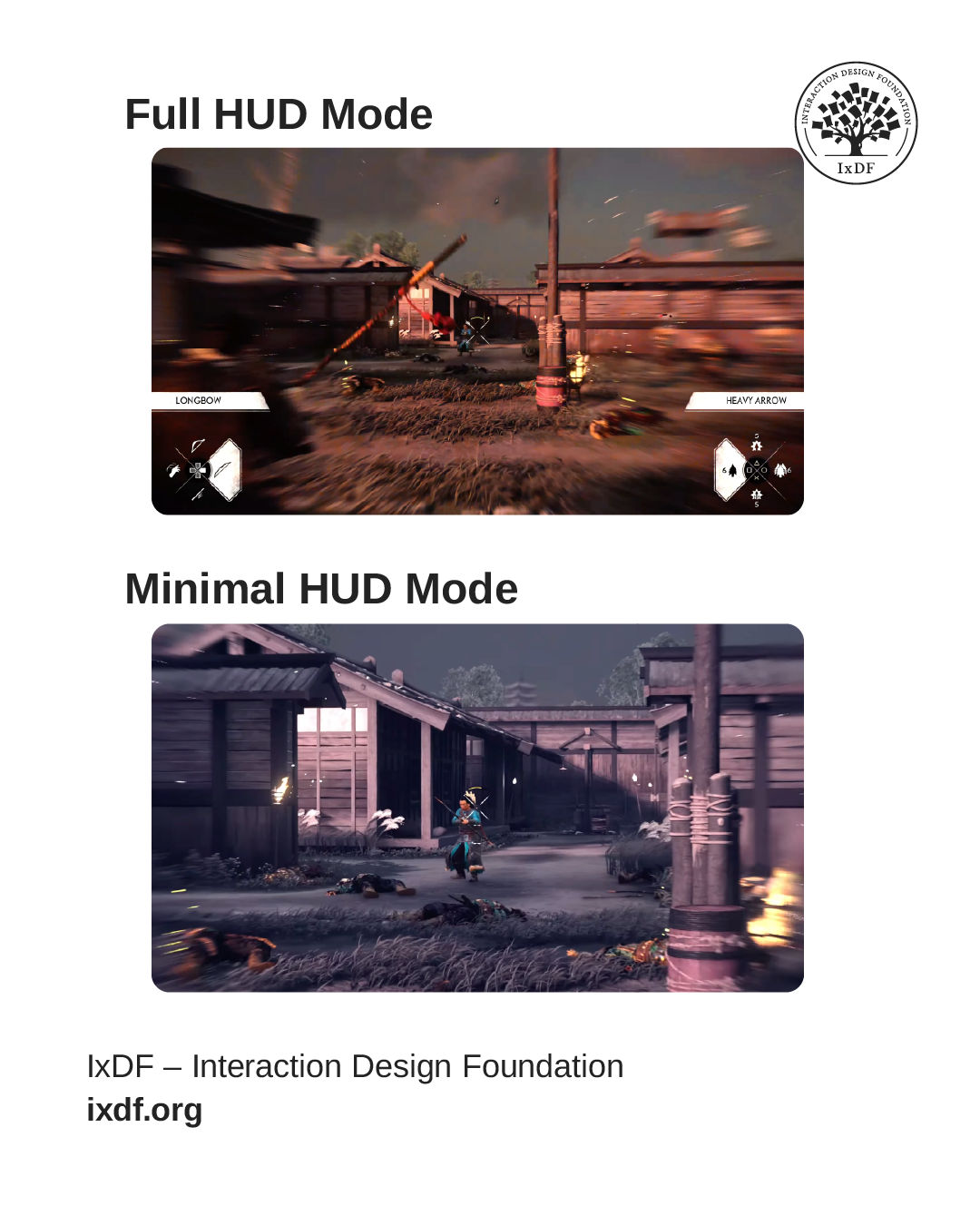
© Sony Interactive Entertainment / Sucker Punch Productions. Fair use. Modified by Interaction Design Foundation.
Minimal HUD modes remove visual noise without removing information. Players learn to read the world itself as feedback, and the fiction stays unbroken.
The Last of Us, God of War, and Ghost of Tsushima pursue that goal through restraint, with minimal displays that fade when not immediately relevant and "no HUD" modes that replace explicit data with implicit communication. Heavy breath signals low stamina, a limp communicates injury, and red at the screen edges marks danger. The information is still there, woven into the world rather than layered on top of it, and players absorb it without a conscious thought.
Not every game benefits from this approach. Competitive multiplayer, complex strategy games, and information-dense RPGs need comprehensive displays because their cognitive demands require constant data access. But the underlying principle applies to every HUD decision you make: show your players exactly what they need, present it with enough clarity that it lands without effort, and trust the world to carry everything else. The best HUD you'll ever design is the one no player ever thinks about.
References and Where to Learn More
Want to design games players love to play and remember for years? Take our course, [name], and master how to build experiences grounded in cognitive science, apply the engageabilityframework to solve real design problems, and advocate for players at every stage of development.
Read our article Stop the Generic Portfolio Trap! Design a Stand-Out Portfolio for Your UX/UI Niche: Game UX to learn how to present your HUD design work in a way that stands out to studios.