
Oli Gardner – the Creative Director of Unbounce (a landing page builder for marketers), is an advocate of CCD. He says that deploying CCD makes each page you create on a website a piece of “accountable content”. In that you can measure the impact, purpose and success of each page as that page plays a part in converting visitors into customers. Design is often about solving problems. Many of the problems that designers work on are user-oriented problems. However, there is another consideration when it comes to problem-solving; solving business-oriented problems.
Conversion Centred Design (CCD) exists to help designers create user experiences that drive a single business goal. [Tweet this]
That might be as simple as clicking to another page or as complex as ensuring a sale or registration on a website.
Conversely CCD makes it easy to determine when a design is unsuccessful because it fails to play its part in converting visitors into customers. As with all things design CCD is a hybrid between art (the visual, UX and content design) and a science (the measuring and analysing of the results).
Oli offers 7 principles which he says are the core of making CCD work for you on your design projects:
Encapsulation
Contrast
Direction cues
The Use of Lots of White Space
Urgency and Scarcity
Let’s see them in detail and with some examples!
The 7 Principles of CCD
The First Principle of CCD – Encapsulation
Encapsulation is the wrapping that you put the most important content in. Rather like the wrapping paper we use to draw someone’s attention to their present on their birthday; the idea is to make it clear to the visitor that the content is important to them.
What do you wrap in CCD? The content that triggers the action that you desire; it it’s a click that’s required make the button big and interesting. If it’s a sign up; call attention to it.
Examples of encapsulation (social media buttons):

Author/Copyright holder: Free Stock Images. Copyright terms and licence: CC BY 2.0
The Second Principle of CCD – Contrast
Put a big red button on a bright red background and what happens? It becomes indistinguishable from the background.
In CCD it’s not the colours that you use that matter – it’s the contrast from the background that matters. [Tweet this]
If your call to action blends in with everything else, who will see it?No-one that’s who. Make stuff stand out using contrast. White on black.Green on red.Not sure how to create the greatest levels of contrast? Check out the colour star below (points that are opposite each other offer the greatest levels of contrast):
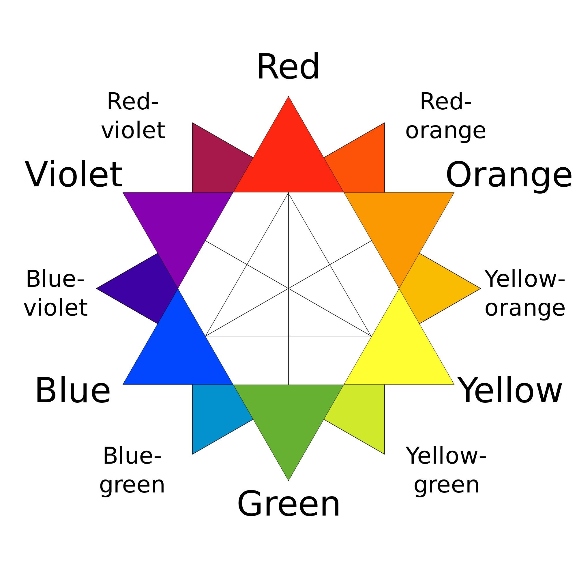
Author/Copyright holder: Kwamikagami. Copyright terms and licence: CC BY-SA 4.0
The Third Principle of CCD – Direction Cues
In CCD you want to make it as easy as possible for your customers to take action that means building your pages so that they point the way to the action you want them to take. You can use arrows to highlight attention to specific areas on screen or triangulate to create a focal point. When you use photos use the line of sight to point out the call to action.
With the photograph shown here – you would want the call to action placed directly in the baby’s eye line to help the viewer know where to go next:

Author/Copyright holder: Pixabay. Copyright terms and licence: Free to use
The Fourth Principle of CCD – The Use of Lots of White Space
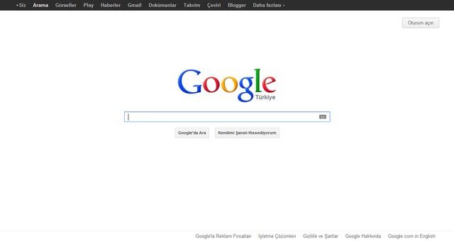
The more white space the better, the less cluttered that your designs are – the easier it’s going to be for the view to decide where they are supposed to take action. This also makes it simpler to communicate a single key message to your user.
There’s no better example of the powerful use of white space than the Google homepage.
Author/Copyright holder: Emperyan. Copyright terms and licence: Public Domain
The Fifth Principle of CCD – Urgency and Scarcity
If you want people to take action now; you have to give them a reason to do so. Psychology says that you can drive people to action by limiting their decision making time. You can do this either by making the resource scarce “Only 7 cameras left at this price – then they go up to $999” or by making the time scarce “Only 23 minutes left to order for delivery tomorrow morning!”
Ideally you want to place these messages as close to the call to action as possible.
As you can see in this shot from Amazon’s website – this special price is limited and already 35% of the bundled items have been claimed. The message is clear “take action now or miss out”.

Author/Copyright holder: Unknown. Copyright terms and licence: Fair Use
The Sixth Principle of CCD – Try Before You Buy
If you’ve ever been to a supermarket and been offered a sample of a product; you weren’t offered that sample out of the manufacturer’s generosity. It helps you decide to buy a product if you can be sure that you’ll like it. So while it might not be possible to give someone a sip of Cola or a slice of cheese online; you can duplicate this idea digitally.
Think about giving away a synopsis of a report or a sample chapter from a book or the first 10 minutes of your latest training video.
The idea is simple, it provides customers with reassurance that your product is worth their investment. Even when that investment is only an e-mail address.
Here’s an example from The Reading Room which gives away free preview chapters of books that it sells:

Author/Copyright holder: Unknown. Copyright terms and licence: Fair Use
The Seventh Principle of CCD – Social Proof
The final key to sealing a deal is for the visitor to trust you enough to make the leap of faith required to become a customer. One of the simplest ways to help build that trust is to deliver “social proof” which is simply feedback on how other customers and visitors have felt about your products and services.
It can be in the form star ratings (like the ones in the Reading Room example above) or full testimonials like the one below from Legal and General (the insurer):

Author/Copyright holder: Legal & General. Copyright terms and licence: All rights reserved Img source
It’s always a good idea (like above) to add just a little explanation with a testimonial to make it clear that that’s what it is.
An Example of CCD in Action – Wistia.Com
Let’s take a look at the landing page of Wistia and see which rules of CCD they follow:
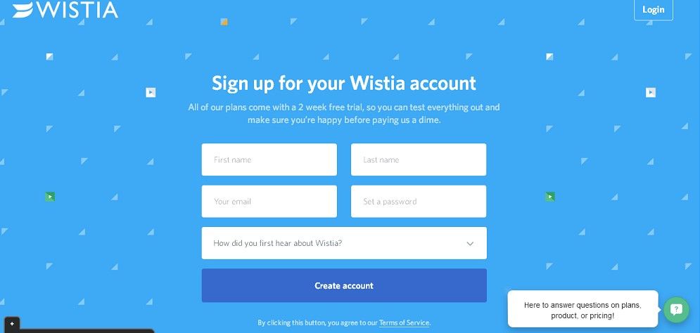
Author/Copyright holder: Unknown. Copyright terms and licence: Fair Use
“Create account” is fully encapsulated and it’s clearly contrasting with the background. There’s not much choice on screen at all and that leaves plenty of room for whitespace and clear direction (fill in the form – please). They also offer a try-before-you-buy option “All of our plans come with a 2-week free trial… make sure you’re happy before paying us a dime.”
In fact, the only things missing are a little social proof and scarcity. It’s important to note that you do not have to fit every CCD concept into every page you design – you just need to ensure that you include a focus on enough principles that it evokes a call to action.
Why did we choose Wistia for this example? HubSpot picked it as the best landing page of 2015.
The Take Away
CCD is a new concept in design and Oli Gardner of Unbounce is its leading practitioner. However, the intent of CCD is not new at all. Website owners and companies seek conversions; it’s the number one business issue that they want to tackle.
While your designs still need to appeal to your users, in order for them to be accepted and successful, it’s also important that they tackle real business problems – if they don’t then no-one is going to be willing to pay for them.
Putting CCD into practice is simply a question of using the principles of encapsulation, contrast, direction cues, whitespace, urgency and scarcity, try before you buy and social proof.
References
Hero Image: Author/Copyright holder: Hubspot. Copyright terms and licence: All rights reserved. Img
Want to hear the story of Conversion Centred Design as told by Oli Gardener himself? Find it here.
Want to examine the best landing pages of 2015 and then put them in context with your understanding of CCD? Find the landing pages here.


