In this video, William Hudson, User Experience Strategist and Founder of Syntagm Ltd, explores the psychological phenomena that affect how users perceive changes in dynamic web interfaces. While the focus is on web pages, these principles apply to any interactive technology, from desktop applications to mobile interfaces.
Understanding Human Perception
When we add dynamic functionality to web pages using technologies like Ajax, we gain tremendous flexibility to update content without full-page reloads. However, this increased interactivity introduces a crucial challenge: users may not notice the changes we make. Three key perceptual phenomena explain why even obvious updates can go completely undetected.
Inattentional Blindness
The invisible gorilla experiment, conducted by Daniel Simons and colleagues in the 1990s, dramatically illustrates how much we can miss when our attention is focused elsewhere. In this famous study, participants watched a video of two teams, one in white shirts, one in black, passing basketballs. When asked to count the passes made by each team, approximately half the viewers completely failed to notice a person in a gorilla suit who walked into the center of the scene, beat their chest for several seconds, and walked off.
This phenomenon, called inattentional blindness, becomes even more pronounced when users are multitasking, fatigued, or working under demanding conditions. The implications for interface design are significant: even large, important changes to a screen may go completely unnoticed if users are focused on a specific task.
Change Blindness
Ron Rensink's pioneering research in the 1990s revealed another perceptual limitation that directly affects web design. Change blindness occurs when people fail to detect alterations to a visual scene, particularly when those changes happen during a brief interruption or "blank field."
This is precisely what happens during traditional page reloads in web browsers. When a page refreshes, the screen briefly goes blank before displaying the updated content. During this interruption, users become remarkably poor at detecting what has changed, even when the modification is substantial and occurs in plain view.
William demonstrates this with alternating images of a Spanish street scene, where an entire palm tree appears and disappears. The blank frame between images makes the change extraordinarily difficult to spot, even when you're actively looking for it. Without the blank interval, the change would be immediately obvious.
Attentional Gambling
The third perceptual challenge occurs when designers expect users to notice changes in multiple locations simultaneously. William calls this "attentional gambling," betting that users will look in the right place at the right time.
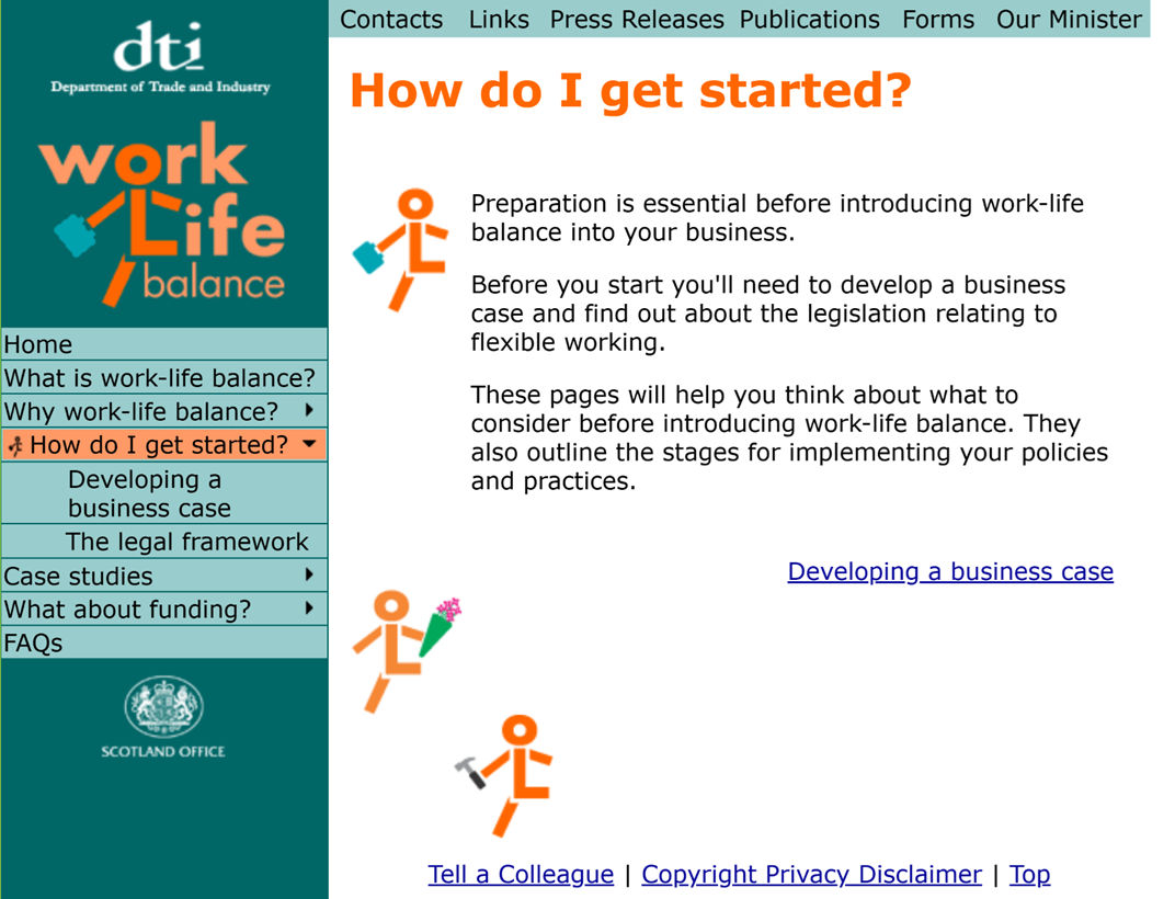
In usability testing, clicking "How do I get started?" on the left simultaneously opened a new page and expanded the menus.
The example is from usability testing of a UK government website. When users clicked a menu item, two things happened at once: the left-hand navigation expanded to show sub-items, and the main content area updated with new information. Consistently, users noticed the content change but completely missed the menu expansion. They simply couldn't attend to both locations simultaneously. As a result, they struggled to find the second sub-item, "The legal framework".
Design Strategies for Visibility
In the second part of this video, William discusses practical design strategies for overcoming inattentional blindness, change blindness, and attentional gambling.
To work around these perceptual limitations, designers must make updates conspicuous and strategically position them.
Making Changes Noticeable
Three characteristics help ensure users detect interface updates:
Size matters. Larger changes are more likely to catch attention than subtle modifications.
Color draws the eye. Bright, contrasting colors can break through inattentional blindness more effectively than muted tones.
Animation attracts notice. Movement triggers our peripheral vision, making animated changes particularly effective. Many modern websites use pop-up messages that briefly appear and then fade away; a good practice as long as there's also a persistent indicator of the change.
Strategic Positioning
Where you place feedback is just as critical as how you present it. William recounts a usability test for Barclays Bank, where users consistently failed to notice navigation buttons in the bottom-right corner of the page. The bank had to add explicit text instructions telling users to "click on the green next button" after completing forms; instructions that would be unnecessary if the buttons were positioned directly below the form fields where users were looking.
The mouse cursor presents a unique opportunity for desktop applications. Since users visually track their cursor, placing feedback immediately adjacent to it virtually guarantees visibility. However, this strategy doesn't translate to touchscreen interfaces, where fingers obscure the screen.
Common Pitfalls
Ajax and dynamic updates can worsen user experience when implemented without consideration for perception.
William encountered a shopping website where clicking "add to basket" updated a counter in the top-right corner of the page, far from where users were working in the bottom-right. The feedback was too subtle and too distant to notice, even without a full page reload. Ajax wouldn't have improved this situation because the fundamental problem was positioning, not technology.
Another website attempted to be more elaborate by showing a pop-up basket summary when users clicked the basket icon. However, this pop-up didn't allow checkout. Users had to discover a small "view/edit order" link to proceed. This was Ajax being used to create barriers rather than remove them, reducing usability in the name of flashiness.
Basket Update
In the last clip, William referred to a tools website that subtly updated the basket count when an item was added. The combination of the page refresh and the distance from the "Add to basket" button, which was the last thing users focused on, made the update virtually invisible. A 2026 visit shows that the issue has been resolved, as shown here.

Screenshot showing basket notification pop-up (2026).
The Take Away
Three perceptual phenomena create significant challenges for dynamic interface design:
Inattentional blindness means even large changes may go unnoticed when users are focused on demanding tasks or experiencing stress or fatigue.
Change blindness prevents users from detecting modifications when page reloads create visual interruptions, requiring changes that are dramatically obvious to break through.
Attentional gambling fails when designers expect users to simultaneously monitor multiple screen locations; users can only look in one place at a time.
To design effective dynamic interfaces, make updates large, colorful, or animated. Position feedback where users are looking, not where design guidelines arbitrarily specify. Remember that adding Ajax functionality doesn't automatically improve user experience; it must be implemented thoughtfully, with careful attention to human perceptual limitations.
References and Where to Learn More
Discover more about inattentional blindness by searching for The Invisible Gorilla (Daniel Simons).
Hero image: © Interaction Design Foundation, CC BY-SA 4.0 (based on video by Daniel Simons)