The forced registration design pattern is a dark pattern with which companies force the user to establish an account, providing the companies with his/her personal information. This information is not essential for using the user interface. Rather, companies gather personal information about the user to sell to third parties or send unwanted advertisement emails.
Forced Registration
Your constantly-updated definition of Forced Registration and collection of videos and articles.
Be a conversation starter: Share this page and inspire others!
Get 1 Powerful Email Each Week
Join 313,397 subscribers.
What is Forced Registration?
Learn More About Forced Registration
Make learning as easy as watching Netflix: Learn more about Forced Registration by taking the online IxDF Course UI Design Patterns for Successful Software.
Why? Because design skills make you valuable. In any job. Any industry.
Earn Industry-Recognized Certificates
Industry giants trust our courses to train their teams, and prestigious universities integrate our content into their curricula. Add your certificates to your LinkedIn profile, résumé, and job applications.




All Free IxDF Articles on Forced Registration


Beware of Harvesting Users’ Information with Forced Registration
If a company knows you really well, they have more of an opportunity to make money. Time was, the second you registered with any website, whether it was an online shop or a social platform, they could send you advertisements or even sell your information to other companies. Much legislation exists n
- Social shares
- 534
- Published
Read Article
Beware of Harvesting Users’ Information with Forced Registration
If a company knows you really well, they have more of an opportunity to make money. Time was, the second you registered with any website, whether it was an online shop or a social platform, they could send you advertisements or even sell your information to other companies. Much legislation exists now to protect users from data harvesting. Still, if you’re a designer, it’s good to know about the forced registration design pattern, and understand that using it is the sort of reputation you don’t want to cultivate for a company. So, read on and learn more about how to spot and avoid it so you can keep your users friendly and keep in line with legislation.
Entering personal details can be tedious, especially when all you want to do is quickly interact with a website in some way, such as entering a competition or contacting an online support team. Worse, it can put users on their guard—and many casual users will likely balk on seeing the cue to enter such details, before they slink off to see if they can get a competitor’s version instead. Even so, if users want something badly enough, they may resign themselves to putting up with a little bit of this nonsense. In order to harvest as much information from each user as possible, many websites once used (and some still do use) forced registration, where the user must establish an account before they can interact with or use a certain part of the user interface.
For example, the historical screenshot below shows how Vimeo wanted to encourage users to register after landing on their page via their Google advertisement. Only when clicking further, which took users to the registration pop-up would they find a search bar, hidden in the right-hand corner, which allowed them to browse Vimeo content without signing up. So, no one can ever claim Vimeo backed first-time users into a corner.

© Vimeo, Fair Use
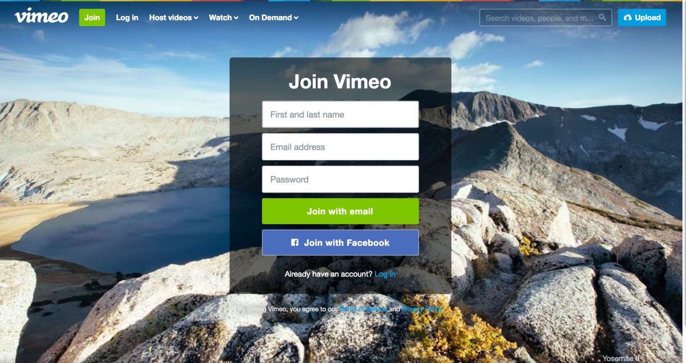
Vimeo used a softer version of the forced registration design pattern: rather than actually forcing users to register before they could use the website, they made it appear as if it were required (see the first screenshot in this example). Only when clicking the ‘Join now’ button for the Vimeo Basic membership in this screen could the user find functionalities they needed for fulfilling a task without registering. The second screen appeared; while it still had a registration cue consisting of input fields and ‘Join with’ buttons positioned at center stage, it also offered a search box in the top-right corner.
© Vimeo, Fair Use
Why is this classed as a dark pattern?
Other than in obvious circumstances (e.g., when ordering goods), there is almost never a benefit associated with providing websites with more of your personal details than your email address. By forcing you to register on their website—regardless of how simple or brief your intentions might be—an organization could gain access to a range of information about you that might be used either for their own purposes, such as choosing what spam to send you, or to decide whom to pass your details on to so they can make money from third parties.
Instinctively, many users are wise enough to deduce that something is ‘up’ if they find themselves prompted in this way. Depending on how much they want the item they stand to gain by entering their details, most are sure to hesitate for at least a moment and wonder how much bother it will cause further down the road. After all, forced registration seeks to provoke a comfortable (for the website) surplus of information. So, we should bear in mind the definition of a related term: volunteering information, which means furnishing more information than the person asking the question need know. On that subject, let’s see just how one-sided that activity tends to be when a human and an artificial intelligence are dealing with each other:
“The computer is notorious for not volunteering information.”
—Geordi La Forge (Character from the “Star Trek – The Next Generation” TV series)
As you can see from the example—also historical—below, in order to enter a competition, the user was expected to register with the website. Within the registration forms, the user provided his or her telephone number, email address, and university details. All of these details could have been used to send you endless correspondence, filling up your mailbox, answerphone, and email account. To soften—or maybe we should say ‘lighten’—the darkness of this registration form, the organization decided to explain what they would use this information for.
In similar situations, it would be sufficient simply to provide an email address as a means of identifying the user (e.g., in the event that user won the competition!). Indeed, it would be wonderful if matters just ended there—without any strings attached. However, the website designers had apparently produced a user interface that restricted users unless they provided more details. We hasten to add that the James Dyson Foundation is reputable and has noble intentions, explaining in full what the registrants’ details would be used for.
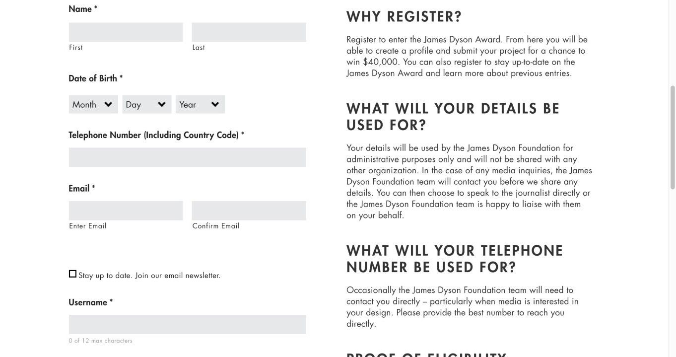
As described in the main text, the James Dyson Foundation student competition required potential participants to register, but also took the time (and quite some space on the user interface) to explain why they needed to provide the information.
© James Dyson Foundation, Fair Use
The Take Away
Many times, a company needs some information from a user to enable access to a service. When this is the case, the user will voluntarily and consciously decide to share this information by registering. However, sometimes a company will force people to give them information when they don’t actually need it for providing their main service. This is when registration becomes a dark pattern. Its purpose is to harvest information the company can use to send the user more advertisements, or to sell on to third parties. Legislation exists to safeguard users from such practices, particularly in the European Union, but it’s important to know about this dark pattern. As a responsible designer, you can—and indeed should—add clear explanations to any registration form, indicating why you need the information.
References and Where to Learn More
Hero Image: © Ryan Raffa, CC BY-SA 2.0.
Jenifer Tidwell, Designing Interfaces: Patterns for Effective Interaction Design, 2010
Martijn van Welie, Pattern Library, 2008