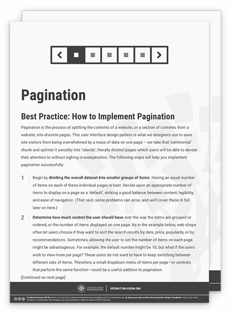
Pagination is the process of splitting the contents of a website, or a section of contents from a website, into discrete pages. This user interface design pattern is used so site visitors are not overwhelmed by a mass of data on one page.
How to Effectively Implement Pagination
Pagination has a broad range of applications, and we see them almost everywhere in different forms. The most common use case is to split long lists (such as search results on Google and product listings on Amazon) or large data tables (for example, a list of blog posts on the WordPress dashboard).
In this video, Senior UX Consultant for the European Parliament and creative lead of Smashing Magazine, Vitaly Friedman, explains how to effectively implement pagination on complex data tables.
Advantages of Pagination
Reduces cognitive load: When users see a limited number of items on a page, they can focus on the information in front of them.
Easy to navigate: Pages offer “landmarks'' for people to navigate. For example, a user might recall that a particular entry in a list was on a specific page number. If the product offers sorted data, the page “numbers” can also hint at where to find a particular entry—for example, a specific date or price range.

Letters instead of numbers for alphabetical lists can help users find content more easily.
© Interaction Design Foundation, CC BY-SA 4.0
Sets expectations: Users know precisely how large the data set is and how far they’ve reached.
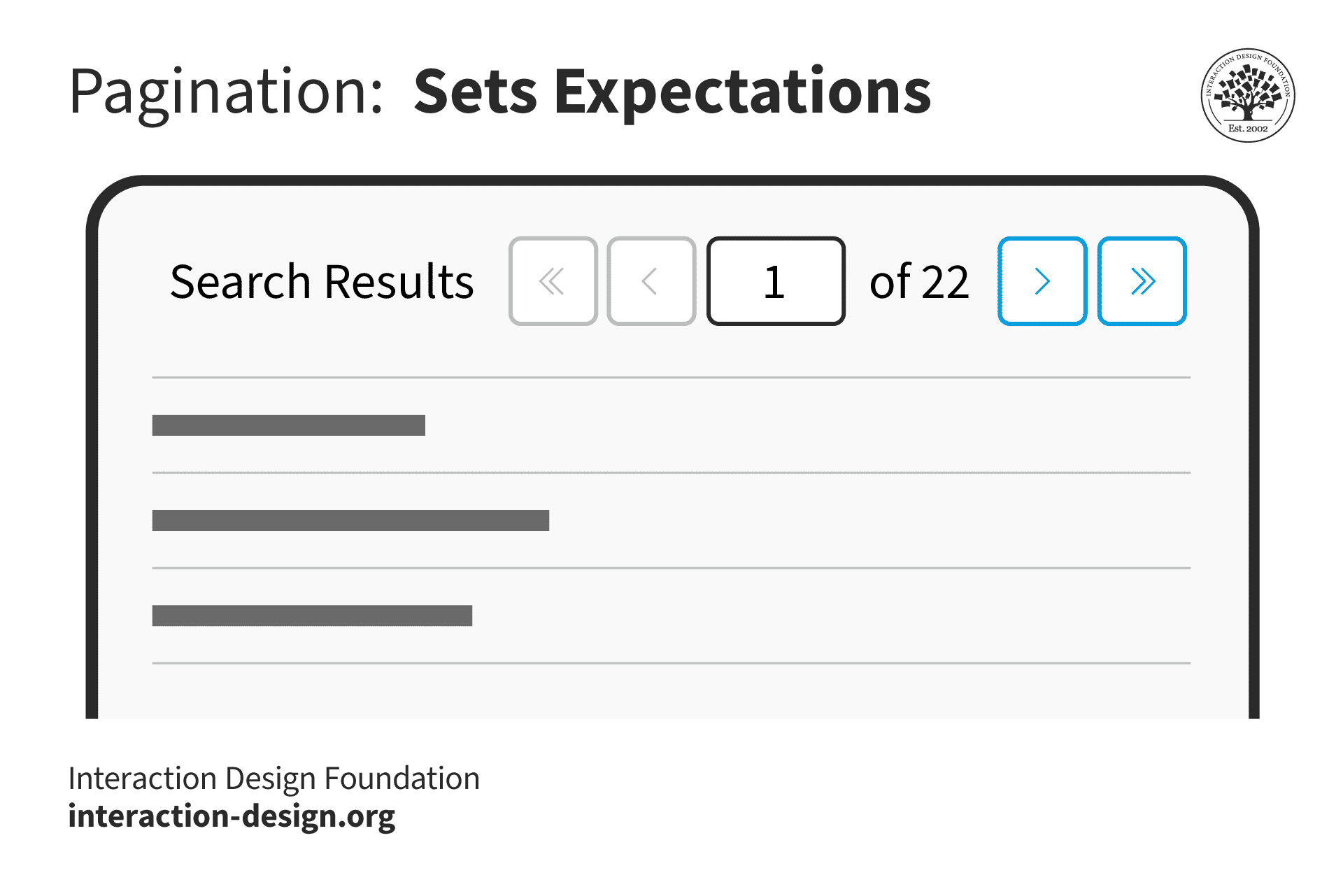
© Interaction Design Foundation, CC BY-SA 4.0
In addition to showing which page number the user is on, WordPress offers an input field that allows users to jump to specific pages instead of relying on just the arrows to move forward or backward incrementally.
© WordPress.org, Fair Use
Offers user control: If the design provides customization options, users can control how many pages they wish to see so that they can view more data in one go instead of clicking “Next” several times.
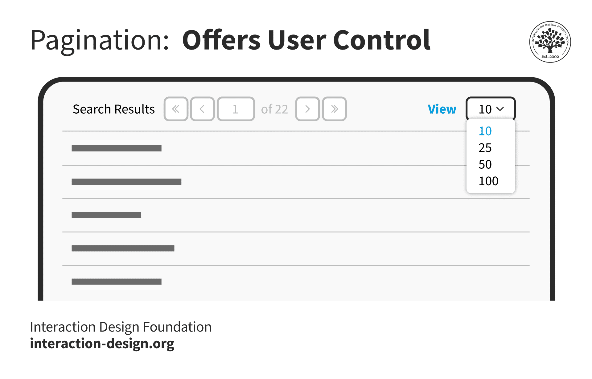
© Interaction Design Foundation, CC BY-SA 4.0
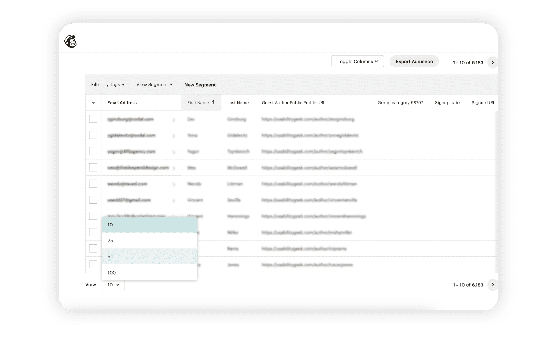
Mailchimp’s Audience page allows users to customize how many contacts they want to view in one go.
© Mailchimp, Fair Use
Search-engine friendly: Since each page is discrete, search engines index them separately, unlike other techniques such as infinite scrolling. While search engines can consider such pages as duplicates and penalize them, in most cases, the algorithms can identify that they are part of a series.
Supports continuity: Users can pick up from where they left off when a site splits data into manageable chunks.
Disadvantages of Pagination
It disrupts the user’s flow: Users only see a small portion of the information at a time. When they reach the end of the page, they have to break their workflow to navigate to the next page.
Requires multiple page loads: Pagination becomes tedious when the user needs to compare content across multiple pages.

E-commerce sites typically offer pagination at the end of the product listing. If users want to go back to previous pages, they must either use the browser’s back button or reload the page.
© Interaction Design Foundation, CC BY-SA 4.0
Pagination vs Infinite Scrolling vs Load More—Which One is the Best?
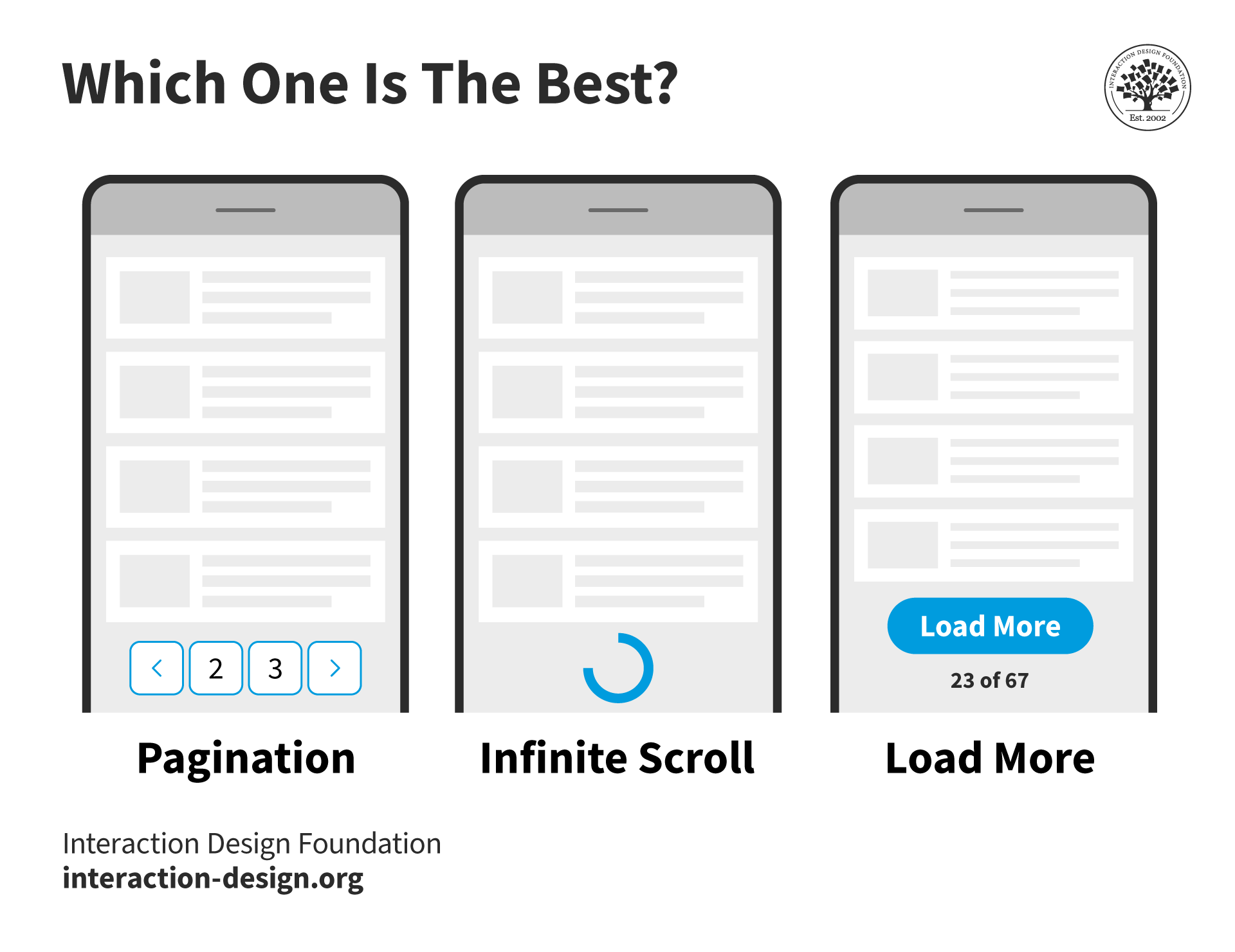
© Interaction Design Foundation, CC BY-SA 4.0
Infinite scrolling is a design technique in which a page loads content as the user scrolls down, thus removing the need for pagination. Infinite scrolling is used on social media platforms and feeds where content has no definite structure or sorting order, allowing users to explore endlessly. It removes the friction of navigating back—users can simply scroll up. This is more apparent on mobile devices; infinite scrolling is both easy and intuitive.
Vitaly Friedman compares the two approaches, along with a more controlled version of infinite scrolling—the load more button.
Infinite scroll aims to keep people on a particular page. However, it poses usability issues.
Impossible to reach the footer: Footers usually offer useful links such as contact information and help resources. An infinite scroll makes this essential information impossible to reach.
Makes it hard to find content: If a user navigates away and returns to the infinite scrolling page, they return to the top and must start from scratch. One way to address this issue is to automatically change the page URL as the user scrolls to help the user retain their position on the page. Social media sites are notorious in this regard, as they load completely new content every time the page loads, which makes it extremely difficult to find a previous post.
Large page sizes and performance issues: As more content loads on the page, it becomes larger and heavier, which might cause the page to become slower. If a site tracks the user’s position on the screen, then every time it reloads the page, it will reload all the content the next time. This takes much longer to load than a site with pagination.
Scrolling fatigue: If users don’t see any end, they might get tired of scrolling and even get overwhelmed or frustrated.
Poorer search indexing: Since the page loads content dynamically, search engines might not index the content that loads later. To circumvent this issue, Google recommends a paginated version of an infinite scroll.
How to Choose between Pagination and Infinite Scroll
Pagination and infinite scroll have their advantages, challenges and use cases.
While infinite scrolling works well for free exploration, pagination is most useful when:
The user has a specific goal and wants to find content.
Content has more structure or can be sorted according to objective criteria. For example, an e-commerce store that allows users to filter products and sort them according to price.
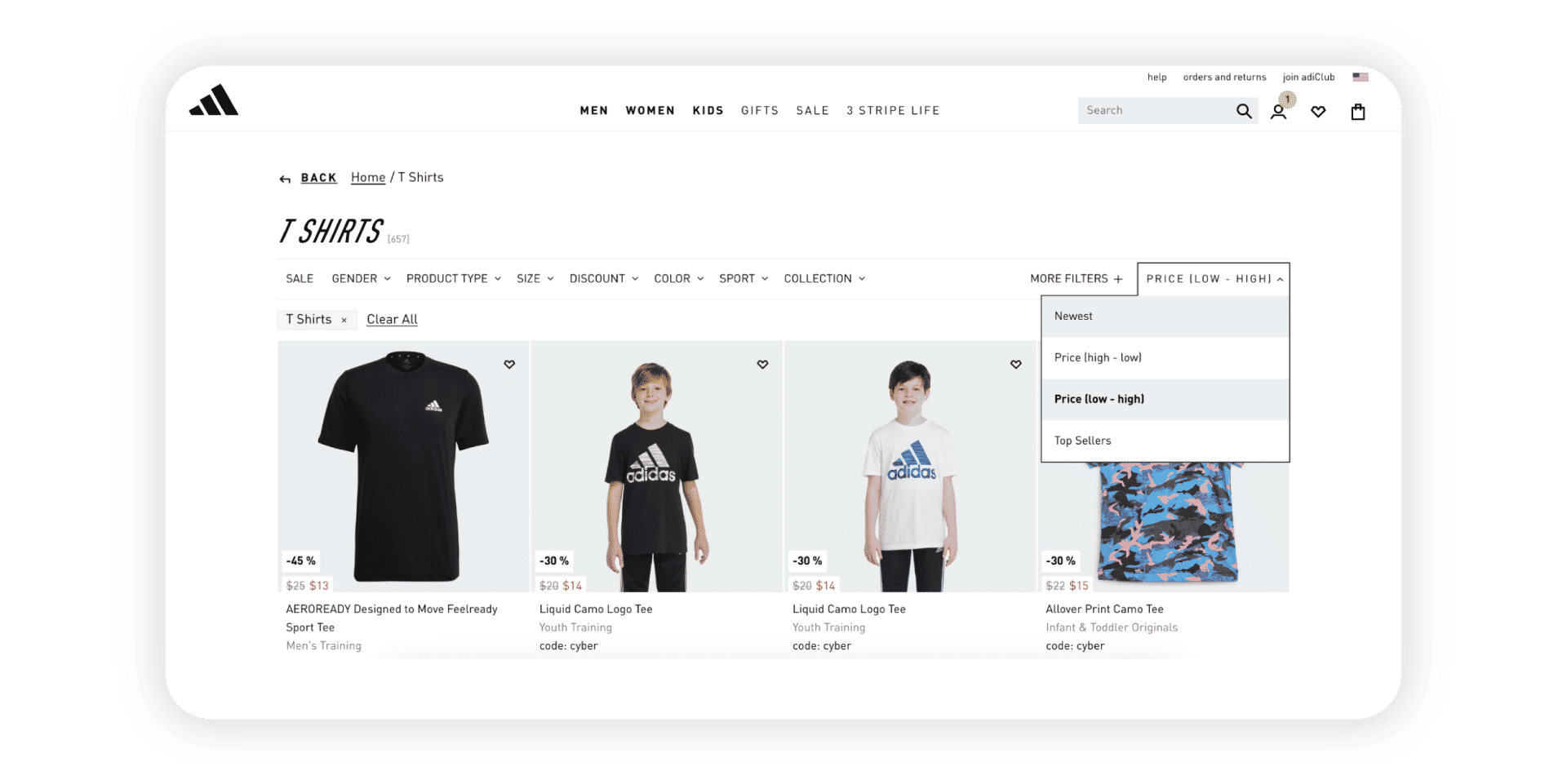
Adidas's shop allows users to sort through products and splits the results across several pages. A smaller list of products helps them focus more on the products and prevents analysis paralysis.
© Adidas, Fair Use
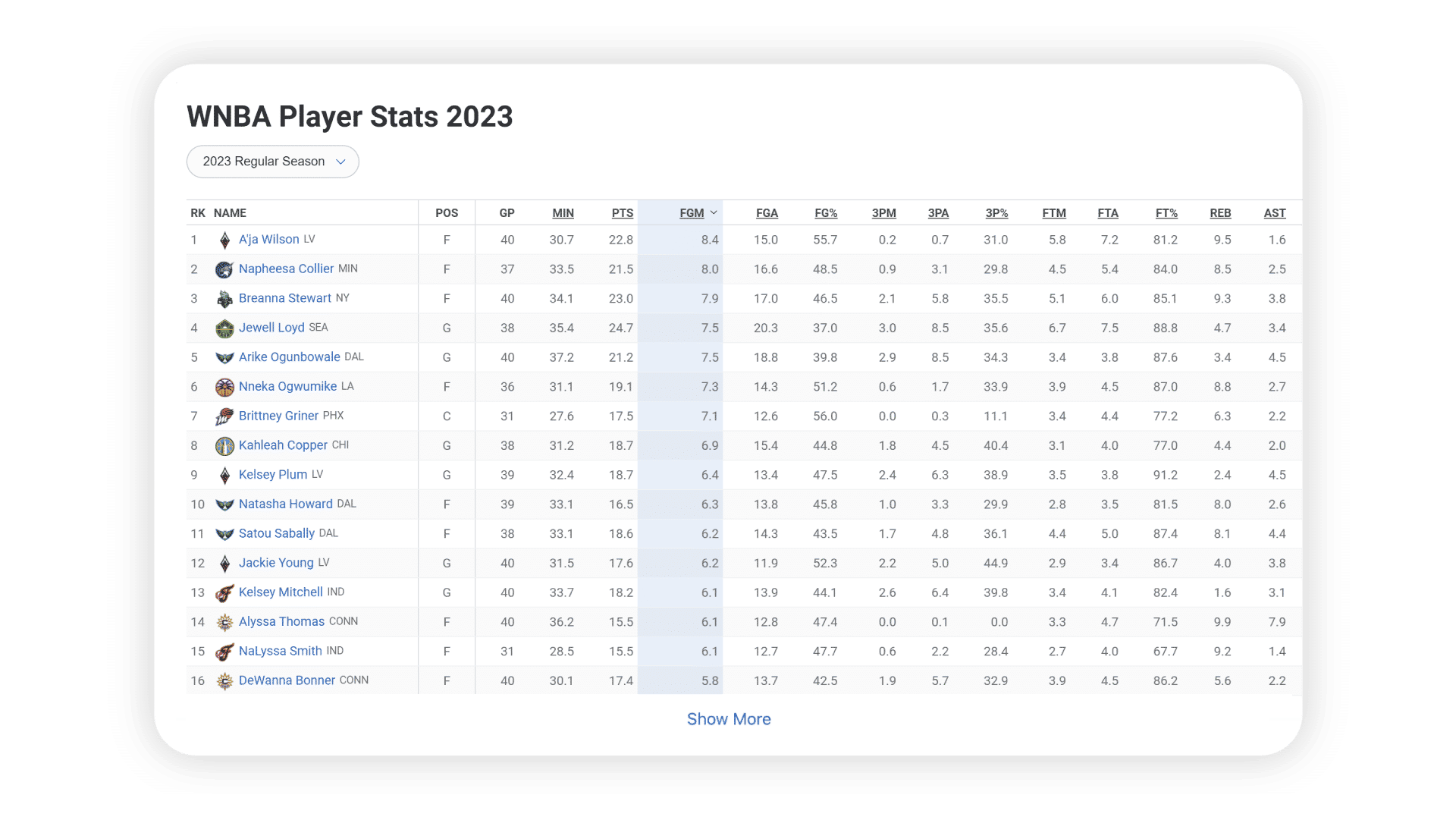
ESPN's "Show More" link works for its users because they will likely be on the page to explore without any task or objective. However, since this is a large table filled with numbers, it is impossible to tell what these numbers mean because the headers are off the page.
© ESPN, Fair Use
As these examples indicate, there is no specific formula to decide whether to split content across pages or use infinite scroll, with or without a “Load More” option. What option designers choose depends on the users’ goals. Teams must always rely on user research and test their solutions with users.
Best Practices to Implement Pagination
Make the pagination options easy to find: For the most optimal experience, place the pagination options at the top and the end of the content. Maintain a consistent layout across pages for a smoother user experience.
Ensure the links are clickable: Since most pagination options are numbers, keeping text links will lead to small click areas. Add more space around the numbers and increase the click area to ensure easy navigation.

Google's creative use of its logo to show page numbers looks interesting but is harder to use because of how close each number is. Google has stopped using this visualization and switched over to infinite scrolling.
© Google, Fair Use
Where appropriate, offer customization and respect user choices. Give people options to view more (or less) than the default number of items on a page. Remember their preferences on the next page load so they don't have to set it every time manually.
Allow people to jump to the first and last pages.
Show the user’s current position.
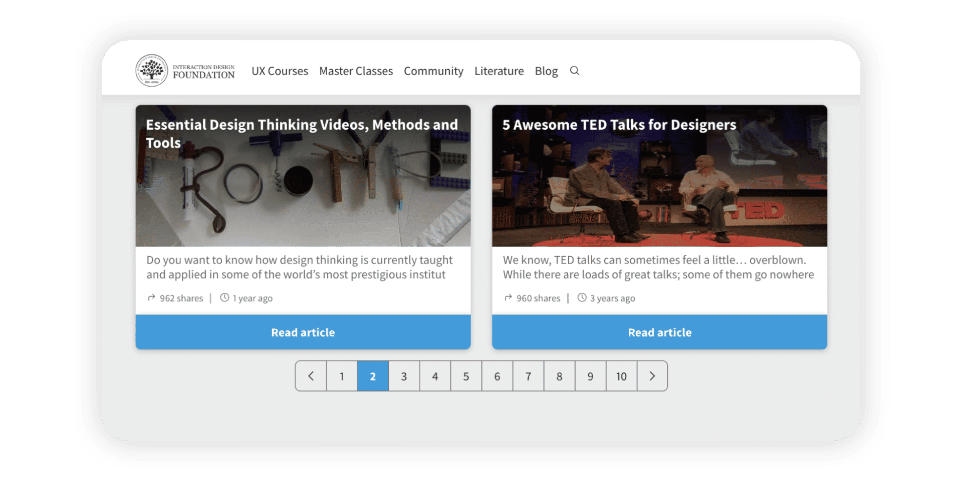
It is no accident that many pagination examples show numbers in boxes—they indicate the large area people can click on to navigate easily. The pagination on IxDF's website highlights the current page through a colored background.
© Interaction Design Foundation, CC BY-SA 4.0