Red hanging poster reads UX Myths and UX design is about usability

UX Research Communication – Using Posters

• 4 min read

478 Shares
Save

This week, we’re looking at how to communicate UX research in a way to add real value to your projects and to help ensure that people act on your research rather than ignore it. As always, each part of this series may be found under the UX Daily tab on this site. Today, we’re going to look at a very simple method for mass communication of ideas – posters.

Using Posters for UX Research Communication

This method always appeals to the natural graphic designer and leaves the rest of us feeling somewhat out of our depth. I have no natural graphic design skills, in fact I think I may have been born with that part of my brain missing. I once rented a house where the bathroom suite included a pink bath, a blue toilet and a brown sink – I didn’t notice when I looked round or indeed before I signed the contract and probably would never have noticed until my girlfriend burst into tears when she saw it (I probably should have paid more attention to the lime green vinyl wallpaper too…).

That doesn’t mean that you can’t make an effective poster, thankfully. Though, I prefer to cheat and visit a friend with some graphic design talents and ask (or beg) for their help.


Author/Copyright holder: UX Bleeps. Copyright terms and licence: All rights reserved Img source


The trick with posters is to try and convey simple messages rather than complex ones. One of the most popular pieces of research to communicate via posters will be the output of your user persona research. There’s no need to touch on the methods used, data sourced, etc. all you really need to do is get a picture that looks something like that idea user and then put the key data points around it. That’s something you can even do in word – if you really have zero design skills.

The advantage of using posters includes:

  • You can reach a wide audience much more easily with posters than nearly every other form of communication – including e-mail. People don’t read all the e-mails they get but there’s something about a poster that nearly always draws the eye.
  • It stimulates conversation about UX beyond the project team. This is always a good thing because there are often great ideas hiding out in the general population of a business that never make it to the UX team.
  • It stimulates questions about UX. This is even better because it gives you a chance to evangelize for UX without coming across as preachy or interrupting people’s days.
  • It stimulates debate about UX. Stereotypes, such as UX personas, should withstand some challenging and if they don’t…. it probably means they aren’t quite as good as they should be. The chance to improve your UX work should never be passed up.
  • It keeps people focused on UX. A poster is a constant reminder of the importance of your work. But don’t forget to move them around a bit – they can get dull without a little refreshing every now and again.

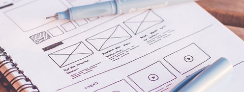
Header Image: Author/Copyright holder: Zoltan Gocza and Zoltan Kollin. Copyright terms and licence: All rights reserved. Img

Learn More in This Course:

Learn Design and AI From the Best

Get one powerful email each week, like 312,425 others.

Next email in:

What You Should Read Next

  • Read full article
    The Relationship Between Visual Design and User Experience Design - Article hero image

    The Relationship Between Visual Design and User Experience Design

    A common perception about UX designers is that we are artists who can create beautiful interfaces from a blank canvas. While the aesthetics of products are important, visual design is only one aspect of the design process – in which team members with different skillsets and expertise collaborate

    Social shares
    802
    Published
    Read Article
  • Read full article
    You’re Not Bad at Presenting; You Just Haven’t Mastered the Right Way (Yet) - Article hero image

    You’re Not Bad at Presenting; You Just Haven’t Mastered the Right Way (Yet)

    Ever walked out of a presentation thinking, “That could’ve gone so much better, maybe I’m just not a presenter”? You’re not alone. And you’re not the problem. You simply haven’t been shown an easy, clear, repeatable way to prepare, deliver and follow up.Presenting is not an innate talent; it’s a ski

    Social shares
    359
    Published
    Read Article
  • Read full article
    The Power of Mapping - Article hero image

    The Power of Mapping

    The map is one of the earliest and most important human inventions. It helps us to navigate our complex world. Maps simplify complex spaces, create shared understanding, reveal hidden insights and help us coordinate action. Around 25,000 B.C. a person carved the earliest known map into a mammoth tus

    Social shares
    589
    Published
    Read Article
  • Read full article
    The Past, Present, and Future of Virtual Reality - Article hero image

    The Past, Present, and Future of Virtual Reality

    Virtual Reality (VR) has come a long way since its humble beginnings—with stereoscopic images back in the 1800s—“astronomically” far, in fact! Twenty-first century VR catapults users into immersive and interactive 3D environments, ones that let them experience something far beyond what they find in

    Social shares
    647
    Published
    Read Article
  • Read full article
    Turn Your Non-Design Experience into Design Portfolio Gold - Article hero image

    Turn Your Non-Design Experience into Design Portfolio Gold

    Have you ever wondered how to transition into UX and product design from a different career background without feeling insecure? Let's uncover strategies to confidently bridge the gap and showcase your skills to prospective employers with confidence and clarity.In this video, Morgane Peng, Desi

    Social shares
    508
    Published
    Read Article
  • Read full article
    Structure First: The Inverted Pyramid and Visual Organization - Article hero image

    Structure First: The Inverted Pyramid and Visual Organization

    This clip examines two principles that work hand in hand to make web content readable: the inverted pyramid approach to information order and the use of visual structure to help users scan efficiently. William Hudson, UX Strategist and Founder of Syntagm Ltd, describes the theoretical basis and prac

    Social shares
    207
    Published
    Read Article
  • Read full article
    What Is Card Sorting? - Article hero image

    What Is Card Sorting?

    In this video, William Hudson, UX Strategist and Founder of Syntagm Ltd, introduces card sorting: what it is, where it comes from, and the broad range of problems it can help solve.Card sorting is a research technique in which participants organize a set of items into groups that make sense to them,

    Social shares
    174
    Published
    Read Article
  • Read full article
    Design Accessible Navigation for Keyboards and Screen Readers - Article hero image

    Design Accessible Navigation for Keyboards and Screen Readers

    Accessibility is often treated as a finishing touch, but for navigation, it belongs at the foundation. Menus are how users reach everything else on a site, so a menu that works only with a mouse quietly shuts out anyone who depends on a keyboard, a screen reader, or another form of assistive technol

    Social shares
    174
    Published
    Read Article
  • Read full article
    The Scent of Information: Give Users the Confidence to Click - Article hero image

    The Scent of Information: Give Users the Confidence to Click

    William Hudson, UX Strategist and Founder of Syntagm Ltd, introduces the scent of information as a model for understanding how users navigate toward their goals, and sets out the principles for writing navigation links that strengthen that scent.Information Foraging and the Scent of InformationThe s

    Social shares
    174
    Published
    Read Article
  • Read full article
    4 UI Design Tips Every Designer Needs to Know - Article hero image

    4 UI Design Tips Every Designer Needs to Know

    User interface (UI) design can make or break any digital product. A user often won’t even notice when they interact with a great UI. They feel the visual appeal and simply trust it. On the contrary, a bad UI design can prevent the user from interacting with a product intuitively or at all and lead t

    Social shares
    646
    Published
    Read Article

Top Articles

Top Topic Definitions

39% of Today's Skills Will Change by 2030

The World Economic Forum expects 39% of today's skills to be transformed or become outdated by 2030.

The good news is that jobs in UX / UI design and AI are among the fastest-growing professions globally.

Build Skills That Keep You Relevant

Privacy Settings

By using this site, you accept our Cookie Policy and Terms of Use.
Customize
Accept all

Be the One Who Inspires

People remember who shares great ideas.

Share on:

Academic Credibility — On Autopilot

Don't waste time googling citation formats. Just copy, paste and look legit in seconds.

Learn Design and AI From the Best

Get one powerful email each week, like 312,425 others.

Next email in: